the thing is not that the 3/5 container does not what you like to have the point is that the background-image and the container does not do what you intend to have.
The above gives you the possibility to have a responsive Color-section – but you have to make adjustments to have content that fits into the smaller section
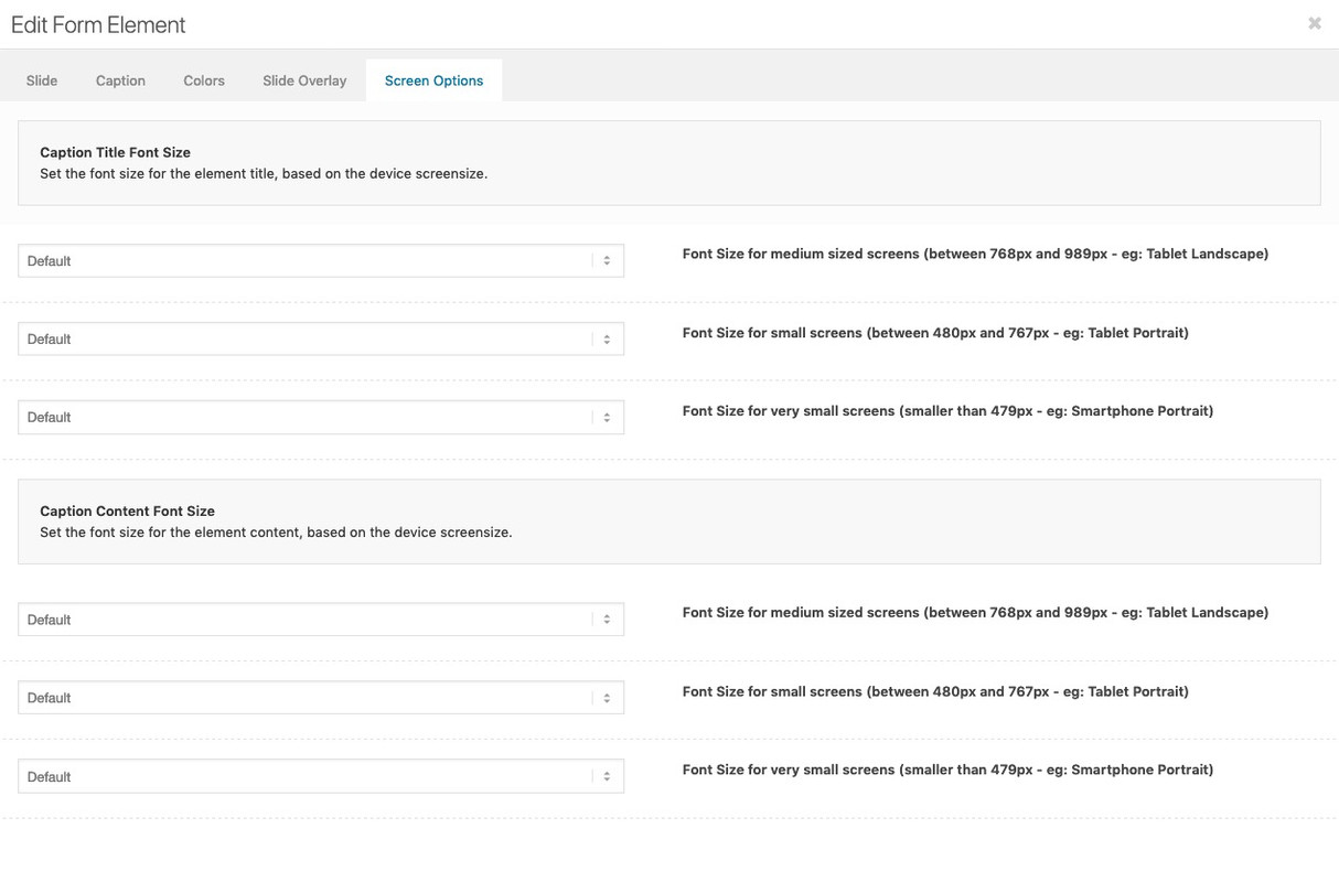
so my recommendation : use the fullwidth easy slider – it starts from the beginning with responsiveness. – and even the content is prepared for that.
you don’t need to find a relative font-size like the code above does with screen width relation – each slide got his own screen behavior to adjust for smaller screens :
Hi,
Try the following instead:
#top .av-caption-style-overlay .av-masonry-entry .av-masonry-entry-title{
font-size:11px!important;
}
Best regards,
Jordan Shannon
This reply has been marked as private.
Hey schwabino,
Add this to quick css:
h3.av-masonry-entry-title.entry-title{
font-size:10px!important;
}
Adjust the font size to what you need it to be
Best regards,
Jordan Shannon
just one moment – i did’t saw the test link in your starting thread.
To have a responsive Color-Section – you have to have a responsive Content ! – otherwise it will go out of the container.
Your bg-image is 1600/768 so an aspect ration of 48%
so you have to set your background-image to “contain” the image – but the height of the color-section should be 48% of width:
in responsive Case the 3/5th container should stay in this width or should be adjusted to your needs – enfold goes to have the containers under each other at a responsive width so to speek on 100% width:
see here the test page: https://webers-testseite.de/responsive-color-section/
.page-id-35548 #av_section_1 {
  width: 100vw;
  height: 48vw !important;
}

.page-id-35548 .flex_column.av_three_fifth {
  width: 58vw !important;
}

.page-id-35548 .flex_column.av_three_fifth .av-special-heading h1 {
  font-size: 4vw !important;
  line-height: 6vw !important;
}

.page-id-35548 .flex_column.av_three_fifth .av-special-heading .av-subheading {
  font-size: 3vw !important;
  line-height: 4vw !important;
}

.page-id-35548 .avia-button .avia_iconbox_title {
    font-size: 2.5vw !important;
}

.page-id-35548 .flex_column.av_three_fifth .av-special-heading h1 {
	font-size: 3.2vw !important;
	line-height: 5vw !important;
}
.page-id-35548 .flex_column.av_three_fifth .av-special-heading .av-subheading {
	font-size: 2vw !important;
}
Hello, I would like to change the size of the H1. If you go to our blog, long words als “Sehenswürdigkeiten” are not correct displayed (on the smartphone). The writing is too big for that.
I have already tested some tips (Quick CSS) here from the forum, but so far, unfortunately, none of the instructions has worked for us.
Best regards
Florian
Hi,
I can only really help if you know specifics but generally css would look like
.pageid-xxx p{
font-size:20px;
font-weight:300;
color:red;
}
Best regards,
Jordan Shannon
Hi,
What font styles are you looking to change? The color, size, weight? Please provide a link to the specific page so we can help further.
Best regards,
Jordan Shannon
mal von der Gesprächshypnose ausgehend, werde ich fortan dir besser in deutsch antworten.
manchmal sind im css definitionen durch mehr selektoren höher in ihrem Gewicht.
heißt: wenn da eine Definition zu h2 existiert: .responsive #top .av-heading h2 etc dann ist die gewichtiger als deine h2.custom-h2
du kannst das immer durchsetzen, indem du den merkmalen ein !important gibst:
h2.custom-h2 {
font-size:20px  !important ;
line-height:1.4em  !important ;
}
was auch sein kann: du hast bei Enfold das Merging aktiviert ( ist bei Performance ( leistung))
das Merging ist oft dafür Verantwortlich, dass man Veränderungen nicht direkt sieht.
Daher meine Empfehlung: solange man am Styling bastelt das teil abschalten.
( unten kann man aber auch das Neugenerieren durch löschen des bestehenden veranlassen)
“Delete old CSS and JS files?”
Hi Guenni,
i added this to my html text:
<h2 class=”custom-h2″>Artikel zur Gesprächshypnose:</h2>
and this to quick css:
h2.custom-h2 {
font-size:20px ;
line-height:1.4em ;
}
but it’s not effecting it?
kind regards Jak
Hi Mike,
it should be
font-family: Gilroy-Semibold;
font-size: 16pt;
when inactive
and
font-family: Gilroy-Bold;
font-size: 16pt;
on hover
Thanks again
so you have set on text ALB Element in your text some h2 .
The best way could be to change to text view – then you see the tags set in html view.
you text may look like:
<h2> some heading inside </h2>
you can change it to:
<h2 style="custom-class"> some heading inside </h2>
then you can put in your quick css :
h2.custom-class {
font-size:2em
}
Hi,
i would like to change the font-size on some H2 tags on some pages (not globally).
I know, this should be possible with adding an id, but how can i do that?
Kind regards Jak
Hi Rikard,
Sorry for my slow reply.
Good news. Your solution fixed the headings alignment (to the left) and size of caption text. Thank you very much.
Here is the full code used:-
#footer .widgettitle {
padding-left: 0 !important;
text-align: left !important;
}
#footer .wp-caption-text {
font-size: 18px !important;
}
span.news-time {
display: none;
}
Out of interest, do you know what this last bit of code does?
span.news-time {
display: none;
}
I can’t remember where I got it from as I have been working on this site for over a year. But I think it was probably some code on the forum answers. I can’t identify what it does and want to know if I can delete it safely.
Thanks again
Simon
Hey Sascha,
Add this to quick css:
.avia_iconbox_title{
font-size:20px!important;
}
Best regards,
Jordan Shannon
Hello,
I cannot change the fontsize of the buttons. Have tried in advanced styling, but no effect. Can you please help me out?
Best regards,
Sascha
 Harry Houthuijse
Guest
Hallo,
Unsere beiden Homepages sind mit Enfold aufgebaut.
Seit einiger Zeit haben wir Schwierigkeiten mit Textanpassungen. Die Seiten werden im Classic Modus angezeigt. Beim Editieren einer Seite werden nun auch Formate angezeigt, was ein Editieren sehr mühsam macht, s. nachstehendes Beispiel. Was ist zu tun, damit wir die Textinhalte ohne Formate sehen und anpassen können?
Vielen Dank und beste Grüsse aus Zürich,
Harry Houthuijse
[av_layerslider id=’4′]
[av_textblock size='28' font_color='' color='']
Cornfeld Executive Search
[/av_textblock]
[av_hr class='short' height='50' shadow='no-shadow' position='left' custom_border='av-border-thin' custom_width='50px' custom_border_color='' custom_margin_top='30px' custom_margin_bottom='30px' icon_select='yes' custom_icon_color='' icon='ue808' font='entypo-fontello']
[av_one_full first min_height='' vertical_alignment='' space='' custom_margin='' margin='0px' padding='0px' border='' border_color='' radius='0px' background_color='' src='' background_position='top left' background_repeat='no-repeat' animation='']
[av_textblock size='' font_color='' color='']
Hey Jak73,
Try using this code:
#top #wrap_all .main_color h3.iconbox_content_title {
    font-size: 18px;
    font-family: Arial;
}
Best regards,
Victoria
Hi,
i would like to change the font-size of the icon box and font-style.
How can i do that?
kind regards Jak
Hey m,
Here is the code you can put in Enfold > General Styling > Quick Css, if it does not work, put into themes/enfold/css/custom.css
 @media only screen and (max-width:767px){
     #top #wrap_all .all_colors h3 {
        font-size: 22px;
     }
     #top #wrap_all .all_colors h1 {
        font-size: 28px;
     }
 }
If you need further assistance please let us know.
Best regards,
Victoria
Hey Jak73,
Add this to quick css:
H2, H3{
font-size: 18px;
line-height: 30px;
text-transform: none;
}

H1{
font-size: 25px;
text-transform: none;
line-height: 35px;
}
Best regards,
Jordan Shannon
Hi,
i would like to adjust the headline rotator font-size and font-style on my startpage for all devices and mobile devices.
For all devices it should be:
line-height: 68px;
text-shadow: 1px 1px 5px #000000;
font-family: Arial, Helvetica, sans-serif;
devices max width 768px
font-size: 102px;
line-height: 102px;
devices max width 568px
font-size: 100%;
line-height: 90px;
devices max width 320px
font-size: 83%;
line-height: 66px;
What is the code for that and where do i need to add a code for that?
kind regards Jak
Hi,
i would like to change my fonts styles to:
H1
font-size: 25px;
text-transform: none;
line-height: 35px;
and
H2, H3
font-size: 18px;
line-height: 30px;
text-transform: none;
What do i need to add for that and where can i add this?
kind regards Jak
Hi,
I’ve customised the position of the job title and the excerpt (full-time) on the masonry tiles, so they both align at the top.
https://www.pixifoxanimation.com/#careers
This works pretty good overall, but in some cases, when dragging the browser window smaller, the two texts overlap each other.
What I would like to do is keep the title on top, as it is now, but align the excerpt on the bottom.
I can’t get it to work myself, so I was hoping you could help me with it.
My client might want to make the except two or three lines in the future, so it is important that the text aligns from the bottom, and grows to the top.
/*----------------------------------------
// CSS - Masonry title Alignment
//--------------------------------------*/
/* Title */
#top .av-masonry-entry-title {
	color: #FFF; /* Apply the !important rule if the titles color do not change*/
	font-size: 26px;
	font-weight:400;
	text-align: left;
	position: absolute;
	top: 0;
	z-index: 1000;
	width: 90%;
	padding-top: 10%;
}

#top .masonry-upcoming .av-masonry-entry-title {
	color: #929292; /* Apply the !important rule if the titles color do not change*/
}

/* Masonry Content */
#top .av-masonry-entry.isotope-item .entry-content {
	color: #ff5100;
	font-size:16px;
	text-align: left;
}

/* Masonry Content masonry-upcoming*/
#top .masonry-upcoming .av-masonry-entry.isotope-item .entry-content {
	color: #929292;
	font-size:16px;
	text-align: left;
}

/* Title Background */
#top .av-masonry-entry.isotope-item figcaption,
#top .av-masonry-entry.isotope-item .avia-arrow {
	background: rgba(0, 0, 0, 1.0);
}

/* Title Background masonry-upcoming */
#top .masonry-upcoming .av-masonry-entry.isotope-item figcaption,
#top .masonry-upcoming .av-masonry-entry.isotope-item .avia-arrow {
	background: rgba(255, 255, 255, 1.0);
}

/* Border masonry grid */
.av-masonry-entry .av-inner-masonry {
    border: 2px solid;
border-color: #ffffff;
}

/* Border masonry grid masonry-upcoming */
.masonry-upcoming .av-masonry-entry .av-inner-masonry {
    border: 2px solid;
border-color: #929292;
}

/* Hover masonry grid */
#top .av-masonry-entry:hover .av-inner-masonry {
   border: 2px solid #ff5100;
}

@media only screen and (max-width: 989px) and (min-width: 767px) {
.responsive .av-masonry-entry .av-masonry-entry-title+.av-masonry-entry-content {
      display: block;
  }
}
Best regards, Haiko.
Hi Marco,
Thanks for your kind words :)
If the function doesn’t work as expected, I think you can try to check other functions just above it if it works, because sometimes if the code on top of it has issues the code/function after it is skipped.
4. Please move text-align: center from ul to li. (will give instructions after #5)
5. Yes, I think that would be best solution, please replace this code:
#top .widget_categories h3.widgettitle {
    text-align: center;
}

#top .widget_categories ul {
    display: block;
}


#top .widget_categories li {
    display: inline-block;
    width: 31%;
    float: none;
    padding: 15px 15px 15px 18px;
    margin: 15px 15px 8px 0px;
    border: ridge;
    font-size: 18px;
    box-sizing: border-box;
    text-align: center;
}
with:
#top.page-id-86 .container_wrap .widget_categories h3.widgettitle {
    text-align: center;
}

#top.page-id-86 .container_wrap .widget_categories ul {
    display: block;
}


#top.page-id-86 .container_wrap .widget_categories li {
    display: inline-block;
    width: 31%;
    float: none;
    padding: 15px 15px 15px 18px;
    margin: 15px 15px 8px 0px;
    border: ridge;
    font-size: 18px;
    box-sizing: border-box;
    text-align: center;
}
Hope it helps.
Best regards,
Nikko
Yes – but i would advice you to have “buttons” on small screens underneath each other.
if you know how to insert the shortcode here is the shortcode of that layout:
[av_layout_row border='' min_height_percent='percent' min_height_pc='35' min_height='0' color='main_color' mobile='av-flex-cells' id='' av_element_hidden_in_editor='0' mobile_breaking='' av_uid='av-jz6fxoy1' custom_class='']
[av_cell_one_third vertical_align='middle' padding='30px' padding_sync='true' background='bg_color' background_color='#38a8da' background_gradient_color1='' background_gradient_color2='' background_gradient_direction='vertical' src='' attachment='' attachment_size='' background_attachment='scroll' background_position='top left' background_repeat='no-repeat' link='manually,#' linktarget='' link_hover='' mobile_display='' av_uid='av-jz6fvtyh' custom_class='']

[av_font_icon icon='ue84d' font='entypo-fontello' style='border' caption='' link='manually,#' linktarget='' size='40px' position='center' animation='' color='#ffffff' av_uid='av-jz6fyjec' custom_class='' admin_preview_bg=''][/av_font_icon]

[av_heading heading='— Renting Process —' tag='h2' link_apply='' link='manually,http://' link_target='' alt_attr='' style='blockquote modern-quote modern-centered' size='' subheading_active='' subheading_size='15' id='' margin='' padding='10' color='custom-color-heading' custom_font='#ffffff' custom_class='' admin_preview_bg='' av-desktop-hide='' av-medium-hide='' av-small-hide='' av-mini-hide='' av-medium-font-size-title='' av-small-font-size-title='' av-mini-font-size-title='' av-medium-font-size='' av-small-font-size='' av-mini-font-size='' av_uid='av-1fveu9n'][/av_heading]

[/av_cell_one_third][av_cell_one_third vertical_align='middle' padding='30px' padding_sync='true' background='bg_color' background_color='#a7a7a7' background_gradient_color1='' background_gradient_color2='' background_gradient_direction='vertical' src='' attachment='' attachment_size='' background_attachment='scroll' background_position='top left' background_repeat='no-repeat' link='manually,#' linktarget='' link_hover='' mobile_display='' av_uid='av-jz6fvyc9' custom_class='']

[av_font_icon icon='ue80b' font='entypo-fontello' style='border' caption='' link='manually,#' linktarget='' size='40px' position='center' animation='' color='#ffffff' av_uid='av-jz6fyjec' custom_class='' admin_preview_bg=''][/av_font_icon]

[av_heading heading='— Sellers Guide —' tag='h2' link_apply='' link='manually,http://' link_target='' alt_attr='' style='blockquote modern-quote modern-centered' size='' subheading_active='' subheading_size='15' id='' margin='' padding='10' color='custom-color-heading' custom_font='#ffffff' custom_class='' admin_preview_bg='' av-desktop-hide='' av-medium-hide='' av-small-hide='' av-mini-hide='' av-medium-font-size-title='' av-small-font-size-title='' av-mini-font-size-title='' av-medium-font-size='' av-small-font-size='' av-mini-font-size='' av_uid='av-16oz9iz'][/av_heading]

[/av_cell_one_third][av_cell_one_third vertical_align='middle' padding='30px' padding_sync='true' background='bg_color' background_color='#e83947' background_gradient_color1='' background_gradient_color2='' background_gradient_direction='vertical' src='' attachment='' attachment_size='' background_attachment='scroll' background_position='top left' background_repeat='no-repeat' link='manually,#' linktarget='' link_hover='' mobile_display='' av_uid='av-jz6fw4u3' custom_class='']

[av_font_icon icon='ue821' font='entypo-fontello' style='border' caption='' link='manually,#' linktarget='' size='40px' position='center' animation='' color='#ffffff' av_uid='av-jz6fyjec' custom_class='' admin_preview_bg=''][/av_font_icon]

[av_heading heading='— Buyers Guide —' tag='h2' link_apply='' link='manually,http://' link_target='' alt_attr='' style='blockquote modern-quote modern-centered' size='' subheading_active='' subheading_size='15' id='' margin='' padding='10' color='custom-color-heading' custom_font='#ffffff' custom_class='' admin_preview_bg='' av-desktop-hide='' av-medium-hide='' av-small-hide='' av-mini-hide='' av-medium-font-size-title='' av-small-font-size-title='' av-mini-font-size-title='' av-medium-font-size='' av-small-font-size='' av-mini-font-size='' av_uid='av-kbfs1n'][/av_heading]

[/av_cell_one_third]
[/av_layout_row]
you can decide if you like to have column link or link on icon and heading ( you then must synchronize it)
looks this way: https://webers-testseite.de/pseudobuttons/
there are small borders (allthough this is not selected on grid alb element) these comes from width 33,3 % width if the width was defined as 33,33% it is not shown – but it might get in to problems on different browsers.
Easier to solve that problem is to give to the whole gird-row a the background-color of the middle column:
#av-layout-grid-1 {
    background-color: #a7a7a7;
}
Hey jillinnemann,
Sorry for the late reply, and thanks for the link and screenshot. Unfortunately there is not a good way to do this that will work for all screen sizes because these are really 4 different tables next to each other, not 1 table, so the height of each cell in each column has to be set. Yet these would have to be re-calculated for each screen size because a percentage won’t work.
If it was one table then the content of the first column cells would set the whole row, think of a spreadsheet.
But if you would like to give it a try I can explain what css to use, we will look at the first cell that is larger “Angebote, Aufträge, Lieferscheine, Rechnungen”, so to make all of the cells in that row the same use this css:
#top.page-id-1346 div.avia-table.main_color.avia-pricing-table-container ul > li:nth-child(8) {
	height: 72px !important;
}
then all you need to do is chage the nth-child number for each cell after that one working down, skipping the cells that are not larger, and also change the height for each one to match your text.
now you will want the icons to be centered, so use this css:
#top.page-id-1346 div.avia-table.main_color.avia-pricing-table-container ul > li:nth-child(8) img {
	position: absolute;
	top: 50%;
	left: 50%;
	transform: translate(-50%, -50%);
}
and just match the nth-child numbers you came up with.
Please see the screenshot in Private Content area.
If you test the css above, be sure to clear your browser cache.
I would recommend re-wording your text and maybe making the font smaller to fit the cells, or use an on-hover popup to show your full text.
I hope this helps.
Best regards,
Mike
Hi jillinnemann,
Here is the code you can put in Enfold > General Styling > Quick Css, if it does not work, put into themes/enfold/css/custom.css
.special_amp {
    font-size: 1em;
    line-height: inherit;
}
If you need further assistance please let us know.
Best regards,
Victoria
Hello!
Newbie question, from a SEO perspective, my landing page is all pictures and buttons with text. IPSCBUTIKEN
From a SEO perspective the landning page is lacking h1 and h2 OR does the text in the buttons do it for the crawlers?
CSS inline the button text to h2 made some undesired layout issues with button icon, and split the button in two full width parts.
<h2 style=”color:#ffffff; font-size: 24px; “>Vapen</h2> button text for example
Also I added a structured “screen options hidden-not show” h1 h2 text, high on my landing page, will that do anything for the crawlers? =)
“<h1>IPSCBUTIKEN – ARE YOU READY</h1>
<h2>Rödpunkt pistol</h2>
<h2>Rödpunkt gevär</h2>
<h2>Vapen</h2>
<h2>Begagnade vapen</h2>
<h2>Montage rödpunktsikte</h2>
<h2>Montage rödpunktsikte gevär</h2>
<h2>Toni System</h2>
<h2>Guga Ribas</h2>
<h2>DKYX – Hölster och magasinshållare</h2>
<h2>Skytteglasögon</h2>”
What would best practice be for a picture/button landing page?
//Anders
Hi,
Please try this instead:
#footer .widgettitle {
    padding-left: 0 !important;
    text-align: left !important;
}

#footer .wp-caption-text {
    font-size: 15px !important;
}
Best regards,
Rikard