Hi,
Thank you for the update.
Are you referring to these shortcodes?
[av_button label='Member Access' icon_select='no' icon='ue800' font='entypo-fontello' link='manually,https://event.webinarjam.com/register/370/lx94nfl8' link_target='' size='medium' position='center' label_display='' title_attr='' color_options='' color='theme-color' custom_bg='#444444' custom_font='#ffffff' btn_color_bg='theme-color' btn_custom_bg='#444444' btn_color_bg_hover='theme-color-highlight' btn_custom_bg_hover='#444444' btn_color_font='theme-color' btn_custom_font='#ffffff' id='' custom_class='' av_uid='' admin_preview_bg='']
Did you switch to the Visual mode of the text editor before you added the shortcode? Please post the login details in the private field so that we could check the issue properly.
Best regards,
Ismael
Hi Guys
some of that coding is way above me but seems it may be the key to my problem – however I do know how to add code to my child themes functions.php file – though often I have no idea what the code means!!
I have a situation where I have a site that is importing real estate listings from a hub – the site only needs 2 thumbnails of a certain size (one for from end and one for admin/media library) and 2 larger images of a certain size for the font end
the site is at https://gccre.com.au/
is there code to control what images are created when they are imported?
currently it appears that Enfold is creating many different sized images that are wasting a lot of server space
the images it uses seem to be just
300×225 for the media library
300×200 for the front end thumbnail
800×500 for the listing image
and the full size image for a clickable larger pop-up image from the listing images
my question is – is it possible to set it so only those image sizes are created from the import?
I’m not too worried about quality as I have Short Pixel that can set the compression quality and max size
if you could supply me with the code that would do this I shall be eternally grateful!
Buonasera, ho notato che i pulsanti e le scritte delle slider non sono proporzionate la visualizzazione partendo da un iPhone X fino ad un iPhone 12 – ho applicato tale codice css – allego video dopo l’applicazione – video errore visione mobile
/*hide auto sidebar from magazine*/
.page-id-2967 .sidebar .widget_nav_hide_child {
display: none;
}
/*2.8 firefox problem*/
.avia-image-container-inner, .avia_image {
max-width: 100%;
}
#socket .avia-bullet, #socket .avia-menu-fx {
display: none;
}
@media only screen and (max-width: 479px) {
.js_active .av-elegant-toggle .toggler {
padding: 15px 60px 15px 5px;
}
}
@media only screen and (max-width: 479px) {
h2.avia-caption-title {
font-size: 12px !important;
}
.avia-caption .avia-caption-content p,.avia-caption .avia-caption-title {
padding: 2px 15px !important;
}
.avia-caption {
bottom: 2px !important;
left: 8px !important;
padding: 2px 20px !important;
}
}
@media only screen and (max-width: 479px) {
h2.avia-caption-title {
font-size: 12px !important;
}
.avia-caption .avia-caption-content p,.avia-caption .avia-caption-title {
padding: 2px 15px !important;
}
.avia-caption {
bottom: 2px !important;
left: 8px !important;
padding: 2px 20px !important;
}
}
Ma nulla da dare. Rende il sito nella visione mobile non proporzionata almeno per l’impaginazione delle slider.
Potete controllare tale codice e verificare eventualmente dove è l’errore?
Grazie
Hi kouamx100,
Try adding this CSS code in Enfold > General Styling > Quick CSS:
.html_modern-blog #top #wrap_all .avia-content-slider .slide-entry-title {
    font-weight: normal;
    text-transform: none;
    letter-spacing: 0;
    font-size: 18px !important;
}
just adjust the font size value.
Hope it helps.
Best regards,
Nikko
Hello,
How to adjust (CSS) font size in a table and also adjust color link in a table.
See https://nieuw.werkhuismaastricht.nl/tijdschema/
I previously received the code below from you:
.alternate_color table caption,
.alternate_color tr:nth-child(even),
.alternate_color .pricing-table>li:nth-child(even),
#top .alternate_color .avia-data-table.avia_pricing_minimal td {
color: #5a4e4e;
background-color: #;
}
.alternate_color tr {
border: 2px solid #e1e1e1;
}
See also post #1229173
Thanks
-
This topic was modified 5 years, 1 month ago by
 tomcusters.
Hi,
– Please refer to this post – https://kriesi.at/documentation/enfold/intro-to-layout-builder/#debug-mode and enable debugging mode for ALB
– Add Table element to your page, choose to display Tabular data and choose to make entire table scroll-able on mobile in Advanced > Responsive tab – https://imgur.com/a/GK6Szkn
– Copy the shortcode of Table element from debugging field that should appear right below ALB and paste it inside your tabs
Unfortunately, I cannot think of any other solution for smaller devices. Only other option I think is to decrease font size further however I do not think that is a good solution.
Best regards,
Yigit
Hey John,
Thank you for the inquiry.
There is no plan on adding this feature in the theme just yet, but we will forward your request to our channel. For the meantime, you could start with the following css code to create a grid like structure in the search results page. You may need to control the length of the excerpt to make sure that the items in the rows have equal height.
.search .post-entry {
	width: 32%;
	float: left;
	clear: none;
	border: 1px solid;
	border-radius: 3px;
	margin: 0 1% 2% 0;
	padding: 1%;
}

.search  .search-result-counter {
	display: none;
}

.search .template-search.content .entry-content-wrapper {
	padding-bottom: 10px;
	padding-left: 15px;
	font-size: 13px;
	clear: both;
	padding-right: 15px;
}
Best regards,
Ismael
Hey Caterisana,
Thank you for the inquiry.
1.) We could use the following css code to adjust the style of the product buttons.
#top .avia_cart_buttons .button {
	min-width: 50px;
	float: none;
	width: 100%;
	text-align: center;
	border-radius: 0;
	padding: 11px 2px;
	font-size: 11px;
	font-weight: 600;
	line-height: 15px;
	margin: 0;
	color: red !important;
}
2.) And in order to remove the “show details” button, please use this css code.
.button.show_details_button {
	display: none !important;
}
With the first css code, we also adjusted the width of the add to cart button and align it to the center.
Best regards,
Ismael
Hi kouamx100,
I would like to use this as a reference this demo for the Blog Grid: https://kriesi.at/themes/enfold-2017/blog/blog-default/
I could see the title is not in capital letters (displayed as it is written) and not in bold (visually it looks bold because of the large font size and darker color).
Can you give us the link to your blog page? so we can try to inspect it and give some css to adjust it.
Best regards,
Nikko
How can I change the word “previous” (German: vorangegangen) into “<“?
THX for help
Hi lauragrashoff,
There seems to be an unclosed CSS, I can find this code:
#top .avia-data-table.right tr td:first-child, #top .avia-data-table.right td:first-child {
width: 200px !important;
min-width: 200px !important;
text-align: left !important;

#avia-menu li a .avia-menu-text{
font-size:30px!important;
}

.html_header_sidebar #header .av-main-nav > li.current-menu-item {
    background: #005da9;
}

.html_header_sidebar #header .av-main-nav > li > a {
    margin: 0 13%;
}
.html_header_sidebar #header .av-main-nav > li {
    margin: 0;
}

.html_header_sidebar #header .av-main-nav > li.current-menu-item {
    background: orange;
}
I would suggest indenting the properties so it’s easier to see if it’s closed or not.
Best regards,
Nikko
Hi Tia,
We are sorry for the late reply!
I added following code to bottom of Quick CSS field
#footer #custom_html-15 {
    top: 15px;
}

#footer #custom_html-15 .av_font_icon {
    margin-right: 20px;
}
Then I decreased the font size of the icons to 30px from 40px and removed line break from 2nd footer area.
Please review your website :)
Best regards,
Yigit
if you replace the second part by:
add_action('wp_footer', 'avf_add_search_script');
function avf_add_search_script(){
?>
<script type="text/javascript">
(function($) {
$('.av-burger-menu-main').on('click', function() {
var page = window.location.href;
var mobile = $('.menu-item-search-mobile');
var search = '<form action="'+page+'" method="get" class=""><div><input type="submit" value="" id="searchsubmit" class="button avia-font-entypo-fontello"><input type="text" id="s" name="s" value="" placeholder="Search"></div></form>';
setTimeout(function() {
if(mobile.find('form').length == 1) return;
mobile.html(search);
}, 500);
});
})(jQuery);
</script>
<?php
}
!!! Only difference is the value “?” – then a magifier symbol is seen
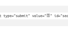
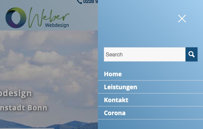
( get a bigger magnifier: )
#av-burger-menu-ul #searchsubmit {
    font-size: 25px;
}
Hi,
Thank you for the update.
You can use this css code to adjust the style of the button element.
#top .avia-button-fullwidth {
	width: calc(100% - 40px);
	padding: 20px;
	font-size: 1.5em;
	margin: 20px;
}
And to create spaces between the elements, you can either apply a margin to them, again with the use of css code or insert an hr/separator element.
Best regards,
Ismael
Hello,
I would like to change the entire style of the cookie consent modal window (the one that opens up after clicking the cookie settings button in the cookie consent bar). Background color, font color, button colors, etc.
I just found ways of changing the buttons of the consent bar within the advanced styling option but I can’t find a possibility to change colors and font sizes etc. of the cookie consent modal window.
Further I would like to have the toggles right beside the tab labels on the right. Is it possible to do that?
Thanks for your help maybe I am blind :-)
Regards,
Verena
Hi,
It is working fine on my end on screens below 767px however it needs to be adjusted for bigger sizes as well so please add following code to Quick CSS as well
@media only screen and (max-width: 1044px) and (min-width:768px) {
#top .av_tab_section .avia-single-number.__av-single-number, #top .av_tab_section .avia-no-number {
    font-size: 22px;
}
#top .av_tab_section th h3 {
    font-size: 18px;
}}
Best regards,
Yigit
Hi shihanze,
You can add color attribute to text, for example:
.pagination .pagination-meta {
    font-size: 13px;
    font-weight: bold;
}
would become:
.pagination .pagination-meta {
    color: blue;
    font-size: 13px;
    font-weight: bold;
}
For buttons, you can change the background color, so from:
#top .widget_price_filter .button {
    font-size: 15px;
    font-weight: bold;
}
to:
#top .widget_price_filter .button {
    background-color: green;
    font-size: 15px;
    font-weight: bold;
}
Best regards,
Nikko
This reply has been marked as private.
Hello, I want to increase the font size of the menu items.
I am thinking this should work but it doesn’t seem to:
#menu-pr-and-communications-services a{
font-size:18px!important;
}
Hi sensiblekaren,
Go to Enfold > Advanced Styling > Click (Select an element to customize) then choose Widget Title and click the Edit Element button, then adjust the font size.
Hope it helps.
Best regards,
Nikko
Hello am looking to increase the font size on the menu widget on the right hand side of this page and all pages it features on. Link below. Thank you.
FEB 2021
Masonry Gallery – Image caption “title” below the image element.
We see 100% height of the image and the caption does not hide or overlay on the bottom of the image.
Solution I have just implemented – thought I would share.
Masonry Gallery – Caption – Display Title
Default Display (at the bottom of the elements image)
Always Display
Column Responsiveness Set: 3 Column | 2 Columns | 1 Column | 1 Column
Then add the following to the Quick CSS
#top .av-inner-masonry {overflow:visible;}

.av-large-gap.av-fixed-size .av-masonry-entry .av-inner-masonry { bottom:100px;}

.av-fixed-size .av-masonry-entry .av-inner-masonry-content, .av-masonry-entry.av-masonry-item-with-image .av-inner-masonry-content {bottom:-50px;}

.av-masonry-entry .av-inner-masonry-content {padding:10px 20px; height:50px;}

 .responsive #top #wrap_all .all_colors h3.av-masonry-entry-title {font-size:26px; }

.main_color .av-inner-masonry-content.site-background {background:transparent;}
To resize the h3 title responsively use responsive css media styles – add the following at the top of your QUICK CSS
@media screen and  (max-width: 460px) {
.responsive #top #wrap_all .all_colors h3.av-masonry-entry-title {font-size: 14px !important;}
}

@media only screen and (min-width: 768px) and (max-width: 988px) {
.responsive #top #wrap_all .all_colors h3.av-masonry-entry-title {font-size: 18px !important;}
}
3 column font size = 26px
2 column font size = 18px
1 column font size = 26px
1 column (viewport width smaller than 460px wide) font size = 14px
height, bottom negative margin should be the same value.
Css – vary height, bottom negative margin and font size according to your longest headline.
I hope this helps someone else.
Cheers : )
Hi shihanze,
I see, try adding this CSS code in Quick CSS, located in Enfold > General Styling:
.pagination .pagination-meta {
    font-size: 13px;
    font-weight: bold;
}
For the price filter text:
.price_slider_wrapper .price_label {
    font-size: 15px;
    font-weight: bold;
}
For the price filter button text:
#top .widget_price_filter .button {
    font-size: 15px;
    font-weight: bold;
}
Just adjust the font sizes.
Hope it helps.
Best regards,
Nikko
Hi @kavaliauskas,
Please add following code to Quick CSS field in Enfold theme options > General Styling tab
@media only screen and (max-width: 767px) {
#top .av_tab_section .avia-single-number.__av-single-number, #top .av_tab_section .avia-no-number {
    font-size: 20px;
}
#top .av_tab_section th h3 {
    font-size: 15px;
}}
Best regards,
Yigit
Hi Mike,
thank you for your answer, but it’s not quite as before yet. There are still some CSS issues and I don’t know where they’re coming from.
A sidebar border is displayed in the full width section and the content in there is pushed to the right. Furthermore the headlines (“Sektion Versorgungsforschung” in the full width section and “Kontakt” in the sidebar) are capitalised and the font-sizes aren’t correct.
It seems that some CSS rules from enfold_child.css aren’t shown/used.
Please check the links below again.
Thank you and best regards,
Sean
HI,
I want change the
page numbers font size little big & and bold.
also in the shop page i want make the price filter font and dragging button font bog and bold
-
This topic was modified 5 years, 1 month ago by
 shihanze. Reason: some more thing
Hi,
You add the following code:
.page-id-25 .av-masonry-entry-content {
    text-align: center;
    font-size: 20px;
}
Best regards,
Jordan Shannon
Hi,
Thanks for that. Please try the following in Quick CSS under Enfold->General Styling:
.home .av-masonry-entry-content {
    text-align: center;
    font-size: 20px;
}
Best regards,
Rikard
Hi,
I want to use a custom class in a button-shortcode. But I am not able to add one.
They all say I have to enable Theme Options -> Layout Builder -> Builder Options For Developers, but in my backend I cannot find those options as shown in https://kriesi.at/documentation/enfold/intro-to-layout-builder/#developer-options
My aim is to add a custom class to this button-shortcode which I use in a widget:
[av_button label='Aktuell: Zum virtuellen Infoabend!' link_target='https://chs-em.de/info-uebersicht/' size='large' position='center' color='theme-color' custom_bg='#444444' custom_font='#ffffff' av_uid='av-5obiu2i']
Thanks in advance!