Hi,
The top padding is set by your custom css:
.template-page.content.av-content-full.alpha.units {
    padding-top: 20px !important;
    padding-bottom: 20px !important;
}
Change 20px to zero if you want to remove it, but note this will affect all of your pages.
While you have set the text color to white, your text is bold (strong) which has a blue color, either remove the strong tag, or add the color to the span style, like your font size.
If you don’t know how to do that try this css:
.avia_textblock p span[style*="color: #ffffff"] strong span[style*="font-size: 14pt"] {
    color: #ffffff;
}
Best regards,
Mike
Hey bemodesign,
Thank you for the inquiry.
For the submenu text color and a few other improvements, try to add this to the Enfold > General Styling > Quick CSS field:
#av-burger-menu-ul .av-submenu-indicator{
    display: none;
}

#av-burger-menu-ul .sub-menu li a {
    color: #45a5dd !important;
}

#av-burger-menu-ul .av-width-submenu > a::after {
    content: "›";
    display: inline-block;
    margin-left: 20px;
    transform: rotate(90deg);
    font-size: 0.9em;
}
Please make sure to purge the cache before testing.
Let us know the result.
Best regards,
Ismael
Hello, Can you adjust or add new CSS to make the menus look good on desktop and mobile?
You are good at setting it to what looks best.
They are close, but couple things:
1. There are 2 “arrows” for the dropdowns. Just keep the one next to the wording, and remove the one on the right side.
2. Text color for “sub menu” should be #45a5dd
3. Anything you see that will make it look better
this is the last code i added:
@media only screen and (max-width: 767px) {
#top #wrap_all .av-burger-overlay .av-burger-overlay-scroll #av-burger-menu-ul li a {
font-size: 22px;
}
.html_av-overlay-full #top #wrap_all #av-burger-menu-ul li,.html_av-overlay-full #top #wrap_all #av-burger-menu-ul li li {
line-height: 1.5em;
}
.responsive #top #wrap_all #av-burger-menu-ul li {
font-size: 22px !important;
}
}
Hey jb84,
There is a 500 internal server error on the file in private while saving the theme options. Why that is I can’t say unfortunately, you would have to share server error logs with us, or reach out to your hosting provider.
The missing styling was likely due to a missing curly bracket at the end of your Quick CSS code:
time.slide-meta-time {
    display: none!important;
}
.av-inner-tab-title {
    font-size: 15px;
    font-weight: bold;
}
#top .av_header_glassy.av_header_transparency #header_main {
    background-color: rgba(255,255,255,0.8);
Best regards,
Rikard
Hey JannyPolak,
Thank you for the inquiry.
Looks like the Advanced Styling settings may be getting overridden by another css rule, or the styles may be cached. Before anything else, please try to disable the Enfold > Performance > File Compression settings, save, and purge your cache, then check again.
If the styling still doesn’t apply, you can force the font and text-transform for the main nav links with this custom css added on the Enfold > General Styling > Quick CSS field:
#top .av-main-nav > li > a > .avia-menu-text {
    font-family: 'Josefin Sans', sans-serif;
    font-size: 30px;
    font-weight: 400;
    text-transform: uppercase;
}
Make sure Josefin Sans is loaded on your site. If you’re using it via Enfold > Advanced Styling, it should already be enqueued. If not, you may need to select it under Enfold > General Styling > Fonts.
Please make sure to purge the cache before testing.
Let us know if the issue persists.
Best regards,
Ismael
HI
All of a sudden my menu is changed (on pc). The adjustment in Advanced Styling does not work. At least, I treid in ‘headmenu links’
See website https://www.rietreiger.nl
I tried now: Lettertype family Josefin Sans, Size 30px, transformation to capitals and weight 400
The wordt ‘Sauna’ in the menu is still not with capitals (supposed to be SAUNA, and also the font is not correct.
Can you help?
Hi, how can i change the fontsize for the mobile view here? i want the font much smaller – only in mobile view. thanks, alex
Hey Elena,
It looks like you want the font size to be 14px, but you have a Advanced Styling set to 18px which overrides it:
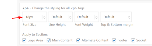
Since this size is for your whole site, try this css just for the testimonials:
#top .all_colors .avia-testimonial-content p em {
    font-size: 14px;
}
Best regards,
Mike
Hello,
I have a testimonials content element in the lower part of most of my website pages.
I would like to make the font size of the testimonials content smaller but when I reduce the font size in the style section of the element it seems to me that only the actual line height is reduced and not the font size itself. Lines get squeezed close to each other and are not easy to read.
Am I doing something wrong?
Credentials attached
Best regards,
Elena
Dear team,
on my page https://www.auto-wulf.de I use the extra info top bar.
in the backend it shows:
[av_font_icon icon='ue854' font='entypo-fontello' size='20px' color='#ffffff'] Geesthacht: 04152 / 87780 Dömitz: 038758 / 24077
on safari the phone symbol appear correctly, but on chrome just a white square box.
what is the reason / how to fix?
thx a lot & best regards Tilman
Hey bemodesign,
Try this css:
@media only screen and (max-width: 767px) {
    #top #wrap_all .av-burger-overlay .av-burger-overlay-scroll #av-burger-menu-ul li a {
        font-size: 22px;
    }
    .html_av-overlay-full #top #wrap_all #av-burger-menu-ul li,.html_av-overlay-full #top #wrap_all #av-burger-menu-ul li li {
    line-height: 1em;
		}
		.responsive #top #wrap_all #av-burger-menu-ul li {
    font-size: 22px !important;
		}
}
Adjust to suit.
As for your anchor link, the ID #book-call is in the second section column with the title “Free 15-Minute…” if you want the first section title “CONTACT BEMO DESIGN” to show, then move the ID to that section.
Best regards,
Mike
Hi,
Thank you for the screenshot.
We couldn’t reproduce the alignment issue on smaller screens on our end. For the table text size, you can try adding this to Enfold > General Styling > Quick CSS or your child theme’s style.css file:
.t3-widget-root .t3-table tbody tr td {
    font-size: 20px;
}
Please make sure to purge the cache before testing.
For any other styling issues specific to the booking module itself, we recommend keeping in touch with the Tomm Booking support team since we don’t provide support for third-party plugins. They’ll be in the best position to help you with additional configuration options.
Let us know if you have more questions.
Best regards,
Ismael
Hello, can you get me CSS to increase mobile font size, sub menu font size & line spacing? I just need to the mobile menu to look better. Please let me know what will look good. thanks!
I also have that very top of page link that says “Book a Free Strategy Call” That goes to an anchor link “https://bemodesign.com/contact-bemo-design/#book-call but it cuts off the top of headline when it does. how can I move this down when they click on this achor link?
THanks!!
Hey debbiepeverelli,
Thank you for the inquiry.
1. The overlapping image is likely due to the absolute positioning, which causes it to appear incorrectly scaled on smaller screens. The best approach is to either hide it on mobile or manually adjust its size using css media queries.
You may need to apply a custom css class name to the overlapping image element.
— https://kriesi.at/documentation/enfold/add-custom-css/#enable-custom-css-class-name-support
Once you have added a custom class, for example av-overlap-image, you can target it on smaller screens like this:
@media only screen and (max-width: 767px) {
    .av-overlap-image {
        display: none;
    }
}
Or if you prefer to keep it visible but resize it:
@media only screen and (max-width: 767px) {
    .av-overlap-image {
        width: 80px;
        height: auto;
        top: 20px;
        left: 10px;
    }
}
You can add these css rules to Enfold > General Styling > Quick CSS field and adjust the values as needed.
2. The light blue highlight on focused fields and the green success message are default styles applied to the contact form. You can override them by adding the following to Enfold > General Styling > Quick CSS field — adjust the color values to match your site:
#top .avia-form .avia-input:focus,
#top .avia-form .avia-textfield:focus {
    background-color: #yourcolor;
    border-color: #yourcolor;
}

#top .avia-form .avia-success {
    background-color: #yourcolor;
}

#top .avia-form .avia-success p {
    font-family: inherit;
    font-size: inherit;
    color: #yourcolor;
}
Replace #yourcolor with the hex values that match your site palette.
Let us know the result.
Best regards,
Ismael
Hi,
Try this css:
.avia-button.avia-size-large.av-1b88t-1848646851a5a8989084337c098e76b2 {
	font-size: 20px;
}
Best regards,
Mike
This will work!
How can I make the font size larger?
Hi,
For that page try adding this css:
.page-id-4370 .iconbox_left_content.avia-builder-el-9 .avia-icon-pos-left.av_font_icon{
  float: none;
  margin-right: 0;
  vertical-align: middle;
  display: inline-block;
  padding-left: 0.5em;
}
.page-id-4370 .iconbox_left_content.avia-builder-el-9 .iconbox_content_container strong {
  font-size: 15px;
}
Best regards,
Mike
Hi,
Odd. This is not the menu style I saw yesterday. Please try to use this css code instead:
#av-burger-menu-ul li.av-show-submenu > .sub-menu > li > a > .avia-menu-text {
    color: #ffffff;
    font-size: 0.8em;
}
To add a submenu indicator, try to add this css code:
.av-width-submenu > a::after {
    content: "›";
    display: inline-block;
    margin-left: 6px;
    transform: rotate(90deg);
    font-size: 0.9em;
}

.av-width-submenu.av-show-submenu > a::after {
    content: "";
}
Best regards,
Ismael
Hi,
Thank you for the inquiry.
Try this css code to adjust the color and font size of the submenu items.
.html_av-overlay-side #top #wrap_all .av-burger-overlay-scroll #av-burger-menu-ul li ul a {
    color: rgba(255,255,255) !important;
    font-size: 0.8rem;
}
The menu items with submenus should have angled brackets (>) by default.
Best regards,
Ismael
Hey dreyerjm,
Try is css:
.page-id-3710 .iconbox_left_content.avia-builder-el-4 .avia-icon-pos-left.av_font_icon{
  float: none;
  margin-right: 0;
  vertical-align: middle;
  display: inline-block;
  padding-left: 0.5em;
}
.page-id-3710 .iconbox_left_content.avia-builder-el-4 .iconbox_content_container strong {
  font-size: 15px;
}
Then clear your browser cache.
Best regards,
Mike
Hi, I have a plugin that is showing me the newest events but the colors, fonts, and sizes dont match. How would I get those to match the theme? I highlighted the text on the website so you can see it – it is black
when I upload, the server is putting the file I zipped titled “fontello-d16d12c1.zip” into the folder structure WordPress content > uploads > 2026 > 02 > fontello-d16d12c1.zip
When I ask google etc for what to do it says a folder named avia_fonts must be placed in the uploads fold and an uncompressed folder must be placed there.
What should the folder be named? the folder with the config.json file and css folder and font folder on the root? ipage.com is my service provider. the files created at https://fontello.com create the files. It appears the svg file is a blank file. that isn’t right. I can create a svg vector file in it but I wouldn’t know what size to make the vector file. This is a mild PITA.
Thanks again, I worked with Claude to get this script I could drop in the child theme functions file, so I don’t have to copy any of the files to the child theme — lmk if you think it’s a problem. With the script and css below I got everything looking and working as it was, but now with “buttons”. After all that work, I’m wondering (and should’ve asked earlier): Do you even agree the sorting items as links were an accessibility issue? If it all looks good to you, feel free to close this thread.
/* JavaScript to convert sorting links to buttons */
add_action('wp_footer', 'child_masonry_links_to_buttons', 999);
function child_masonry_links_to_buttons() {
    ?>
    <script>
    jQuery(document).ready(function($) {
        // Convert all masonry sort links to buttons
        $('.av-masonry-sort a[data-filter]').each(function() {
            var $link = $(this);
            var $button = $('<button type="button"></button>')
                .attr('data-filter', $link.data('filter'))
                .attr('class', $link.attr('class'))
                .html($link.html());

            $link.replaceWith($button);
        });

        // Re-bind click events to buttons
        $('.av-masonry-sort').off('click', 'a').on('click', 'button', function() {
            var current = $(this),
                linktext = current.html(),
                selector = current.data('filter'),
                masonry = current.parents('.av-masonry').eq(0),
                container = masonry.find('.av-masonry-container').eq(0),
                links = masonry.find('.av-masonry-sort button'),
                activeCat = masonry.find('.av-current-sort-title');

            links.removeClass('active_sort');
            current.addClass('active_sort');
            container.attr('id', 'masonry_id_' + selector);

            if(activeCat.length) {
                activeCat.html(linktext);
            }

            // Trigger isotope filtering
            var filters = selector ? {filter: '.'+selector} : {};
            filters['layoutMode'] = 'packery';
            filters['packery'] = {gutter:0};
            filters['percentPosition'] = true;
            filters['itemSelector'] = "a.isotope-item, div.isotope-item";
            filters['originLeft'] = $('body').hasClass('rtl') ? false : true;

            container.isotope(filters);

            setTimeout(function() { $(window).trigger('debouncedresize'); }, 500);
            return false;
        });
    });
    </script>
    <?php
}
/* sorting menu styling accessible buttons */
.main_color .av-sort-by-term button {
    border: none;
    color: #fff;
    background: #0076a8;
    padding: 6px 15px 8px;
    text-transform: capitalize;
    font-size: 15px;
	margin: 3px 3px 0 0;
  	font-family: 'sarabun',Helvetica,Arial,sans-serif;
}
.main_color .av-sort-by-term button:hover {
    background: #b6bd00;
	transition: .25s;
}
.main_color .av-sort-by-term button.active_sort {
    color: #fff;
	background: #b6bd00;
}
Meanwhile i could solve this.
Text is visible inside the block.
BUT when i click on it, it opens the background image which is the blue color. How can i change the url link for this one specific block? or deactivate the lightbox here? This is the code i used for:
.referenzen  .grid-entry  .inner-entry {  overflow: hidden !important}

.referenzen .grid-content {
  display:flex;
  flex-flow: column nowrap;
  justify-content: space-around;
  position: absolute;
  top: 0%;
  left: 0%;
  width: 100%;
  height: 100%;
  padding: 10px;
  background: #1b2640 !important;
  z-index: 0;
  text-align:center;
  pointer-events: none;
}

.referenzen .grid-content * {  background: transparent !important; }
.referenzen .image-overlay {  display: none !important; }
.referenzen .grid-content .avia-arrow { display: none; }

.referenzen .grid-entry-excerpt { font-size: 15px!important;  font-style: normal!important;  margin-bottom: -2px; color:#ffffff !important;  font-family: ffclanproregular !important; }
-
This reply was modified 1 month, 2 weeks ago by
 xeovision.
Hi Ismael
Thank you for coming back.
Nothing special (standard plugins like staging, Yoast, etc.) and only custom CSS:
/*Menue Button*/
/*#top #wrap_all .header_color li#menu-item-10312.av-menu-button-colored > a .avia-menu-text {background-color:#FA7D19;}*/
#top #wrap_all .header_color .av-menu-button-colored > a .avia-menu-text {background-color:#FA7D19 !important; border-color:#FA7D19 !important;}
#menu-item-10312 .avia-menu-text {background-color:#FA7D19 !important; border-color:#FA7D19 !important;}
/*Desktop*/
@media only screen and (max-width: 1920px) {
.indicates-required {display:none !important;}
.mc-field-group label {display:none !important;}
.mc-field-group {clear:none !important; width:32% !important; float:left !important; margin-right:13px;}
.mc-field-group input {font-size:16px !important; padding:13px !important;}
#mc_embed_signup .button {background-color:#2d5c88 !important; border-color:#0b3a66 !important; width:32% !important;border-radius:2px !important; height:45px !important; line-height:23px !important;}
#mc_embed_signup .button:hover {background-color:#3d71a1 !important; border-color:#1b5080 !important;}
}
/*Mobil – Tablet*/
@media only screen and (max-width: 768px) {
.mc-field-group input {margin-bottom:0px !important;}
.mc-field-group {clear:none !important; width:100% !important; float:left !important; margin-right:13px; margin-bottom:0px !important;}
#mc_embed_signup .button {width:100% !important;}
}
/*News Übersicht Seite – Datum deaktiviert*/
.html_elegant-blog .avia-content-slider .slide-meta {display:none !important;}
/*Zwei Border Linien Blog Seite deaktiviert*/
.html_elegant-blog #top .post-entry .post-meta-infos {display:none !important;}
#top .av-menu-button > a .avia-menu-text {border-radius: 20px !important;}
/*P-Tag move font size*/
.p-move-h2 {font-size:40px !important; font-weight:bold;}
/* CSS Enfold-Mailchimp-Newsletter Input fields*/
#top .avia_ajax_form.avia-mailchimp-form input[type=’text’] {
background: #c4dff6;
color: #00334e;
}
#top .avia_ajax_form.avia-mailchimp-form .required{
display: none;
}
Any thoghts?
Thank you.
Philipp
Hey EstudioNOVO,
Thank you for the inquiry.
The font size of the title and content can be adjusted directly in the Iconbox editor. To adjust the icon size, you can use the following css code:
.iconbox_content header .iconbox_icon svg {
    width: 30px !important;
    height: 30px !important;
    left: -3px;
    position: relative;
    top: -4px;
}
This assumes you have selected an SVG icon.
Best regards,
Ismael
Hey JennyGr,
1. The font size can be set in the element options, look in the Styling tab. I’m not sure which button you are referring to?
2. If you are referring to text like “A Morning in the Kindergarten”, then that is a b tag, not strong. Try using a strong tag instead, or use CSS to change it:
b {
  color: red;
}
Best regards,
Rikard
Hi I made some adjustments to font styling which I am struggling to amend.(see web page and log in detail in provate content).
1. Font size – I previously changed the font size for certain elements across the site and can’t work out where to change this.
On this webpage the font for the ‘Book now’ button and the Accordion titles is too small. Where do I change this – I’d like to make a site wide change so that these content elements across the site aren’t too small.
2. The strong colour in the accordion is magenta and I want it to to match the strong colour in the body text at the top (dark grey). I thougth I had set this site wide in Advanced Styling but it is not applying to strong text in an accordion.
I seem to remember possibly making changes not only in the Theme styling options, but possibly in custom CSS, maybe to relative font size?
I think I had to may have had to add some custom css to get the sidebar navigation to show larger.
Many thanks
Hi,
Thank you for the update.
We adjusted the css code slightly. Please make sure to purge the cache before testing. You can also adjust the font size for different screen sizes in the Styling > Font Sizes panel of each slide.
Best regards,
Ismael