Forum Replies Created
-
AuthorPosts
-
I got this one. Finally found several other posts about what I actually was looking for, getting the advanced editor to work with LearnDash custom post types. Some earlier code I found added the ALE to the LearnDash CPTs, but removed it from the existing post types. Putting the following code from the bottom of this post in my child theme’s functions.php file kept the existing ALE configuration and added it to LearnDash CPTs.
Thanks Everyone!
/* * Add Advanced Layout Editor to LearnDash Custom Post Types */ //Add meta boxes to custom post types add_filter('avf_builder_boxes', 'avia_register_meta_boxes', 10, 1); function avia_register_meta_boxes($boxes) { if(!empty($boxes)) { foreach($boxes as $key => $box) { $boxes[$key]['page'][] = 'sfwd-courses'; $boxes[$key]['page'][] = 'sfwd-lessons'; $boxes[$key]['page'][] = 'sfwd-topic'; $boxes[$key]['page'][] = 'sfwd-quiz'; } } return $boxes; }-
This reply was modified 10 years, 9 months ago by
scotthco. Reason: Corrected "sfwd-topics" to "sfwd-topic"
Hi Yigit!
I already has it set as you suggest. Maybe I did misunderstand how it’s supposed to work. When I go to the page I created, it does display the list of posts, which is good. However I thought what I was doing in the procedure above was creating a new template upon which all future posts would be based, but that’s not the case, is it? The first part above just allows the use of the ALE for posts in addition to just pages, and the second part just designates the page on which the list of blog posts is displayed, right?
Ok, so is there a way within WordPress and Enfold that I can create a template upon which all future posts would be based, hopefully including any posts by third party plugins? Or will I need to modify some template files? I certainly can modify files if I have to. I just thought it would be quicker and easier if there was a way to do it from within the program.
Thanks!
Thanks, Ismael!
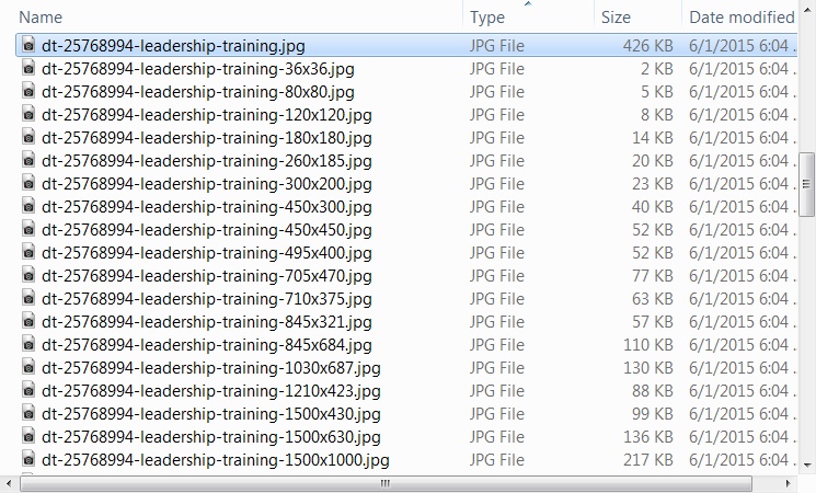
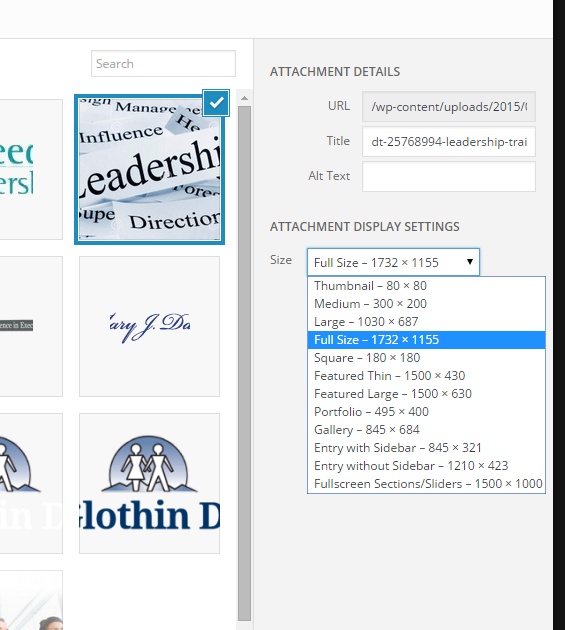
Sorry it took me so long to try this out. It did work though, at least for the ones listed in the code you referred to. However there are three sizes actually in the folder that this did not cover: 120×120, 450×300, and 450×450. Any idea how to get those guys in there too?
Thanks again!
Hi Ismael:
I did figure out one thing: In the submenu settings, there’s a checkbox labeled “If checked the menu will stick at the top of the page once it touches it”. If this box is checked, the menu first appears where you initially placed it. So for me it appears underneath the first color section like it’s supposed to. Then if you scroll, it sticks just under the main menu once it gets to the top of the page. If you do NOT check that box, then it first appears at the top of the page, overlaying whatever else is there, instead of where you initially placed it, but it does scroll off top when you scroll the page. This is not the behavior I’d expect. I’d expect it to appear where I initially placed it either way and that the only thing that checkbox should alter is whether or not the menu scrolls off the top of the screen or not.
Thanks!
Hi Ismael:
Well as I explained earlier, and as I confirmed again just now, using href=”#” refreshes the page, and the menu does not expand.
Also with its default styling, even though in the ALE the full width submenu is located below the color section at the top of the page, when it’s not in mobile mode, the submenu appears at the very top of the page overlaying the “extra elements” above the main site menu. Once it’s in mobile mode, it’s positioned where it’s supposed to be. Presumably this is due to it being positioned absolutely with a z-index of 301 when not in mobile mode.
In any case, I get these exact same results on anything I test with. I get these results with desktop browsers by resizing their window width. I get these results on my Samsung Galaxy S3 (built in Android browser, Chrome, and Firefox). I get these results on my iPhone 4’s Safari. And to be certain the third party plugin isn’t affecting it, I deactivated that plugin while testing.
Thanks!
-
This reply was modified 10 years, 9 months ago by
scotthco.
I updated to version 3.2 of the theme. Was able to change the sub menu button text from “Menu” to “What We Do” and change the href=”#” to href=”javascript:void(0);”, but it’s still doing what I described above. The menu opens, but when you click any of the menu items, even though the links do point to the correct URLs, the menu just collapses back, and the page does not change.
I use relative URLs on purpose. WordPress is already enough of a pain to move from one server to another. Besides, these same links work just fine for the desktop left side menu AND for this full width submenu if I allow it to display at desktop widths. In fact they’re the same menu; I just told the full width submenu element to use the existing menu. Also there’s no invisible element on top of the menu items because I do get the hover effects.
So why would the fw submenu links work when it’s horizontal, but not when it’s vertical for mobile???
Actually never mind. I think I figured out how to use that other menu. It can only have one instance for the site, but thanks to the fact that each page has the page id as one of the classes for the body tag, I can adjust the menu’s position for different pages if I need to.
I would’ve liked to been able to use native Enfold elements all the way, but of well. Thanks anyway.
I almost forgot: Where would I go in the code, or what could I do in my child theme’s functions.php or style.css to change the text for the mobile full width submenu button from “Menu” to “What We Do”???
This reply has been marked as private.Update: Using Inspect Element in Firefox (desktop), I changed the “#” to “javascript:void(0);” and then it no longer just refreshed. Unfortunately it didn’t expand the menu either. Is there anything I can try here, or is this something that has to be resolved and put into a future minor release?
Thanks Ismael! It’s sort of working. I’ve got the basic show/hide stuff for the regular side menu vs. the full width menu (in mobile mode) working. However when I tap or click the full width mobile menu “button”, all that happens is the page refreshes. I’m guessing this is because its href has a “#”, so before anything else can happen, before the hidden menu items can appear, the page just refreshes. I’ve found that javascript:void(0) sometimes works better for this, but of course I don’t think I have the ability to change that, do I?
Just so you know, I have an iPhone 4 that I use for testing, and my regular phone, a Samsung GS3 with the built in android browser, Chrome, and Firefox. It does this in all three browsers on the GS3 and on the iPhone. FYI – I do want it to work with the built in android browser. I’m sure many people still have mobile devices with this browser on it, either because they don’t know the other browsers are available for android or because they just plain don’t want to mess with changing.
Thanks!
That didn’t work, but this did…
.avia-msie-8 .av-section-color-overlay {
filter: alpha(opacity=40);
}After you posted, I thought I remembered something about IE and filters, so I looked it up.
Thanks!
Thanks, Ismael! I think I’ll try this.
Can it be implemented in the child theme so it doesn’t get wiped out when Enfold gets updated, or would that hose things up?
Hi Elliott:
The full sized image is 1732w x 1155h. I’ve uploaded a couple of screenshots to my site that illustrate what I’m talking about.
These are the images that were created when original was uploaded and are available on disk.

These are the images that are available in the Attachment Display Settings drop down.

FYI – The site to which I uploaded the images is NOT the site in question. That site is still on my development machine.
Thanks!
Thanks Josue! I’ll give it a try.
Hi Josue:
Wouldn’t that affect ALL pages? I’d only want the same color section on certain pages, not all of them.
Thanks!
Scott
Yes, it looks ok in the mobile versions of Chrome and Firefox. It’s mainly in the native android browser that it’s messed up. That’s why I’m concerned, because as a web developer, even though I personally prefer both Chrome AND Firefox to the native browser, I have to assume that most users will use the built in one.
So you’re saying it looks fine on a Nexus 7 in the built in android browser?
February 20, 2015 at 8:51 pm in reply to: Javascript registered and enqueued, but how do you call it? #399866Must’ve never clicked submit for this reply.
I’m getting the hang of the jQuery binding thing. It’s working quite well, thank you! I did end up using the footer hook for the actual binding calls though. Turns out that wp_register_script and wp_enqueue_script insert my custom script file just before the jQuery libraries, so I couldn’t call jQuery stuff at that point.
One thing I’m still a bit confused on though: Even in the footer where they do work, if I use the $() I get an error that $ is not a function. However if I use jQuery(), it works just fine. Could something else in all the scripts included with the Enfold theme be conflicting with $()???
Thanks again!
January 31, 2015 at 11:51 pm in reply to: Need to Jump to Anchor but Can't Use Color Section #388887Thanks for the info! That additional content ended up being enough that I gave it its own page, but I’ll try your suggestion next time.
BTW – I don’t remember seeing an email from the forum when you replied. Can you tell me what email address it sends from in case I need to make an exception in the spam filter?
Thanks!
-
This reply was modified 10 years, 9 months ago by
-
AuthorPosts
