Forum Replies Created
-
AuthorPosts
-
December 16, 2022 at 3:44 am in reply to: Die farbig hinterlegten Headlines sehen in der mobilen Ansicht schlecht aus #1376329
Hi Nic_007,
Can you try adding this CSS code in Enfold > General Styling > Quick CSS:
@media only screen and (max-width:767px) {
  #av_section_1 .av-special-heading-tag {
    font-size: 32px !important;
    padding-left: 0;
    padding-right: 0;
    margin-left: 0;
    margin-right: 0;
    background-color: transparent;
  }
}
Best regards,
NikkoHi Nic_007,
Some modern servers have built-in caching in them, you can try to access cpanel and see if there’s a caching option.
If there’s none, can you give us temporary admin access? so we can try to check on it.
Just post the credentials privately.Best regards,
NikkoHi Patrick,
Thanks for pointing it out to us, the documentation should be fixed shortly.
As for the CSS code, you can use this:/*------------------------------------------------ ------------------------------------------------ Accordion style 2 ------------------------------------------------ -------------------------------------------------*/ /* Tab title style */ .av-accordion-style-2 .toggler { font-size: 18px; font-weight: bolder; padding: 10px 15px; text-transform: uppercase; margin: 2px 0; background: #B5DCFD; } .av-accordion-style-2 .activeTitle.toggler:hover, .av-accordion-style-2 .activeTitle.toggler, .av-accordion-style-2 .toggler:hover { color:#FFF; background: #1869FF; } /* Extra content in tab title */ .av-accordion-style-2 .toggler span.extra-content { display: block; clear: both; font-size: 13px; line-height: 1.5em; font-weight: lighter; opacity: .65; padding: 5px 0; text-transform: none; } /* Accordion icon */ .av-accordion-style-2 .toggle_icon:before { position: absolute; font-size: 18px; top:50%; transform: translateY(-50%); left: 0; content:"\e875"; font-family: 'entypo-fontello'; line-height: 0; } /* Active tab icon */ .av-accordion-style-2 .activeTitle .toggle_icon:before { content:"\e873"; font-family: 'entypo-fontello'; } /* Hide default icon */ .av-accordion-style-2 .toggle_icon { border:none; position: absolute; left: auto; right: 20px; } .av-accordion-style-2 .toggle_icon .vert_icon, .av-accordion-style-2 .toggle_icon .hor_icon { display:none; } /*Toggle content area */ .av-accordion-style-2 .toggle_content { background: #ced7df; }Hope it helps.
Best regards,
NikkoDecember 16, 2022 at 3:19 am in reply to: Hide Shipping Calculator When Selecting Local Pickup #1376324Hi sdsitetechdotcom,
Yes you are correct, please change ‘#customer_details .col-2’ in the code to ‘.woocommerce-shipping-destination, .woocommerce-shipping-calculator’
Hope it helps.Best regards,
NikkoHi engage24,
Please try to add this CSS code in Enfold > General Styling > Quick CSS:
#main .pagination {
    display: none;
}
Hope this helps.
Best regards,
NikkoHi acscreativenew,
Can you try to disable other plugins? and see if it removes the delay.
If it does, try to enable the plugins one by one to see which one causes the delay.Best regards,
NikkoHi acscreativenew,
Can you try to disable other plugins? and see if it removes the delay.
If it does, try to enable the plugins one by one to see which one causes the delay.Best regards,
NikkoHi PopCut,
Can you give us more context to your request?
Best regards,
NikkoHi acscreativenew,
Please try to add this in your functions.php (child theme):
function enfold_post_slider_meta_content($meta_content, $entry, $index, ) {
    $categories = get_the_category($entry->ID);
    $separator = ' ';
    $output = '<div class="slide-meta-del">/</div><div class="postslider-category">';

    if ( ! empty( $categories ) ) {
	        foreach( $categories as $category ) {
				$output .= '<span alt="' . esc_attr( sprintf( __( 'View all posts in %s', 'textdomain' ), $category->name ) ) . '">' . esc_html( $category->name ) . '</span>' . $separator;
	        }
	    }
	$output .= '</div>';

    return $meta_content . $output;
}

add_filter('avf_post_slider_meta_content', 'enfold_post_slider_meta_content', 10, 4);
Hope it helps.
Best regards,
NikkoHi VariablerEsel,
Please try to delete the tokens that aren’t working including the one you generated.
Then generate a new token, and make sure it has the following permissions:
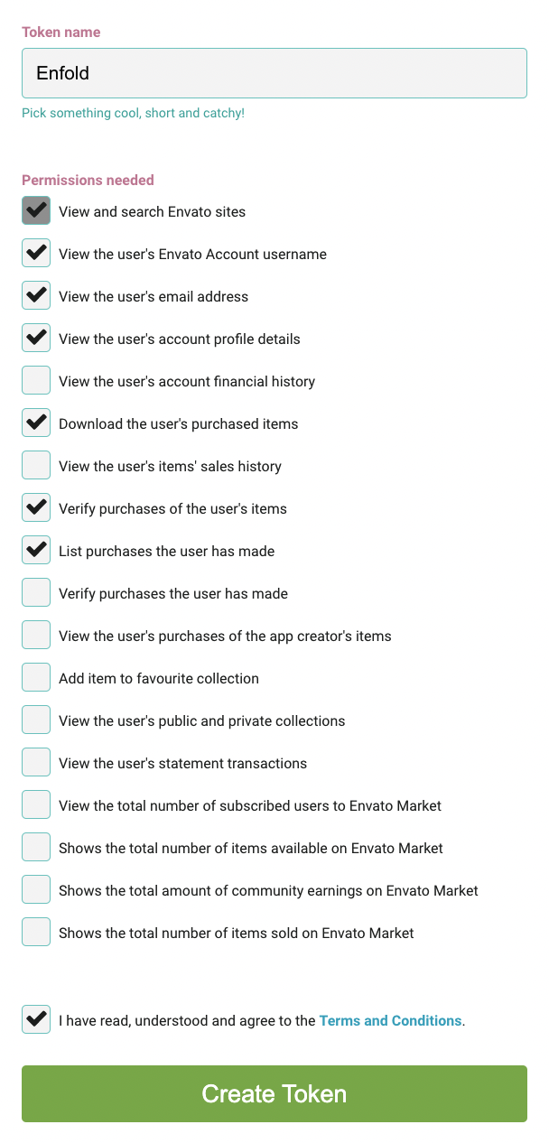
Hope this helps.Best regards,
NikkoHi webmonnik,
It’s possible with some CSS code however it won’t look good if images are not using different sizes.
Try to use this CSS code and see if it helps:#top.page-id-23 .av-equal-height-column-flextable { display: flex; gap: 6%; } #top.page-id-23 .av-equal-height-column-flextable .av-flex-placeholder { display: none; } #top.page-id-23 .av-equal-height-column-flextable .flex_column { display: flex; flex-direction: column; flex: 1; justify-content: flex-end; margin: 0; } #top.page-id-23 .av-equal-height-column-flextable .flex_column .av_textblock_section { margin-bottom: auto; }Best regards,
NikkoHi woogie07,
Please try to add this CSS code:
@media only screen and (max-width:767px) {
  #top #wrap_all .avia-slideshow .av-slideshow-caption .avia-caption-title {
    font-size: 36px !important;
  }
}
Just change the font size as you see fit.
Best regards,
NikkoDecember 13, 2022 at 1:30 am in reply to: Newly Added Enfold Theme – Issue with Demo Import #1376011Hi migmarrero,
In your WordPress Dashboard, please go to Enfold > Import/Export > Iconfont Manager then delete Flaticon.
Hope this helps.Best regards,
NikkoDecember 9, 2022 at 11:54 am in reply to: how to achieve that Home-Menu has no overlay with image #1375655Hi mebi,
Thanks for giving us a link to your site.
Please edit the page and then go to the bottom of the sidebar and set Header visibility and transparency to No transparency.
Hope this helps.Best regards,
NikkoHi Alfredo,
I’m glad that Yigit could help you :)
Just let us know if you still need further assistance or if we can close this thread.Best regards,
NikkoHi Marina,
I’m glad that Ismael could help you :)
Thanks for using Enfold and have a great weekend!Best regards,
NikkoHi Nic_007,
Can you give us more context regarding layout architect that you mentioned? maybe some screenshots or other details that we can check.
Best regards,
NikkoDecember 9, 2022 at 11:42 am in reply to: Transparent Mobile menu as on desktop "Transparent header" function. #1375649Hi BenjaminSpeedtsberg,
Thanks for giving us admin access.
I have added this CSS code in Quick CSS:@media only screen and (max-width:980px) { .responsive #top #wrap_all #header.av_header_transparency { position: absolute; background-color: transparent; } .responsive #top #wrap_all #header.av_header_transparency .logo img, .responsive #top #wrap_all #header.av_header_transparency .logo > a > svg { display: none; } .responsive #top #wrap_all #header.av_header_transparency .logo img.alternate, .responsive #top #wrap_all #header.av_header_transparency .logo .subtext { display: block; } }Please review your site.
Best regards,
NikkoDecember 9, 2022 at 11:11 am in reply to: Blog Page showing up as a category instead of a page #1375645Hi navindesigns,
There’s a url conflict because of the permalink structure.
To fix this, please go to Settings > Permalinks > set Custom Structure from /%postname%/ to /%category%/%postname%/
Hope this helps.Best regards,
NikkoDecember 9, 2022 at 11:04 am in reply to: Center Title for full width easyslider – Vertically and Horizontally #1375642Hi CharlieTh,
Please edit the slider item, then go to Styling > Caption > set Caption Positioning to either Center Framed or Center without Frame.
Hope this helps.Best regards,
NikkoHi Angela,
Thanks for contacting us!
First, to create a support thread you’ll need to register your account first in our forum.
You will be required to enter a purchase code which you can get from themeforest (screenshot below):
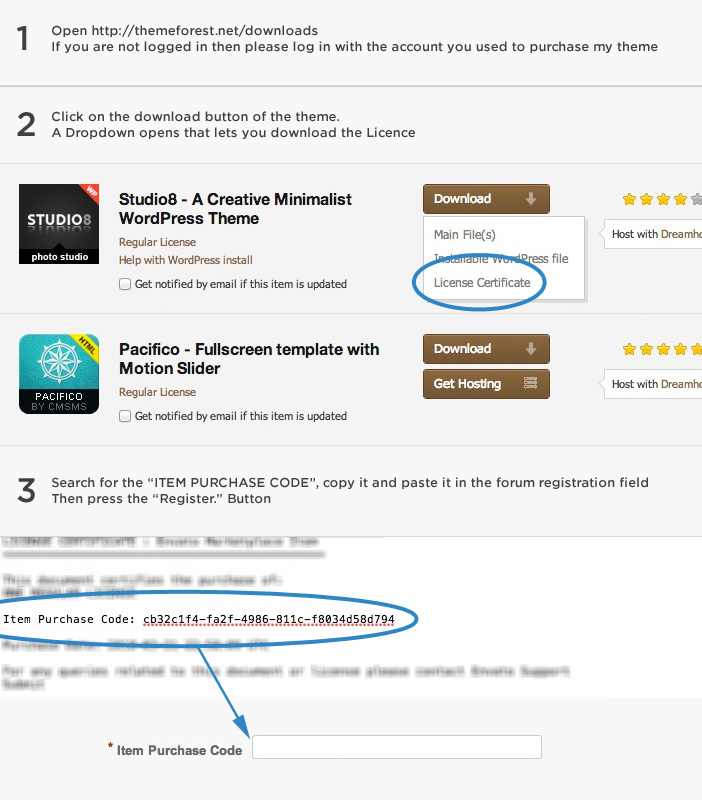
If you can’t access the forum then you need to do the following to renew support:
- Log in to your account in Themeforest
- Hover over your username and click ‘Downloads’ from the drop-down menu.
- The downloads section displays a list of all the items purchased using your account.
- Click on ‘Renew support now!’ or ‘Extend now’ next to the item you wish to renew the item support for and that’s it!
If support hasn’t expired yet or renewal is successful then you should be able to access the forum without any issues.
For further information please check envato’s documentation regarding renewing items: https://help.market.envato.com/hc/en-us/articles/207886473-Extending-and-Renewing-Item-SupportBest regards,
NikkoHi Richard,
I see, please add those removed codes and then please try to add this code at the bottom of your child theme’s functions.php:
function add_overlay_icon_on_mobile(){
    ?>
    <script>
        var slideImages = document.querySelectorAll('.slide-image');
        slideImages.forEach(function(image) {
            var span = document.createElement('span');
            span.classList.add("image-overlay", "overlay-type-video");
            span.innerHTML = '<span class="image-overlay-inside"></span>';
            image.appendChild(span);
        });
    </script>
    <?php
}
add_action('wp_footer', 'add_overlay_icon_on_mobile');
Hope it helps.
Best regards,
NikkoDecember 7, 2022 at 7:03 pm in reply to: Transparent Mobile menu as on desktop "Transparent header" function. #1375413Hi BenjaminSpeedtsberg,
The code I gave does not seem to show or get fetched.
Can you try to disable CSS File Merging And Compression in Enfold > Performance? and also try to flush and temporarily disable any caching plugin.
If that still does not work, please give us temporary admin access, so we can check further.Best regards,
NikkoDecember 5, 2022 at 7:27 am in reply to: header and footer aren't showing the color settings #1375079Hi yifatcohen,
Thanks for providing us both admin access and the video.
It seems the issue was more of caching, I have disabled CSS File Merging And Compression in Enfold > Performance which fixes the issue.
Please try to enable it back after several days.Best regards,
NikkoHi Diana,
Is this already fixed?
I have checked your site using both Chrome and Firefox, and the issue you mentioned does not seem to show on my end.Best regards,
NikkoHi Christopher,
Can you try adding this CSS code in Enfold > General Styling > Quick CSS:
#top .avia-content-slider .slide-entry-wrap {
    display: flex;
}

#top .avia-content-slider .slide-entry-wrap .slide-entry {
    margin: 0;
    padding: 3%;
    flex: 1;
}

#top .avia-content-slider .slide-entry-wrap .slide-entry + .slide-entry {
    border-left: 1px solid white;
}
Best regards,
NikkoHi troupdim,
You can change it by adding some padding in CSS.
Can you give us a link to your page with fullscreen slider? so we can check how it looks and then try to give you a CSS code that should help.
You can post the link in private content.Best regards,
NikkoDecember 5, 2022 at 2:53 am in reply to: Transparent Mobile menu as on desktop "Transparent header" function. #1375069Hi BenjaminSpeedtsberg,
Please try to add this CSS code as well:
@media only screen and (max-width:767px) {
  .responsive #top #wrap_all #header.av_header_transparency {
    position: absolute;
    background-color: transparent;
  }

  .responsive #top #wrap_all #header.av_header_transparency .logo img {
    display: none;
  }

  .responsive #top #wrap_all #header.av_header_transparency .logo img.alternate {
    display: block;
  }
}
Hope this helps.
Best regards,
NikkoDecember 3, 2022 at 11:27 am in reply to: Transparent Mobile menu as on desktop "Transparent header" function. #1374890Hi BenjaminSpeedtsberg,
Can you try Yigit’s solution on this thread?
Hope it helps.Best regards,
Nikko -
AuthorPosts