Forum Replies Created
-
AuthorPosts
-
Hi mescalytequila,
Please try to add this CSS code as well:
#top #wrap_all .price del {
    font-size: 32px;
    text-decoration-color: red;
    text-decoration-thickness: 4px;
}
Best regards,
NikkoHi sarthakchoudhary,
Please try to add this CSS code in Enfold > General Styling > Quick CSS: (just replace the url with the image you want to use)
.home #footer {
    background-image: url(https://website.com/themes/wp-content/uploads/2023/03/footer_bg.jpg);
    background-size: cover;
}
Hope it helps.
Best regards,
NikkoHi Ian,
Can you try adding this CSS code in Enfold > General Styling > Quick CSS:
@media only screen and (max-width:1180px) {
  .page-id-734 #after_layer_slider_1 .container {
    width: 100%;
    max-width: 100%;
  }
}
Best regards,
NikkoHi Erin,
I’m glad that Ismael could help you :)
Thanks for using Enfold and have a great day!Best regards,
NikkoHi envatodolphin,
Yes, edit the Masonry, then go to Content > Captions > Element Title and Excerpt set to Display Neither.
Hope this helps.Best regards,
NikkoMarch 2, 2023 at 6:28 am in reply to: Changed my Envato Email and Name and Now the theme does not accept my Token #1399746Hi Monika,
Please make sure you have the correct permission:
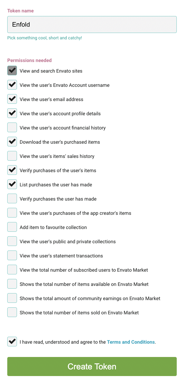
For further information please follow the instructions in our documentation: https://kriesi.at/documentation/enfold/theme-registration/#how-to-generate-a-envato-personal-tokenBest regards,
NikkoHi patriziahucho,
Thank you for your patience, our devs have further investigated the issue but unfortunately, we’re not able to find a way to fix the issue at the moment.
That being said, the workaround we could suggest would be to put elements inside the layout elements like 1/1 column, color section, etc.Best regards,
NikkoHi cdiaz,
You will need to set the Parent Page in order to show it in the breadcrumb.
If it has no parent page then it will just show Home / Current Page in the breadcrumb.Best regards,
NikkoHi Martina,
I’m glad that we could help you :)
Thanks for using Enfold and have a great day!Best regards,
NikkoHi Lene,
You’re welcome :)
Thanks for using Enfold and have a great day!Best regards,
NikkoMarch 2, 2023 at 2:19 am in reply to: hide recent posts, meta, comments etc on woo commerce product page. #1399738Hi tonyiatridis,
You’re welcome :)
Thanks for using Enfold and have a great day!Best regards,
NikkoHi Franz,
Thanks as well for using Enfold and have a great day!
Best regards,
NikkoHi Franz,
You’re welcome :)
It’s a pleasure to help you.
Thanks as well for using Enfold and have a great day!Best regards,
NikkoHi Franz,
I think you can use this code so it’s equal columns on desktop including tablet (landscape), just increase the min-width value to 1200px and that should only target desktops and laptops:
@media only screen and (min-width:1024px) {
  #top .equal-height-column .entry-content-wrapper {
    display: flex;
  }

  #top .equal-height-column .entry-content-wrapper .iconbox {
    display: flex;
    min-height: 100%;
  }
}
If you plan to target individual devices, that will be fine as well but you will need a lot of code, please check this article: https://codeconvey.com/responsive-media-queries-for-all-devices/
I hope it helps.Best regards,
NikkoMarch 1, 2023 at 9:59 am in reply to: a pattern in the background PLUS Pictures in Background #1399645Hi Monika,
Can you provide a screenshot of what you’re trying to achieve?
Best regards,
NikkoMarch 1, 2023 at 9:55 am in reply to: how to force a column/picture to go to the End of a browser #1399644Hi Monika,
To position the picture to the right (using a color section) assuming the layout you’re using is the same as the one in private content, please do the following:
1. Edit the Color Section, then go to Advanced > Developer Settings > Custom CSS Class and put move-right and save.
2. Go to Enfold > General Styling > Quick CSS and add this CSS code#top .move-right .container { margin-right: 0; }You can use this again on other sections by repeating only step 1.
To position the picture to the left:
1. Edit the Color Section, then go to Advanced > Developer Settings > Custom CSS Class and put move-left and save.
2. Go to Enfold > General Styling > Quick CSS and add this CSS code#top .move-left .container { margin-left: 0; }You can use this again on other sections by repeating only step 1.
Hope this helps.Best regards,
NikkoHi Monika,
Can you try using this CSS code instead and see if it helps?
/* Transparent Sticky Header */
#top #wrap_all #header,
#header.header_color .header_bg {
    background: transparent!important;
}

/* Sticky header on mobile */
@media only screen and (max-width: 1024px) {
  .responsive #top #main {
    margin-top: 0;
  }

  .responsive #top #wrap_all #header {
    position: fixed !important;

  }
}
Best regards,
Nikko-
This reply was modified 3 years ago by
Nikko.
Hi Martina,
Thanks for providing us with admin access.
I used a plugin called Better Search and replace to replace all http://yourwebsite.com to https://yourwebsite.com and it seems to have resolved the issue.
Please review your site :)Best regards,
NikkoHi tonyiatridis,
We’re happy to hear that :)
Thanks for using Enfold and have a great day!Best regards,
NikkoMarch 1, 2023 at 9:17 am in reply to: How to *center align 1 column in a content section* ? #1399628Hi netzfuchs,
I tried to inspect your site however I could not find one of these Custom IDS eh-center-align-columns or ih-center-align-columns as mentioned in the documentation.
Which section are you referring to on the link you gave?Best regards,
NikkoHi sarthakchoudhary,
Please try to add this CSS code in Enfold > General Styling > Quick CSS:
#top #header .container {
    width: 100%;
}
If you want to move it a bit further to the left then use this CSS code instead:
#top #header .container {
    width: 100%;
    padding-left: 10px;
}
just change the padding-left value as you see fit (you can set it to 0, the default value is 50px).
Hope this helps.Best regards,
NikkoMarch 1, 2023 at 9:08 am in reply to: hide recent posts, meta, comments etc on woo commerce product page. #1399624Hi tonyiatridis,
Please try to add this CSS code in Enfold > General Styling > Quick CSS:
.single-product .sidebar {
    display: none !important;
}
Best regards,
NikkoMarch 1, 2023 at 9:06 am in reply to: Remove a single Portfolio item from the portfolio loop #1399622Hi togetherconcept,
I think it’s possible.
Please check Ismael’s answer on this thread: https://kriesi.at/support/topic/skip-certain-portfolio-entries-in-post-navigation/#post-1337423
Hope it helps.Best regards,
NikkoHi Sean,
The function I shared in that link won’t help.
However, I have found a workaround to imitate the layout in https://kriesi.at/themes/enfold-minimal-photography/1. Edit the Masonry Gallery, go to Advanced > Developer Settings > Custom CSS Class and add this value big-first-item then save.
2. Add this code in functions.php using a child theme or if you don’t have a child theme, you can use WPCode plugin to insert this php snippet:function masonry_gallery_first_item(){ ?> <script> (function() { const images = document.querySelectorAll('#top .big-first-item .av-masonry-container > a:nth-child(2)'); images.forEach(image => { image.classList.add("av-landscape-img", "av-portrait-img"); }); })(); </script> <?php } add_action('wp_footer', 'masonry_gallery_first_item');The purpose of the code is just to set the first item to occupy two spaces in both column and row.
If you need to do this on another page, then just repeat Step #1 (only).
I have tested this on my end and it worked.
These are the order and sizes of the images (in px):
1. 1600 x 1600
2. 800 x 800
3. 900 x 1600
4. 800 x 800
5. 1600 x 600
6. 900 x 1600
7. 800 x 800
8. 800 x 800
9. 800 x 800
10. 800 x 800I hope this helps.
Best regards,
NikkoHi Gianluca,
I’m not sure why that is happening although the correct size for the post slider (3 items/slide) you mentioned should be 495x400px and not 696x464px.
Can you setup a staging site? where we can try to check issue further.
Please post the credentials in private content.Best regards,
NikkoHi Franz,
I have replied on the original thread and it will be for all devices, so you won’t need to add multiple media queries.
Best regards,
NikkoHi Franz,
I apologize for the delayed response.
Please remove the code I gave, then edit the Color Section where those iconboxes where placed.
1. Go to Advanced > Developer Settings > Custom CSS Class and put equal-height-column and save.
2. Go to Enfold > General Styling > Quick CSS and add this CSS code:#top .equal-height-column .entry-content-wrapper { display: flex; } #top .equal-height-column .entry-content-wrapper .iconbox { display: flex; min-height: 100%; } @media only screen and (max-width:479px) { #top .equal-height-column .entry-content-wrapper { flex-direction: column; } }This should result in those 3 columns in the same height for all devices except for the mobile phone (portrait) where iconboxes will be using 1 column.
If you need to use the same layout on other pages (or the same page), just do Step #1 to other Color Sections (assuming it’s the same layout).
Hope this helps.Best regards,
NikkoHi Monika,
We’re glad to hear that :)
Thanks for using Enfold and have a great day!Best regards,
NikkoHi Tony,
We’re glad that we could help you :)
Thanks for using Enfold and have a great day!Best regards,
NikkoHi schweg33,
Please try to add this CSS code in Enfold > General Styling > Quick CSS:
.page-id-3578 #av_section_1 .av_one_third .iconbox_content {
    min-height: 258px;
}
Hope it helps.
Best regards,
Nikko -
This reply was modified 3 years ago by
-
AuthorPosts