Forum Replies Created
-
AuthorPosts
-
Hi Rikard,
thanks for your reply.
Here are the credentials.Best regards,
Neverlands-
This reply was modified 8 years, 12 months ago by
John Torvik.
Hello Victoria,
thanks for your reply.
Adjusting the css as in your example would be great!Best regards,
NeverlandsHello Rikard,
thanks for your reply!
Here are the links..Best regards,
NeverlandsHello Victoria,
thanks for your reply!
It is just because of the captions. When the images shrink, not the whole content of the caption is shown anymore. But okay we can live with that.Only in mobile and tablet view the captions get much too wide, when there is only one or two images in the line. I tried it with overflow: hidden but with no success.
Do you have a hint what we need to do, that the width of the caption is the same of the images?Best regards,
NeverlandsHere is the link.
Best regards,
NeverlandsHello Rikard,
thanks for your reply.
Unfortunately no matter on which device or browser I can’t see the Masonry Galleries anymore. Cleared all caches mutliple times.
It must have something to do with the latest update to 4.0.3 since I was working on the dev site when performing the update, soon after that the galleries have disappeared.It seems to be exactly the same problem I found in a post from Dandy (https://kriesi.at/support/topic/masonry-gallery-bug-since-4-0-3-when-lightbox-is-deactivated/)
The Masonry Gallery on my front page uses the lightbox effect, all the other galleries don’t and have disappeared.
Could you please take a deeper look into my website (you will find the access data within my first post).
Best regards,
NeverlandsHello,
I also have the same problem since the update from 4.0.2 to 4.0.3.
March 22, 2017 at 5:14 pm in reply to: Secondary Menu right of the Logo – Space above Header #764899I was able to solve the problem – thanks!
March 22, 2017 at 1:49 pm in reply to: Secondary Menu right of the Logo – Space above Header #764777Now I have a problem with the mobile view of the header.
There a blue stripes above and below the main menu, the secondary menu is not above the logo anymore and the Advanced Layer Slider has a huge white space above it.Best regards,
NeverlandsMarch 22, 2017 at 12:25 pm in reply to: Secondary Menu right of the Logo – Space above Header #764734Hello,
I changed the css to
#header_meta { height: 6px !important; background: #fff !important; }It works :)
Thank you,
best regards,
NeverlandsMarch 19, 2017 at 2:36 pm in reply to: Advanced Layer Slider, transparent header & scroll down arrow #763197It works works perfectly – many thanks!
Best regards,
Neverlandsad (1)
Hello,
I have the same problem with the height of the tab contents.
I am using various Masonry Galleries, some have only one image, some have 20 and more – the tab with only one image has a huge white space above and below the image..
Is there any possibilty to use the height of the content of the active tab?Best regards,
NeverlandsMarch 13, 2017 at 1:05 pm in reply to: Advanced Layer Slider, transparent header & scroll down arrow #759968I send you the website infos..
Update: The sroll down arrow problem is solved in the meantime, thanks.
The ticket can be closed, thanks :)
Many thanks for your replies!
Since the new theme update I am now using the Tab Section feature which perfectly fits my needs.Best regards,
NeverlandsUpdate:
Very interesting… since the style.css in the Appearance > Editor appeared to be empty although it was physically there I copied the content via the editor.
Since then all css-styles seem to be working as they should.Many thanks!
As soon as I refreshed Appearance > Editor -> style.css all of the content disappeared.
Thank god I had a backup..Here is the new pastebin: http://pastebin.com/7svrLbsN
Not sure what exactely I have to do with the pastebin.com..
Tried this: http://pastebin.com/kXs5estSLine 2 works in the Quick CSS but not in the style.css – I’m using the Enfold Child Theme.
Many thanks – this works perfectly!
The strange thing about is is that if I use the same code in the style.css it doesn’t work.
Even with an !important:li#menu-item-214.active-parent-item > a > .avia-menu-text { color: #930270 !important; }Because your proposal changes the colour of all menu-text in the active sub-menu I treid this variation:
.active-parent-item > a > .avia-menu-text { color: #930270; }This is working, but I need to set a different coulor for each main menu avia-menu-text.
Unfortunately the code below doesn’t work:
li#menu-item-214 .active-parent-item > a > .avia-menu-text { color: #930270; }Hi Rikard,
thanks for your reply!
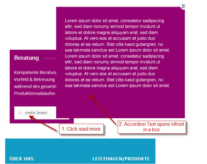
My intention is that – if you click on the accordion “read more” button – the accordion text does not open below but as a box infront of anything else.
Here is an image:
Best regards,
NeverlandsAnd a related question:
Is it possible to make a function like: if top parent’s menu title or the category of the post contains “products” then add the class “products” to the menu items.
Then I woudln’t have to specify each single menu item number in the css, everytime there is a new main or sub menu entry.Something like
function add_category_name($classes = '') {
   if(is_single()) {
      $category = get_the_category();
      $classes[] = 'category-'.$category[0]->slug;
   }
   return $classes;
}
add_filter('nav_menu_css_class','add_category_name');
But this doesn’t really work.
Hi Rikard,
I tried this but it also changes the colour of all menu-text in the active sub-menu.
Also, I have to specify the number of the menu-item (ex: li#menu-item-28) because each main-menu text shoud have another colour.Best regards,
Neverlands -
This reply was modified 8 years, 12 months ago by
-
AuthorPosts
