Forum Replies Created
-
AuthorPosts
-
Hey rmavila,
I believe this is because your link is the full url, please try changing it to “#photos”
If this doesn’t help, Can you please include a admin login in the private content area so we can take a closer look.Best regards,
MikeHey flordelizamejia,
Try this code in the General Styling > Quick CSS field:#top #wrap_all .header_color li#menu-item-73 a { background-color: #d2232a !important; padding-right: 0px !important; } #top #wrap_all .header_color #menu-item-73 .av-menu-button-colored > a .avia-menu-text { border-color: #d2232a !important; }Best regards,
MikeMay 16, 2018 at 3:07 am in reply to: Removing Space Between Boxes on Mobile View (revisited) #957273Hey Studio13SprayTanning,
I took a look at your site on Android mobile and with Chrome dav tools, and couldn’t find the error.
Please see screenshot in Private Content area.
Have you tried clearing the device cache? Which device are you seeing this error on?Best regards,
MikeHey SAdesignsUnltd,
When I doesn’t go to that page, does it go to a 404 for the link? There was a link error corrected with the latest update, v4.3.2
Have you tried this update?
If this doesn’t help, Can you please include a admin login in the private content area so we can take a closer look.Best regards,
MikeHey abkuijer,
My first recommendation was to ask you read this: Everything You Need to Know About Hidden Text & SEO
Then I re-read your question and believe that a solution would be to use a accordion element where you can have such content that is not “hidden” per say.Best regards,
MikeMay 16, 2018 at 1:46 am in reply to: Transparent header on mobile screen: logo position issue #957253Hi,
Try:#bbp-user-wrapper #bbp-single-user-details { width: 100% !important; float:right !important; } #bbp-user-body { float:right !important; }Best regards,
MikeHey Andre,
Try this code in the General Styling > Quick CSS field:.html_modern-blog #top.page-template-default .post-entry .post-meta-infos { margin-top: 0px !important; padding: 0px !important; top: -22px !important; } .html_modern-blog #top.page-template-default .entry-content-wrapper .big-preview.single-big { margin-top: 0px !important; padding-bottom: 0px !important; }Best regards,
MikeHey Lara,
I found that you have a empty column on the first row to keep the others to the right, but that column starts the row below the widget. For a solution I added a custom class to the column “hide-column” and added this css to your Quick CSS:.hide-column { display:none !important; }please see the link and screenshots in the Private Content area, try to add the class on your other pages.
Best regards,
MikeHi,
I found this code in your custom css twice hiding the first image:@media only screen and (min-width: 1023px) { .post-entry-1108 .avia-builder-el-3 { display: none; } }I then had to flush your cache & CDN a few times, it’s now showing. Please clear your browser cache a few times and check.
Best regards,
MikeHi,
Please add:.header_color .avia-menu-fx .avia-arrow { background-color: #498ad8 !important; color: #ffffff; border-color: #498ad8 !important; }Best regards,
MikeHi,
For your header, I believe we are talking about the slider, I also think that changing the settings would achieve what you want. Do you want the image to end at the bottom of the screen, “the fold”? I tested changing the setting to 1500×430 and it seemed to work well, Please see screenshot in Private Content area. You could also try 1500×630, it is now at 1500×1500.
If this doesn’t help, please explain what you would like to see as we could assist with some css.The gray text on your homepage is due to the “Main Content font color” at Enfold Theme Options > General Styling > Main Content:
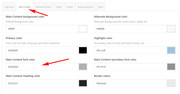
in other places gray font can be due to “Alternate Content” color & “Main Content secondary” color.For your icons on your homepage, I added a ID to the color section “mid-body” and this css to your Quick CSS:
@media only screen and (max-width: 767px) {
#mid-body .flex_column.av_one_third {
    margin-left: 0 !important;
    width: 100%
}
}
so they will be 100% wide on smaller screens, up to tablet. Please clear your browser cache and check.
East Coast, before 8am, after 7pm, split shift.
Best regards,
MikeHi,
We have just released v4.3.2, please update.
Please note that if you update via FTP, you will need to remove the old theme folder first then upload the new enfold folder.
Please don’t try to overwrite the theme folder, as this will leave old files behind.Best regards,
MikeMay 15, 2018 at 11:16 am in reply to: Email signup form requires 2 calls to CSS to display correctly #956895Hi,
Glad we were able to help, we will close this now. Thank you for using Enfold.For your information, you can take a look at Enfold documentation here
And if there are features that you wish Enfold had, you can request them and vote the requested ones here
For any other questions or issues, feel free to start new threads under Enfold sub forum and we will gladly try to help you :)Best regards,
MikeHi,
The required settings are, in the Enfold Theme Options > Blog Layout > Blog Styling: “Default (Business)” & “Multi Author Blog (displays Gravatar of the article author beside the entry and feature images above)”
Then in your Blog Posts element on your page, the Blog Style needs to be set to “Multi Author Blog (displays Gravatar of the article author beside the entry and feature images above)”
I made these changes for you, please check.Best regards,
MikeHi,
Now that is a good tip! Thanks for sharing!
Glad we were able to help, we will close this now. Thank you for using Enfold.For your information, you can take a look at Enfold documentation here
And if there are features that you wish Enfold had, you can request them and vote the requested ones here
For any other questions or issues, feel free to start new threads under Enfold sub forum and we will gladly try to help you :)Best regards,
MikeHi,
I see you have a error that was corrected today with the latest update, v4.3.2
Please update.
Please note that if you update via FTP, you will need to remove the old theme folder first then upload the new enfold folder.
Please don’t try to overwrite the theme folder, as this will leave old files behind.Best regards,
MikeHi,
Glad we were able to help, we will close this now. Thank you for using Enfold.For your information, you can take a look at Enfold documentation here
And if there are features that you wish Enfold had, you can request them and vote the requested ones here
For any other questions or issues, feel free to start new threads under Enfold sub forum and we will gladly try to help you :)Best regards,
MikeHi,
Your code is good, and would work fine, but since you asked, I would like to see it like this:@media only screen and (max-width: 767px) { .title_container .main-title { font-size: 20px; line-height: 20px; margin-bottom: 10px; } }it’s just easier to read :)
As for your footer, I don’t see the error now, did you change it? I thought I saw the error at the url in the Private Content area?Best regards,
MikeMay 15, 2018 at 2:56 am in reply to: enfold: problem befoore transfer in other host. Lost icon and other ! #956770Hi,
For the contact form, I changed the contact form to the dark theme and it is black border & text on white, please check.For the footer, I changed the setting at Enfold Theme Options > General Styling > Footer, please check
*I was unsure how you wanted the socket, the area under the footer, so I wait for your instructions.The code was to remove the white space over the slider, as I posted two posts back. Do you find it working well?
I reviewed the history, and while it looks to have been built with the default builder, I don’t have a explanation for it. I checked it with the debugger and found no broken code, only missing code when compared to today. I recommend if this happens again, take note of what you were doing and let us know so we can check. I recognize this may not be a solution today, but it’s hard to reconstruct an error based on the WP history.
I’m in the USA
Best regards,
MikeHi,
Glad to hear, we will close this now. Thank you for using Enfold.Best regards,
MikeMay 14, 2018 at 2:06 pm in reply to: enfold: problem befoore transfer in other host. Lost icon and other ! #956453Hi,
The sites structure doesn’t look the same, one has the correct /dynamic_avia/ while the other doesn’t, plus other differences such as the flag images pointing to the wrong url.
The only reason I bring this up is because if you migrated the database, these will all be errors, which is what I think we are seeing now.
If you don’t want to use the Duplicator, then how about trying to copy all of the files, in the exact same structure to the .it site, then try pushing the database from the .com site to the .it site using this plugin
Then the two sites will match, which is what you want, right?Best regards,
MikeHi,
Glad we were able to help, we will close this now. Thank you for using Enfold.For your information, you can take a look at Enfold documentation here
And if there are features that you wish Enfold had, you can request them and vote the requested ones here
For any other questions or issues, feel free to start new threads under Enfold sub forum and we will gladly try to help you :)Best regards,
MikeHi,
Sorry, that is version 3.3.2, please download v4.3.1 from your Theme Forest account, and upload to your dropbox.Best regards,
MikeHi,
2: Ok, I understand now, Try this code in the General Styling > Quick CSS field:@media only screen and (max-width: 767px) { .responsive .title_container .main-title + .breadcrumb { top: -14px !important; } }please feel free to adjust to suit.
I couldn’t check as your site seems down right now.Best regards,
MikeHi,
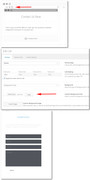
We are from different parts of the world in different time zones, sorry there is not a live feature, I see today it has only been an hour since you posted.1: Here is how to change the background color of the 1/2 grid row that the contact form is in, you’ll see in the screenshots that you can change it to any color, I put it back because I was not sure that it’s what you wanted.
2: yes the footer widgets look dark gary / light black to me on both desktop & mobile.
3: I added the css for you in the quick css, seems to work good.
4: to add screenshots try using https://postimg.cc and paste the url’s here.
Best regards,
MikeHi,
Thank you for the feedback, please try adding this code also:#av_section_2.footer_color .avia_start_animation { opacity: 1 !important; -moz-transform: scale(1 !important); -webkit-transform: scale(1) !important; -ms-transform: scale(1) !important; transform: scale(1) !important; -webkit-animation: none!important; -moz-animation: none !important; -msanimation: none !important; animation: none!important; }Please clear your browser cache and check.
Best regards,
Mike -
AuthorPosts