Forum Replies Created
-
AuthorPosts
-
July 17, 2018 at 3:54 am in reply to: Hide titles and descriptions when you hover on images or thumbnails of galleries #986205
Hi,
I changed the code in your function to work on every image on your site, Please clear your browser cache and check.
Since you won’t have the title under your lightbox image, perhaps you will also wish to hide the “number” of images under the lightbox also.
If so please try this code in the General Styling > Quick CSS field:.mfp-bottom-bar { display: none !important; }Best regards,
MikeHi,
Please try:h2 a:hover { text-decoration: underline !important; }Best regards,
MikeJuly 17, 2018 at 3:36 am in reply to: "Couldn't add the font because the server didn’t respond" error when uploading #986198Hi,
Glad we were able to help, we will close this now. Thank you for using Enfold.For your information, you can take a look at Enfold documentation here
For any other questions or issues, feel free to start new threads under Enfold sub forum and we will gladly try to help you :)Best regards,
MikeHi,
Please include a admin login & FTP access in the Private Content area, so we can take a closer look.Best regards,
MikeHi,
I believe this is true, because it is getting a error message on submit, so it’s not telling you that it was successfully sent.
We will keep this open until you can test with the correct SMTP details.Best regards,
MikeHi,
Yes this code is for adding scripts via the functions.php & it’s a good way to add scripts.
The “wp_head” is what puts it in the head, if you want to add it to the footer, use “wp_footer”
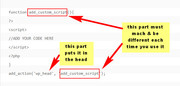
Unless there is anything else we can assist with on this issue, shall we close this then?Best regards,
MikeHi,
Glad we were able to help, we will close this now. Thank you for using Enfold.For your information, you can take a look at Enfold documentation here
For any other questions or issues, feel free to start new threads under Enfold sub forum and we will gladly try to help you :)Best regards,
MikeHi,
Glad to hear that you have an answer to the issue.
Unless there is anything else we can assist with on this issue, shall we close this then?Best regards,
MikeJuly 17, 2018 at 2:58 am in reply to: Last updated date insertion / problem with avia blog postings #986185Hi,
Good article, thanks for sharing :)
Unless there is anything else we can assist with on this issue, shall we close this then?Best regards,
MikeHi,
Glad we were able to help, we will close this now. Thank you for using Enfold.For your information, you can take a look at Enfold documentation here
For any other questions or issues, feel free to start new threads under Enfold sub forum and we will gladly try to help you :)Best regards,
MikeHi,
Thanks for the login, I added the custom class so your css rule will work.
Please clear your browser cache and check.Best regards,
MikeHi,
There are 15 times “All” is in a phrase, case sensitive, but only one time by it’s self, line 3590

Please download from the Private Content areaBest regards,
MikeHi,
Glad we were able to help, we will close this now. Thank you for using Enfold.For your information, you can take a look at Enfold documentation here
For any other questions or issues, feel free to start new threads under Enfold sub forum and we will gladly try to help you :)Best regards,
MikeHi,
Thanks for sharing your solution, unless there is anything else we can help with on this issue, shall we close this then?Best regards,
MikeHi,
Thank you for the login, I was able to click each text layer and then click the trash can to delete, I then clicked the save button at the bottom of the screen.
Are these the steps you tried?
What browser are you using?
I looked at your server settings, which seemed fine, but I did get a server timeout error (503) navigating between pages, which is not a good sign for a webhost.
Do you have a option to upgrade your service, or switch webhosts?Best regards,
MikeHey J,
Have you considered adding a h1 special heading element to both pages, a h1 doesn’t necessary have to be at the very top of the page.
Perhaps we can add a h1 tag to the element of your choice on the page with javascript if it has a unique class:$(document).ready(function() { $(".unique_class").replaceWith("<h1>new H1 heading</h1>"); });We would need to see your pages and elements
Best regards,
MikeHey Nilpferd,
Please try this code in the General Styling > Quick CSS field:.av-special-heading-tag { float: right !important; }If this doesn’t help please include the url to the page in question so we can take a closer look.
Best regards,
MikeHey Nin0,
Please try this code in the General Styling > Quick CSS field:.av-special-heading { padding-bottom: 0px !important; margin-bottom: -30px !important; }If this doesn’t help please include the url to the page in question so we can take a closer look.
Best regards,
MikeHey profputr,
Please make a copy of the slider and tell us which lay you wish to remove so we can try, and so if we mess up you will still have your original to work with.
Can you please include a admin login in the private content area so we can take a closer look.Best regards,
MikeHey toniritter,
Please try this code in the General Styling > Quick CSS field:h3.widgettitle { display: none !important; }I believe this got them all, I didn’t find any h5 on your page.
Please clear your browser cache and check, and let us know if there are any others.Best regards,
MikeHi,
Please try this code in the General Styling > Quick CSS field:#top a.av-masonry-entry:hover > .av-inner-masonry img { -webkit-filter: blur(5px); filter: blur(5px); }Best regards,
MikeHey BeyondMS,
Please try this code in the General Styling > Quick CSS field:@media only screen and (max-width: 767px) { #top div.product .woocommerce-tabs:last-child { display: block !important; } }Please clear your browser cache and check.
Best regards,
MikeHi,
Please try this code in the General Styling > Quick CSS field:#top.home .flex_cell.avia-builder-el-6 { border-right-color: #fff !important; border-right-style: solid !important; border-right-width: 5px !important; } #top.home .flex_cell.avia-builder-el-10 { border-left-color: #fff !important; border-left-style: solid !important; border-left-width: 5px !important; }With the grid row that you are using we can’t separate the boxes, and because of the background colors there is a slight line in the middle that we can’t remove. You could use half of the code above and have the border 10px to one side to avoid the line, and perhaps you won’t notice one side is larger.
Otherwise you will need to use two columns to create the space in the middle.Best regards,
MikeHey enduringword,
I took a look at your page, but I don’t see any dates on it, and since it’s The Book of Revelation, I’m not sure you want to reverse the order?
Perhaps I’m looking at the wrong page, please advise.Best regards,
MikeHey flordelizamejia,
Please try this code in the General Styling > Quick CSS field:.avia-table td:nth-child(1) { vertical-align: top !important; }Please clear your browser cache and check.
Best regards,
MikeHi,
Please try setting up the simple image sizes plugin this way, go to WordPress > Dashboard > Settings > Media > Media Settings
and change all of the image sizes to zero:

then click the save changes button.
I tested this again just now and my upload only generated the one original file and 3 woocommerce files 100px, 300px, & 600px
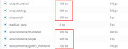
I know the screenshot looks like 6 files, but in the uploads folder it was only 3 woocommerce images.Best regards,
MikeHi,
Glad we were able to help, we will close this now. Thank you for using Enfold.For your information, you can take a look at Enfold documentation here
For any other questions or issues, feel free to start new threads under Enfold sub forum and we will gladly try to help you :)Best regards,
MikeHi,
Please try adding “/#top” to the end of the home link, this will cause it to be active when you scroll back to the top of the page.
This will hide the link and first pipe:#menu-item-502 {display: none !important;} #menu-item-32 span.avia-menu-text { border-left-color: transparent !important; }Best regards,
Mike -
AuthorPosts