Forum Replies Created
-
AuthorPosts
-
Hey thepash,
I see this is your homepage, do you want to hide just the menu in the sidebar, or the whole sidebar?Best regards,
MikeHey carla,
It looks like this div is from the plugin “wp-miniaudioplayer” in the item title.
I imagine you have looked in the item’s title for quotes?
If you didn’t find any, Try adding this code to the end of your functions.php file in Appearance > Editor:function custom_script(){ ?> <script> jQuery(window).load(function(){ jQuery( '#av_player-0 .map_pl_container' ).each(function() { jQuery( this ).find( '.map_item_title' ).replaceWith('FICO Score Audio'); }); }); </script> <?php } add_action('wp_footer', 'custom_script');Best regards,
MikeHey ProTravelGolf,
I don’t have a ipad to test with, but I believe this should work,
Please try this code in the General Styling > Quick CSS field:@media only screen and (min-device-width : 768px) and (max-device-width : 1024px) and (orientation : portrait) { span.logo,.logo a img { height: 180px !important; } }Best regards,
MikeHey EliteMassageSolutions,
Please check the url in the Private Content area, it has no TLD, I tried “.com” with no luck.Best regards,
MikeHey Mona,
Please download the file in the Private Content area & save a backup of your slideshow.js & and try replacing it via ftp at:
enfold > config-templatebuilder > aviashortcodes > slideshow > slideshow.js file.
since it’s a js file, you will need to clear the cache a few times before the fix shows.Best regards,
MikeHi,
Can you link to the logo, and I’ll first try to just add the logo & test under different screen sizes.Best regards,
MikeAugust 6, 2018 at 1:30 am in reply to: Further CSS Customizations for Sales Page to Look Like Boxed Layout? #993766Hi,
I’ve tried working on this, but didn’t find a solution, so I will ask the rest of the team to take a look.
Thanks for your patience.Best regards,
MikeHi,
Glad we were able to help, we will close this now. Thank you for using Enfold.For your information, you can take a look at Enfold documentation here
For any other questions or issues, feel free to start new threads under Enfold sub forum and we will gladly try to help you :)Best regards,
MikeHi,
It will be a little trickier, will you also want the text to be left aligned?
What if you created a transparent image of the logo and text that we replace the text with and link it to the contact form?
This way the image will scale to the screen width and remain consistent. Perhaps 200px by 600px?Best regards,
MikeHi,
Glad we were able to help, we will close this now. Thank you for using Enfold.For your information, you can take a look at Enfold documentation here
For any other questions or issues, feel free to start new threads under Enfold sub forum and we will gladly try to help you :)Best regards,
MikeHi,
Sorry about that, I didn’t see that message.
I added this css to correct:/* font color of the menu item of the current page */ #top #header .av-main-nav > li.current-menu-item a span.avia-menu-text { color: #ff0000 !important; }now it goes from dark red to red on mouse out.
Please clear your browser cache and check.Best regards,
MikeHi,
Ok, I see now, so first on your page your elements are h2, not h3
then if you want some to float right, and others to float left, you will need to create two classes “align_right” & “align_left”
and add the appropriate class to the appropriate element.
Please see screenshot in Private Content area.
then use this css:.align_right h2 { float: right !important; } .align_left h2 { float: left !important; }Best regards,
MikeHi,
Ok, that is how it looks now for tablets (768px) how do you want it to look for mobile?
To get the same menu for mobile, the menu items will have to be very small.Best regards,
MikeHi,
1: I changed the color
2: I removed it
3: The text has been the same for every slide for me, hasn’t it been the same for you?
4: I enabled your custom css at: Enfold Theme Options > Layout Builder > Show element options for developers
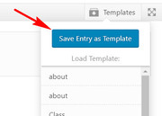
so I could add the custom class “homepage_slider” to the draft slider then I changed the css to include the custom class, now it will work correctly for any page. Now after you check the draft slider one last time, you can use the “Save Entry as Template” button to save the entry, and add it to the homepage, and remove the other one.
Best regards,
MikeHi,
Unless there is anything else we can assist with on this issue, shall we close this then?Best regards,
MikeHi,
Can you please include a admin login to the beta site in the private content area so we can take a closer look.Best regards,
MikeHey jmoeser,
It looks like there is a script that is changing the social icons li tag to div in the dom
Please take a look in your custom functions or scripts, or please include a admin login in the private content area so we can take a closer look.Best regards,
MikeHey acscreativenew,
Try adding this code to the end of your functions.php file in Appearance > Editor:add_filter( 'avf_google_heading_font', 'avia_add_heading_font'); function avia_add_heading_font($fonts) { $fonts['Open Sans'] = 'Open Sans:300,400,600,700'; return $fonts; } add_filter( 'avf_google_content_font', 'avia_add_content_font'); function avia_add_content_font($fonts) { $fonts['Open Sans'] = 'Open Sans:300,400,600,700'; return $fonts; }Best regards,
MikeHey elvirais,
For desktop screens would you like your logo image to always be 300px high, allowing the over flow width to go off screen if needed, or would you like your width to always be 100% wide, allowing to height to be scaled down so the image is proportional?
I ask because your image is 1600px by 300px, so to maintain the 300px height we could allow to image to over flow off screen.For tablets and mobile I assume you want your logo to be 100% wide? Would you consider a different logo for these screens that is cropped at your name to the bird? (Please see image in Private Content area.) this would allow the text in your image to be read easier at smaller screens.
As I look at your site now the logo image has some padding and is less than 100% wide, and this quick css would fix that:
.av-logo-container {
padding: 0px !important;
}
.logo,.logo a {
    width: 100% !important;
}
But your answers to the questions above may change the css we will want to use.
Best regards,
MikeAugust 5, 2018 at 2:38 pm in reply to: Wrong description on mouse over in previous and next product #993684Hey profumopuntoit,
Do you happen to have some added javascript to create the thumbnail titles, or have you customized the theme files, or have you manually added the titles to the media?
because on my install the “entry-image” thumbnails for the next / previous do not have titles for the images, and as you pointed out yours are more like descriptions than titles.
If you would like us to take a closer look, please include a admin login in the Private Content area.
Wold you like the default behavior of no titles there?Best regards,
MikeHey sjidesign,
I took a look at your site, but the login said “invalid user” please check
To add the widget area to your header please follow these instructions then add your widgets so we can assist with the placement.
I don’t see the “my account” & “login” in your menu, are you able to create these and need help moving them, or do you need help to create & move them?Best regards,
MikeHi,
[slap-forehead] don’t know why I didn’t think of that :)
anyways I changed the css a little, please try this code:<style type="text/css"> .socialbody { display: flex; flex-wrap: wrap; justify-content: center; align-items: flex-end; align-content: center; padding:0 0 20px 0; height: 100px; font: 16px Roboto, sans-serif; } a { text-decoration: none; } .socialBB-icon { width: 36px; height: 36px; fill: currentColor; transition: .2s; } a.socialBB-link--instagram:hover { color: #e67300 } a.socialBB-link--500px:hover { color: #6699ff } a.socialBB-link--instagram:hover::after { background: #e67300 } a.socialBB-link--500px:hover::after { background: #6699ff } .socialBB-link { position: relative; color: #bbb; } .socialBB-link:not(:last-of-type) { margin-right: 15px; } .socialBB-tooltip::before, .socialBB-tooltip::after { display: block; position: absolute; left: 50%; transform: translate(-50%, -10px); opacity: 0; transition: .2s; } .socialBB-tooltip::before { content: ''; bottom: calc(100% + 2px); border: solid 5px transparent; border-top-color: currentColor; } .socialBB-tooltip::after { content: attr(aria-label); bottom: calc(100% + 12px); padding: .61em .93em; font-size: .875rem; color: white; border-radius: 3px; } .socialBB-tooltip:hover::before, .socialBB-tooltip:hover::after { opacity: 1; transform: translate(-50%); } </style> <div class="socialbody"> <svg class="socialBB-icon"><use xlink:href="#icon--instagram"></use></svg> <svg class="socialBB-icon"><use xlink:href="#icon--500px"></use></svg> <svg style="display: none"> <symbol id="icon--instagram" viewbox="0 0 24 24"> <path d="M7.8,2H16.2C19.4,2 22,4.6 22,7.8V16.2A5.8,5.8 0 0,1 16.2,22H7.8C4.6,22 2,19.4 2,16.2V7.8A5.8,5.8 0 0,1 7.8,2M7.6,4A3.6,3.6 0 0,0 4,7.6V16.4C4,18.39 5.61,20 7.6,20H16.4A3.6,3.6 0 0,0 20,16.4V7.6C20,5.61 18.39,4 16.4,4H7.6M17.25,5.5A1.25,1.25 0 0,1 18.5,6.75A1.25,1.25 0 0,1 17.25,8A1.25,1.25 0 0,1 16,6.75A1.25,1.25 0 0,1 17.25,5.5M12,7A5,5 0 0,1 17,12A5,5 0 0,1 12,17A5,5 0 0,1 7,12A5,5 0 0,1 12,7M12,9A3,3 0 0,0 9,12A3,3 0 0,0 12,15A3,3 0 0,0 15,12A3,3 0 0,0 12,9Z" /> </symbol> <symbol id="icon--500px" viewbox="0 0 97.8 97.8"> <path d="M72.3,47.9c-1.6,0.2-2.9,1-4.1,1.9c-1.4,1.1-2.5,2.3-3.7,3.6c-0.2,0.2-0.1,0.3,0,0.4c0.8,0.9,1.7,1.8,2.7,2.6c1.6,1.3,3.4,2.3,5.5,2.5c2.4,0.2,4.4-0.9,5.2-3.1c0.3-0.8,0.4-1.5,0.4-2.5c0-0.2,0-0.6-0.1-0.9C77.9,49.5,75.4,47.5,72.3,47.9z"/><path d="M52.2,49.8c-1-0.7-2.1-1.4-3.4-1.7c-1.9-0.5-3.6-0.2-5,1.3c-1,1.2-1.5,2.6-1.5,4.3c0,0.2,0,0.4,0,0.7c0.2,2.3,1.8,4.1,4,4.5c1.2,0.2,2.5,0.1,3.6-0.4c2.5-1,4.4-2.7,6.2-4.7c0.1-0.1,0.1-0.2,0-0.3C55,52.1,53.7,50.8,52.2,49.8z"/><path d="M48.9,0C21.9,0,0,21.9,0,48.9s21.9,48.9,48.9,48.9s48.9-21.9,48.9-48.9S75.9,0,48.9,0z M73,65.7c-3.1,0-5.7-1.2-8.1-3.1c-1.6-1.2-2.9-2.6-4.2-4.1c-0.2-0.2-0.3-0.3-0.6,0c-1.3,1.4-2.6,2.8-4.1,4c-1.9,1.5-4,2.7-6.4,3c-4.3,0.6-8-0.5-10.9-3.9c-0.7-0.8-1.1-1.6-1.6-2.6c-0.1-0.1-0.1-0.3-0.2-0.4c-0.6,1.2-1.3,2.3-2.2,3.3c-2.3,2.5-5.2,3.7-8.5,3.9c-2.4,0.1-4.8-0.2-7-1.3c-3.7-1.8-5.8-4.7-6-8.9c0-0.3,0.1-0.4,0.4-0.4c2,0,4,0,6,0c0.3,0,0.4,0.1,0.4,0.4c0.4,2.3,1.6,3.9,3.9,4.5c3.2,0.8,6.2-1,7-4.3c0.6-2.2,0.3-4.4-1.2-6.2c-1-1.2-2.3-1.8-3.9-1.9c-2.2-0.2-4.1,0.6-5.4,2.5c-0.1,0.2-0.3,0.2-0.5,0.2c-1.8,0-3.6,0-5.4,0c-0.3,0-0.4-0.1-0.3-0.4c0.9-5.2,1.9-10.4,2.8-15.6c0.1-0.7,0.3-1.4,0.4-2.1c0-0.2,0.1-0.3,0.4-0.3c6,0,12,0,18,0c0.3,0,0.3,0.1,0.3,0.4c0,1.6,0,3.2,0,4.8c0,0.3-0.1,0.4-0.4,0.4c-4.3,0-8.6,0-12.9,0c-0.4,0-0.5,0.1-0.6,0.5c-0.4,2.3-0.8,4.6-1.2,6.8c0,0.1-0.1,0.2,0,0.3c0.1,0.1,0.2-0.1,0.3-0.1c2-1.9,4.4-2.5,7-2.3c2.5,0.1,4.7,1.1,6.5,2.9c0.7,0.8,1.3,1.6,1.8,2.6c0.1,0.1,0.1,0.2,0.2,0.4c0.5-1.3,1.1-2.5,2-3.5c1.9-2.2,4.4-3.4,7.3-3.7c4.1-0.4,7.5,1.2,10.5,3.9c1.2,1.1,2.3,2.4,3.4,3.6c0.2,0.3,0.3,0.3,0.6,0c1.4-1.6,2.7-3.3,4.4-4.6c2-1.5,4.1-2.6,6.6-2.9c6.2-0.7,11.3,2.6,12.6,9c0.6,2.7,0.4,5.3-0.5,7.9C82,63,78.1,65.7,73,65.7z" /> </symbol> </svg> </div>Best regards,
MikeHi,
For [object object] error: it’s the enfold > config-templatebuilder > aviashortcodes > slideshow > slideshow.js file.
Please download the fixed file in the Private Content area & save a backup of your slideshow.js & and try replacing it via ftp.
since it’s a js file, you will need to clear the cache a few times before the fix shows.For the header: I assume you have made no theme file changes, such as in the header.php? Can we temporary disable the plugins to test?
Best regards,
MikeHi,
Glad we were able to help, we will close this now. Thank you for using Enfold.For your information, you can take a look at Enfold documentation here
For any other questions or issues, feel free to start new threads under Enfold sub forum and we will gladly try to help you :)Best regards,
MikeHi,
So you want the social icons visible at mobile width, next to the language selector, and the weather at the top of the page centered?
Please see screenshot in Private Content area.Best regards,
MikeHi,
Unless there is anything else we can assist with on this issue, shall we close this then?Best regards,
MikeHi,
Entiendo que le gustaría agregar sus propios iconos para los perfiles sociales que no existen, como en las instrucciones: Cómo agregar iconos sociales personalizados a las opciones de Enfold Pero solo puedes hacer eso si agregas iconos de fontello.com No puedes usar imágenes para hacer esta.
Es por eso que sugiero una técnica para sustituir los iconos incorporados por tus imágenes
Puede cambiar el título del icono con jQuery, aquí hay un ejemplo que cambia el título de twitter. Intente agregar este código al final de su archivo functions.php en Apariencia> Editor:function change_twitter_title(){ ?> <script> jQuery(window).load(function(){ jQuery( '.social_bookmarks_twitter' ).each(function() { jQuery( this ).find( 'a' ).attr({title: "New Social Title"}); }); }); </script> <?php } add_action('wp_footer', 'change_twitter_title');Estaré encantado de ayudarlo a crear código personalizado para sus propios títulos
————–
I understand you would like to add your own icons for social profiles that do not exist such as in the instructions: How to add Custom Social Icons to Enfold options But you can only do that if you add icons from fontello.com You can not use images to do this.
This is why I suggest a technique to substitute the built-in icons for your images
You can change the icon title with jQuery, here is an example that changes the twitter title. Try adding this code to the end of your functions.php file in Appearance > Editor:function change_twitter_title(){ ?> <script> jQuery(window).load(function(){ jQuery( '.social_bookmarks_twitter' ).each(function() { jQuery( this ).find( 'a' ).attr({title: "New Social Title"}); }); }); </script> <?php } add_action('wp_footer', 'change_twitter_title');I will be happy to assist you create custom code for your own titles
Best regards,
MikeHi,
Glad we were able to help, we will close this now. Thank you for using Enfold.For your information, you can take a look at Enfold documentation here
For any other questions or issues, feel free to start new threads under Enfold sub forum and we will gladly try to help you :)Best regards,
MikeHey verydapper,
If I understand correctly you would like to have a transparent header with a white logo and menu items, and on scroll the header becomes white with black logo and menu items.
For this the setting “Header is invisible and appears when user scrolls down” is not correct, this setting shows no header at all until scroll.
The setting you want is “Transparent Header” which I changed for you.
Yet your header is behaving like a sticky header, which was set at: Enfold Theme Options > Header > Header behavior > Sticky Header
Which I unchecked for you.I see you have a Godaddy cache, which I tried clearing, but I believe it is cached on the server, please clear and disable all caching, especially a server cache, I also see you have JetPack installed, please disable.
I believe this should get your header working right, because I believe we are looking at a cached version, but there could be a conflict elsewhere, such as “Nifty Coming Soon & Maintenance page”
So try to temporarily disable if the steps above don’t help.
Let us know if this doesn’t solve and allow us to disable your plugins to test.Best regards,
Mike -
AuthorPosts