Forum Replies Created
-
AuthorPosts
-
August 30, 2018 at 5:14 am in reply to: Add Fullwidth Sub Menu to Header.php across whole website #1003345
Hi,
In the code above, the “menu=’25′” sets the menu.
To find out what the number is of the menu you wish to use, please go to your menus and use the inspector on the drop down to see the numbers.
If this doesn’t help, please include a admin login in the private content area and tell us which menu you would like to use.Best regards,
MikeHi,
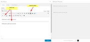
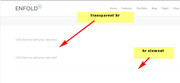
Please try looking in the sidebar of your editor under Layout > Header visibility and transparency and choose the option “no transparency”Best regards,
MikeAugust 30, 2018 at 4:45 am in reply to: Homepage on black except for the taskbar. Rest of the pages are working fine #1003338Hi,
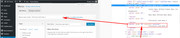
Yes, making a backup is a good idea. I would first look in your control panel for your webhost, most webhosts offer very good backup & restore options for WordPress.
Another good option is to see if your webhost offers a one click clone or staging site option, this is a option in most cPanels to create a staging clone of your site so we can test on it and you site will stay up and running. You can always ask your webhost to help you with setting this up if you want.Here are some screenshots of what it would look like:
Best regards,
MikeHi,
Thank you for the login, I believe it would be better to use a image as a burger menu item so there won’t be these issues.
Please try this example code in the General Styling > Quick CSS field:.av-hamburger::before { content: url(https://s6.postimg.cc/hw8mmus4h/icons8-menu-filled-50.png); display: block; padding-top: 5px; } .av-hamburger-inner {display:none!important;}If you like this icon you can save it to your site and change the url above to point to it, otherwise you could find a new icon to use instead. I found this icon at: https://icons8.com/icon/set/menu/all
Best regards,
MikeAugust 30, 2018 at 3:45 am in reply to: Burger/Mobile Menu / How can I get it bigger/thicker? #1003330Hi,
Thank you for the login, I see that my code snippet doesn’t work for what you wanted, completely remove the mobile menu and use the main menu instead.
The best solution I found was to edit the layout.css and change line 2283 to this:@media only screen and (max-width: 77px) {Please clear your browser cache and check.
While this works, I note that for mobile devices your menu creates 3 lines because it is too large for the screen. We can make the menu font smaller and reduce the menu padding, but on the smallest screens there will still be two menu items that start a second line.
This is the css I added to your Quick CSS:@media only screen and (max-width: 767px) { .av_seperator_small_border .av-main-nav > li > a > .avia-menu-text { font-size: 12px !important; padding-left: 10px !important; margin-left: -10px !important; } .av-main-nav > li > a { padding: 0 7px !important; } .av_seperator_small_border .av-main-nav > li:first-child > a > .avia-menu-text { border-left: none; padding-left: 13px !important; } .responsive #top #wrap_all .container { width: 95% !important; max-width: 95% !important; } }Best regards,
MikeAugust 30, 2018 at 2:20 am in reply to: Problems with font and header size, and line spacing in a paragraph #1003325Hi,
Glad to hear that using the br code will work for you. I added this css to change the color of your hr:.av_textblock_section .avia_textblock hr { border: solid #00a0a3 !important; border-width: 1px 0 0 !important; }Please clear your browser cache and check.
Best regards,
MikeHi,
I took a look at your pages and the background color is showing for me, Please clear your browser cache and check.
You can replace the “red” with hexadecimal like this:#custom_html-12.widget,#custom_html-11.widget { background-color: #e1e1e1 !important; padding: 0px 20px !important; }This color is a light gray, so the text shows well.
Best regards,
MikeAugust 29, 2018 at 5:50 am in reply to: Problems with font and header size, and line spacing in a paragraph #1002979Hi,
The 6px is the padding for top & bottom, and the 0px is for left & right, so each line has it’s line height, plus a 6px padding for the bottom, and the next line has a 6px for the top plus it’s line height.
But the bullet line itself doesn’t add this padding when it is very long and wraps to a second line, in that case it’s only the line height.
I hope this makes sense.I did a lot of research into the line brakes and found that the text element will not support these line brakes
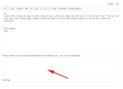
I tested many “solutions” and the only one that works is to switch to the text tab and add this code:<br class="custom-break" />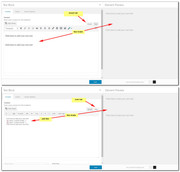
But I didn’t think you would want to do that, so I came up with a different solution. You could add the HR from the expanded toolbar, and we could add a css rule that whenever it is used inside the text element it will be transparent. This way if you want to use the HR element from the builder between other elements it will show.
This is the code we would add to your Quick CSS:.av_textblock_section .avia_textblock hr { border: none transparent !important; }We could also adjust the thickness of it to suit your needs.
Best regards,
MikeHi,
Thank you, I was able to login.
I added this to your Quick CSS:#top .no_margin.av_one_third { width: 33.4% !important; }which seems to have solved, Please clear your browser cache and check.
Best regards,
MikeAugust 29, 2018 at 3:18 am in reply to: Problems with font and header size, and line spacing in a paragraph #1002945Hi,
The spacing was created with this css:.avia_textblock li { padding: 6px 0px !important; }which adds top and bottom padding to the list lines. The code is in your Quick CSS and you can change it any time.
I will have to look into the extra [return] issue feather.Best regards,
MikeHi,
We would like to help figure out why this is not working for you, but it’s harder if we can’t inspect the issue.
Please try disabling your plugins & custom scripts, to see if that helps.You can grant access without posting your login like this:
- Install and activate ” Temporary Login Without Password “.
- Go to ” Users > Temporary Logins ” on the left-side menu.
- Click ” Create New “.
- Add the email address for the account ( you can use (Email address hidden if logged out) ), as well as the ” Role ” making that the highest possible and the expiry about four days
( do be sure that we have enough time to debug ). - Click ” Submit “.
- You’ll now have a temporary account. Please provide us here in the private section the URL, so we can login and help you out.
When your issue is fixed, you can always remove the plugin!
Best regards,
MikeHi,
I tried logging in, but I received an error that a Authentication Code has been to an email address.
Please disable this security check, so we can login to your site.Best regards,
MikeHi,
I mean that we would be happy to take a look at your icon box to change the Font Size of the icon box title + the icon box body font, with a admin login, please include the login in the Private Content area so it will be only visible for moderators.
Best regards,
MikeHi,
Perhaps the Quick CSS rules need more specificity of the classes and ID’s, ending your rules with “!important;” also helps.
I recommend using a child theme for more reasons than css, such as adding filters and actions in the functions.php
If you are having problems with a certain css rule, we will be happy to look at it for you.Best regards,
MikeHey terrysteeley,
I would recommend disabling Enfold Theme Options > Performance > JS & CSS file merging and compression while you are creating your site. What is happening is that when you add css directly into your style.css the merged css file is not updated unless you save your theme options again, that is the big blue button at Enfold Theme Options.
You can force your merged css to update by clicking this button, if you can’t click it, try adding a blank space in the Enfold Theme Options > General Styling > Quick CSS field and then you will be able to click it.Alternatively, you could simply add your css into the Enfold Theme Options > General Styling > Quick CSS field instead of the style.css
If you ever find you are fighting with a tough element, the WordPress > Customize > Additional CSS has priority over other css.Best regards,
MikeHi,
Glad we could help, unless there is anything else we can help with on this issue, shall we close this then?Best regards,
MikeHi,
Please try this code in the General Styling > Quick CSS field:#custom_html-12.widget,#custom_html-11.widget { background-color: red !important; padding: 0px 20px !important; }Please see the screenshot in Private Content area.
Best regards,
MikeAugust 28, 2018 at 5:44 am in reply to: Problems with font and header size, and line spacing in a paragraph #1002536Hi,
Ok, I believe this spacing between the list items is closer to what your are looking for. This way you won’t to add extra lines with the [return] key.
Please note I had to take a screenshot of a different page that had enough text to create second lines in the list.Best regards,
MikeHey finblue,
To create a background color for the burger menu, we will use two colors to create a box. One is your current background color so it will not be seen, and the other is the color for the box. Here is my example, please adjust the colors to suit your site.
Also note that I changed the padding of the element to adjust the left & right width of the box..av-burger-menu-main { padding-left: 8px !important; padding-right: 8px !important; background: linear-gradient( to top, #282B2E, #282B2E 25%, #ff0000 25%, #ff0000 75%, #282B2E 75%); }
Please post a link to your site so we can assist in moving the mobile menu to the top right corner of your site.
Best regards,
MikeHi,
The first one gives a error, but the second one doesn’t, it just reloads the prompt.
Do you have a plugin that blocks logins by country IP?Best regards,
MikeHi,
Glad we were able to help, we will close this now. Thank you for using Enfold.For your information, you can take a look at Enfold documentation here
For any other questions or issues, feel free to start new threads under Enfold sub forum and we will gladly try to help you :)Best regards,
MikeAugust 28, 2018 at 3:14 am in reply to: Burger/Mobile Menu / How can I get it bigger/thicker? #1002496Hi,
Please included a link to your site and a admin login so we can see if there is a conflicting css that keeps the second snippet from working.
This snippet starts working at 200px, the smallest mobile screen is typically 325px, I wrote it like this to try to overcome current css rules and stop working at laptop screen sizes, where your other rules will pick up.
But I’ll be able to better evaluate once I can examine your site.Best regards,
MikeAugust 28, 2018 at 2:58 am in reply to: Problems with font and header size, and line spacing in a paragraph #1002495Hi,
1: I changed your line height to 1.6em for the “p” tag, please see screenshot “1” in the Private Content area, to see if you like that, or feel free to adjust, but please only look at the text in the screenshot.
The reason is that area is a true test of the line height. Screenshot “2” text area in not correct because each line is treated as a paragraph which adds a top and bottom margin, we will address this later.3: I’m not sure what the default em is, it shows as px in my inspector tool, 41.25px
4: I changed one of your “hyphens” lists back to a “bullet” list, and added some css to change the line height, please see screenshot “3” to see if you like it.
Best regards,
MikeHey entrepreneur41,
The issue is with the<sup>®</sup>causing the extra line height.
To correct, please try this code in the General Styling > Quick CSS field:p sup { line-height:18px !important; }Or try adding it to WordPress > Customize > Additional CSS
Best regards,
MikeHey kpcradix,
My research found WPGYM – WordPress Gym Management System
Here are some others: 15 Best Fitness & Gym WordPress Plugins
Hope this helps.Best regards,
MikeHi,
I see that you have posted your WordPress login, but it seems we will also need a another login first to get to the WP login.
Which menu item do you want to only show on the homepage mobile menu?Best regards,
MikeHey VerhoevenGroup,
Thank you for the login, I see that you are getting these errors:
probably from a plugin conflict:
Try disabling your plugins. If that resolves the issue, reactivate each one individually until you find the cause.
I also see that you are using Enfold v4.2, which did have a few bugs, I would recommend updating to v4.4.1Please note that if you update via FTP, you will need to remove the old theme folder “enfold” first then upload the new “enfold” folder at /wp-content/themes/enfold/
Please don’t try to overwrite the theme folder, as this will leave old files behind and cause errors.Best regards,
MikeHey baethes,
Please see our documentation for instructionsBest regards,
MikeHi,
CSS, please link to the form in question.
When you say the background red, is that the background of the form, or the input field?Best regards,
MikeHi,
When adding css in the style.css the merged styles is not rebuilt, to force this please re-save the theme settings, that is the big blue button at Enfold Theme Options. If the button is not allowing you to click it, add a blank space in the Enfold Theme Options > General Styling > Quick CSS field, then you can click the button.
Then clear your browser cache.
You should also disable Enfold Theme Options > Performance > JS & CSS file merging and compression, and any caching plugin until you are done building your site.Best regards,
Mike -
AuthorPosts