Forum Replies Created
-
AuthorPosts
-
Hey Sigmund,
The testimony images don’t have links, but there is a “Website Link” field for each testimony, would you want to apply this link to the image, or are you looking to add a different link to each image?
Please link to your page so we are sure to be working within the same configuration.Best regards,
MikeSeptember 15, 2018 at 6:15 pm in reply to: Problem with the Heading and Menu font of theme. #1010205Hey DharmavajraDesign,
I believe this is a duplicate question, I have requested a url to your site in your other post, lets continue in that thread so we don’t have any confusion.
Thanks for your patience and understanding.Best regards,
MikeHey DharmavajraDesign,
Please remove the css that caused the error and link to the page in question so we can assist.Best regards,
MikeSeptember 15, 2018 at 6:07 pm in reply to: Insert Author name in the previews of the articles #1010202Hi,
I took a look and found that you were hiding the meta tags with this code:.avia-content-slider .slide-meta { display: none; }I assume that you only wanted to hide the date & time tags, so I changed the code to:
.avia-content-slider time.slide-meta-time,.avia-content-slider div.slide-meta-del { display: none; }Now the author name shows, you may wish to display a more friendly reading author name, so try going to your profile and adding a nickname.
Please clear your browser cache and check.Best regards,
MikeHey Blue_Bear,
I believe I understand, Please see the screenshot in Private Content area. To achieve this, Please try this code in the General Styling > Quick CSS field or in the WordPress > Customize > Additional CSS field:#top #header #avia-menu #menu-item-945 .avia_mega_div > .sub-menu,#top #header #avia-menu #menu-item-945 .avia_mega_div > .sub-menu.avia_mega_hr { width: 50% !important; margin: auto !important; }Best regards,
MikeHey Jak73,
Thanks for the screenshot, I see that it is of the “Shop Demo”, I believe that you are asking how to activate (install) this demo.
To do so please go to Enfold Theme Options > Demo Import > Import demo files
Then hover over the image of the demo and click the button that appears “Click to import”
Please note that the “Shop Demo” requires the WooCommerce plugin to be installed and activated first.
Please let us know if this answered your question.Best regards,
MikeHey Pattriek,
I assume that you are referring to the gold colored elements:

Please try this code in the General Styling > Quick CSS field or in the WordPress > Customize > Additional CSS:#top.page-id-23 .avia_ajax_form p#element_avia_7_1,#top.page-id-23 .avia_ajax_form p#element_avia_8_1,#top.page-id-23 .avia_ajax_form p.form_element .button { color: #fff!important; }Best regards,
MikeHey Jak73,
In order to install the demo you will need to install & activate the WooCommerce plugin first, then install the demo.
Afterwards you can deactivate & remove the WooCommerce plugin to remove the “Shop”
You will have a few elements that won’t work on the homepage because they depend on WooCommerce, but you can replace them with something else that you choose to use.
So in the end, you can use the demo without the “Shop”Best regards,
MikeSeptember 15, 2018 at 3:18 pm in reply to: Insert Author name in the previews of the articles #1010138Hi,
I tested this modification on my localhost, and found the code was around line 629, please try using the modify file in the Private Content area, and keep a copy of your original as a backup.Best regards,
MikeHi,
Thanks for sharing that info, based on that I wrote a jQuery script that will load in the “admin_head” of the site and will remove the inline-style for those ID’s
I tested in my browser and I seemed to work, so I then created a function to add it to your child theme functions.php, but it would not save, so please try adding this function via ftp:function remove_wcc_inline_syle(){ ?> <script> jQuery(window).load(function(){ jQuery(".wcc-settings-meta-box #tab-main.hidden").removeAttr("style"); jQuery(".wcc-settings-meta-box #tab-category.hidden").removeAttr("style"); jQuery(".wcc-settings-meta-box #tab-post.hidden").removeAttr("style"); jQuery(".wcc-settings-meta-box #tab-templates.hidden").removeAttr("style"); jQuery(".wcc-settings-meta-box #tab-notes.hidden").removeAttr("style"); jQuery(".wcc-settings-meta-box #tab-import-export-settings.hidden").removeAttr("style"); }); </script> <?php } add_action('admin_head', 'remove_wcc_inline_syle');and then reload your site and test.
Best regards,
MikeHi,
Glad we were able to help, we will close this now. Thank you for using Enfold.For your information, you can take a look at Enfold documentation here
For any other questions or issues, feel free to start new threads under Enfold sub forum and we will gladly try to help you :)Best regards,
MikeHey Stefano,
Are you installing / uploading the theme for the first time on this site, or are you updating the theme on this site?If you are installing for the first time on this site, please ensure you have extracted the “enfold.zip” from the file that you downloaded from Theme Forest, and only upload “enfold.zip”
If you are updating, Please update the theme via FTP, look for the “enfold” folder at /wp-content/themes/enfold/ and rename to “enfold-old” then upload the new version as the folder “enfold”
Please don’t try to overwrite the theme folder, as this will leave old files behind and cause errors.
Once you have cleared your browser cache and tested that your site is working correctly, you can delete the old folder “enfold-old”.
If for some reason you want to go back to the old version, simply remove the new folder and change the name of “enfold-old” back to “enfold”Best regards,
MikeHey webguy007,
First you would need to move the menu text down to make room for the image:
#top #header .av-main-nav > li > a {
margin-top: 36px !important;
}
Then you can add your image above the text:li#menu-item-3173 { background-image: url(https://png.icons8.com/color/96/cccccc/morty-smith.png); background-size: contain; background-repeat: no-repeat; background-position: 50% -1%; }
Try adjusting the image url and position to suit.Best regards,
MikeHey scott_redletter,
When setting up your grid row, create 3 cells and then click the “set cell size” below the element, then the last choice will be
2/5 1/5 2/5
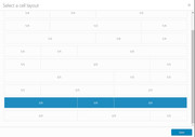
Then Turn on Custom CSS Class field for all ALB Elements and add a custom class to the middle cell, such as “small-grid” and add a custom css rule to your Enfold Theme Options > General Styling > Quick CSS field, such as this:.flex_cell.small-grid { width: 10% !important; }Best regards,
MikeHey Olga,
Thank you for the login, I checked your Map API and it returned “Could not connect to Google Maps with this API Key”
I then checked my API and it worked.
Please try creating a new API key with no restrictions and see if that works for you.
Did you enter your billing info at Google Maps?Best regards,
MikeHey slui,
Please check the url, as I’m getting the “site can’t be reached” error.
I assume you have tried disabling your plugins and any custom scripts?
Can we also try disabling these?Best regards,
MikeHey nextlevelbros,
I took a look at your site and I see this css rule hiding your list items:/*WOOCOMMERCE*/ /*THANK YOU PAGE HIDE TITLE AND SHARES*/ .xlwcty_thankyou-template-default.woocommerce-order-received .post-entry .entry-footer div.av-share-box, .entry-content-header { display: none!important; }If you added this css, please remove the last part with the comma
, .entry-content-headerBest regards,
MikeHey Ivo,
I believe that you are referring to the placeholder text color, in this case please add this css:::-webkit-input-placeholder { color: #b844cf !important; } :-moz-placeholder { color: #b844cf !important; } ::-moz-placeholder { color: #b844cf !important; } :-ms-input-placeholder { color: #b844cf !important; }Best regards,
MikeHey drewfr,
I took a look at your page, and I assume you would like this to work across your site, I also assume that these will always be in a text block element. In this case please try this code in the General Styling > Quick CSS field:.av_textblock_section li { padding: 0px !important; }Please clear your browser cache and check.
Best regards,
MikeHi,
Please try removing the code, this should return the buttons so we can try again. I didn’t test with scrolling the menu, as it didn’t look like you had enough items to scroll. As far as the items aligning to different screen widths, I would ask you to test this way: if you are testing in a desktop browser by changing the width to emulate a device, please reload the page for each size, so if you want to test mobile at 425px please reload the page, then change the width to tablet, 768px, and reload again.
Because for your visitor on a mobile device, it won’t suddenly change to a tablet.
Perhaps adding admin login in the Private Content area would allow me to see what the error was. It tested well before I posted the code.
Also can I ask if adding the language selectors in the social media icon line in the mobile menu be a alternative? As they are not “floating” like these are and will not require the fadein, and they will adjust to the browser width changes.Best regards,
MikeHi,
Glad to hear, thanks :)
Unless there is anything else we can assist with on this issue, shall we close this then?Best regards,
MikeSeptember 14, 2018 at 1:09 pm in reply to: Hiding background images on small devices (mobile and tablets) #1009888Hi,
Glad to see that you were able to adjust the css to achieve your results.
Unless there is anything else we can assist with on this issue, shall we close this then?Best regards,
MikeSeptember 14, 2018 at 1:01 pm in reply to: Headline Rotator centre alignment not working for Prepended static text line #1009883Hi,
I logged into your test site above and took a look at your issue, I found that you had this code in your Enfold Theme Options > General Styling > Quick CSS field<script type="text/javascript"> (function() { var trial = document.createElement('script'); trial.type = 'text/javascript'; trial.async = true; trial.src = 'https://easy.myfonts.net/v2/js?sid=190012(font-family=Cutz)&key=dY5c5sjKYZ'; var head = document.getElementsByTagName("head")[0]; head.appendChild(trial); })(); </script>which was causing the error, I moved the code to your Enfold Theme Options > Google Services > Google Analytics Tracking Code to test and it corrected the error.
I would recommend adding this script to the end of your functions.php instead though, but you will need to do so via FTP or your hosting panel “file manager” the location of the file is:\wp-content\themes\enfold\functions.phpTo add it to the end of your functions.php I wrote it as a function, please use this code:
function myfonts_script(){
  ?>
  <script type="text/javascript">
    (function() {
        var trial = document.createElement('script');
        trial.type = 'text/javascript';
        trial.async = true;
        trial.src = 'https://easy.myfonts.net/v2/js?sid=190012(font-family=Cutz)&key=dY5c5sjKYZ';
        var head = document.getElementsByTagName("head")[0];
        head.appendChild(trial);
    })();
   </script>
  <?php
  }
  add_action('wp_footer', 'myfonts_script');
Please follow these steps to correct the error on your live site.
Best regards,
MikeSeptember 14, 2018 at 6:03 am in reply to: Hiding background images on small devices (mobile and tablets) #1009809Hi,
To hide all of the background-images on your site for mobile view, Please try this code in the General Styling > Quick CSS field:@media only screen and (max-width: 767px) { .av-parallax { background-image: none !important; } }Best regards,
MikeHi,
Thanks for sharing your solution, unless there is anything else we can help with on this issue, shall we close this then?Best regards,
MikeHey Ken,
Please try this code in the General Styling > Quick CSS field:
.special-heading-inner-border {
    border-top-width: 5px !important;
}
Please adjust to suit, and please clear your browser cache and check.
If this doesn’t help please include the url to the page in question so we can take a closer look at the elementBest regards,
MikeHey Moondreamer21,
If I understand correctly you would like the same dashed like under the post page title, Please try this code in the General Styling > Quick CSS field:#top #wrap_all h1.post-title.entry-title { border-bottom: 2px dashed #CCBDB8!important; padding-bottom: 10px; width: 100%; }Best regards,
MikeSeptember 14, 2018 at 5:25 am in reply to: Insert Author name in the previews of the articles #1009798Hi,
To add the author to the blog grid, please see this post.Best regards,
MikeSeptember 14, 2018 at 5:07 am in reply to: load an element of the content of the theme and remain processed #1009786Hey horacioaryan1972,
The reason your editor is not loading is because you are getting a 403 error:/wp-admin/admin-ajax.php - Failed to load resource: the server responded with a status of 403 (Forbidden)Since this is happening only on one page it could be a false positive in your Wordfence firewall, or your hosting firewall. I recommend disabling your Wordfence to see if that helps, if not try asking your webhost if they can see from the server log why you are getting a 403 error.
Best regards,
MikeHi,
@ArloGraphic Thank you for the login.
Please ask your webhost to change your “PHP Post Max Size” & “PHP Max Upload Size” to 50M – right now it is 8M
Then please try using the WordPress Reset plugin to remove the failed demo import and then try again.
Can you recall what the error was the first time it didn’t work? Who is your webhost?Best regards,
Mike -
AuthorPosts