Forum Replies Created
-
AuthorPosts
-
September 18, 2018 at 9:55 pm in reply to: Password-Protect Page Not Working in Google Chrome #1011523
Hi,
I have seen the password option used on many Enfold sites that we assist with working without issue.
I have a clean install test site in the Private Content area that I set a password to that is working correctly, please check.
I only thing I can think of that might be causing your issue is a rule in your .htaccess file, perhaps if you can post it’s content here we can take a look at it.
I tried looking back, but did you try disabling all of your plugins?
Until we figure this out, you could put a notice on your page that says to may need to reload the page, but it’s really not much of a solution.Best regards,
MikeHi,
Glad Ismael could help, unless there is anything else we can help with on this issue, shall we close this then?Best regards,
MikeSeptember 18, 2018 at 8:34 pm in reply to: Is it safe to delete old theme (e.g 3.1.3) if new one (4.4) is active? #1011494Hey woahsy,
It should be safe because the child theme is typically in a folder named “enfold-child”.
Any old versions in your theme folder are not used, try renaming the folder to something else, if your see no issues then it’s safe the delete.Best regards,
MikeSeptember 18, 2018 at 8:27 pm in reply to: enfold change background color in video slideshow #1011492Hi,
You are seeing black pillar boxing on the sides of the video because the aspect ratio of the player differs from that of the video.
The black you are seeing is from youtube.
If you were able to upload the video as a different ratio you would not have the pillar boxing, but I don’t believe that is a option with youtube. I also looked into changing the color but I didn’t find that solution. Try looking in your youtube author panel to see if they have added a new option to do so.Best regards,
MikeHi,
@Guenni007 great solution, glad Dude was able to help, I’m sure many will find it helpful. Thanks for sharing.Best regards,
MikeHi,
Thank you for sharing, so is each box a grid row with a image element inside and text block on top of that?Best regards,
MikeSeptember 18, 2018 at 7:37 pm in reply to: Insert Author name in the previews of the articles #1011469Hi,
Glad Victoria could help, we will close this now. Thank you for using Enfold.For your information, you can take a look at Enfold documentation here
For any other questions or issues, feel free to start new threads under Enfold sub forum and we will gladly try to help you :)Best regards,
MikeSeptember 18, 2018 at 6:25 pm in reply to: Enfold doesn't generate H1, missing author error #1011443Hey LeoHollander,
When I check your first link I see it has a H1 in the layerslider, and this audit tool also found it Which tool are you using?
The next two links don’t have H1’s but they also have videos at the top of the page. How did you add H1’s to those two pages? Try changing the first H2 under the videos to H1.
As for your missing author, it looks like you are using the advanced layout builder to create your pages, Enfold doesn’t add these tags when using the advanced layout builder. But it looks like you are using Yoast SEO plugin, which will add these tags for you, please see this guide on how to set it upI took a look at your site but I didn’t see any errors, do you mean in your webmaster tools? If so please try disallowing it in your robots.txt
Best regards,
MikeHi,
Glad we could help, unless there is anything else we can help with on this issue, shall we close this then?Best regards,
MikeHi,
All of your content will stay the same, the license key doesn’t change that. But before updating the theme it is always a good practice to make a backup using your webhost’s tools.Best regards,
MikeSeptember 18, 2018 at 5:21 pm in reply to: Insert Author name in the previews of the articles #1011402Hi,
I took a look at this and it appears to be a glyph,…which is a one character symbol from your font “Lato” but I’m not sure how it got there, I tried removing the code I posted above but that didn’t help.
Is there a chance that you edited the post with the default editor and left a space there? Did you paste the content into the post from MS Word or another website?
I took a look at your post but couldn’t find the glyph and it isn’t in the source code of your post, only on your homepage.
If you create a new post does this happen again?
If you create this same post again from scratch does it happen again?Best regards,
MikeHi,
Glad we were able to help, we will close this now. Thank you for using Enfold.For your information, you can take a look at Enfold documentation here
For any other questions or issues, feel free to start new threads under Enfold sub forum and we will gladly try to help you :)Best regards,
MikeHi,
You will not need to activate the plugin before updating Enfold, but after updating you will need to re-add the code, as the update will overwrite it.
Please save a link to this post or save a copy of this code to your computer.
If you install a child theme you will not have to worry about this as the code will always be safe. Read about using a Child Theme here.Best regards,
MikeHi,
This error is due to your plugin “Async JavaScript” it is causing a jQuery error.

I disabled it at WordPress > Settings > Async JavaScript
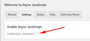
and now your special heading works correctly.Best regards,
MikeHey Pim Zwager,
You can install woocommerce on your site easily by searching for it in the “Add New” option under Plugins.
There are many options when setting up woocommerce, so please review this video created by a fan on Enfold, it shows how to set it up, step-by-step: https://youtu.be/V00AZ90fC7wPlease ask your developer for your license key, all or our sales and license keys are managed by Theme Forest and we don’t have access to them, nor can we issue new ones.
If you can not reach your developer, you could try contacting Theme Forest and explain your situation, but I’m certain you will need to buy a new license.
The good news is if you do buy a license you will also get 6 months of support on our forum, I recommend upgrading to 12 months of support, it’s only a little more and I’m certain you will find our support a great value.Best regards,
MikeHi,
Thank you for the screenshot, the css above only changes the colors and not height, perhaps it’s a color illusion?
I tried testing with and without the css but I don’t see a change in height, unless I’m looking at the wrong area.
I made a video of my test to show what I mean. Please see video link in the Private Content area.To make the header background a darker white please try changing the “0.7” to a higher number.
.header_color .header_bg, .header_color .main_menu ul ul, .header_color .main_menu .menu ul li a, .header_color .pointer_arrow_wrap .pointer_arrow, .header_color .avia_mega_div, .header_color .av-subnav-menu > li ul, .header_color .av-subnav-menu a {
    background-color: rgba(255, 255, 255, 0.7) !important;
}
But I found the header to see when scrolling over a white area of your site, perhaps try testing a lighter black will help?
.header_color .header_bg, .header_color .main_menu ul ul, .header_color .main_menu .menu ul li a, .header_color .pointer_arrow_wrap .pointer_arrow, .header_color .avia_mega_div, .header_color .av-subnav-menu > li ul, .header_color .av-subnav-menu a {
    background-color: rgba(0, 0, 0, 0.3) !important;
}
To make the phone text white, please try this css:
.phone-info {color: #fff !important;}To hide the top bar borders, please try:
#top .social_bookmarks li,#top .av_header_transparency #header_meta {
    border-right-style: none !important;
    border-bottom: none !important;
}
Best regards,
MikeHey Mark,
Please try changing this css:@media screen and (max-width: 1250px) { nav.main_menu { display: none !important; } #advanced_menu_toggle { display: block !important; } }to:
@media screen and (max-width: 1250px) {
nav.main_menu { display: block !important; }
#advanced_menu_toggle { display: block !important; }
}
If this doesn’t help, please include a admin login in the private content area so we can take a closer look.
Best regards,
MikeSeptember 16, 2018 at 7:14 pm in reply to: Mobile: Custom Background Image from Grid Row missing #1010490Hi,
Please try changing the height of the white space separator 300px or 250px
This will force the image full width for mobile screens.Best regards,
MikeSeptember 16, 2018 at 7:04 pm in reply to: A different "Visibility" on posts with the advanced layout editor #1010488Hi,
I took a look at your site to try to assist, and see that your posts with the default editor have a max-width of 600px for the content. I also see that you don’t use any sidebars.
I didn’t find any posts created with advanced layout builder, but understand that you would like to use it to create posts and keep your current 600px centered layout.
You can do this by adding this css to the Enfold Theme Options > General Styling > Quick CSS field:@media only screen and (min-width: 1023px) { #top.single-post .template-page.content.av-content-full.units { max-width: 600px !important; width: 600px !important; } #top.single-post .av_default_container_wrap.fullsize .container:first-child { max-width: 600px !important; } }it will only effect single posts content when viewed on screens larger than 1023px (laptops) just like your current blog posts.

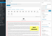
you can also have full width sliders at the top if you wish, just make your post in a text element.
Please note that if you create a post with the advanced layout builder, please don’t try to then edit it with the default editor.
Please try creating a test post using this method and let us know if this works for you.Best regards,
MikeSeptember 16, 2018 at 5:51 pm in reply to: Mobile: Custom Background Image from Grid Row missing #1010473Hey tbraendle,
Please try adding a white space / separator element in the empty grid row with the background image.
This will keep the empty cell from disappearing.
If this doesn’t help, please include a admin login in the private content area so we can take a closer look.Best regards,
MikeSeptember 16, 2018 at 5:46 pm in reply to: Make a category page have a blog post at the top #1010471Hi,
Please try one of these plugins:
WPCustom Category Image
Categories Images
Category and Taxonomy ImageI have not tried these, but I recall another user used one successfully, I just don’t remember which one.
Best regards,
MikeSeptember 16, 2018 at 5:37 pm in reply to: Categories Pages To Show Like I have On Blog Page #1010468Hey wpcupid,
Try adding this code to the end of your functions.php file in Appearance > Editor:add_filter('avf_blog_style','avia_change_category_blog_layout', 10, 2); function avia_change_category_blog_layout($layout, $context){ if($context == 'archive') $layout = 'blog-grid'; return $layout; }Best regards,
MikeSeptember 16, 2018 at 5:33 pm in reply to: Widget Title On Home Page Not Showing White In Footer But It Is For Other Pages #1010465Hey wpcupid,
Your homepage footer widget titles are showing white for me, Please clear your browser cache and check again.Best regards,
MikeSeptember 16, 2018 at 5:26 pm in reply to: Remove featured image link without pointer-event:none #1010463Hey Tom,
Try adding this code to the end of your functions.php file in Appearance > Editor:function remove_featured_image_link(){ ?> <script> (function($){ $(document).ready(function(){ $('.big-preview.single-big a').contents().unwrap(); }); })(jQuery); </script> <?php } add_action('wp_footer', 'remove_featured_image_link');and add this code in the General Styling > Quick CSS field or in the WordPress > Customize > Additional CSS field:
.big-preview.single-big img {
z-index: 0 !important;
}
Best regards,
MikeHi,
Thank you for the login, I did find a missing bracket in the rule above this one. Correcting this error seems to have corrected your font and heading issue.
Please clear your browser cache and check.Best regards,
MikeHi,
Glad we were able to help, we will close this now. Thank you for using Enfold.For your information, you can take a look at Enfold documentation here
For any other questions or issues, feel free to start new threads under Enfold sub forum and we will gladly try to help you :)Best regards,
MikeHey Konstantin,
I took a look at your site and exported your slider to my localhost, were the slider worked fine.
I have also tried matching all of your performance settings, yet I was not able to recreate the error.
The error “Cannot tween a null target” seems to refer to “animating something that does not exists or is invalid” with greensock.js, yet I don’t see that you are using this animation. Do you recall using greenstock on a element?
I found another reference to this and layerslider here.
Please try disabling your plugins to see if this helps.Best regards,
MikeHi,
Perhaps there is a missing bracket or some other error in your Quick CSS, please include a admin login in the Private Content area so we can take a look.Best regards,
MikeHi,
Glad we were able to help, we will close this now. Thank you for using Enfold.For your information, you can take a look at Enfold documentation here
For any other questions or issues, feel free to start new threads under Enfold sub forum and we will gladly try to help you :)Best regards,
Mike -
AuthorPosts