Forum Replies Created
-
AuthorPosts
-
October 27, 2018 at 4:36 pm in reply to: Google Structured Data hcalender "Location" Error & The Event Calendar #1027083
Hi,
I will ask the rest of the team to take a look for a solution, thanks for your patience.Best regards,
MikeOctober 27, 2018 at 4:06 pm in reply to: Google Structured Data hcalender "Location" Error & The Event Calendar #1027064Hi,
I search the theme files and this markup is in these files:\enfold\config-events-calendar\event-mod-css-dynamic.php \enfold\config-events-calendar\views\single-event-no-mobile.php \enfold\config-events-calendar\views\single-event.php \enfold\config-templatebuilder\avia-shortcodes\magazine\magazine.php \enfold\config-bbpress\bbpress-mod.cssI’m not sure of the result if this code is removed, I recommend you keep copies of the files should removing the code cause errors.
Unfortunately this doesn’t look like a easy task, and is beyond our support scopeBest regards,
MikeHi,
Sorry, your links in your post are not working for me, but I worked on this some more and finally got it working very good :)
Still add the ID “main_content” to the first element of content, such as after your slider on each page. To enable the custom ID and class for elements go to Enfold Theme Options > Layout Builder > Show element options for developers
Then use this function instead:function custom_screen_reader_script(){ ?> <script> jQuery(window).load(function(){ jQuery( '<div id="skipnav"><p class="skipnav"><a href="#main_content">Skip to Content (Press Enter)</a></p></div>' ).insertBefore( '#top' ); }); </script> <?php } add_action('wp_footer', 'custom_screen_reader_script');and this css instead:
.skipnav {position: absolute; display: none; text-align: left; margin: 0; padding: 0} /*For all, including Opera. Display:none used to switch off the skip links for Opera users (it's redundant, Opera has excellent keyboard navigation)*/
* html .skipnav {display: block} /*Switch on for IE6 and below*/
*+html .skipnav {display: block} /*Switch on for IE7*/
:root .skipnav {display: block} /*Switch on for Moz, FF and Safari*/
.skipnav p {margin: 5px 0 0 0; padding: 0; position: absolute; font-size: 2em}
.skipnav a {width: 26em; display:block; color: #fff; background: #333; text-decoration: none; padding: 5px; position: absolute; left: -1000em; top: 0; font-weight: bold}
.skipnav a:visited {color: #fff}
.skipnav a:focus, .skipnav a:active {z-index: 999; min-width: 250px; top: -.1em; left: 0; border: solid #777 2px; color: #fff; background: #333 !important} /*Note IE bug that requires use of :active to mimic effect of :focus*/
.skipnav a:hover {cursor: default}
expected results on the second press of the tab key, (WP admin menu has control of the first tab key press, if you are logged in)

adding some color to links that are in focus while tabbing might also be helpfula:focus { color: white !important; background-color: red !important; text-decoration: none !important; }adjust to suit.
I tested this solution, and I was able to continue to tab down the page without ending up in the main menu.
Best regards,
MikeOctober 27, 2018 at 2:38 pm in reply to: Google Structured Data hcalender "Location" Error & The Event Calendar #1027026Hey siteraum,
Sorry for the late reply, please try one these plugins, which will allow you to use and edit the latest json Structured Data.
WPSSO Schema JSON-LD Markup
WP SEO Structured Data Schema
When using these plugins you will want to deactivate Enfold’s “generic HTML schema markup” at:
Enfold Theme Options > Layout Builder > Automated Schema.org HTML MarkupBest regards,
MikeOctober 27, 2018 at 2:11 pm in reply to: attempted to update theme to latest version then crashed #1027018Hi,
If I understand correctly, the site you were have trouble with is solved by changing to PHP 7.2?
That is great news, anything else we can assist with?Best regards,
MikeOctober 27, 2018 at 2:06 pm in reply to: Enfold 4.5 Theme Update "Update Failed: Download failed. A valid URL was not pro #1027016Hi,
Please include the FTP password, I did try your WP password, but it didn’t work.Best regards,
MikeHi,
Glad we were able to help, we will close this now. Thank you for using Enfold.For your information, you can take a look at Enfold documentation here
For any other questions or issues, feel free to start new threads under Enfold sub forum and we will gladly try to help you :)Best regards,
MikeOctober 27, 2018 at 1:50 pm in reply to: Table of Contents Widget: where to choose simple and where elegant style? #1027009Hey Gitte,
Sorry for the late reply, I believe I have tracked this down as an option on the widget that is marked as “ready to test”, but I sent a message to the dev team for clarification. I expect to hear back from them after the weekend, and I will post their reply.
Thanks for your patience.Best regards,
MikeHi,
Since disabling the ModSecurity module did work, then ask your webhost to whitelist the “admin-ajax.php” file from the mod security rule, this way you still have it in place without the error.Best regards,
MikeHi,
@michaelH thanks for assisting, @andressa_mero did correcting the permissions help?Best regards,
MikeOctober 27, 2018 at 5:26 am in reply to: attempted to update theme to latest version then crashed #1026981Hi,
Thank you for sharing your solution, can I ask if you are still able to use PHP Version: 5.5.38, or did you also update it too?
Unless there is anything else we can assist with on this issue, shall we close this then?Best regards,
MikeOctober 27, 2018 at 5:20 am in reply to: Avia Gallery Element always shows Thumbnail after upgrade to version Enfold 4.5 #1026980Hi,
Thank you for pointing this out, I found that in the \enfold\config-templatebuilder\avia-shortcodes\gallery\gallery.css
on line 38 it is:av-hide-gallery-thumbs .av-hide-gallery-thumbs .avia-gallery-thumb{display:none;}where it should be:
.av-hide-gallery-thumbs .avia-gallery-thumb{display:none;}I have reported this and certain it will be corrected.
You could correct your file by removing the first sector or the rule.Best regards,
MikeHi,
If it’s full width then it could be achieved with this css:.avia-builder-el-6:before { content:""; display: block; height: 100%; position: absolute; top: 0; left: 0; width: 100%; background-color: rgba(78, 202, 194,.5) }if it’s not full width then it will be tricky to do so for mobile screens.
Best regards,
MikeHi,
Oh sorry. Can you please include a admin login in the private content area so we can take a closer look.
Also please explain what steps we should take to see this error, such as: create a new test page with the advanced layout builder and publish.
If I understand correctly, you tried disabling your plugins, can we also try this?
Does your webhost error log show any errors when this happens?Best regards,
MikeHi,
Since I didn’t click save last time I decided to give it another try, and this time save and check the page on the front end. But I was able to add a image to the top & bottom editing sections. Please see the screenshot in Private Content area.
I then looked at the page with Chrome Dev Tools, and the only warning I got was that TinyMCE had deprecated.Deprecated TinyMCE API call: <target>.onNodeChange.add(..) wp-tinymce.php?c=1&ver=4800-20180716:11But I did notice the backend sidebar seemed to be shaking a little.
I also tried adding a image to the homepage, and then tested adding images to the product page again with Edge & Firefox. All worked fine.
Sorry I can’t explain why it’s not working for you, and I can’t think for another way to reproduce the error.
Please try again in Chrome and when you get the error press the F12 key, I assume your on Windows, and see what errors are listed in the console, and take a screenshot. Here is an example.
Best regards,
MikeHi,
#cezarneaga I thought you might find the plugin helpful,
It says:Enable skip links with WebKit support by adding JavaScript support to move keyboard focus.
How about something like this, add the ID “main_content” to the first element of content, such as after your slider.
Then try adding this code to the end of your functions.php file in Appearance > Editor:function custom_screen_reader_script(){ ?> <script> jQuery(window).load(function(){ jQuery( '<div><a href="#main_content" class="screen-reader-shortcut">Skip to main content</a></div>' ).insertBefore( '#top' ); }); </script> <?php } add_action('wp_footer', 'custom_screen_reader_script');and add this code in the General Styling > Quick CSS field:
a:focus { color: white !important; background-color: red !important; text-decoration: none !important; }The css will highlight each link as you tab though, and the injected link will be the second link on the page before the navigation menu. I was hoping to hide the link if it was not in keyboard focus with this css:
:NOT(a.screen-reader-shortcut:focus) {
      visibility: hidden !important;
 }
but it doesn’t work, perhaps it’s not needed?
Best regards,
MikeHi,
@elames thank you for the login, I took a look and found that your “PHP Max Upload Size” is 16mb which is too small, Enfold is 16.7mb, please ask you webhost to change it to 20mb, if you include your FTP access I will update it for you, if you wish.
@johpg You will need to update manually, because your theme will not connect to Theme Forest correctly for the new token system, v4.5 will auto update next time.
If you open a new thread and include your FTP access I will update it for you, if you wish. Or you can this:Here are the steps to update with the plugin
*Please ensure your “PHP Max Upload Size” is at least 20mb, because Enfold is 16.7mb.
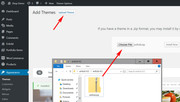
1: please install the plugin: Update Theme and Plugins from Zip File

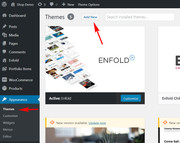
2: then go to WordPress > Themes > Add New > Upload
3: after the install, click “Return to Themes page” (NOT Activate)
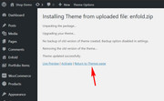
4: success:

Please note that if you update via FTP, you will need to remove the old theme folder “enfold” first (via FTP) then upload the new “enfold” folder at /wp-content/themes/enfold/
Please don’t try to overwrite the theme folder, as this will leave old files behind and cause errors.Best regards,
MikeHi,
@erikstorm_no typically the “installable” theme files download from your Theme Forest account may have the version number listed when you bought the theme, but if you download it, it turns out to be the latest version. To check open the “style.css” file, the third line from the top has the version number.

@elames The way the plugin works is by allowing you to upload a theme though the theme “Install New” function of a theme that is already installed. WordPress won’t let you do this normally. If you use the plugin and install the same theme again it will delete the current one. As long as your upload_max_filesize is larger than Enfold, which is 16.7mb, and your webhost has ZipArchive Extension enabled to extract zip files, which it should.
This is a very easy 3 steps, that is most likely easier than FTP for most clients.Please note that if you update via FTP, you will need to remove the old theme folder “enfold” first (via FTP) then upload the new “enfold” folder at /wp-content/themes/enfold/
Please don’t try to overwrite the theme folder, as this will leave old files behind and cause errors.After this update, going forward, you will be able to use the built-in updater, as the v4.5 corrects the Theme Forest API/Token change.
If you are having issues, please open a new thread, and include your admin login & ftp access in the Private Content area, so we can assist, but as this is not your thread your login info will not be private here.
Best regards,
MikeOctober 26, 2018 at 11:59 am in reply to: fatal error nach update von 4.4.1 auf 4.5 mittels FTP #1026736Hey minogig,
I recommend updating with this plugin, it is very easy. It will require that your PHP MAX UPLOAD is at lest 16.7mb, because that is the size of the Enfold theme.
Here are the steps to update with the plugin to assist.
1: please install the plugin: Update Theme and Plugins from Zip File
2: then go to WordPress > Themes > Add New > Upload
3: after the install, click “Return to Themes page” (NOT Activate)
4: success:
Please let us know if you would like help with this.
Best regards,
MikeOctober 25, 2018 at 9:31 pm in reply to: fatal error nach update von 4.4.1 auf 4.5 mittels FTP #1026565Hey sieglindeB,
Bitte fügen Sie einen Administrator-Login und einen FTP-Zugang im Bereich Privater Inhalt hinzu— Translated with Google —
Please include a admin login & FTP access in the Private Content area
Best regards,
MikeOctober 25, 2018 at 9:23 pm in reply to: horizontal indicator bar on menu – increase its thinkness ??? #1026559Hi,
Glad we were able to help, we will close this now. Thank you for using Enfold.For your information, you can take a look at Enfold documentation here
For any other questions or issues, feel free to start new threads under Enfold sub forum and we will gladly try to help you :)Best regards,
MikeHi,
@rdswestnet
After you update to v4.5 you should be able to update as normal, within the theme. You will need to have a minimum PHP of v5.6, but this has been a requirement for a while & I believe the godaddy managed WP plan has this.
Here are the steps to update with the plugin to assist.
1: please install the plugin: Update Theme and Plugins from Zip File
2: then go to WordPress > Themes > Add New > Upload
3: after the install, click “Return to Themes page” (NOT Activate)
4: success:
or if you start a new thread with your login info for WP & FTP, we can assist with your update.
Best regards,
MikeHi,
I took a look at your page and added a image with the media button, I didn’t save it , but you can see it in the the screenshot in Private Content area.Best regards,
MikeHey Simon,
Here are a couple of articles for adding a toggle elements to your page, mostly you will wrap the content you want to hide in a DIV and then add the javascript to your page. Please look these over and let us know if you have any questions.https://www.w3schools.com/howto/howto_js_toggle_hide_show.asp
https://www.w3schools.com/howto/howto_js_accordion.asp
https://alligator.io/css/collapsible/
Best regards,
MikeOctober 25, 2018 at 7:52 pm in reply to: Avia Gallery Element always shows Thumbnail after upgrade to version Enfold 4.5 #1026510Hey tonyplanet,
I took a look at your page and see the 6 galleries in a grid format, but there are no thumbnails.
Please see the screenshot in Private Content area.Best regards,
MikeHey jb84,
Glad to see you found a solution, perhaps it is a browser extension or a social media script running in the background.Best regards,
MikeOctober 25, 2018 at 7:34 pm in reply to: attempted to update theme to latest version then crashed #1026506Hey codecreative,
I don’t see a error on your site so I assume this is from your error log, I see that you are using PHP Version: 5.5.38, and version 5.6 is the recommended minimum, please update to v7
Also I assume that you updated via FTP, Please note that if you updated via FTP, it is very important that you had removed the old theme folder “enfold” first then uploaded the new “enfold” folder at /wp-content/themes/enfold/
Please don’t try to overwrite the theme folder, as this will leave old files behind and cause errors.If you had overwritten the theme folder, please try updating again and delete the old theme folder first.
Best regards,
MikeOctober 25, 2018 at 6:47 pm in reply to: horizontal indicator bar on menu – increase its thinkness ??? #1026489Hey tommyt,
Please try this code in the General Styling > Quick CSS field:.avia-menu-fx { height: 4px !important; }please adjust the number to suit, 2px is the standard.
If this doesn’t help please include the url to the page in question so we can take a closer look.Best regards,
MikeHi,
I did some more research and found this plugin have you tried this?Best regards,
Mike -
AuthorPosts