Forum Replies Created
-
AuthorPosts
-
Hi,
Thank you for the login, I see that the posts, categories, and portfolio items don’t show. But I found no errors in the background, but I did notice that when viewing the source code of the pages, your link titles are:& 13and such, this makes me think that html code has been added to the titles which can cause errors. When I clicked on these titles I got a 500 server error.
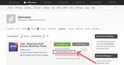
I exported your content and imported it to my localhost and while some of your posts came though, your portfolio items had this text:The Dmedia template is a creative design retina ready and 100% responsive design portfolio template coded with HTML5 & CSS3 and Bootstrap 3. It is the an amazing template for anyone showcase your portfolio items or application works.do you know what this is referring to?
I have included the export file in the Private Content area, should you want to try importing it on a localhost to recover your content.
Sorry without useful error messages I’m not sure how to fix. Try asking your webhost to look at the server error logs for clues about the 500 server error.
Sorry I wish I had a solution for you.Best regards,
MikeNovember 11, 2018 at 9:40 pm in reply to: Help: ugly overlays on linked images and slider images since update Enfold 4.5 #1032353Hi,
Thank you for sharing your solution, this is indeed a new feature.
Unless there is anything else we can assist with on this issue, shall we close this then?Best regards,
MikeHi,
Glad we were able to help, we will close this now. Thank you for using Enfold.For your information, you can take a look at Enfold documentation here
For any other questions or issues, feel free to start new threads under Enfold sub forum and we will gladly try to help you :)Best regards,
MikeHey frankster1234,
I took a look at your page and it seems that the media query rules are not being triggered, Can you please include a admin login in the private content area so we can take a closer look.Best regards,
MikeHey Eric,
Please try this code in the General Styling > Quick CSS field:#main .content p a { font-weight: bolder !important; color: #491291; }If this doesn’t help please include the url to the page in question so we can take a closer look.
Best regards,
MikeHey kostertje,
Can you please include a admin login in the private content area so we can take a closer look.Best regards,
MikeNovember 11, 2018 at 8:36 pm in reply to: I accidentally deleted the theme on the dashboard #1032312Hey Karola_Woll,
Please go to your Theme Forest account and download the “Installable WordPress file only”. This will download the zip file for your theme.
Best regards,
MikeHi,
Glad Rikard could help, unless there is anything else we can help with on this issue, shall we close this then?Best regards,
MikeNovember 11, 2018 at 8:28 pm in reply to: Woocommerce Product Page does not show bulllet points #1032304Hey WebManager11,
I tested on my localhost with v4.5 , but I didn’t find any issues:
But if you are having issues, then please try this css in your Quick CSS or in the WordPress > Customize > Additional CSS field:.woocommerce .single-product-summary ul { list-style: disc !important; }If this doesn’t help please include the url to the page in question so we can take a closer look.
Best regards,
MikeHey ninjata12,
Here are the steps to update with the plugin
*Please ensure your “PHP Max Upload Size” is at least 20mb, because Enfold is 16.7mb.
First go to your Theme Forest account and download the “Installable WordPress file only”.
1: please install the plugin: Update Theme and Plugins from Zip File

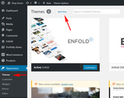
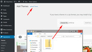
2: then go to WordPress > Themes > Add New > Upload
3: after the install, click “Return to Themes page” (NOT Activate)
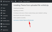
4: success:

Best regards,
MikeHey joeydrums,
Gehen Sie zu Ihrem Theme Forest-Konto und laden Sie die “Nur installierbare WordPress-Datei” herunter. Dadurch wird die ZIP-Datei für Ihr Design heruntergeladen.
— Translated with Google —
Please go to your Theme Forest account and download the “Installable WordPress file only”. This will download the zip file for your theme.
Best regards,
MikeHey ugurarslan,
Thank you for using Enfold, the layerslider that is bundled with enfold doesn’t need to be activated to work or to be used.
You may see that there is a update available, but you can’t update the bundled layerslider, it is updated when the theme is updated.Best regards,
MikeNovember 11, 2018 at 7:35 pm in reply to: Instagram and Invalid Data error, some new questions #1032281Hey likegluelikecrew,
If you are using version 4.0.7, then your best option is to manually update to version 4.5, the files for the fix will be included. First go to your Theme Forest account and download the theme zip file, “enfold.zip”
Then please ensure your “PHP Max Upload Size” is at least 20mb, because Enfold is 16.7mb.1: please install the plugin: Update Theme and Plugins from Zip File
2: then go to WordPress > Themes > Add New > Upload
3: after the install, click “Return to Themes page” (NOT Activate)
4: success:
Best regards,
MikeNovember 11, 2018 at 7:23 pm in reply to: Reverse the Next/Previous navigation tabs for Portfolio Items #1032273Hey ashforthmarketing,
Please try this solutionBest regards,
MikeHey ezvisa,
Can you please include a admin login in the private content area so we can take a closer look.Best regards,
MikeHi,
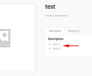
Sorry for the late reply, thank you for the screenshot. To create columns inside the promo box, wrap your text with a class such as “promo-column” you can do this by switching to the text tab when editing the content and using this code:<div class="promo-column">Your content here.</div>Then add this code in the General Styling > Quick CSS field:
.promo-column {
  -webkit-columns: 3 50px;
  -moz-columns: 3 50px;
  columns: 3 50px;
  -webkit-column-gap: 2em;
  -moz-column-gap: 2em;
  column-gap: 2em;
}
Here’s a screenshot of the results:

You can read more about this and the optionsBest regards,
MikeNovember 11, 2018 at 6:24 pm in reply to: Featured image slider, The Events Calendar and custom post type support #1032253Hi,
Thank you for pointing this out and setting up a testing site, I have reported this to the dev team, please try leaving the testing site up a couple more days so the dev team can investigate.Best regards,
MikeHi,
Glad we were able to help, we will close this now. Thank you for using Enfold.For your information, you can take a look at Enfold documentation here
For any other questions or issues, feel free to start new threads under Enfold sub forum and we will gladly try to help you :)Best regards,
MikeHi,
Oh I see, I thought with the arrows in the image, it meant to push to the left.
Please try this code in the General Styling > Quick CSS field:#top.home .av_two_third.avia-builder-el-2,#top.home #av-layout-grid-2 .avia-builder-el-10,#top.home #av-layout-grid-3 .avia-builder-el-13 { padding-left: 50px !important; }Please clear your browser cache and check.
Best regards,
MikeHi,
Glad we were able to help, we will close this now. Thank you for using Enfold.For your information, you can take a look at Enfold documentation here
For any other questions or issues, feel free to start new threads under Enfold sub forum and we will gladly try to help you :)Best regards,
MikeHi,
Sorry to hear that, I’m asking the rest of the team for some help with this, thanks for your patience.Best regards,
MikeHi,
Glad we were able to help, we will close this now. Thank you for using Enfold.For your information, you can take a look at Enfold documentation here
For any other questions or issues, feel free to start new threads under Enfold sub forum and we will gladly try to help you :)Best regards,
MikeHi,
I would like to help with a slide out sidebar, it sounds like a great solution, but unfortunately it’s going to take more coding and time than what I can do here, thanks for your understanding.
I did find a great article with code snippets for a sidebar slide out which may help. Also I recommend looking for a plugin that will do this.
I can help with some css to adjust your sidebar and content for smaller mobile screens, I found that there is actually plenty of room on your site for the sidebar between 480px & 879px, so please try this css:@media only screen and (min-width: 480px) and (max-width: 767px) { .responsive #top #wrap_all .container .av-content-small { width: 60% !important; } .responsive #top #main .sidebar.smartphones_sidebar_active { width: 40% !important; clear: none !important; } } @media only screen and (min-width: 767px) and (max-width: 879px) { .responsive #top #wrap_all .container .av-content-small { width: 70% !important; } .responsive #top #main .sidebar.smartphones_sidebar_active { width: 30% !important; clear: none !important; } }If you try this code, Please clear your browser cache and check.
Best regards,
MikeHi,
Please try this code in the General Styling > Quick CSS field:.av-masonry-entry .av-masonry-entry-title { font-size: 10px !important; } div .mfp-title { font-size: 10px !important; }The first rule is for the thumbnail titles, and the second rule is for lightbox titles.
Best regards,
MikeHi,
I tried using a VPN in Germany and I was able to login to your site.
I came up with a way to move your language selector below your menu, it looks like it’s down a little more than you wanted, but that’s because of how tall the menu items are (90px), if we adjust the height the language selector will move up some.
Try adding this code to the end of your functions.php file in Appearance > Editor:function custom_script(){ ?> <script> jQuery(window).load(function(){ jQuery( "#avia2-menu" ).insertAfter( "#avia-menu" ); }); </script> <?php } add_action('wp_footer', 'custom_script');and add this code in the General Styling > Quick CSS field:
#avia2-menu {
float: right !important;
}
#header_meta {
display: none !important;
}
Please see the screenshot in Private Content area, and Please clear your browser cache and check after adding the code.
Best regards,
MikeHi,
I see, thanks for the images, I went ahead and installed the demo on my localhost, along with the events calendar, and the post nav didn’t show until I added this code into my functions.php:add_filter( 'avia_post_nav_entries', 'enfold_customization_postnav', 10, 2); function enfold_customization_postnav($entries, $settings) { $entries['next'] = get_next_post($settings['same_category']); $entries['prev'] = get_previous_post($settings['same_category']); return $entries; }Please ensure your events have categories, and if it doesn’t work try adding the same categories to your events.
Best regards,
MikeNovember 10, 2018 at 9:12 pm in reply to: How to change main menu link color on individual blog pages #1032100Hi,
Glad we were able to help, we will close this now. Thank you for using Enfold.For your information, you can take a look at Enfold documentation here
For any other questions or issues, feel free to start new threads under Enfold sub forum and we will gladly try to help you :)Best regards,
Mike -
AuthorPosts