Forum Replies Created
-
AuthorPosts
-
Hi,
Thank you, please try this code in the General Styling > Quick CSS field or in the WordPress > Customize > Additional CSS field:.entry-content-wrapper.container_wrap { min-height: 90vh !important; }this will give the content area a 90% visual height, if it’s changed to 100vh the “socket” aka footer, will be below the bottom of the screen. This can be used for all of the pages because it sets the “minimum” height, which will allow for some pages to be larger.
Another option is this:#socket { position: fixed; bottom: 0; }we would have to assign this to only certain pages, because if the page is larger it will bring the socket up in to view. But some people like this because they put “call to action” links or info in the socket.
Best regards,
MikeHi,
Please try contacting Envato support, the licensing, registering, and security is handled by them.Best regards,
MikeHi,
Thanks for the additional screenshots, I didn’t see anything else to check. When I checked your site though I did see that you have mixed content errors on 10 images, which could be the issue. Please see the screenshot in Private Content area.
The easiest way to fix this is to use the Really Simple SSL plugin.
Please try this out.Best regards,
MikeNovember 27, 2018 at 2:56 am in reply to: Mailchimp thank you page is opening in the lightbox #1037897Hi,
Thanks for the login, I wanted to give you a update, I have tried a few approaches to this, without luck so far, but I would like to research some more on this.
Thanks for your patience.Best regards,
MikeHi,
Please register here kriesi.at/support/register with your item purchase code .Go to https://kriesi.at/support/ select the theme you purchased bookmark the URL.
Example: https://kriesi.at/support/enfold
Scroll to the bottom of the page to open a new ticket.
Best regards,
MikeHi,
Once you install it go to: Enfold Theme Options > Demo Import > Import demo files and there is a list of the demos with thumbnails of each one, you can click to install the demo of your choice.
If you are still having trouble please include a admin login in the private content area so we can take a closer look.Best regards,
MikeHi,
I would try the ones checked, and also look on the other tabs.
Please include the url to your site in the Private Content area, so we can examine further.
Does your site have SSL (https)?
Best regards,
MikeHey Andrea,
Please include the url to the page in question so we can take a closer look.Best regards,
MikeHey Max,
Ich habe mir Ihren Einkaufswagen angesehen und die Schaltflächen in einer Reihe angeordnet. Versuchen Sie es mit diesem Code im Feld Allgemeines Styling> Schnelles CSS oder im Feld WordPress> Anpassen> Zusätzliches CSS :.wc-proceed-to-checkout a.checkout-button.wc-forward,.wc-proceed-to-checkout a#woo_pp_ec_button { display: inline-block !important; } .wcppec-checkout-buttons__separator { width: 50px !important; display: inline-block !important; vertical-align: middle !important; } .wc-proceed-to-checkout .woo_pp_cart_buttons_div { width: 220px !important; vertical-align: middle !important; }Um den Text von “- or -” zu ändern, fügen Sie diesen Code am Ende Ihrer Datei “functions.php” in Appearance> Editor ein:
function custom_script(){ ?> <script> jQuery(window).load(function(){ jQuery(".wcppec-checkout-buttons__separator").text("- @ -"); }); </script> <?php } add_action('wp_footer', 'custom_script');Bitte passen Sie das “- @ -” im Code an.
— Translated with Google —
I took a look at your cart and to line the buttons up, Please try this code in the General Styling > Quick CSS field or in the WordPress > Customize > Additional CSS field:
.wc-proceed-to-checkout a.checkout-button.wc-forward,.wc-proceed-to-checkout a#woo_pp_ec_button { display: inline-block !important; } .wcppec-checkout-buttons__separator { width: 50px !important; display: inline-block !important; vertical-align: middle !important; } .wc-proceed-to-checkout .woo_pp_cart_buttons_div { width: 220px !important; vertical-align: middle !important; }Then to change the text of “- or -” Try adding this code to the end of your functions.php file in Appearance > Editor:
function custom_script(){ ?> <script> jQuery(window).load(function(){ jQuery(".wcppec-checkout-buttons__separator").text("- @ -"); }); </script> <?php } add_action('wp_footer', 'custom_script');please adjust the “- @ -” in the code.
Best regards,
MikeHi,
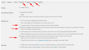
Thanks for the login, I took a look and tried adjusting your page font at the general options:
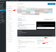
But after disabling the Enfold Theme Options > Performance > JS & CSS file merging and compression and clearing your cache the new font showed.
before:
after:
Please keep in mind that the “JS & CSS file merging and compression” is like a cache, in the since that it’s an external file that is not directly changed by the theme, to generate a new file the system options need to be saved, and it may help to turn off the compression, save the settings, then turn the compression back on to create the new file.
Please give this a try and let us know if there is there anything else we can assist with on this.Best regards,
MikeHey adiwarsaw,
I took a look at your site & checked out your pages but didn’t find a example of a page with little content.
Please link to one.
Basically we have two options, we can write some code to give your pages a minimum height, just below “the fold” aka, below the bottom of the screen, which I can adjust to a few device resolutions, or for some pages we can set the footer to be fixed to the bottom of the screen.
Do you have a preference for these solutions?Best regards,
MikeHi,
Glad we were able to help, and thanks for the kind words :) we will close this now. Thank you for using Enfold.For your information, you can take a look at Enfold documentation here
For any other questions or issues, feel free to start new threads under Enfold sub forum and we will gladly try to help you :)Best regards,
MikeHey ClairePitts,
To change the demo, please install the “wp-reset” plugin, it will reset your WordPress back to the first run state. Please note you will lose all content and settings.
Then use the “import demo” option to install your new demo. Then Please clear your browser cache and check.
If you are still having trouble please include a admin login in the private content area so we can assist, also let us know which demo you would like.Best regards,
MikeHey Leilani,
Thank you for contacting us, the Enfold Law Demo is a demo within Enfold, please purchase Enfold from Theme Forest and after you install it you will be able to choose the Law Demo
I would recommend checking the box “Extend support to 12 months” when you order to get a full year of our famous support at a supper value price that you won’t get later, after the Black Friday sale.Best regards,
MikeHi,
Your css rules hide the homepage sidebar for mobile, Please try this code in the General Styling > Quick CSS field or in the WordPress > Customize > Additional CSS field to show it:@media only screen and (max-width: 767px){ .responsive .template-blog .blog-meta, .responsive .post_author_timeline, .responsive #top #main .sidebar { display: block !important; } #top #main .sidebar { overflow: visible !important; } }Best regards,
MikeHi,
Glad to hear, unless there is anything else we can help with on this issue, shall we close this then?Best regards,
MikeHi,
Yes I would recommend trying a caching plugin that will create a html copy of your site which will be easier for the in-app browsers to read. This will include the images. Here is a list I found for you. It looks like WP Super Cache: generates static HTML files from your dynamic WordPress blog and caches it instead of the WordPress PHP scripts
which sounds like it may help, please give it a try.Best regards,
MikeHi,
I have taken a look at your site and css, in your custom css you have this code:/* Contactform text color */ #top .main_color .input-text, /* #top .main_color input[type='text'], */ #top .main_color input[type='input'], #top .main_color input[type='password'], #top .main_color input[type='email'], #top .main_color input[type='number'], #top .main_color input[type='url'], #top .main_color input[type='tel'], #top .main_color input[type='search'], #top .main_color textarea { color: white !important; } #top .main_color select { color: black !important; }the issue is this line:
#top .main_color textarea { color: white !important; }please change the color to black.
Then clear your browser cache and any cache plugin, and check.
If this doesn’t help, please include a admin login in the private content area so we can adjust for you.Best regards,
MikeHey nuncer,
Sorry for the late reply, I see that you have rolled back to v4.4, did you try using this plugin to update?
Please note that if you update via FTP, you will need to remove the old theme folder “enfold” first (via FTP) then upload the new “enfold” folder at /wp-content/themes/enfold/
Please don’t try to overwrite the theme folder, as this will leave old files behind and cause errors.
If you include ftp access we can try updating your site for you. Please ensure that you create a full backup, because this is a good practice.Best regards,
MikeHey Maskenzauber,
Ok, no css, please go to: \enfold\framework\php\class-framework-widgets.php
line 1452 and find:if( ! in_array( $instance[ $key ], array( 'popular', 'recent', 'comments', 'tagcloud' ) ) )and modify to look like:
if( ! in_array( $instance[ $key ], array( 'popular', 'recent' ) ) )unfortunately there is not a hook to use to add modifications to your functions.php, so you would have to copy the function from the file to your functions.php, which would be most of the page. Or you could add a copy of the file to your child theme folder.
Here is how to add the file to your child theme adjust the instructions for this file.Best regards,
MikeHey vnfan,
I have taken a look at your site at see your text block element with the H4, content, & button,
but I don’t understand why you are using in-line style and css in your stylesheet?
I believe that you want your button to the left under your content, but you have it wrapped in “text-align: right;” and the button is “position=’right'” please remove the text-align: right; and change the button to “position=’left'”
Please let me know if I have misunderstood your request, or if I can be of more help.Best regards,
MikeHi,
When you want to override your theme with another you will need to install the plugin “wp-reset” and reset your site, and then reinstall the new demo.
Please note you will lose your content and settings.
We could help, but we will need a password to login. Please include one in the Private Content area.Best regards,
MikeHey dancedojo,
Thank you for the login, I download your “dance & numbers” zip and tested it on my localhost, which worked fine, then I cleared your “LiteSpeed Cache Purge” in your top admin bar, then I went to your “testpage” and added a dance icon at the top of your page.
I believe clearing your LiteSpeed Cache did the trick.
Please clear your browser cache and check.Best regards,
MikeHi,
Can you please include a admin login in the private content area so we can take a closer look.Best regards,
MikeHi,
The container that the image is in is not full width, and it is in is also the container of the page, so making it full with also makes your page full width.
Your best option is to remove the image you now have, and try this code in the General Styling > Quick CSS field or in the WordPress > Customize > Additional CSS field:.main_color.container_wrap_first.container_wrap.fullsize{ background: url(https://www.vietnam.destinatour.de/wp-content/uploads/vietnam-reisen-halong-bucht.jpg) center center no-repeat; background-size: contain; }Otherwise this might be another option:
#main .container:first-child {
    max-width: 2200px !important;
    padding: 0px !important;
}
#footer .first {
    margin-left: 150px !important;
    max-width: 20% !important;
}
#footer .av_one_third {
    max-width: 20% !important;
}
Best regards,
MikeHi,
To correct the date background colors, Please try this code in the General Styling > Quick CSS field or in the WordPress > Customize > Additional CSS field:#top select.ui-datepicker-month,#top select.ui-datepicker-year { background-color: #191919 !important; border: 0px none #191919!important; color: #777 !important; }To change the format of the datepicker, Try adding this code to the end of your functions.php file in Appearance > Editor:
add_filter('avf_datepicker_dateformat', 'avia_change_dateformat_cf');
add_filter('avf_datepicker_date_placeholder', 'avia_change_placeholder_cf');

function avia_change_dateformat_cf() { return  'dd / mm / yy'; }
function  avia_change_placeholder_cf() { return  'DD / MM / YY'; }
Best regards,
MikeHi,
Are you using a caching plugin? Some aggressive ones will create a HTML file of your page and serve that first, which the in-app browser should read easily.Best regards,
MikeHi,
Google has said that a site with SSL will be listed more favorable, they didn’t say downgrade. Google is a supporting partner of the free Lets-encrypt service.Best regards,
MikeHey victoria,
I see that the test is not loading your images, css, or scripts, but when I test our online demo all of these load and it passes the mobile test
I believe the main reason your site is not passing is because it is not SSL (https) so the test is not loading your resources.
I recommend adding SSL (https) to your site, many webhosts offer this for free using the Lets-encrypt SSL, please ask your webhost if they support this.
Let us know if you would like a webhost recommendation that supports the free Lets-encrypt SSLBest regards,
Mike -
AuthorPosts