Forum Replies Created
-
AuthorPosts
-
March 2, 2026 at 9:54 pm in reply to: Please help! How do I make Button link, open the side Elfsight Form? #1495674
Hi,
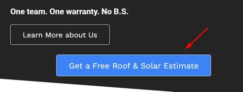
To make it dark, like the one above it, remove these two classes fron the button code: avia-color-theme-color avia-font-color-theme-color and add this one avia-color-light.Best regards,
MikeHi,
Try this css:.page-id-4370 #av_section_2 .iconbox_content_container p { margin: 0; }Then clear your browser cache.
Best regards,
MikeHi,
Glad that we could help, and thanks to Guenni007 for the solution. If you have further questions please open a new thread and we will try to help. Thanks for using Enfold.Best regards,
MikeHi,
Glad that we could help, if you have further questions please open a new thread and we will try to help. Thanks for using Enfold.Best regards,
MikeHi,
Thanks, glad that we could help, if you have further questions please open a new thread and we will try to help. Thanks for using Enfold.Best regards,
MikeMarch 1, 2026 at 10:20 pm in reply to: Scroll Buttons: Multiple CTA buttons scroll to the same form #1495648Hi,
I was not able to login to your site, as the typically login url is not working /wp-admin/ I assume that you have set a custom one.
I tried to recreate your page on my site with five color sections, each 100vh and with a button and a contact form at the bottom. All five buttons work with no bouncing.
Please share your login url and Enable the Avia Layout Builder Debugger to your functions.php file. You may need to scroll the documentation page to the Debug mode section or use the sidebar TOC link.
With this I can copy your page exactly and add it to my test site to see if the same error occurs there.Best regards,
MikeHi,
I can not view your page as it is maintenance mode. You can not use the advanced layer builder on category pages.
But we can change the Prints link in the breadcrumb to your prints page instead of the new prints page that you want to use as a custom category page.
So the first step is to add a new product category “Prints” and make it the parent of any other category that you wish for it to show in the breadcrumb trail.
Then add this code to your child theme functions.php if you are not using a child theme you could use the WP Code plugin then add a new snippet, in the top right corner use the PHP snippet as the code type: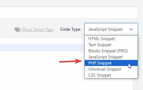 then add the code below and save.
function change_breadcrumb_trail() { ?>
  <script>
document.addEventListener('DOMContentLoaded', function() {
const printsLink = document.querySelector('.breadcrumb-trail a[href="http://enfold.test/product-category/prints/"]');

if (printsLink) {
  printsLink.href = 'http://enfold.test/prints/';
}
});
</script>
  <?php
}
add_action( 'wp_footer', 'change_breadcrumb_trail', 99 );
Ensure that you change the URLs in the code above to your site, and make sure to use the full URL.
Best regards,
MikeHey Munford,
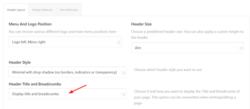
To add breadcrumbs to the category pages go to Theme Options > Header > Header Layout > Header Title and Breadcrumbs
It shows on my site:

Since you are not using the Shop page, try creating a blank “Prints” page and then go to WooCommerce > Settings > Products > General > Shop page and choose it. Then “Prints” will show in the breadcrumbs on the category pages:

and on the product pages:

Or you could add a new product category “Prints” and make it the parent of any other category that you wish:
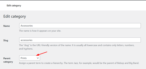
and will also show in the breadcrumbs:

Best regards,
MikeMarch 1, 2026 at 4:08 pm in reply to: CopyTrack wants me to show a license for an image included in the demo #1495638Hey A1city,
The demo images were purchased with an extended license from Photodune.net (the Envato Stock website) with some images from peopleimages.com that are Royalty Free Images. I’m not sure exactly which site that image is from, but I think it’s from Photodune.net due to it’s age.
See this thread: https://kriesi.at/support/topic/abmahnung-wegen-bildrechtverstos/
Kriesi states that his extended license allows end users to use the images in the theme, but not outside the theme.
If you want to have your own license to images on your site for future reference, there are many Royalty Free Images sites, this would also ensure that you site doesn’t look exactly like the demo and other sites that use the same demo. Just a thought.Best regards,
MikeHi,
To shrink the header and logo on mobile scroll I added this css to the end of your Quick CSS field:/* mobile shrinking header */ @media only screen and (max-width: 767px) { #top #header:not(.av_header_transparency) #header_main > .container { height: 70px !important; line-height: 70px !important; } .responsive #top #header:not(.av_header_transparency) .logo img { height: 60px !important; } .responsive #top #wrap_all #header:not(.av_header_transparency) .main_menu { top: -12px; } }adjust to suit.
As for moving the logo up away from the text try this css and adjust to suit:.responsive #top #header .logo img { top: -10px; }but you don’t have much room in the header, so you may need to adjust the previous css that changed the size of the logo to suit, I can not because I don’t see the same as you do, to me it looks like plenty of room:

Best regards,
MikeMarch 1, 2026 at 1:49 pm in reply to: Please help! How do I make Button link, open the side Elfsight Form? #1495634February 28, 2026 at 10:49 pm in reply to: Please help! How do I make Button link, open the side Elfsight Form? #1495631Hi,
Try this css:.avia-button.avia-size-large.av-1b88t-1848646851a5a8989084337c098e76b2 { font-size: 20px; }Best regards,
MikeHey Munford,
It looks like your site is in maintenance, I don’t see a lightbox.Best regards,
MikeHey Munford,
Glad to hear that you sorted it out, if you have further questions please open a new thread and we will try to help. Thanks for using Enfold.Best regards,
MikeFebruary 28, 2026 at 9:56 pm in reply to: Burger and Social Media icons position on Mobile view #1495627Hi,
Glad that we could help, if you have further questions please open a new thread and we will try to help. Thanks for using Enfold.Best regards,
MikeFebruary 28, 2026 at 9:48 pm in reply to: Please help! How do I make Button link, open the side Elfsight Form? #1495626Hi,
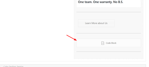
I do not have experience with elfsight, but from examining your button I can tell that there is no direct link to your side form popout, it works via the data-elfsight-show-form attribute:
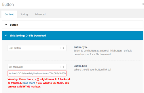
There is not a built-in way to add a data attribute to a button.
So I created a second button for you with your link snippet and the Enfold classes so the style is the same. Please check.Best regards,
MikeHi,
Glad that we could help, if you have further questions please open a new thread and we will try to help. Thanks for using Enfold.Best regards,
MikeHi,
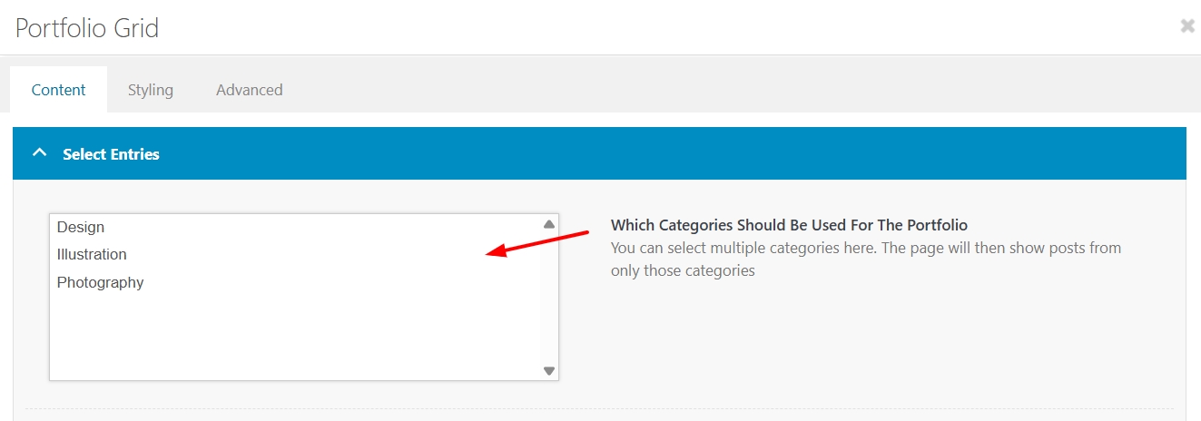
Not sure, perhaps you used a different element than the portfolio grid, but it is only ment to show portfolio categories.So try creating a portfolio category with a portfolio item to show.
Or if you don’t want to try the masonry or blog post element.Best regards,
MikeHi,
Also note that you must have portfolio categories, the portfolio grid will not show post categories.
I’m sure you know that, but just wanted to make sure that we are on the same page.Best regards,
MikeHi,
Thanks, do you have any custom built elements in your child theme? If so switch to the parent theme to see if they are the cause. Otherwise try to disable all of your plugins and check.Best regards,
MikeHey Tilman,
When I check your page the horizontal galleries behave as intended, clicking a image enlarges it until the next one is clicked. It’s true that they stay enlarged. If you want the image size to be restored after 5 seconds, try this function in your child theme function.php file. If you are not using a child theme you could use the WP Code plugin then add a new snippet, in the top right corner use the PHP snippet as the code type:

then add the code below and save.function restore_horizontal_gallery_size() { ?> <script> document.querySelectorAll('.av-horizontal-gallery-wrap').forEach(item => { item.addEventListener('click', function () { clearTimeout(this._galTimer); this._galTimer = setTimeout(() => { this.classList.remove('av-active-gal-item'); }, 5000); }); }); </script> <?php } add_action( 'wp_footer', 'restore_horizontal_gallery_size', 99 );Best regards,
MikeFebruary 28, 2026 at 4:44 pm in reply to: Lightbox Pdf not working – shows up black multiple solutios #1495607Hi,
You have a server error:Failed to load module script: Expected a JavaScript-or-Wasm module script but the server responded with a MIME type of "". Strict MIME type checking is enforced for module scripts per HTML spec.Typically this is an Incorrect Server Configuration: The server is not serving .js or .wasm files with the correct MIME types.
Configure your server to set the proper Content-Type header.
Apache: Add AddType application/javascript .js to .htaccess or httpd.conf
Since each webhost is different, please ask your web host support to help, we are not experts on each host setup.Best regards,
MikeFebruary 28, 2026 at 4:38 pm in reply to: Burger and Social Media icons position on Mobile view #1495606Hey dreyerjm,
Please see our documentation: Add Images to mega menu you may need to scroll to the section, or use the link in the sidebar.Best regards,
MikeHey dreyerjm,
I’m not sure why this is, try this css:.avia-buttonrow-wrap.avia-builder-el-last { clear: left; }Then clear your cache.
Best regards,
MikeHey Luigi,
When I check the changelog it shows February 20th 2026 – Version 7.1.4
Please refer to this one.Best regards,
MikeFebruary 28, 2026 at 3:47 pm in reply to: Please help! How do I make Button link, open the side Elfsight Form? #1495602Hi,
I see that your button is in a text block, the reason that the text is not centered is because it has a
BR before the text, try viewing in the plain text tab of the element and remove the BR
If you can’t find it try this css:.avia_textblock .avia-slideshow-button br { display: none; }Hi,
There is not a setting, you will need to use css. Since I’m not seeing the same as you I had to guess a little, try the following css and adjust to suit:@media only screen and (max-width: 767px) { #top .logo img { max-height: 140px; } #top .logo img { left: 55%; transform: translateX(-50%); } #top .av-burger-menu-main { transform: translateY(-38%) !important; } .av-hamburger-box { width: 50px!important; } .av-hamburger-inner::before{ top: -15px; } .av-hamburger-inner::after { bottom: -15px; } .av-hamburger-inner, .av-hamburger-inner::before, .av-hamburger-inner::after { height: 6px; } }This is how it looks for me with this css:

Best regards,
Mike -
AuthorPosts


