Forum Replies Created
-
AuthorPosts
-
March 31, 2019 at 3:58 pm in reply to: 4.5.5 Fails To Show ANY Custom Background Image at the top of my home page #1085099
Hi,
Sorry for the late reply, for version 4.5.4 please use the Classic Editor and not the block editor, look at the bottom of your “Theme Options” for the option to use the Classic Editor.
Best regards,
MikeHi,
Sorry for the late reply, if I understand you would like to have columns in your sub-menu, but you don’t want to use the mega-menu.
This css will create two columns in a sub-menu:#menu-item-3477 ul.sub-menu { width: 320px !important; } #menu-item-3477 ul.sub-menu li { display: inline-block !important; float: left !important; width: 150px !important; } #menu-item-3477 ul.sub-menu li:nth-child(odd) { float: left !important; margin-right: 10px; width: 150px !important; } #menu-item-3477 ul.sub-menu li:nth-child(even) { float: right !important; width: 150px !important; }you will notice the “menu-item-3477” which you can change, this is a test for your “Obstbrand” sub-menu, just add the css to your Quick CSS and clear your browser cache.
Here’s the results:

Another idea I had was to create a lightbox popup “moral” for the content of the page you linked to.Best regards,
MikeHi,
Glad we were able to help, we will close this now. Thank you for using Enfold.For your information, you can take a look at Enfold documentation here
For any other questions or issues, feel free to start new threads under Enfold sub forum and we will gladly try to help you :)Best regards,
MikeHi,
Glad we were able to help, we will close this now. Thank you for using Enfold.For your information, you can take a look at Enfold documentation here
For any other questions or issues, feel free to start new threads under Enfold sub forum and we will gladly try to help you :)Best regards,
MikeHi,
The way the css for the full width slider is set up it uses !important; in the stylesheet and will be hard to overwrite, an alternative is to use the full width slider for desktops and the full screen slider for mobile, please see the example page I cloned for you at the link in the Private Content area.
You can adjust the font sizes and add the button within the slider.Best regards,
MikeHi,
Glad to hear you have it sorted out, we will close this now. Thank you for using Enfold.For your information, you can take a look at Enfold documentation here
For any other questions or issues, feel free to start new threads under Enfold sub forum and we will gladly try to help you :)Best regards,
MikeHi,
Oh, I guess I misunderstood, please try this css:.tab_titles,.active_tab { background-color: gray !important; } .tab_inner_content p,.tab_inner_content a { font-size: 20px !important; }results:

I would point out that the tabs don’t go to the footer like in your mockup, so you will need to do something else for that.Best regards,
MikeHi,
Sorry for the late reply, Thank you for the FTP access, I uploaded the new theme as “enfold-new” and renamed your current theme to “enfold-old” then renamed the new one to “enfold”. But I got a HTTP ERROR 500, this was your error_log error:[30-Mar-2019 21:52:03 UTC] PHP Fatal error: Call to undefined function apply_filters_deprecated() in /home/pprtwdpz/public_html/wp/wp-content/themes/enfold/framework/php/class-framework-widgets.php on line 2578I switched back to your old theme and removed the widgets from your footer and sidebar, and tried again, and again I got the error. I see all for your plugin were disabled so I don’t know why you got this.
I believe you are going to need to update WordPress first backup your whole site, and remove your widgets and plugins, then try switching to a WordPress core theme and update to v5.1.1 then rename your current theme to “enfold-old” and rename “enfold-new” to “enfold” then activate it, hopefully this will work.I search for this error and only found that it should be a plugin widget, but I had tried removing these.
Please let us know if this works for you.Best regards,
MikeHey Manuela,
Sorry for the late reply, I took a look at your page and the image at the bottom, to make it larger Please try this code in the General Styling > Quick CSS field or in the WordPress > Customize > Additional CSS field:@media only screen and (max-width: 767px) { #top.home #av_section_2 { height: 100vh !important; } }This will make it 100% visual high for mobile devices, please adjust to suit.
Best regards,
MikeHi,
Oh, I see. Please try this code in the General Styling > Quick CSS field or in the WordPress > Customize > Additional CSS field:.sidebar_tab_left .tab_content,.sidebar_tab_left .tab_content,.sidebar_tab_left .tab,.tabcontainer .active_tab_content { box-shadow: -8px 0px 20px -10px rgba(0, 0, 0, 0.2) !important; left: 0; padding: 0px 0 0 30px; border-color: #ebebeb !important; } .main_color div .sidebar_active_tab, div .main_color .tabcontainer .active_tab_content, div .main_color .tabcontainer .active_tab { color: #b0b0b0; background-color: #ffffff !important; border-color: #ebebeb !important; }Best regards,
MikeHi,
Sorry for the late reply, I tried to review the past posts and believe that you want your burger menu & sub-burger menu to show until 1100px, you also want the top-bar menu to show, but you don’t want two burger menus to show at the same time. There is also a slash next to the burger menu, and removing it is for extra points :)
So I believe I have done all of this, I won’t know for sure until you remove the old css.
So please remove and add this:@media only screen and (min-width: 766px) and (max-width: 1100px) { .menu-item { display: block !important; } #avia-menu.av-main-nav li.menu-item-object-page,#avia-menu.av-main-nav li.menu-item-object-custom { display: none !important; } .av-burger-menu-main.menu-item-avia-special { display: block !important; } .av-hamburger:after { display: none !important; } #top #header .av-main-nav > li > a:after { content: none !important; } } @media only screen and (min-width: 989px) and (max-width: 1100px) { .av-logo-container nav.main_menu { display:none !important; } } @media only screen and (max-width: 766px) { #top #header .av-main-nav > li > a:after { content: none !important; } }Best regards,
MikeHi,
Sorry for the late reply, Do you want to add the words “Google Adsense” to your breadcrumbs?
If this is for a post please try adding a category “Google Adsense” and then select it as the parent category

it will then show in your breadcrumbs.Best regards,
MikeHey c_srishti,
Sorry for the late reply, and I’m also sorry to say that this type of filtering is not available, it would require quite a lot of modifications. I can suggest this plugin: Beautiful taxonomy filters which seems like it would do what you are asking.
Please give it a try, or perhaps a similar plugin.Best regards,
MikeMarch 30, 2019 at 8:38 pm in reply to: How can I list posts by category and custom taxonomy? #1084961Hey Martin,
Sorry for the late reply, thank you for the screenshot it helps a lot, so I believe that this solution address your situation.
But this would require rewriting the loop, and it’s a little more than what I’m good at.
But perhaps this plugin would work for you, it seems to do the same.
Have you tried searching for a plugin to do this?
The only other tricky thing I see is your category and taxonomy options below each post. I believe that you could hire someone with more experience to do this quickly on one of the freelancer sites, but sorry I didn’t find any functions that you could add to produce this in Enfold.Sorry, I wish I could have been more help.
Best regards,
MikeHi,
Sorry for the late reply, I took a look at your page and am trying to understand, I see that the images are full screen (cover) which seems larger than the screen, because it’s trying to ensure there are no blank areas.
Would full screen (contain) be better? The difference is that the image will be as large as possible but still fit on the screen, one side (top or sides) may have some space because photo aspects are not the same as screen aspects.
I also notice that the images are not opening in lightbox as in your screenshot, but I guess that is not needed because it’s already full screen, is this correct?
I was going to point out that the lightbox adds some padding to the image so to create the lightbox effect.I guess my question is if you want the images to be contained within the screen so you can see the whole image, and if so do you still want the lightbox? Would it be larger than the screen?
Please remove the css so we can try again.
Best regards,
MikeHi,
Thanks, for some reason I landed on a different page the first time, this makes more since :)
Please try this code in the General Styling > Quick CSS field or in the WordPress > Customize > Additional CSS field:#top.page-id-257 #av_section_1 > div > div > div > div > div.flex_column.av_one_half.flex_column_div.av-zero-column-padding.avia-builder-el-10.el_after_av_one_half.el_before_av_one_half { float:right !important; }Will you want to use this on other pages? If so please add a custom class to the 1/2 column element on the right and I can give you a new css that you can use for all pages.
Best regards,
MikeHi,
Did you try leaving the fields for the size blank and change the drop down to no cropping, and then Regenerate Thumbnails?
As you see from my screenshots above it worked for me.Best regards,
MikeHi,
Glad to hear, thanks for sharing your solution. We will close this now. Thank you for using Enfold.For your information, you can take a look at Enfold documentation here
For any other questions or issues, feel free to start new threads under Enfold sub forum and we will gladly try to help you :)Best regards,
MikeHi,
Sorry for the late reply, I took a look at your gallery and found that it contained the image of the red button “Photos” so I wrote this javascript to remove it from the gallery on page load, now when the lightbox is opened it will not show.
Try adding this code to the end of your functions.php file in Appearance > Editor:function remove_first_image(){ ?> <script> (function($){ $(document).ready(function(){ $( '.avia-gallery-thumb a.first_thumb[data-onclick="1"]' ).remove(); }); })(jQuery); </script> <?php } add_action('wp_footer', 'remove_first_image');If you have this setup on more pages it should work as long as the order of the images are the same. But please check if you have other galleries that this is removing images that you do want to show the first image.
In this case we can modify it to only work on some pages, but I will need to know all the pages you want it to work on and all the pages you don’t want it to work on, and what you expect new pages to be, working or not.Best regards,
MikeHi,
Sorry for the late reply, you can change the size of the image using this plugin: Simple Image Sizes
So I tried to choose the same example post as yours from our demo

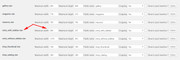
Then I looked for the same image size in the new image size options at WordPress > Dashboard > Settings > Media > Media Settings
The size of both of our images is 845 x 321
Now change it to the size you want it to be, I wanted it you be full size so I left the fields blank and set croping to “No”

Then go to the bottom of the page and “Regenerate Thumbnails”
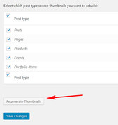
Now my image is full size:

If you change your mind, just enter the old size again and “Regenerate Thumbnails” again.
Please give this a try.Best regards,
MikeHey elzevir,
Sorry for the late reply, I tried to create the same contact form as you described and insert the subject field and the city field as the out going email subject line:
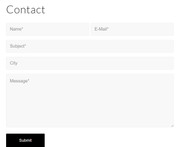
and this is what worked for me, Try adding this code to the end of your functions.php file in Appearance > Editor:add_filter('avf_form_subject','avia_change_mail_subject', 10, 3); function avia_change_mail_subject($subject, $new_post, $form_params) { $subject = sprintf("%s %s", $new_post['3_1'], $new_post['4_1']); return $subject; }If it doesn’t work try changing the field numbers in the code.
Best regards,
MikeHi,
Sorry for the late reply, I have tried to read over your past posts, and I believe that now you are looking to have to your menu items gray before you scroll, right now they are white on white so they won’t show.
I also believe that the 4 pages you listed are the only ones with the issue. Please try this code in the General Styling > Quick CSS field or in the WordPress > Customize > Additional CSS field:#top.parent-pageid-5666 #header.header_color.av_header_transparency .av-main-nav > li > a .avia-menu-text, #top.parent-pageid-5672 #header.header_color.av_header_transparency .av-main-nav > li > a .avia-menu-text, #top.parent-pageid-5659 #header.header_color.av_header_transparency .av-main-nav > li > a .avia-menu-text { color: #a9aab0 !important; }Please try this and check that there are no conflicts with other pages.
Please also clear your browser cache.Best regards,
MikeMarch 30, 2019 at 4:28 pm in reply to: Burger Menu title is transparent so menu scrolls behind title #1084891Hi,
Sorry for the late reply, I have taken a look at your site on mobile and see that your company name is floating in front of the burger menu when it opens. This is because your autoptimize cache has the element “ .logo .subtext” with a z-index of “999”, which is way too high. The solution, as Victoria pointed out, is to set the z-index to “1”
So while I couldn’t override the css in autoptimize with this:@media and only screen and (max-width: 767px) { .logo .subtext { z-index: 1 !important; } }I was able to with javascript, Try adding this code to the end of your functions.php file in Appearance > Editor:
function set_logo_zindex(){
  ?>
  <script>
(function($){
  $(document).ready(function(){
  $('.menu-item-avia-special').click(function(){
  $('.logo .subtext').css({'z-index':'1'});
  });
  });
  })(jQuery);
</script>
<?php
}
add_action('wp_footer', 'set_logo_zindex');
Please see the video in Private Content area.
Please post your admin access if you need a hand adding this to your functions.php
Then Please clear your browser cache and check.Best regards,
MikeHey moonknight066,
Thank you for the link, but I couldn’t login to make the changes. Try adding this code to the end of your functions.php file in Appearance > Editor:function move_shop_content_below_products(){ ?> <script> (function($){ $(document).ready(function(){ $('<div class="container new-woo-container">' ).insertBefore( '#top.woocommerce-page .container_wrap.footer_color' ); $('#top.woocommerce-page .woocommerce-products-header .page-description').appendTo('.new-woo-container'); $('.new-woo-container').css({'margin-bottom': '50px'}); }); })(jQuery); </script> <?php } add_action('wp_footer', 'move_shop_content_below_products');Then clear your browser cache and check.
Best regards,
MikeMarch 30, 2019 at 2:10 pm in reply to: Space after caption + Caption under each photo in Gutenberg Image Gallery #1084868Hey tkumabe,
Please include the url to the page in question so we can examine the elements. I assume when you say that you are using the “Gutenberg” editor you mean that you are not using one of the Advanced Layout Builder elements, in this case the css to move the captions under the images would be similar to what is found here. But we would need to see the page so we can examine the elements to assist with css.Best regards,
MikeHi,
@elituchy thanks for the link, Please try this code in the General Styling > Quick CSS field or in the WordPress > Customize > Additional CSS field:div .logo { position: relative !important; } #header .logo img { margin-top: 0px !important; }Best regards,
MikeHey lmackinnon,
Please like to your page so we can assist with css for your aweber form. Since Enfold may have a few different color schemes, please try adding a Enfold form with the correct colors on a test page for us to see.Best regards,
MikeHey webworm72,
The demo page that you have linked to is created with the Advanced Layout Builder using the “Tabs” element
But since you are asking about the shortcode I assume you are using the WordPress Classic Editor to create your page. In this case you can create the shortcode for the element by using the “Shortcode Wand” and choose “Tabs”
Then when the element editor opens be sure to choose “Display Tabs on the left”
and then add your content to the tabs.
If this doesn’t help, please include an admin login in the private content area so we can be of more assistance.Best regards,
MikeHey macika,
Thank you for the link to your site, but I’m not quite sure I understand as I don’t see a table with icons. Is the link correct?
Perhaps a screenshot of what you are trying to do would help.Best regards,
MikeHi,
Sorry for the late reply, please try using these two functions in your functions.php, it adds the visitor email as the reply-to address://have the visitor address in the Reply-To: header instead of the From: header add_filter('avf_form_from', 'enfold_contact_form_change_from', 10, 3); function enfold_contact_form_change_from($from, $new_post, $form_params) { global $enfold_visitor_from; $enfold_visitor_from = $from; $from = "info@<domain>"; return $from; } add_filter( 'avf_form_mail_header', 'enfold_contact_form_add_replyto', 10, 3 ); function enfold_contact_form_add_replyto( $header, $p1, $p2 ) { global $enfold_visitor_from; $header .= 'Reply-To: ' . $enfold_visitor_from . "\r\n"; return $header; }As I recall you need to use both of these together, so in the top one please edit your “from” address, but you could first try testing just the bottom one as it adds the “reply-to” address.
Best regards,
Mike -
AuthorPosts