Forum Replies Created
-
AuthorPosts
-
Hi,
Thanks for the feedback, I see your new image in the media library with the caption, but the placement doesn’t look correct for my screen resolution I’m using 1536 x 864. So I made a new image for you as an example and cloned your top slider with the new image, and set the screen options to hide your original one. Please clear your browser cache and check the slider now on desktop, and see the “gif” screenshot in the Private Content area, you may need to click it to play the gif.
This demonstrates the basic idea of the solution.Best regards,
MikeHi,
Glad we were able to help, if you have any further questions please create a new thread and we will gladly try to help you. Thank you for using Enfold.Best regards,
MikeHi,
Glad Ismael could help, if you have any further questions please create a new thread and we will gladly try to help you. Thank you for using Enfold.Best regards,
MikeHi,
Glad Nikko was able to help, if you have any further questions please create a new thread and we will gladly try to help you. Thank you for using Enfold.Best regards,
MikeNovember 2, 2021 at 11:41 am in reply to: Setting to hide caption below lightbox doesn't work #1327413Hi,
Glad we were able to help, if you have any further questions please create a new thread and we will gladly try to help you. Thank you for using Enfold.Best regards,
MikeHi,
I had meant in the Quick CSS, but when I logged in and tried it I noticed the icons became smaller so I adjusted to this:#container-icone .icona-social { padding-right: 5px; padding-left: 5px; height: 40px; width: 50px; }Please see the screenshot in the Private Content area of the before & after and clear your browser cache and check.
Best regards,
MikeHey gdsconcepts,
Thank you for the link to your site, unfortunately, you can not effectively make the caption of your slider fixed, you could take a screenshot of your slider with the caption and then use that image as the background image and remove the slideshow caption, but then you won’t have the animation of the caption.
For your second issue to match the header to your desktop view please try this code in the General Styling ▸ Quick CSS field or in the WordPress ▸ Customize ▸ Additional CSS field:@media only screen and (max-width: 767px) { #top #wrap_all #main { margin-top: -82px; } }below is a screenshot of the expected results.
After applying the css, please clear your browser cache and check.Best regards,
MikeHey ebrupa,
Thank you for the link to your site but we can not see the issue because we do not have a login, but I see that you are using Enfold v4.8.2 which had an issue with the new widgets block. Please update to v4.8.7 to correct.Best regards,
MikeHi,
Glad Rikard could help, if you have any further questions please create a new thread and we will gladly try to help you. Thank you for using Enfold.Best regards,
MikeHi,
To increase the space between them you would add padding like this:.icona-social { padding-right: 5px; padding-left: 5px; }Best regards,
MikeHey alliansohog,
Thank you for the link to your site, as I understand what you want, you have one blog element at the top showing a full post and another blog element at the bottom showing a grid of 3 posts with pagination, you would like to click on a post from the grid to show the full content in the top post without leaving the page. Unfortunately you can not do that with your current elements. But you could do something similar with the Portfolio Grid Element and choose the Open a preview of the entry (known as AJAX Portfolio) option.

The only issue is that you would have to convert your posts into portfolio item to use this element, which should not be hard.
If you try this please note that this element shows the content from the lower part of the portfolio, under Ajax Portfolio Preview Settings so that is where you will want to add your “post” see the red boxed area in this screenshot.

Best regards,
MikeHi,
I’m surprised that OVH can’t update your PHP to v7.4 when most sites are now using v8.0.12
Your Google Maps was disabled in the theme settings so that caused the error with the footer, I corrected it, but you will need to add your Google Maps API.
I changed the test page form to send to my test email address then I installed the WP Mail Log plugin to check if the form is sending an email, and my test email was logged, you can see in the admin panel

I also tested your contact page form and it also logged. So at this point you could try setting up your WordPress email to use SMTP with the plugin WP Mail SMTP this would make your site use your own SMTP server instead of the PHP mail, there is a good chance this will work.Best regards,
MikeHey amollde,
Sorry but we don’t have a merging option, but you can import the health coach icons in the Enfold Theme Options ▸ Import/Export ▸ Iconfont Manager with the zip linked below.Best regards,
MikeHey Lautho2011,
Please try this code for the H1 tag in the General Styling ▸ Quick CSS field or in the WordPress ▸ Customize ▸ Additional CSS field:#main h1 { letter-spacing: 4px; }Feel free to adjust the spacing and add more tags for other headings as desired.
After applying the css, please clear your browser cache and check.Best regards,
MikeOctober 31, 2021 at 8:09 pm in reply to: Youtube Video url is not working and Video is not showing up #1327219Hi,
Your version is probably still using the old Envato API for licensing which no longer works, you need to get a Envato Token for the update notification to work. So you will need to go to your Theme Forest account and download the latest version 4.8.7 and upload it to your themes, WordPress will ask you if you want to update, here is an example of the screen you will see.

Best regards,
MikeHey kwtakis,
Thank you for your question, if the site is using WordPress v5.5+ then you should be able to update via the theme uploads option. If not then this will not work and you will need to update via FTP, look for the “enfold” folder at /wp-content/themes/enfold/ and rename to “enfold-old” then upload the new version as the folder “enfold”
Please don’t try to overwrite the theme folder, as this will leave old files behind and cause errors.
Once you have cleared your browser cache and tested that your site is working correctly, you can delete the old folder “enfold-old”.
If for some reason you want to go back to the old version, simply remove the new folder and change the name of “enfold-old” back to “enfold”.
I would recommend that you create a full backup using your webhost backup tools, if you have a one click staging site option then use this to test to update first to ensure any customization or plugins won’t cause a conflict. This is a option in most cPanels to create a staging clone of your site so you can test on it and your site will stay up and running. You can always ask your webhost to help you with setting this up if you want.Here are some screenshots of what it would look like:


I don’t believe you will have any issues updating, but it is better to be safe than sorry.Best regards,
MikeHey SHO UCHIYAMA,
Thank you for your question, please see our Enfold Spa Demo or perhaps our Enfold Health Coach. You can also see all of our demos here.
All of these demos are available for import in the Enfold ThemeBest regards,
MikeHey photographie-tous-azimuts,
Thank you for the screenshots, please see our sticky post: Extra padding in Grid Row cells after updating to 4.8.7 I believe this will solve your issue.Best regards,
MikeHi,
Glad we were able to help, if you have any further questions please create a new thread and we will gladly try to help you. Thank you for using Enfold.Best regards,
MikeHi,
Thank you for the login, I see that you are using Enfold v4.2, this is quite old and is a pre WordPress v5 release, please update to v4.8.7. Please note that Enfold v4.2 used the old Envato API for licensing which no longer works, so you will need to login to your Theme Forest account and download the latest version of Enfold and manually update by installing the zip file via the WordPress install new theme button, WordPress will ask you if you want to update and then update for you. Here is an example of the message you will see.

I also note that your server is using PHP v7.3.31, WordPress recommends a minimum of v7.4 please ask your webhost to help you update this, please note that WordPress uses PHP for the mail system so please update this.
After you do this your email should work, if not we will take another look.Best regards,
MikeHi,
Glad to hear that you were successful after enabling the PHP ZipArchive Extension on your server, I took a look and your demo seems to have installed well, I note that your homepage is in the trash ut assume that you are now working on the site as your other pages are working fine.
If you have any further questions please create a new thread and we will gladly try to help you. Thank you for using Enfold.Best regards,
MikeHi,
Glad to hear, I will let our team know. If you have any further questions please create a new thread and we will gladly try to help you. Thank you for using Enfold.Best regards,
MikeHi,
From the admin menu you can choose WordPress ▸ Appearance ▸ Theme Editor

then you can choose the functions.php from the file list

Best regards,
MikeHi,
Glad we were able to help, if you have any further questions please create a new thread and we will gladly try to help you. Thank you for using Enfold.Best regards,
MikeOctober 31, 2021 at 2:39 am in reply to: hotspot, image slider not working, google map not working either #1327157Hey kailibuy,
Thank you for the link to your site and the screenshots but your pages seem to be working for me, please see the screenshots in the Private Content area.
Perhaps try clearing your browser cache and checking again, can you include screenshots of the frontend so we can see your error?Best regards,
MikeHey Eldamhogy,
Thank you for the link to your site, I can help you import the 2017 demo, but you can only import one demo at a time as the demos overwrite each other. Please include FTP access in the Private Content area and ask your webhost to enable PHP ZipArchive Extension, I see it’s disabled on your server. Please note that I will need to reset your site and your current settings will be lost.
Please disable all of your plugins especially “Limit Login Attempts Reloaded”, thank you.Best regards,
MikeHey LesleyJean,
Thanks, but I’m not sure why this would be an issue for your site now, the grid_row.css has a 30px padding on line 5
.flex_cell{display: table-cell; padding:30px; vertical-align: top; }
going back to at least v4.7.5, probably further, so this is not new.Best regards,
MikeHey keep12,
Thank you for the link to your site, please try this code in the General Styling ▸ Quick CSS field or in the WordPress ▸ Customize ▸ Additional CSS field:.menu-item-has-children ul{ max-height:450px; overflow:auto; }After applying the css, please clear your browser cache and check.
Best regards,
MikeOctober 31, 2021 at 1:17 am in reply to: can't figure out how to change bolded text color in main content area #1327152Hi,
Glad we were able to help, if you have any further questions please create a new thread and we will gladly try to help you. Thank you for using Enfold.Best regards,
MikeHey kowalski,
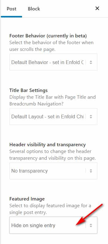
Thank you for the link to your site it looks like your featured images have a 16:9 aspect ratio (702×395) but the thumbnails need to be more square 206×166, thus the cropping.
One way around this would be to use featured images that are more square and would show on your blog page correctly and then hide the featured image on the post itself and use your full-sized image instead.
That is you would manually add your full-sized image at the top of your post and use the option to hide the featured image on the post:
Best regards,
Mike -
AuthorPosts