Forum Replies Created
-
AuthorPosts
-
Hey elisa_polidori,
If you would like to change the Masonry Gallery “Load More” button text to “See all photos”, try adding this code in the General Styling ▸ Quick CSS field or in the WordPress ▸ Customize ▸ Additional CSS field:#top #main a.av-masonry-pagination.av-masonry-load-more { font-size: 0px; } #top #main a.av-masonry-pagination.av-masonry-load-more:before { content:"See all photos"; font-size: 13px; }After applying the css, please clear your browser cache and check.
Best regards,
MikeJanuary 17, 2022 at 1:27 pm in reply to: Problem Fußzeile und Hauptmenu nach Aufruf Impressum/Datenschutz #1335861Hi,
Sorry, I don’t understand, is this a new topic?
There are plugins to duplicate pages, but if all the pages are clones you would not need to change the menu, just add your additional menu items.
I don’t understand your goal.Best regards,
MikeHey RaymondWillemse,
Please see this solution in our documentation.Best regards,
MikeJanuary 17, 2022 at 12:38 am in reply to: Sidebar not showing up on WooCommerce category page #1335800Hi,
Thanks for the test site, I see that the sidebar shows in post categories, posts, pages, products, but not product categories?
I tried switching to your parent theme and that didn’t help, but when I exported your content to my localhost the sidebar worked on product categories.
I tried updating your parent theme but that didn’t help either, so I’m stumped.
I’ve asked the rest of the team if they have any ideas, can you enable the theme editor so we can investigate further?Best regards,
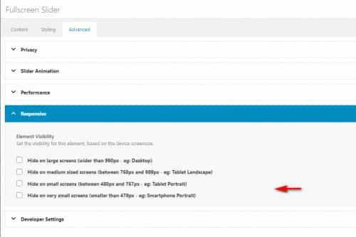
MikeJanuary 16, 2022 at 11:55 pm in reply to: Full width layer slider on mobile devices max height #1335796Hi,
Perhaps I misunderstand your goal, the slider you are using is the full slider so it is meant to be this large for desktops, if you want to use the css with the script you can, I was trying to help correct the issue with the other device sizes and had hoped to create a solution for all sizes.Best regards,
MikeHi,
Glad to hear, I have not heard of this plugin before but on the plugin page it only has a one-star review, you surely don’t need this 🙂 I would recommend removing it.
Enfold has it’s own performance and optimization settings.
You can also remove the temp login if you wish and we will close this if you like.Best regards,
MikeJanuary 16, 2022 at 11:17 pm in reply to: Full width layer slider on mobile devices max height #1335793Hi,
I believe you mean that you added it to your live site and not the site I have assess to, I forgot it was not your live site.
Please remove the css for the home page, and check, the script automatically sets equal size for all home sliders this way the size is always correct no matter the screen size, otherwise you would need to set different sizes for mobile, tablet, laptop, & desktop.Best regards,
MikeHi,
Glad we were able to help, if you have any further questions please create a new thread and we will gladly try to help you. Thank you for using Enfold.Best regards,
MikeHi,
Thank you, it looks like there is a caching conflict with another plugin, I see this message below many of your plugins:
This plugin was installed by WordPress.com and provides features offered in your plan subscription.
are you using WordPress.com to host your site?
I recommend disabling your plugins and clear your browser cache and then check again, Please note that testing with Mac Safari can be hard to clear the cache, often you need to also clear the history to fully purge the cache, following these steps for Safari and note Step 4 where you will Clear the History.
If this corrects, then you can enable your plugins one at a time until the issue returns, then you will know which one caused the conflict.
If this doesn’t help can I test by disabling your plugins?Best regards,
MikeHey Matthew,
Thank you for your patience and the link to your site, I’m not sure why this has occurred but I couldn’t recreate it on my demo site and your other pages seem to be correct, so assuming that this is the only page with the issue I came up with this script to correct.
Try adding this code to the end of your functions.php file in Appearance ▸ Editor:function custom_script() { ?> <script> (function($){ var temp = $("#top.postid-70154 .breadcrumb-trail span:nth-child(2)").html(); $("#top.postid-70154 .breadcrumb-trail span:nth-child(2)").html($("#top.postid-70154 .breadcrumb-trail span:nth-child(4)").html()); $("#top.postid-70154 .breadcrumb-trail span:nth-child(4)").html(temp); })(jQuery); </script> <?php } add_action('wp_footer', 'custom_script');Best regards,
MikeHey macjeffff,
Try adding this code to the end of your functions.php file in Appearance ▸ Editor:add_filter( 'avia_breadcrumbs_trail', 'remove_category_from_breadcrumb', 50, 2 ); function remove_category_from_breadcrumb( $trail, $args ) { if ( is_single() ) { unset ($trail[1]); unset ($trail[2]); } return $trail; }Best regards,
MikeHi,
I have not seen a screen like that for the layerslider, can I check?
Please post us your login credentials (in the “private data” field), so we can take a look at your backend, or you can use the Temporary Login Without Password plugin.- Install and activate ” Temporary Login Without Password “.
- Go to ” Users > Temporary Logins ” on the left-side menu.
- Click ” Create New “.
- Add the email address for the account ( you can use (Email address hidden if logged out) ), as well as the ” Role ” making that the highest possible and the expiry about four days
( to be sure that we have enough time to debug ). - Click ” Submit “.
- You’ll now have a temporary account. Please provide us here in the private section the URL, so we can login and help you out.
When your issue is fixed, you can always remove the plugin!
If you prefer to not use the plugin, you can manually create an admin user and post the login credentials in the “private data” field.Best regards,
MikeJanuary 16, 2022 at 9:35 pm in reply to: Background Image not being responsive when seen on mobile device #1335775Hey Aaron,
Thank you for the link to your site, I see that you are using a color section with a background image and on screens larger than about 1440px the image seems to show the embedded text well, so I recommend adjusting for the smaller screens. Please try this code in the General Styling ▸ Quick CSS field or in the WordPress ▸ Customize ▸ Additional CSS field, it changes the background-size to cover for screens 650px to 1439px, and for smaller devices it changes the background-size to contain.@media only screen and (min-width: 650px) and (max-width: 1439px) { #top.home #av_section_1 { background-size: cover; } } @media only screen and (max-width: 649px) { #top.home #av_section_1 { background-size: contain; } #top.home #after_section_1 { border-color: transparent!important; } #top.home #av_section_1 > div > div { height: 36vh; } }Please see the screenshots of the expected results in the Private Content area.
After applying the css, please clear your browser cache and check.
Another option would be to add another color section specifically for mobile devices with a portrait cropped image instead of the landscape image that desktop devices use, then you could show or hide these color sections based on screens size with the visibility option:
Best regards,
MikeHi,
Can you include an admin login in the Private Content area below so I can check?Best regards,
MikeJanuary 16, 2022 at 8:57 pm in reply to: How to Automate Daily Emails for a Webpage (Not Blog Post) that Updates Daily? #1335769Hey Julio,
Thank you for your question, I’m only vaguely familiar with MailPoet, so as I understand MailPoet is where your list of subscribers are held, so you need to trigger the sending there.
One way would be to use the Post Notification Email which you can schedule to send daily regardless of any change to your content or new posts added, in this case instead of adding the Automatic Latest Content Widget in the message just add a link to your video page and a message that says you have a new video.
The only drawback to this is that the message is sent whether or not if you have a new video or not.
Another option I found is a MailPoet ▸ Zapier integration, so I believe that Zapier can be used to trigger the Post Notification Email and Zapier has a updated posts trigger which should also work for pages, so each time you update the video page it should trigger Zapier which triggers the MailPoet Post Notification Email.
This is only based on my research and I would recommend asking MailPoet & Zapier support for further help settings this up.
I hope this helps.Best regards,
MikeHey NIck,
Thank you for your question, you do not need to buy the pro version, when you click on the WordPress ▸ Layerslider menu item you probably see this screen:

from here click on the “Lets Get Started” button in the center, then you should see this:

here you want to click on the slider image, in this case it’s “Enfold Reimagend”, then you should be taken inside the slider editor and be shown a “Tour” popup that you should review:

Most of these steps are only for your first visit to the Layerslider dashboard.Best regards,
MikeHi,
Glad we were able to help, if you have any further questions please create a new thread and we will gladly try to help you. Thank you for using Enfold.Best regards,
MikeJanuary 16, 2022 at 7:41 pm in reply to: Full width layer slider on mobile devices max height #1335762Hi,
Thank you for your patience, I disabled the css for the homepage because I came up with another solution, this script calculates the height of each of your slides and makes them all the same height, it needs to be added to the end of your child theme functions.php file in Appearance ▸ Editor, but this option is hidden right now for me so you will need to add it:function custom_script() { ?> <script> (function($){ $(window).load(function(){ $('#top.home #full_slider_1 .avia-slideshow-inner').each(function(){ var $columns = $('li .avia-slide-wrap img',this); var maxHeight = Math.max.apply(Math, $columns.map(function(){ return $(this).height(); }).get()); $columns.height(maxHeight); }); }); var resizeId; window.addEventListener('resize', function() { clearTimeout(resizeId); resizeId = setTimeout(doneResizing, 500); }); function doneResizing(){ location.reload(); } })(jQuery); </script> <?php } add_action('wp_footer', 'custom_script');If you don’t know how to enable the theme editor then add this via FTP, or post FTP access in the Private Content area below.
Right now the script will only work on the homepage for you to review, if you approve we can adjust to work on other pages.Best regards,
MikeJanuary 16, 2022 at 6:20 pm in reply to: Links are not showing withing blog post on home page view #1335758Hi,
Try using the plugin Advanced Excerpt, in my test it allowed links in the excerpt of the blog post element displaying Classic Editor posts such as yours.Best regards,
MikeHey kazumakitajima,
Try one of these solutions, if you can’t get this to work please link to an example page so we can investigate.Best regards,
MikeJanuary 16, 2022 at 5:13 pm in reply to: My Video on the home page exists in Desktop version but it does not on mobile #1335756Hey onurbasol,
Thanks for the link to your site, it looks like you have hidden it via the screen visibility option:
please check, also note that videos don’t automatically play on mobile devices so you will also want to choose fallback image to display:

You could try using a layerslider instead as this might work on mobile devices, but note that most browsers try to block this for mobile devices.Best regards,
MikeHi,
The product tag page you linked to is not a search results page, but you can add the search shortcode to the product tag page and category page with this additional function:add_action('woocommerce_before_shop_loop', 'before_product_tag_category_loop'); function before_product_tag_category_loop() { if(is_product_tag() || is_product_category()) { echo do_shortcode( '[aws_search_form]' ); } }Best regards,
MikeHi,
Glad we were able to help, if you have any further questions please create a new thread and we will gladly try to help you. Thank you for using Enfold.Best regards,
MikeHey Gonmyr,
Thank you for the login, I see you are using version 4.8.2 and this was a known error that has been corrected, please update to v4.8.8.
I added a temporary solution to your parent theme functions.php:if( ! isset( $avia_config['use_block_widget_page'] ) || $avia_config['use_block_widget_page'] !== true ) { // Disables the block editor from managing widgets in the Gutenberg plugin. add_filter( 'gutenberg_use_widgets_block_editor', '__return_false' ); // Disables the block editor from managing widgets. add_filter( 'use_widgets_block_editor', '__return_false' ); }Best regards,
MikeHi,
Thanks for the feedback, I see that you are using the element builder class numbers in your css, which is ok, but please keep in mind that if you add or change elements on this page in the future the builder class numbers will probably change and your css won’t work, naturally if you notice this you can easily adjust the css. The alternative to builder class numbers is using the custom class names in the elements:

Anyways, I see your css is working:#top.page-id-3983 #main .avia-builder-el-4 { position: relative; left: -50px; top: 30px; } #top.page-id-3983 #main .avia-builder-el-22 { position: relative; left: -50px; top: 30px; } #top.page-id-3983 #main .avia-builder-el-11 { position: relative; right: -50px; top: 30px; }so thank you to @guenni007 for the help and good job applying it to your situation, the only issue you had left was the middle row had the image over the text element instead of the other way around, so to correct we just needed to adjust the z-index like this:
#top.page-id-3983 #main .avia-builder-el-18 {
position: relative;
z-index: 0;
}
I added this for you so please clear your browser cache and check.
Best regards,
MikeHi,
Thank you for the link to your site, please try this code in the General Styling ▸ Quick CSS field or in the WordPress ▸ Customize ▸ Additional CSS field:#main .main_color .av-masonry-outerimage-container { background-color: transparent; }After applying the css, please clear your browser cache and check.
Best regards,
MikeHi,
Glad we were able to help, if you have any further questions please create a new thread and we will gladly try to help you. Thank you for using Enfold.Best regards,
MikeHi,
Thank you @Guenni007 for your help, @grassifrancesca thanks for the login and screenshot but I couldn’t find the page in your screenshot on your site, can you link directly to it?
in your screenshot each of the blocks are overlapping the images so I’m not sure what is not working, but looking at your css above you have an ID hash tag before a class and then a space between each class with no dot before the last one so that is probably why it is not working for you. As a guess you probably want to try something like this:#top #main .avia-builder-el-4 { position: relative; left: -50px; top: 30px; }Best regards,
MikeJanuary 16, 2022 at 12:14 am in reply to: Font Awesome icon not showing after adding from fontello #1335725Hi,
Thank you for your patience, I tried to recreate your Fontello icons in the same order, I linked the zip file below.
I used your function above:

and selected these as the social icons:
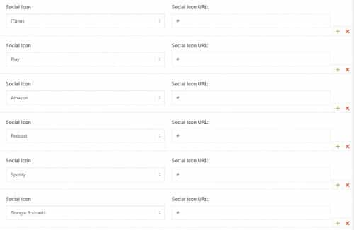
and they showed correctly on the frontend:

Please try using the zip file below and if it still doesn’t work for you include admin login in the Private Content area so we can be of more assistance.Best regards,
Mike -
AuthorPosts