Forum Replies Created
-
AuthorPosts
-
February 14, 2022 at 2:22 pm in reply to: Buttons flipping below each other in responsive view #1340497
Hi,
Parallax doesn’t work on iPhones this is a known Apple issue that has been going on for a few years, Apple must fix this, we can not.Best regards,
MikeHi,
You can add two rules, so remove the one above and add this instead:@media only screen and (max-width: 767px) { #top .av-siteloader-wrap { background-repeat: no-repeat; background-image: url(https://joakims.art/wp-content/uploads/2022/02/bg-intro-2000px.jpg); background-position: 50% 100%; background-attachment: scroll; background-size: cover; } } @media only screen and (min-width: 768px) { #top .av-siteloader-wrap { background-repeat: no-repeat; background-image: url(https://joakims.art/wp-content/uploads/2022/02/bg-intro-2000px.jpg); background-position: 50% 100%; background-attachment: scroll; background-size: cover; } }then change the first image for mobile and the second for desktop, which means to use different images.
After applying the css, please clear your browser cache and check.Best regards,
MikeFebruary 14, 2022 at 2:11 pm in reply to: Search page possibly creating outgoing internal links contain nofollow attribute #1340494Hi,
I blurred the first image, perhaps I’m not understanding what your issue is, when I check your pagehttps://domain.com/blog/page/2/the trailing/?s=is not added. Do you find that it is?
If you are clicking the link you posted above with the trailing/?s=such ashttps://domain.com/blog/page/2/?s=then it will be passed to the url, any parameter after a question mark will be passed, this is normal and expected for WordPress.
But I’m not sure how this relates to the function above to Remove “nofollow” from search, as this is working correctly on your site, here is when the function is disabled:

and here it is enabled, note the “nofollow” is removed

Best regards,
MikeHi,
Glad we were able to help, if you have any further questions please create a new thread and we will gladly try to help you. Thank you for using Enfold.Best regards,
MikeHey Jak73,
To use a background image with the siteloader try this css:#top .av-siteloader-wrap { background-repeat: no-repeat; background-image: url(https://joakims.art/wp-content/uploads/2022/02/bg-intro-2000px.jpg); background-position: 50% 100%; background-attachment: scroll; background-size: cover; }After applying the css, please clear your browser cache and check.
Best regards,
MikeHi,
Thank you for your patience, to follow the steps of adding a child theme and importing the parent theme settings, it should take no more than 5 minutes.
Please note that once your child theme is installed and activated and you followed Step 4: Import parent theme options in our documentation.
After this step save the theme settings (big blue button), reload the frontend, if it doesn’t look like your parent theme did then go to the theme settings again (not the back button) sometimes the big blue button will be blue again, so click it again to save again and check the frontend again and this time it should be correct.Best regards,
MikeFebruary 14, 2022 at 12:30 am in reply to: Table with Widgets / Small Custom Images and Text Fields #1340423Hi,
Thank you for the link to your site and the screenshots, try this css:.main_color .avia-table .avia-heading-row { background: yellow; color: white; } .main_color .avia-table th:nth-child(-n+2), .main_color .avia-table td:nth-child(-n+2) { border-right-width: 0; } .main_color .avia-table td { vertical-align: middle; } .main_color .avia-table a { color: #e50000; }see the expected results screenshot below
After applying the css, please clear your browser cache and check.Best regards,
MikeFebruary 14, 2022 at 12:03 am in reply to: Displaying 2 Widgets – 36x36px – Next to Each Other on All Screen Sizes #1340422Hi,
I’ll try to catch up where you are in this thread, I see you two custom ID’s named “mf-footer-mail” and “mf-footer-linkedin”

and I see that you have this css in your stylesheet:@media only screen and (max-width: 767px) { #top #wrap_all #mf-footer-mail, #top #wrap_all #mf-footer-linkedin { width: 49%; float: left; margin-left: 1%; } }and this seems to be working correctly on every page that I check, so is there anything more to help with this?
Best regards,
MikeHi,
Try this html in a code block element:<a href="#" class="avia-button" style="background-color: transparent; border:none;" > <img src="https://img.icons8.com/external-sbts2018-lineal-color-sbts2018/58/000000/external-hamburger-fast-food-sbts2018-lineal-color-sbts2018.png" /> </a>then size of the image makes the size of the button

Best regards,
MikeFebruary 13, 2022 at 11:04 pm in reply to: After Update to Version 4.8.9.1 big galery problem #1340419Hi,
Glad Rikard could help, if you have any further questions please create a new thread and we will gladly try to help you. Thank you for using Enfold.Best regards,
MikeHi,
Glad Rikard could help, if you have any further questions please create a new thread and we will gladly try to help you. Thank you for using Enfold.Best regards,
MikeHi,
Thank you for you patience, please see our Mega Menu documentation at the bottom under CSS Reference and you will find some styling help.
Yet I see it doesn’t have one for mouse-over so please try this:#top #header #avia-menu .avia_mega_div ul.sub-menu > li a:hover .avia-menu-text { color:red; }Your About mega menu only has four columns:

currently each column has a width of 456.75px / 4 = 1827px which makes the mega menu nearly full width and the inner columns are set to left:0;
So you could use this css to try to “center” the inner columns so it doesn’t look like an empty fifth column:#header .avia_mega_div.avia_mega4.twelve.units>.sub-menu { left: 20%!important; }or you could write a rule to set the width like Guenni007 suggested:
#header .avia_mega_div.avia_mega4.twelve.units {
    width: 1200px!important;
}
#header .avia_mega_menu_columns_4.three.units {
	width: 275px!important;
}
but you might need to write a few rules to adjust for the screen with.
Give each of these a try to see what will work best for you.Best regards,
MikeHi,
Ok, I added this script to the precious script:(function($){ $('.comment-entry').each(function() { $( this ).find('.commentsclosed ').css({ 'text-align': 'center' }).insertBefore( $(this).find('#comments')); }); })(jQuery);
Please let us know once check this so we can close this thread, it is getting off topic and is very long, we try to keep the threads on a singlet opic so future users can find solutions easily, naturally if you have more questions you are welcome to open a new thread and we will help.Best regards,
MikeHi,
Thank you for your patience, I believe that you have missed the slider option at: Testimonials ▸ Styling ▸ General Styling ▸ Testimonial Style

The slider shows one testimony at a time on desktop or mobile so if you set the Advanced > Responsive Settings > Element Visibility options to toggle the visibility of the element only on mobile it should work as you wish.
This is the example I created, linked below.

Best regards,
MikeHi,
@venocl I tested Guenni007’s edited file in my child theme as posted here ensuring the directory structure is:/wp-content/themes/enfold-child/shortcodes/postslider/postslider.php
and it works correctly with the latest version

Thanks Guenni007Best regards,
MikeFebruary 13, 2022 at 9:02 pm in reply to: Editor not working without saving as a draft before #1340409Hey Nicolas,
Thank you for your patience, but the login you posted is not working.
I tried to test this on a new install using an editor role and was able to use the Advanced Layout Builder on a Post and a Page without saving, I could add and edit elements creating a full page/post. What user role did you have trouble with?
Did you test by disabling your plugins?
Are you using any user role or security plugins?
Did you try multiple user logins to ensure it was not only one user with this error?Best regards,
MikeFebruary 13, 2022 at 8:49 pm in reply to: Search page possibly creating outgoing internal links contain nofollow attribute #1340408Hi,
Thank you for your patience, I took a look at your pagehttps://domain.com/blog/page/2/but it didn’t load ashttps://domain.com/blog/page/2/?s=for me, I tried a few other paginations and none of them loaded with the trailing/?s=
You said that you tried the solution here and it didn’t work for you, I found that your page source code for this solution is showing the< and >html entities incorrectly< and >

so please check your code and ensure when you paste it the html entities don’t change.
I also found that if you search the source code for?s=the yoast-schema-graph is adding it:

so you may want to also look at that.
I hope this helps.Best regards,
MikeHi,
Glad we were able to help, if you have any further questions please create a new thread and we will gladly try to help you. Thank you for using Enfold.Best regards,
MikeHi,
Your css is still being served from wpo-minify cache:

/wp-content/cache/wpo-minify/1644759388/assets/wpo-minify-header-070ae8c4.min.css
and it looks like cloudflare is active
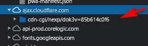
are you also using litespeed caching on your server?

Try disabling all of these and check again in a few hours, it can take a while for these to stop serving the cache.
Please note that yesterday in my screenshot showing that the widget titles were centered, you can see that the “back to top” arrow was working fine, see the screenshot below in the Private Content area.Best regards,
MikeFebruary 13, 2022 at 7:04 pm in reply to: How to remove background from header area in responsive mode #1340397Hi,
Glad we were able to help, if you have any further questions please create a new thread and we will gladly try to help you. Thank you for using Enfold.Best regards,
MikeFebruary 13, 2022 at 7:03 pm in reply to: Email sent via contact form shows admin email instead of configured email #1340396Hey mebi,
Thank you for your patience, I see that you are using Version: 4.8.6.2, I tried to recreate this issue on our current version 4.8.9.1 and was not able to recreate so I recommend updating to the current version.
Here is how I tested, I used a different address for each field describing the field used:

and I used (Email address hidden if logged out) as the contact form email, ie. the visitors email:

the email sent from the Autoresponder only shows the two Autoresponder address:

and the email sent to “you” the admin has the Reply-To as the contact’s email:

since this test was with the default WordPress PHP Mailer the only thing I can imagine is that either there was a bug in that version or you are using a SMTP plugin which is directing the emails through your mail server which is changing the email due to the server’s policies to combat spam, which if that is the reason you will have to talk to your web host as we can’t control them.
From the above test you can see that using the current theme with a new install the Autoresponder doesn’t show the admin email address.Best regards,
MikeHi,
Ok, to display the post meta data you either need to manually add the shortcode Yigit posted above to every post, which you don’t want to do, or change the Theme Options ▸ Blog Styling to one that shows the post meta data, the only issue you seem to have with this is that the excerpts are too short and the meta was above the excerpts, so I added this to your functions.php to make the excerpts longer:add_filter('avf_postgrid_excerpt_length','avia_change_postgrid_excerpt_length', 10, 1); function avia_change_postgrid_excerpt_length($length) { $length = 300; return $length; }and this to more the blog grid meta below the excerpt:
function custom_script() { ?>
    <script>
(function($){
  $( '.slide-entry' ).each(function() {
  $( this ).find( '.slide-meta' ).insertAfter( $(this).find('.entry-footer'));
  });
 })(jQuery);
 </script>
    <?php
}
add_action('wp_footer', 'custom_script');
I believe that it is very close to matching, probably no one will notice the change:

and now the posts have the meta:

Best regards,
MikeHi,
Do you mean you “back to top” arrow? I see your caching is active again, try disabling it and your cloudflare, then wait a while and check again.Best regards,
MikeFebruary 13, 2022 at 3:54 pm in reply to: Buttons flipping below each other in responsive view #1340388Hi,
Thanks for the screenshot, I see that Yigit’s css is meant to work up to 767px, which it does, at 768px is when the error begins until 990px
so please leave that css and include this css also:@media only screen and (min-width: 768px) and (max-width: 989px) { #top .flex_column.av-b06jd-7aa723c4880ea8922c045f58448a9c6d, #top .flex_column.av-3yndl-7bbbd9cec1b3026b5be7583f5d30dfb1 { width: 50% !important; display: inline-block; float: none; } #top .flex_column.av-am57p-d4ca5034c8232c647ae2a808fa9f3665,#top .flex_column.av-49jyx-6d77460c89009f4c568b495af470f2f4 { width: 100% !important; } }After applying the css, please clear your browser cache and check.
Best regards,
MikeHi,
Glad we were able to help, if you have any further questions please create a new thread and we will gladly try to help you. Thank you for using Enfold.Best regards,
MikeHi,
Glad we were able to help, if you have any further questions please create a new thread and we will gladly try to help you. Thank you for using Enfold.Best regards,
MikeHi,
Glad we were able to help, if you have any further questions please create a new thread and we will gladly try to help you. Thank you for using Enfold.Best regards,
MikeHey Corina,
Please see this solution for the contentURL meta tag error.Best regards,
MikeHi,
For mobile you will need to use a smaller font size than 14px, but even then you will probably need to use two lines, I’m not sure how small you will want to go, but here is an example:@media only screen and (max-width: 767px) { #socket .copyright { font-size: 10px; display: inline-block!important; } }
Best regards,
MikeFebruary 13, 2022 at 3:00 pm in reply to: How to remove background from header area in responsive mode #1340369Hi,
To have a transparent mobile header please use Yigit’s css above:@media only screen and (max-width: 990px) { .responsive.html_mobile_menu_tablet #top #wrap_all #header { position: absolute; } .html_mobile_menu_tablet #top #wrap_all .av_header_transparency { background: transparent; } }
Now currently on desktop you have a fixed header that is transparent until you scroll, then it is blue, to have that blue transparent add the second css separately:#top .header_bg { background-color: transparent; }
Best regards,
Mike -
AuthorPosts