Forum Replies Created
-
AuthorPosts
-
Hey Bernoully,
Please login into the support forum and open a new thread, you have asked your question through the contact form which is not for support requests.
If you have not registered to our support forum yet you can do so here.
Thank you for your understanding and for using Enfold.Best regards,
MikeHey Manu,
Please login into the support forum and open a new thread, you have asked your question through the contact form which is not for support requests.
If you have not registered to our support forum yet you can do so here.
Thank you for your understanding and for using Enfold.Best regards,
MikeNovember 14, 2022 at 3:00 pm in reply to: Woocommerce mini cart dropdown – "Subtotal" text styling #1372508Hi,
Glad we were able to help, if you have any further questions please create a new thread and we will gladly try to help you. Thank you for using Enfold.Best regards,
MikeHi,
Ok, try using this function instead:function add_ajax_search_icon_to_burger_menu_no_desktop_search(){ ?> <script> (function($){ $('#top #wrap_all #menu-item-search').css({'visibility':'hidden'}); $('#avia-menu').one('click', function(){ $('#menu-item-search').clone().wrapInner('<li class="burger_search"/>').children(0).unwrap().prependTo('#av-burger-menu-ul'); $('#top #wrap_all #av-burger-menu-ul > li').css({'-webkit-transform':'none'}); }); })(jQuery); </script> <?php } add_action('wp_footer', 'add_ajax_search_icon_to_burger_menu_no_desktop_search');Please note that you still need to have the search icon enabled in the theme options at Enfold Theme Options ▸ Main Menu ▸ General ▸ Append search icon to main menu
Best regards,
MikeHi,
Unfortunately, there is nothing you can do to correct the First Byte time, this is a server issue.
Some “budget” web hosts will place too many customers on each server, slowing everyone down.
I’m not knocking your host it’s just how web hosts can offer low prices, if you can afford to pay more for your hosting try researching “fastest web host” for your country most review sites will show the host speed for their tests.
Then most hosts will let you test for 30 days so you can compare.
If you find one you like, most hosts will have coupons for 60% to 80% off for your first contract, the trick is to get the longest contract time, such as 2-3 years.
You might end up with a 3 year fast webhost for the cost of 1 year at the regular price.
Either way, it can’t hurt to test a different webhost for free for 30 days, just my opinion.Best regards,
MikeHi,
Glad to hear that you have this sorted out, if you have any further questions please create a new thread and we will gladly try to help you. Thank you for using Enfold.Best regards,
MikeNovember 13, 2022 at 11:58 pm in reply to: Shop category thumbnail images are suddenly the wrong size #1372462Hi,
I have not seen that Regenarate thumbnails tool before, but the thread doesn’t call to Regenerate thumbnails so perhaps you don’t need to.
Please enable the theme editor so we can check the code in your functions.php, perhaps you made an error and that is why it doesn’t work?Best regards,
MikeHi,
It is showing below your elements, you have enabled the Avia Layout Builder Debugger
Shall we close this then?Best regards,
MikeHi,
Did the solution work when you edited the /portfolio/portfolio.php file as Ismael suggested?
Please try it that way to ensure his solution works.Best regards,
MikeHi,
Glad we were able to help, if you have any further questions please create a new thread and we will gladly try to help you. Thank you for using Enfold.Best regards,
MikeHi,
Glad we were able to help, if you have any further questions please create a new thread and we will gladly try to help you. Thank you for using Enfold.Best regards,
MikeHey navindesigns,
Thanks for the link to your icons, first I uploaded to my test site and checked them in the icon element and they all showed, then I logged into your site and checked an icon element and they all show on your site too:

try clearing your browser cache and checking again.Best regards,
MikeHi,
Glad to hear that you have this sorted out, sometimes these errors can be very hard to find, I tried to login and check but I was not able to:
Username enfold is not registered on this site.
As long as you have it sorted out that is what is important, shall we close this then?Best regards,
MikeHey plvsultra,
Please see our documentation for the menu styling, near the bottom Burger/Mobile you will find snippets you can use. If you have any trouble please link to your site so we can examine the element you are having trouble with.Best regards,
MikeHi,
Glad Rikard could help, if you have any further questions please create a new thread and we will gladly try to help you. Thank you for using Enfold.Best regards,
MikeHi,
With the element showing nothing, that is a sign of an error, in your shortcode inspector I found one opening div tag with two closing div tags causing the error, I was able to correct for you, please clear your browser cache and check.Best regards,
MikeHi,
Thanks for the screenshot, the notice Notice: Function wpdb::prepare was called incorrectly . The query argument wpdb::prepare() must contain a value
points to the core WordPress file /wp-includes/functions.php don’t edit this file.
You are seeing this Notice because you have WP_DEBUG_DISPLAY enabled, check your site health panel:

So you should disable WP_DEBUG_DISPLAY because this is only a Notice, or you could disable all of your plugins one at a time to find which one is causing this. But a Notice is not the same as an Error.Best regards,
MikeHi,
Glad Rikard could help, if you have any further questions please create a new thread and we will gladly try to help you. Thank you for using Enfold.Best regards,
MikeNovember 13, 2022 at 9:24 pm in reply to: Shop category thumbnail images are suddenly the wrong size #1372434Hi,
Thank you, I don’t know which thread you were following for the code snippet, but typically as part of the instructions they say to Regenerate Thumbnails after adding the function but I don’t see a Regenerate Thumbnails plugin on your site so I assume that you didn’t do this?
After you Regenerate Thumbnails try creating a new post to see if the function is working.
If this doesn’t help, please link to the thread you are following and enable the theme editor so I can check the code in your functions.php.Best regards,
MikeHey daves1997,
Thanks for the link to your page, I compared it to another page that is showing correctly and I found that the main content has a rouge closing tag.
So somewhere on your page there is some html that has an extra or missing closing tag. Compared to the working page I looked at you have an extra element at the bottom with an iframe:
Consistency Within Communities
please check the iframe code or any other code you may have on the page, if you can’t find it try removing the whole section to see if that corrects.
If you still can’t find the error include admin login in the Private Content area so we can be of more assistance.Best regards,
MikeHi,
Please try this code in the General Styling ▸ Quick CSS field or in the WordPress ▸ Customize ▸ Additional CSS field:.responsive #top #header_meta .sub_menu ul.avia_wpml_language_switch li { height: 16px; width: 40px; }After applying the css, please clear your browser cache and check.
Please note that testing with iPads & iPhones can be hard to clear the cache, often you need to also clear the history to fully purge the cache, following these steps for Safari and note Step 4 where you will Clear the History.Best regards,
MikeHey asociacionespanolaaustria,
Do you mean that in the “Yoast preview” the featured image is right? I only recall this being an option in the Yoast plugin so perhaps the Yoast team would have a better idea how to correct this.
We do have the share buttons below posts, but there is no preview for this and it only shares text with no images:
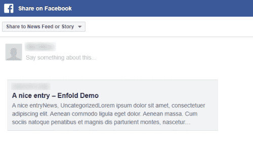
Best regards,
MikeNovember 13, 2022 at 7:53 pm in reply to: Shop category thumbnail images are suddenly the wrong size #1372428Hey Hajé,
Thanks for your question but the link to your test product leads to a “page not found” and the login in not admin so we can not see any settings nor any of the product pages, please upgrade the login to admin.
Also please link to the “Anne” thread that you referred to, I believe this might be the source for this code:
add_filter( 'avf_wc_before_shop_loop_item_title_img_size', 'avf_wc_before_shop_loop_item_title_img_size_mod', 10, 1 ); function avf_wc_before_shop_loop_item_title_img_size_mod( $thumbnail_size ) {return 'woocommerce_thumbnail'; }that I see at the top of your page on the front end:

this code should not be showing, so I believe that you have added this to the wrong area, this should be in your child theme functions.php, try moving this if it is not there and regen your thumbnails.
If this doesn’t help then upgrade the login to admin and let us know.Best regards,
MikeNovember 13, 2022 at 7:29 pm in reply to: Woocommerce mini cart dropdown – "Subtotal" text styling #1372427Hey Annemarie,
Thanks for the screenshot and the link to your site, please try this css:#top #header.all_colors .woocommerce-mini-cart__total strong { color: #fff; }After applying the css, please clear your browser cache and check.
Best regards,
MikeHey lucapada,
Thanks for your question, but I don’t have any experience with GSAP, if you are having trouble with playing the clip I found this thread about this with this working example.I was not very clear on your goal, I tried creating a page with 3 color sections, each set to 100vh, with the background video in the middle section:

and in my test without your script the video doesn’t start playing until it is in view.
So perhaps you don’t need the script to achieve this?Best regards,
MikeHi,
Thanks for the login but the link to your site is not working, do you have a new url?Best regards,
MikeHi,
Thanks for the login, I removed your duplicate css and adjusted the remainder css so instead of having a box around the active menu item it now is green with a green line under it.
Please clear your browser cache and check.Best regards,
MikeHi,
The script is written so that when the burger menu is opened the one at the top is hidden and when the burger is closed the one at the top is shown again.
Is it not working for you in this way?
Or do you wish that the header search icon never shows and is only available in the burger menu?Best regards,
MikeNovember 13, 2022 at 3:51 pm in reply to: All of a sudden: Page Attributes missing for Posts #1372415Hi,
Glad to hear that you have this sorted out, if you have any further questions please create a new thread and we will gladly try to help you. Thank you for using Enfold.Best regards,
MikeHi,
Glad we were able to help, if you have any further questions please create a new thread and we will gladly try to help you. Thank you for using Enfold.Best regards,
Mike -
AuthorPosts