Forum Replies Created
-
AuthorPosts
-
Hi,
Glad Guenni007 could help, thank you Guenni007, if you have any further questions please create a new thread and we will gladly try to help you. Thank you for using Enfold.Best regards,
MikeJune 11, 2025 at 9:07 pm in reply to: Before – After Slider : Button Translations for bilingual websites #1485350Hi,
Glad Guenni007 could help, thank you Guenni007, if you have any further questions please create a new thread and we will gladly try to help you. Thank you for using Enfold.Best regards,
MikeHey JoStudioDeRijp,
Try this CSS in your Enfold Theme Options ▸ General Styling ▸ Quick CSS field:.av-masonry-date { display: none; }If it doesn’t help, please link to your page so we can examine.
Best regards,
MikeHey jedediahzilberberg,
I would point out that the class “ai-optimize-*” is from a plugin, not the theme.
So this is from the plugin, or from your copy/paste or from hitting the “enter key” while in visual mode in the text editor.Best regards,
MikeJune 9, 2025 at 9:53 pm in reply to: Background overlay gradient behind text with background image #1485247Hi,
Glad that we were able to help, please note that in this code, the first class is the page:
.page-id-76
so it is only for this page.
the next class is for the first element on the page, which in this case is a column element:
.avia-builder-el-0
if you wanted to add this to multiple pages, you could add a custom class or ID to these column elements under “Developer Settings” on all of the pages.

When you add custom classes in the field you don’t need to add the “dot”, just the class name.
the third class is for the text block:
.av_textblock_section
and then the paragraph text in the text element:
p
Hopefully this will help, if it does let us know and we will close this thread.
You can always open a new thread in the future for further questions.Best regards,
MikeHi,
Glad we were able to help, if you have any further questions please create a new thread and we will gladly try to help you. Thank you for using Enfold.Best regards,
MikeHi,
Glad we were able to help, if you have any further questions please create a new thread and we will gladly try to help you. Thank you for using Enfold.Best regards,
MikeHi,
Try this CSS in your Enfold Theme Options ▸ General Styling ▸ Quick CSS field:.header_color .menu-item:not(.current-menu-item) .avia-menu-fx { opacity: 1; visibility: visible; background: gold; }Please ensure to copy the code from the forum and not an email notification so the symbols are not converted.
After applying the css, please clear your browser cache and check.Best regards,
MikeHi,
Glad we were able to help, if you have any further questions please create a new thread and we will gladly try to help you. Thank you for using Enfold.Best regards,
MikeHey rixi,
Try this CSS in your Enfold Theme Options ▸ General Styling ▸ Quick CSS field:@media only screen and (min-width: 768px) { #av_section_2 .flex_column_table .avia-button-wrap { position: absolute; bottom: 0; left: 20%; transform: translateX(-13%); padding-bottom: 20px; } #av_section_2 .flex_column_table .av_textblock_section { padding-bottom: 50px; } }Best regards,
MikeHi,
Glad we were able to help, if you have any further questions please create a new thread and we will gladly try to help you. Thank you for using Enfold.Best regards,
MikeHi,
I tried FTP & SFTP and was not able to login with the ports 21 or 22, perhaps you have a different port?
My IP is below.Best regards,
MikeHi,
Glad we were able to help, if you have any further questions please create a new thread and we will gladly try to help you. Thank you for using Enfold.Best regards,
MikeHey dondela,
Try this CSS in your Enfold Theme Options ▸ General Styling ▸ Quick CSS field:.av-large-gap.av-fixed-size .av-masonry-entry .av-inner-masonry { right: 30px; bottom: 30px; }After applying the css, please clear your browser cache and check.
Best regards,
MikeHi,
Glad Ismael could help, if you have any further questions please create a new thread and we will gladly try to help you. Thank you for using Enfold.Best regards,
MikeJune 7, 2025 at 7:14 pm in reply to: Background overlay gradient behind text with background image #1485187Hey bbarasa,
Do you mean gradient like this:

.page-id-76 .avia-builder-el-0 .av_textblock_section p {
	    background: linear-gradient(186deg, rgba(0, 0, 0, 1) 0%, rgba(0, 0, 0, -0.6) 100%);
}
To format the text try this:
.page-id-76 .avia-builder-el-0 .av_textblock_section p {
	font-weight: bold;
    font-size: 36px;
    font-style: italic;
}
Best regards,
MikeHi,
This works good Guenni007, thanks for sharing, hopefully whdsolutions will agree.Best regards,
MikeHi,
For your /making-a-remote-control/ page I see that you are not using a sidebar, it would be better if you follow Guenni007’s instructions as you will need a parent container. But you can try this css:@media only screen and (min-width: 1905px) { .responsive #top #wrap_all .av-d0kp1-a2d2e6eb6b73ac933b7b21ac10cbf36f { position: fixed; width: 435px; right: 19%; top: 57%; } .responsive #top #header.header-scrolled ~ #main .av-d0kp1-a2d2e6eb6b73ac933b7b21ac10cbf36f { position: fixed; width: 435px; right: 19%; top: 18%; } }This will make your author box fixed (sticky) under your header after scrolling, it would be better if your column had a custom class name, right now it is: .av-d0kp1-a2d2e6eb6b73ac933b7b21ac10cbf36f
I also note that your author box is quite tall on my desktop, you may want to make it shorter so it will fit in smaller screens.
For this the css only works after 1905px so the whole box is shown, you will not be able to scroll in the box to see all of the content.
Another option would be to use the WP Sticky Anything plugin.Best regards,
MikeHi,
Glad that the update worked for you. I have not used the GT Translate plugin and I don’t see any errors in the browser console on your site.
Please open a new thread for this new issue, since the opening title for this thread is now solved, this helps other users find solutions based on the opening subject line quicker and helps keep the thread length manageable and on topic for multiple mods to assist. Thank you for your understanding.Best regards,
MikeHi,
Go straight to the current version.
I do not expect any issues when updating from 4.2.1 to 7.1.1, but as good practice you should first make a full backup of your site.Best regards,
MikeHi,
Typically that is where you would install the latest theme from your Envato (Theme Forest) account.
But there is no v99.99.99, so my concern is that your current install has been tampered with. Someone modified it.
I recommend creating a full backup first, files & database, in your webhost tool, not a plugin.
Then backup your theme settings under Enfold->Import/Export, and manually copy your Quick CSS and WordPress ▸ Customize ▸ Additional CSS to a plain text file.
Then try installing the current version like this:
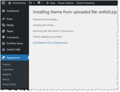
Download the latest installable WP version from your Theme Forest account and upload it to your WordPress ▸ Appearance ▸ Themes ▸ Add Themes ▸ Add New

after you choose the zip file and click install, you will see a This theme is already installed message because you are updating, you can continue

then you will see the Theme updated successfully message.

Best regards,
MikeHi,
If you bought the theme in your Envato (Theme Forest) account, then you can download the updates. Support in the forum is different.
If your developer bought the theme and you don’t have an Envato (Theme Forest) account, then you will need to purchase a new license.
I do not expect any issues when updating from 4.2.1 to 7.1.1, but as good practice you should first make a full backup of your site, files and database.
Please use your webhost backup tool and not a plugin, most plugins do not restore well.
To update your version of Enfold you will need to download the latest installable WP version from your Theme Forest account and upload it to your WordPress ▸ Appearance ▸ Themes ▸ Add Themes ▸ Add New

after you choose the zip file and click install, you will see a This theme is already installed message because you are updating, you can continue

then you will see the Theme updated successfully message.

Best regards,
Mike -
AuthorPosts


