Forum Replies Created
-
AuthorPosts
-
Hi,
Glad we were able to help, if you have any further questions please create a new thread and we will gladly try to help you. Thank you for using Enfold.Best regards,
MikeHi,
Thanks for the feedback, I believe that you are testing by changing the size of a desktop browser, on a actual device you won’t have this issue.
For testing on a desktop browser once you have adjusted the screen to the size you want to emulate, please reload the page, the javascript makes the adjustments on page load based on the screen size.Best regards,
MikeJune 14, 2023 at 1:07 am in reply to: blog menu – if too short – makes date move up next to it. #1410529Hey Tina,
Try this CSS in your Enfold Theme Options ▸ General Styling ▸ Quick CSS field:#recent-posts-3 .post-date { float: left; }After applying the css, please clear your browser cache and check.
Best regards,
MikeHey Todd Adams,
You posted a duplicate, so here is the answer again:
Yes your version is not compatible with PHP v8.1 so you will need to update, unfortunately since you last updated Theme Forest also changed the way auto updates work so you will need to manually update once and the create a new Theme Forest Token for future updates.
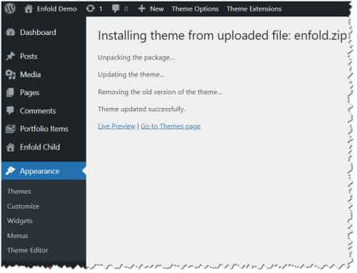
To update your version of Enfold you will need to download the latest installable WP version from your Theme Forest account and upload it to your WordPress ▸ Appearance ▸ Themes ▸ Add Themes ▸ Add New

after you choose the zip file and click install, you will see a This theme is already installed message because you are updating, you can continue

then you will see the Theme updated successfully message.

Best regards,
MikeHey Todd Adams,
Yes your version is not compatible with PHP v8.1 so you will need to update, unfortunately since you last updated Theme Forest also changed the way auto updates work so you will need to manually update once and the create a new Theme Forest Token for future updates.
To update your version of Enfold you will need to download the latest installable WP version from your Theme Forest account and upload it to your WordPress ▸ Appearance ▸ Themes ▸ Add Themes ▸ Add New

after you choose the zip file and click install, you will see a This theme is already installed message because you are updating, you can continue

then you will see the Theme updated successfully message.

Best regards,
MikeHey PrivitMarketing,
Please try using a redirect plugin, there are many available here is a popular one: RedirectionBest regards,
MikeHi,
Glad we were able to help, if you have any further questions please create a new thread and we will gladly try to help you. Thank you for using Enfold.Best regards,
MikeHi,
Glad to hear that you have this sorted out, if you have any further questions please create a new thread and we will gladly try to help you. Thank you for using Enfold.Best regards,
MikeHi,
Thanks for the login, I adjusted the script and it looks like it is working now, please clear your browser cache and check.Best regards,
MikeHi,
When I check now the overylay covers the whole screen even when I scroll, if it is not for you try changing the number higher like:.awpage-document { height: 250vh !important; }or higher.
Best regards,
MikeHi,
Mobile and desktop are the same, let us know after you can check so we can close this thread.Best regards,
MikeHi,
Thanks for your feedback, but unfortunately this is not possible with the portfolio grid.Best regards,
MikeHi,
To add more space between the socket menu items try this CSS in your Enfold Theme Options ▸ General Styling ▸ Quick CSS field:#socket .sub_menu_socket li { padding: 0 20px; }After applying the css, please clear your browser cache and check and feel free to adjust to suit.
Best regards,
MikeHi,
Thanks for the feedback, this is what my screenshot above shows, there is just more space between the image and text.
I adjusted to this:

#top .row-posts.template-blog article.single-small .big-preview {
	width: 300px;
    height: 300px;
    line-height: 300px;
}
#top .row-posts.template-blog article.single-big .blog-meta {
display: none;
}
#top .row-posts.template-blog article.single-big {
	display: flex;
    align-items: center;
    flex-direction: row;
}
#top .row-posts.template-blog article.single-big:nth-child(even) {
	flex-direction: row-reverse;
}
Best regards,
MikeJune 13, 2023 at 5:54 pm in reply to: Advanced Layout Editor does not store or load templates #1410486Hi,
Try exporting your templates and then import them after you update the theme.Best regards,
MikeHi,
Try adding
background-color: transparent;
color: transparent;
like this:.av-hotspot-container-inner-wrap .av-image-hotspot:nth-child(1) .av-image-hotspot_inner { background-image: url("https://test.s-design.tirol/Salzraum/wp-content/uploads/2023/06/salzraumfahne-40.png"); background-size: contain; background-color: transparent; color: transparent; }Best regards,
MikeHi,
I added this css to your WPCode plugin:#top.page-id-738 .avia-standard-logo, #top.page-id-5837 .avia-standard-logo, #top.page-id-5667 .avia-standard-logo { display: none; } #top.page-id-738 .main_menu, #top.page-id-5837 .main_menu, #top.page-id-5667 .main_menu { display: flex; justify-content: center; width: 100%; } #top.page-id-738 .main_menu [data-av_iconfont='entypo-fontello']:before, #top.page-id-5837 .main_menu [data-av_iconfont='entypo-fontello']:before, #top.page-id-5667 .main_menu [data-av_iconfont='entypo-fontello']:before { font-size: 58px; } #top.page-id-738 .main_menu .avia-button, #top.page-id-5837 .main_menu .avia-button, #top.page-id-5667 .main_menu .avia-button { border: none; } #top.page-id-738 .main_menu .avia-button:hover .avia-color-theme-color, #top.page-id-5837 .main_menu .avia-button:hover .avia-color-theme-color, #top.page-id-5667 .main_menu .avia-button:hover .avia-color-theme-color, #top.page-id-738 .main_menu .avia-button .avia-color-theme-color, #top.page-id-5837 .main_menu .avia-button .avia-color-theme-color, #top.page-id-5667 .main_menu .avia-button .avia-color-theme-color{ background-color: transparent; }please clear your browser cache and check the three pages.
Best regards,
MikeHi,
I’m not sure what is causing this, but if it is your only issue I added this css to your WordPress ▸ Customize ▸ Additional CSS and it seems to have solved it:#top #av-burger-menu-ul a { color: #7bafe7; font-size: 18px; } .html_av-overlay-side #top .av-burger-overlay-scroll { background-color: #fff; } .av-burger-overlay-active #top .av-hamburger-inner, .av-burger-overlay-active #top .av-hamburger-inner::before, .av-burger-overlay-active #top .av-hamburger-inner::after { background-color: #000; }Please clear your browser cache and check.
I also checked the placement of the menu overlay and it seems correct for all screen sizes, it is meant to show from the edge of the screen, on desktop your page content is narrow and that is why it seems off a little, I guess we could move it over on larger screens with this css:@media only screen and (min-width: 1700px) { .html_av-overlay-side .av-burger-overlay-scroll { right: 20%; } }but that looks odd to me when I test it, you can test in the WordPress ▸ Customize ▸ Additional CSS and see for yourself.
Best regards,
MikeHi,
If you want this for a faster load this won’t help, I checked your site on WebPageTest and linked the test below.
The bigest issue that I see is youtube videos, I only see 4 videos on your homepage but they cause a lot of events in the test.
It looks like you are adding those videos in a code block with the youtube code, try using the video element with the option Wait for user interaction to load the video this will only load the video and it’s scripts after the user clicks and speed up your page.
You will then need to add a fallback image to show in the place of the video, try adding the video thumbnail or taking a screenshot of the video thumbnail to show.
I don’t believe that the cookie bar is causing any significant delayBest regards,
MikeHi,
Thanks for the login, are there any other styling issues on your site or is it just the menu?
Have you tried disabling your plugins?Best regards,
MikeHi,
Glad we were able to help, if you have any further questions please create a new thread and we will gladly try to help you. Thank you for using Enfold.Best regards,
MikeHi,
Glad to hear that you have this sorted out, if you have any further questions please create a new thread and we will gladly try to help you. Thank you for using Enfold.Best regards,
MikeHi,
Glad we were able to help, if you have any further questions please create a new thread and we will gladly try to help you. Thank you for using Enfold.Best regards,
MikeHi,
Glad to hear that you have this sorted out, shall we close this then?Best regards,
MikeHi,
That doesn’t work when I check, the overlay is only around the text and the page is not scrolling, see the screenshot in the Private Content area.
Try undoing this change and adding the css I posted to WordPress ▸ Customize ▸ Additional CSS
Then clear your browser cache and any cache plugin, and check.
Please note that testing with iPads & iPhones can be hard to clear the cache, often you need to also clear the history to fully purge the cache, following these steps for Safari and note Step 4 where you will Clear the History.
If this doesn’t help please include an admin login in the Private Content area so we can check.Best regards,
Mike -
AuthorPosts

