Forum Replies Created
-
AuthorPosts
-
September 28, 2023 at 6:34 pm in reply to: Dynamic Posts CSS deleted when a page is duplicated and saved #1420832
Hey Christie,
I recall another user having issues with their duplicating plugin, and they found the WP Code duplication script solved their issue, please give this a try.Best regards,
MikeSeptember 28, 2023 at 5:50 pm in reply to: The Events Calendar mit Event Tickets Plus: Einstellungen ignoriert #1420825Hi,
Try adding this code to the end of your child theme functions.php file in Appearance ▸ Editor to disable the theme Events Calendar mods:add_action('after_setup_theme', function() { if(is_child_theme()) remove_action('tribe_events_template', 'avia_events_template_paths', 10, 2); });Please ensure to copy the code from the forum and not an email notification so the symbols are not converted.
This should make the The Events Calendar files used instead of the theme’s modifications, so the single event page will have the default layout, but perhaps the plugin will work as you expect it.Best regards,
MikeSeptember 28, 2023 at 12:38 pm in reply to: Enfols multilanguage site using child and parents sub-directories on WP basis #1420797Hi,
Sorry my example may have been confusing, I checked your base site and see your language menu:

so this is good if you want to show the language menu in the topbar, to do so choose the menu location:

and then choose to show it in the theme settings:

Or you can add the language menu items to the main menu:

in this case you might wish to add a folder called “lang” or anything you wish to hold all of your language links, this is what I had in mind in my other screenshot

I hope this explains better.Best regards,
MikeHi,
Thanks for the video, this looks like the animation is being delay try disabling your caching plugin or your other plugins that would delay the behavior of the page. Or disable the animation of the image elements on the page so they will show on the page load.Best regards,
MikeSeptember 27, 2023 at 5:50 pm in reply to: The Events Calendar mit Event Tickets Plus: Einstellungen ignoriert #1420718Hi,
Thanks for the link to your test page, when I click the green button a lightbox is not shown, the form that is shown looks like it is added via a ajax function, so our lightbox is not causing an error. I couldn’t determine any error on the page, I filled out the form and added guests and it worked correctly so I’m not sure what the issue is.
For each guest there were no required field data except the check box for “Datenschutz” I left all fields empty and the form worked correctly, so any user can register with guests and leave the data empty, no individual data collection for guests is forced.
So perhaps the option in the plugin is working correctly?Best regards,
MikeHey itkaufmann,
I see that you are using a old version 4.7.6.3
If you have malware try deleting the theme files at /wp-content/themes/enfold/ and download the latter version from your Theme Forest account and upload it to the same directory.
If the malware is in the core WordPress files this won’t help, try seeing if your webhost has a backup from the last time you know it was working correctly and roll back to that, perhaps six months ago?
Otherwise you may need professional help in removing the malware.Best regards,
MikeSeptember 27, 2023 at 12:13 pm in reply to: Anchor link from header link to a Slider Revolution slider #1420694Hi,
It seems to always work from the home page and about 50% of the time from the blog & contact page for me, so it seems to be an improvement.
I have asked the rest of the team if they have any ideas, and will reply when I hear from them, Thank you for your patience.Best regards,
MikeHi,
Glad that this helped, if you have any further questions please create a new thread and we will gladly try to help you. Thank you for using Enfold.Best regards,
MikeHi,
Please ensure to copy the code from the forum and not an email notification so the symbols are not converted.
If you are not using a child theme I recommend the WPcode plugin this plugin supports PHP code snippets, JavaScript code snippets, & CSS code snippets, because you will lose the custom code that you add to the enfold ▸ functions.php when you update next time.Best regards,
MikeSeptember 26, 2023 at 12:34 pm in reply to: Anchor link from header link to a Slider Revolution slider #1420425Hi,
Currently your color sections are not set to a height, try setting them all to 100% height:
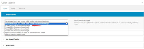
and as I understand each slide is meant to be a full screen height, and you have five sections, but two of them are code blocks with the shortcode and three of them are the slider elements:

the slider elements can not have a height set, so try changing them all to color sections with code blocks with the shortcode that are set to 100% height and see if this helps.
When I test from the homepage the services section lands in the right place, but from the blog page it doesn’t, this seems to point to the position moving as the height changiing when the content loads. Setting the height of each section should correct.Best regards,
MikeSeptember 26, 2023 at 11:58 am in reply to: Enfols multilanguage site using child and parents sub-directories on WP basis #1420419Hi,
You can add menu links to the sites that are live, and add the other ones later.
Try adding a structure like this with the custom menu items and links to each site

Best regards,
MikeHi,
I changed the css to this:/* Icon color on hover */ #footer .widget .social_bookmarks li a:hover { color: #ffffff!important; background: #0a66c2!important; transition: all .35s ease; } .widget .social_bookmarks li a:hover:before { color: #ffffff; }please clear your browser cache and check.
Best regards,
MikeHi,
Did Ismael’s solution work? I see you wrote that it did but I can’t see it?
The reason the other site can have a author link below the image is because only the image has the product link, but on your site the whole element has the product link.
I’m not sure how we can change that without a major element re-write.Best regards,
MikeHi,
I first converted your PNG to SVG at this site.
Then I followed the steps in this thread to convert the SVG into a safe SVG
Then I uploaded the SVG to Fontello to make the icon font.
Then I imported the Fontello zip to my Enfold Theme Options ▸ Import/Export ▸ Iconfont Manager
and now they show in my icon element:

I linked to the Fontello zip below that I created for you to try.Best regards,
MikeHi,
As I understand the subscription is to keep WPML updated with improvements and bug fixes, it doesn’t effect your site’s functionality, you will still be able to use the plugin as before.
At some point you will probably use all of your translation credits for the built-in auto translation, but you can still manually translate your new pages with Google Translate and save it to your site.Best regards,
MikeHi,
Sorry we are limited in our support of third-party plugins, please follow the Polylang instructions ▸ Can I use my own flags for the language switcher or reach out to the Polylang support for further assistance.Best regards,
MikeHi,
Thanks for the login, the error is coming from the file at includes/loop-about-author.php which is what displays the author page.
This file has beed edited and a chunk of the file is missing, I assume as part of your customization, I recommend asking whoever was helping you to compare it with a original version of the file from your Envato (Theme Forest) account and try to figure out what is needed for your customization.
I see that you are not using a Child Theme and your functions.php contains a lot of customizations, please note that this will be lost when you update. Please consider installing a child theme and move all of your customizations to it, since I see the loop-about-author.php was modified I assume that other core theme files were also modified and should be saved in a child theme before the next update.
I can see a lot of work went into your customization and it looks complicated, so I’m sure that you would not want to lose any of this.Best regards,
MikeHi,
I have removed the word “Author” and I have moved the name before the price:

But it can not be a link because the whole element is already a link to the product and you can not have a link inside of a link.Best regards,
MikeHi,
Glad to hear, please let us know when we should close this thread.Best regards,
MikeHi,
Please check your logo in the footer, it has empty space on the right, (all sides) I believe that if you edit the image so the logo is to the edge on the image the right side will align up with the edge of the contaier and be where you want it.Best regards,
MikeSeptember 24, 2023 at 8:44 pm in reply to: Produktbild in WooCommerce auf Seite größer darstellen #1420202Hi,
I added this to your functions.php and it has moved the product image below the product summary, please check.remove_action( 'woocommerce_before_single_product_summary', 'woocommerce_show_product_images', 20 ); add_action( 'woocommerce_single_product_summary', 'woocommerce_show_product_images', 25 );Best regards,
MikeHi,
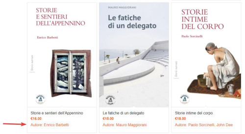
Thanks, I added this code to the end of your child theme functions.php file in Appearance ▸ Editor:add_action('woocommerce_after_shop_loop_item_title', 'display_custom_attribute_in_product_grid', 10); function display_custom_attribute_in_product_grid(){ // HERE define the desired product attributes to be displayed $defined_attributes = array('autore'); global $product; $attributes = $product->get_attributes(); if ( ! $attributes ) { return; } $out = '<ul class="taste-attributes">'; foreach ( $attributes as $attribute ) { // Get the product attribute slug from the taxonomy $attribute_slug = str_replace( 'pa_', '', $attribute->get_name() ); // skip all non desired product attributes if ( ! in_array($attribute_slug, $defined_attributes) ) { continue; } // skip variations if ( $attribute->get_variation() ) { continue; } $name = $attribute->get_name(); if ( $attribute->is_taxonomy() ) { $terms = wp_get_post_terms( $product->get_id(), $name, 'all' ); // get the taxonomy $tax = $terms[0]->taxonomy; // get the tax object $tax_object = get_taxonomy($tax); // get tax label if ( isset ( $tax_object->labels->singular_name ) ) { $tax_label = $tax_object->labels->singular_name; } elseif ( isset( $tax_object->label ) ) { $tax_label = $tax_object->label; // Trim label prefix since WC 3.0 if ( 0 === strpos( $tax_label, 'Product ' ) ) { $tax_label = substr( $tax_label, 8 ); } } $out .= '<li class="' . esc_attr( $name ) . '"style="width:100%" >'; $out .= '<span class="attribute-label">' . esc_html( $tax_label ) . ': </span> '; $tax_terms = array(); foreach ( $terms as $term ) { $single_term = esc_html( $term->name ); array_push( $tax_terms, $single_term ); } $out .= '<span class="attribute-value">' . implode(', ', $tax_terms) . '</span>'; } else { $value_string = implode( ', ', $attribute->get_options() ); $out .= '<li class="' . sanitize_title($name) . ' ' . sanitize_title( $value_string ) . '">'; $out .= '<span class="attribute-label">' . $name . ': </span> '; } } $out .= '</ul>'; echo $out; }and now the author is showing in the product grid and in the Related products at the bottom of product pages:
Best regards,
MikeHi,
Try going to Enfold Theme Options ▸ Frontpage Settings and make sure the Frontpage is set

If that doesn’t help try going to WordPress ▸ Settings ▸ Reading ▸ Your homepage displays and set the frontpage there:

Then check your Pages ▸ All Pages and the frontpage should say Front Page like this:

Otherwise, please disable your JetPack plugin and post the admin login in the Private Content area so we can login and check.Best regards,
MikeHi,
I reviewed the code in the pastebin and it looks like the code was doubled, and this was noted in the other thread, so I removed the extra code and also commented out the extra line:
content_wrap.avia_swipe_trigger( {prev:'.av_prev_tab_section', next:'.av_next_tab_section'} );
and now the 4 icons are showing at the top in a grid instead of off the screen,

so if you are not seeing it like this then clear your cache or open a private window until you do.
If for small screens you want the 4 tabs to be in a single row, try this CSS in your Enfold Theme Options ▸ General Styling ▸ Quick CSS field:@media only screen and (max-width: 430px) { #top.page-id-196 .av-section-tab-title { padding: 1px 2px 0px 2px; } #top.page-id-196 .av-tab-section-icon { font-size: 20px; } #top.page-id-196 .av-inner-tab-title { font-size: 10px; } #top.page-id-196 .av-section-tab-title { width: 25%; } }this is the expected results:

Best regards,
MikeHi,
It sounds like you have this sorted out now, shall we close this then?Best regards,
MikeSeptember 24, 2023 at 4:07 pm in reply to: Produktbild in WooCommerce auf Seite größer darstellen #1420192Hi,
Your test product has nothing in the Product description & Product short description, I assume that you will have text in one of these two places and you want this text to be above the image with the title and price, correct? Please add a sample like you plan on having it.
I believe you want everything at Deine Individualisierung and below to stay under the image, correct?Best regards,
MikeHi,
Ok, thanks. Perhaps also a simple example layout that we can easily duplicate, like the four 1/4 columns in my screenshot above.Best regards,
MikeHey dannyl82,
Try checking the user profile fields for bad characters, or try checking your child theme for code snippets in the functions.php, try enabling the parent theme.
Or try removing any code in your Enfold Theme Options ▸ Google Services ▸ Google Analytics Tracking Code
Otherwise please include an admin login in the Private Content area so we can investigate.Best regards,
MikeSeptember 24, 2023 at 1:06 pm in reply to: Spacebar not working in “Special Heading” and “Timeline” with SPECTRA plugin #1420179Hi,
Glad to hear that you have sorted out the conflict, shall we close this thread then?Best regards,
MikeSeptember 24, 2023 at 1:03 pm in reply to: Produktbild in WooCommerce auf Seite größer darstellen #1420178Hi,
If you want it to work for every product try using this snippet for all products:.single-product .single-product-summary { float: left; }For your next request of puttin the title and the short description above the image, do you want this for all products?
It looks like you want to split the short description in half leaving the “cloud” & “drop files here” below the image, splitting this section in half may be hard, will every product have this? Please include a admin login so we can examine this closer.Best regards,
Mike -
AuthorPosts