Forum Replies Created
-
AuthorPosts
-
Hi,
Try adding this css:#my-icon-circle .avia-icon-circles-icon svg { display: none; } #my-icon-circle .avia-icon-circles-icon:not(.active) { filter: grayscale(100%); } .main_color #my-icon-circle .avia-icon-circles-icon.active { background-color: #fff; border: none; }Then clear your cache and check.
Best regards,
MikeHi,
Glad that Ismael could help, if you have further questions please open a new thread and we will try to help. Thanks for using Enfold.Best regards,
MikeApril 12, 2026 at 4:17 pm in reply to: use existing custom menue as a full width sub-menue with pictures in a row #1496748Hi,
I’m not sure that I understand, do you mean that the images are not lined up?
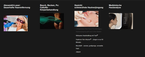
You write about the width, but all menu items & images are the same width
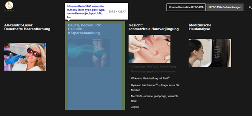
In the image above you have manual line breaks between the words, probably so the long word would not break and be hard to read
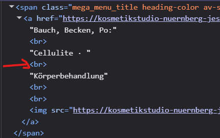
So this might make the space look larger, but it’s really not.Best regards,
MikeHi,
To show the post featured image on the category pages, I added this to your child theme functions.php file:add_filter('avf_blog_style','avia_change_category_blog_layout', 10, 2); function avia_change_category_blog_layout($layout, $context){ if($context == 'archive') $layout = 'single-big'; return $layout; }As for your excerpts, right now you are using manual excerpts, what you call the summary box at the bottom of the article page, when these are used the auto excerpts are disabled, so you can’t have both. You could add more text to the manual excerpts if you wish.
Best regards,
MikeHi,
Try adding this css:.home #portfolio { z-index: 11; }Then clear your cache and check.
Best regards,
MikeHey Sebastian,
I believe your best solution will be to create a new menu for mobile.Best regards,
MikeHi,
When I check the section background is now dark, so it seems correct now. It looks like you have not tried the function in your child theme function.phpfunction custom_avf_post_css_create_file( $create ) { return false; } add_filter( 'avf_post_css_create_file', 'custom_avf_post_css_create_file', 10, 1 );Give that a try.
Best regards,
MikeApril 11, 2026 at 2:01 pm in reply to: Duplicate Post Function Changes Original Slug (Enfold) #1496732Hey Tim van den Hombergh,
Thanks for your input, but I was not able to reproduce the original post slug changing.
I’m not sure why you are experiencing this, perhaps a plugin conflict, etc.
If you would like the Dev Team to review this proposed change, please open a Github Feature Request this will allow you to follow along as the Dev Team reviews the proposed change.Best regards,
MikeHi,
Glad that we could help, if you have further questions please open a new thread and we will try to help. Thanks for using Enfold.Best regards,
MikeApril 8, 2026 at 9:28 pm in reply to: Slide Show volle Breite wird (auf einmal) nicht mehr angezeigt #1496687Hey Damenwahl,
You have a jQuery error:
Uncaught Error: Syntax error, unrecognized expression: #fachlehrkr%C3%A4fte
This is from your menu item:
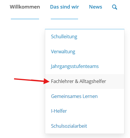
Try removing the ä from the link.Best regards,
MikeHi,
Thanks, try this css:.responsive .page-id-7475 #after_section_4 .container, .responsive .page-id-7625 #after_section_4 .container { max-width: 100%; padding: 0; background-color: #c29454; } .page-id-7475 #after_section_4 .wpcp-carousel-section.nav-vertical-center, .page-id-7625 #after_section_4 .wpcp-carousel-section.nav-vertical-center { margin: 0; } .page-id-7475 #after_section_4,.page-id-7625 #after_section_4 { border-top-style: none; }Best regards,
MikeHi,
Yes that is correct, as I had pointed out above.
Please link to the final page that it will be on so we can adjust. Do you plan to have this on multiple pages or just one?
If you are going to use it on multiple pages it will be important that the pages have the same structure.Best regards,
MikeHi,
Try this instead:@media only screen and (max-width: 890px) and (orientation: landscape) { #header.header_color div .av-hamburger-inner, #header.header_color div .av-hamburger-inner::before, #header.header_color div .av-hamburger-inner::after { background-color: #fff; } }Best regards,
MikeHi,
Try adding this css:@media only screen and (max-width: 890px) and (orientation: landscape) { .html_mobile_menu_tablet .header_color div .av-hamburger-inner, .html_mobile_menu_tablet .header_color div .av-hamburger-inner::before, .html_mobile_menu_tablet .header_color div .av-hamburger-inner::after { background-color: #fff; } }Then clear your cache and check.
Best regards,
MikeHi,
You misunderstood, this is not my css, it is your css already on your site that you need to change:.template-page.content.av-content-full.alpha.units { padding-top: 20px !important; padding-bottom: 20px !important; }Change 20px to zero
Best regards,
MikeHi,
Typically code is red when there is an error, looks like you have / / above the css.Best regards,
MikeHi,
Looks like you have this css:.av-masonry-entry { visibility: hidden; opacity: 0; } .av-masonry-sort { visibility: hidden; } #top .av-masonry-load-more { visibility: hidden; opacity: 0; }Check your css or element settings.
Best regards,
MikeHi,
The top padding is set by your custom css:.template-page.content.av-content-full.alpha.units { padding-top: 20px !important; padding-bottom: 20px !important; }Change 20px to zero if you want to remove it, but note this will affect all of your pages.
While you have set the text color to white, your text is bold (strong) which has a blue color, either remove the strong tag, or add the color to the span style, like your font size.
If you don’t know how to do that try this css:.avia_textblock p span[style*="color: #ffffff"] strong span[style*="font-size: 14pt"] { color: #ffffff; }Best regards,
MikeHi,
It sounds like a caching issue with smushit, try disabing it for a week and see if that helps, or add this function to your child theme function.phpfunction custom_avf_post_css_create_file( $create ) { return false; } add_filter( 'avf_post_css_create_file', 'custom_avf_post_css_create_file', 10, 1 );Best regards,
MikeHi,
For the page your wpcp-carousel is on this css will work:.responsive .page-id-7658 #after_horizontal_gallery .container { max-width: 100%; padding: 0; background-color: #c29454; } .page-id-7658 #after_horizontal_gallery .wpcp-carousel-section.nav-vertical-center { margin: 0; }But once you move it to another page it will not work, we would need to see the final page that it will be on to adjust the css. Do you plan to have this on multiple pages or just one?
Best regards,
MikeHi,
To disable the Linked Image Overlay, go to Theme Options > Advanced Styling > Linked Image Overlay > Disable OverlayBest regards,
MikeHey schweg33,
The height of the text block is based on the content inside of it. The paragraph tag in it will has top & bottom margin, and the section that it is in has padding from your custom css:.template-page.content.av-content-full.alpha.units { padding-top: 20px !important; padding-bottom: 20px !important; }It would probably look nicer if you removed the background color.
Best regards,
MikeHey schweg33,
For your new menu you should go to Theme Options > Main Menu > Burger/Mobile Menu > Menu Icon Submenu Items > Always display submenu items
For other options you could easily compare the settings for both sites.Best regards,
MikeApril 4, 2026 at 1:41 pm in reply to: Enfold Theme Reset – Lost Options & Media / Recovery Assistance Needed #1496585April 4, 2026 at 1:11 pm in reply to: Media Library Empty After Enfold Reset – Files Exist in wp-content/uploads #1496582Hey Quazione,
Resetting the media library doesn’t remove the files but clears the database, to restore the files in the database you will need to upload the files again. There is a few plugins that claim to scan the file directory and add the files back into the database, but they have mixed reviews.We have not tested these, and there maybe others for you to try.
Best regards,
MikeApril 4, 2026 at 12:59 pm in reply to: Unable to Register Enfold Theme via Envato Token (403 Errors) #1496581Hey Quazione,
The Token needs specific permissions to verify the purchase and link your Envato account. If these are not correct you will receive an error, also note at Envato limits the number of checks a day across all of your licenses, so in some cases you will need to wait 24 hours before checking again. Above you write about a API key, which Envato no longer uses, so if you have a old version that asks for a API key, or some v4-v5 you will need to manually update before the Token will work.To manually update your version of Enfold you will need to download the latest installable WP version from your Theme Forest account and upload it to your WordPress ▸ Appearance ▸ Themes ▸ Add Themes ▸ Add New
after you choose the zip file and click install, you will see a This theme is already installed message because you are updating, you can continue,
then you will see the Theme updated successfully message.
After which you can go to your Theme Forest account and create a new Token for future automatic updates.Best regards,
MikeApril 4, 2026 at 12:47 pm in reply to: Enfold Theme Reset – Lost Options & Media / Recovery Assistance Needed #1496580Hey Quazione,
Sorry to hear that you have experienced this setback, clicking the Reset button gives this warning:
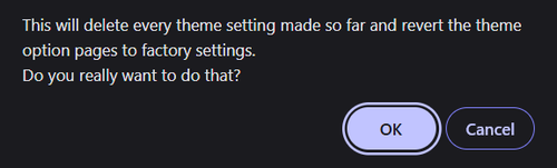
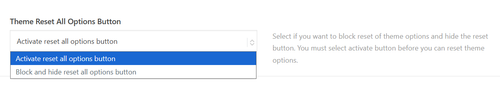
We also have a theme option to hide this button:
But unfortunately once you have approved of the reset there is no recover method, you will need to preform a site restore from your full backup.
You will not be able to restore a partial database.Best regards,
MikeHey kpamela24,
I see that your WordPress site health is also not loading. I see that you have a Search Replace plugin, perhaps using this broke something. Try resetting your site and do a fresh install of WordPress & Enfold to see if this works. If so try the Duplicator plugin to migrate from your localhost to your server.Best regards,
Mike -
AuthorPosts