Forum Replies Created
-
AuthorPosts
-
Hi,
Does your error log say on which page which image is giving a 404 error?Best regards,
MikeDecember 8, 2023 at 12:37 pm in reply to: Burger Menu JS click action is deferred by WP-Rocket #1427556Hi,
Thanks for the link to the WP Rocket bug report, the “solution” at the bottom leads to a 404 page, and the very last post from Nov 30, says it is not a working solution so perhaps WP Rocket is still working on this?
Nonetheless I will look at your staging site, please include an admin login in the Private Content area to the staging site so we can examine closer.Best regards,
MikeDecember 8, 2023 at 12:28 pm in reply to: Test page with solution now in Google Search results – please delete test page #1427555Hi,
Sorry for tne inconvenience, I have deleted my test page and added a robots.txt disallow rule and added a 301 redirect.
Unless there is anything else we can assist with on this issue, shall we close this thread then?Best regards,
MikeHey sharynt3,
Try this CSS in your Enfold Theme Options ▸ General Styling ▸ Quick CSS field:#top .avia-slider-testimonials.avia-testimonial-wrapper { overflow: visible; } #top .avia-slider-testimonials.avia-testimonial-wrapper .avia-slideshow-arrows { transform: translateY(0px); }This will please the arrows at the bottom of the element.
Please see the screenshot in the Private Content area of the expected results.Best regards,
MikeHi,
Glad Ismael could help, if you have any further questions please create a new thread and we will gladly try to help you. Thank you for using Enfold.Best regards,
MikeHey Obrmarketing,
Are you able to roll back with a server backup to get your site back up & running?
Are you using a child theme with any custom theme files such as a footer.php or header.php? This is the most common reason for errors when updating. Try removing these files and checking again. Any customizations you wish to make should be done in your child theme functions.php
If this doesn’t help, please include an admin login and ftp access in the private content area so we can be of more assistance.Best regards,
MikeHey smarta-brett,
We don’t have a public why for you to see this information, I assume that it would be in your Envato (Theme Forest) account because that is where our system pulls the information from, but I looked up your email address and put the information below.
If you have other email address with accounts please list them and we can search them.Best regards,
MikeHi,
I checked all of your pages and only found one 404 on the page /wedding-photography-packages/ for in the section under “Extras” please see the screenshot in the Private Content area.
Please try correcting that image.Best regards,
MikeDecember 8, 2023 at 12:18 am in reply to: Burger Menu JS click action is deferred by WP-Rocket #1427495Hi,
I have not heard any feedback yet. Perhaps if you could create a staging site we could examine closer, if you do please try to disabled the CDN for it, because often when testing the CDN will skew the results so that the cached is not cleared when you think it is. Often it is these little things that turn out to be the issue.
It seems that this be related to something locally as we are not seeing this issue with other sites, other than the one we linked to above.Best regards,
MikeDecember 7, 2023 at 6:02 pm in reply to: The colour section is smaller than it should be for a short time #1427486Hi,
Glad Ismael could help, if you have any further questions please create a new thread and we will gladly try to help you. Thank you for using Enfold.Best regards,
MikeHi,
Glad Guenni007 could help, thank you Guenni007, if you have any further questions please create a new thread and we will gladly try to help you. Thank you for using Enfold.Best regards,
MikeHi,
Glad Ismael could help, if you have any further questions please create a new thread and we will gladly try to help you. Thank you for using Enfold.Best regards,
MikeHey Anouk,
Thank you for the link to your site, this button show the WordPress Block Editor sidebar, but it is not working when the Block Editor is in Fullscreen mode, so for now you can click the three dots to see the options and you will see that the fullscreen mode has a check next to it, so click it again to disable the fullscreen mode and then the sidebar button will work correctly. WordPress changed the way this worked with the last update and we have corrected it in our v5.6.9 update that will be released in the next few days.
I checked the beta v5.6.9 version and it is working correctly so please wait a couple of days for the update.
I don’t have a exact day for the release as the Dev Team is just double checking a few things, so thank you for your patience.Best regards,
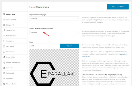
MikeHey fabioque,
Thank you for the link to your site, in the theme settings the frontpage was also selected as the “blog” page, the frontpage can’t be both so I fixed this and now your site is working correctly.
Please clear your browser cache and check.
Best regards,
MikeHi,
I had not heard that long URLs were bad for SEO, but SEO is not an area that I focus on, here are some articles that I found:
Does URL Length Affect SEO?
Are Long URLs Bad For SEO?
How to Create SEO Friendly URLs
Since you have so many pages inter linking with each other and you don’t want to have broken links, you could plan on adjusting new post URL lengths going forward.Best regards,
MikeDecember 7, 2023 at 5:02 pm in reply to: Image titles stopped appearing when clicking on them #1427472Hi,
Glad Nikko was able to help, if you have any further questions please create a new thread and we will gladly try to help you. Thank you for using Enfold.Best regards,
MikeDecember 7, 2023 at 12:02 pm in reply to: code for woocommerce categories & checkout field labels #1427440Hi,
Glad Nikko was able to help, if you have any further questions please create a new thread and we will gladly try to help you. Thank you for using Enfold.Best regards,
MikeHi,
Please find the link below to import the 2017 demo slider into your LayerSlider using the import button:

Best regards,
MikeHey ilonka78,
It looks like you used the construction demo to create your site, which has the fullwidth easy slider at the top, and you want to use the LayerSlider slider at the top like the 2017 demo, correct?
I can post the LayerSlider so that you can import it into your site and then you can remove the top slider on your page and add the LayerSlider element to your page if you like, but if you look at the free templates available in your LayerSlider you may find a slider that you like better than the 2017 demo slider, have you taken a look?
Try going to the LayerSlider templates:

then click sliders:

then click free to see only the free ones:

Best regards,
MikeDecember 6, 2023 at 8:21 pm in reply to: WordPress database error: [Unknown column 'blog_id' in 'field list'] ERROR! #1427380Hi,
Glad to hear that you have this sorted out, if you have any further questions please create a new thread and we will gladly try to help you. Thank you for using Enfold.Best regards,
MikeHi,
Glad we were able to help, if you have any further questions please log into the support forum and create a new thread and we will gladly try to help you. Thank you for using Enfold.Best regards,
MikeHey Jonathon Parris,
Thanks for the css, the issue is that your css for the H2 & H3 tags are don’t have enough specificity, you need to add some IDs and classes to override the theme css, like this:@media only screen and (max-height: 767px) { #top .main_color h2 { font-size: 30px; line-height: 30px; font-family: "Bangers"; } #top .main_color h3 { font-size: 45px; line-height: 45px; font-family: "Bangers"; } }If this doesn’t help please log into the support forum and open a new thread with the url to the page in question so we can examine the specific element closer.
Please note that using the contact form is not appropriate for support question.
If you are unable to login to the support forum because you don’t have a activate support contract, please try going to your Theme Forest account and renew your support and then log in to the support forum and open a new thread.Best regards,
MikeHi,
Thanks but I don’t see the same screen that is in your screenshot, but try this css:#top .main_color p.return-to-shop a.button, #top.woocommerce-account .main_color a.button { color: #fff !important; }Please ensure to copy the code from the forum and not an email notification so the symbols are not converted.
After applying the css, please clear your browser cache and check.Best regards,
MikeHi,
I asked the Dev Team if this was possible and they said that they are not sure if the new Envato API allows that, but it will require them to research this further. The Dev Team asks that you open a Github Feature Request for this so it will be in the correct channel and you can follow the request while they investigate.
Thank you for your patience and for using Enfold.Best regards,
MikeHi,
Thank you, we will leave this thread open to hear back from you.Best regards,
MikeHi,
Ok, I didn’t save your login from any of the old threads (I never save logins) so please provide a login here again and ensure that it has the customer account info so I can see the buttons like in your screenshot above, and a direct link to the account page would be nice so I don’t have to hunt for it, then I can assist with som css :)Best regards,
MikeHi,
Try this CSS in your Enfold Theme Options ▸ General Styling ▸ Quick CSS field:#top .main_color .product[class*="product_cat-"] a .woocommerce-loop-product__title { color: #856c4d !important; }Please ensure to copy the code from the forum and not an email notification so the symbols are not converted.
After applying the css, please clear your browser cache and check.Best regards,
MikeHi,
Do you mean the product category pages like the one linked below?Best regards,
Mike -
AuthorPosts