Forum Replies Created
-
AuthorPosts
-
Hi,
Glad to hear that you have this sorted out, if you have further questions please open a new thread and we will try to help. Thanks for using Enfold.Best regards,
MikeHi,
Glad that Ismael could help, if you have further questions please open a new thread and we will try to help. Thanks for using Enfold.Best regards,
MikeHey Munford,
Your buttons are on top of each other due to position: absolute; in this custom css:.priser .avia-button-wrap { display: inline-block; position: absolute; bottom: 30px; left: 0; right: 0; }Try this instead:
.priser .avia-button-wrap {
    display: block;
    position: relative;
}
Best regards,
MikeHi,
Try adding this css:.html_header_top.html_logo_center .logo img { left: 50%; transform: translate(-50%, 0); }After applying it, clear your browser cache & check.
Best regards,
MikeOctober 19, 2025 at 3:38 pm in reply to: Full screen slider links don’t work when permanent caption is selected. #1490372Hi,
Thanks for your patience, I found that this issue seems to only occur when videos are used in the slider. I opened a issue with the Dev Team for them to review, when we hear back we will post here.Best regards,
MikeOctober 17, 2025 at 10:35 pm in reply to: Add widget for Portfolio Item categories to sidebar that is dynamic #1490360Hi,
Glad that Ismael could help, if you have further questions please open a new thread and we will try to help. Thanks for using Enfold.Best regards,
MikeHey gquezada1,
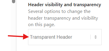
To make the header transparent, choose the Transparent Header option for your page:

Then to make the header not sticky, go to Theme options > Header > Header Behavior > Sticky Header and unchoose:

This is the solution for desktop, transparent headers are not supported for mobile by default, for mobile you will need to follow this thread:Best regards,
MikeHi,
Glad that Ismael could help, if you have further questions please open a new thread and we will try to help. Thanks for using Enfold.Best regards,
MikeHi,
Glad that Ismael could help, if you have further questions please open a new thread and we will try to help. Thanks for using Enfold.Best regards,
MikeOctober 12, 2025 at 2:32 pm in reply to: Main Page Moves Few Pixels Right When Shopping Cart is Clicked #1490078Hi,
Try this css:body.xoo-wsc-cart-active, html.xoo-wsc-cart-active { overflow: visible !important; }After applying it clear your browser cache and check.
Best regards,
MikeHey sitesme,
Try this css:.avia_transform #top .avia-slideshow .avia-slideshow-slide .av-slideshow-caption { opacity: 0; } .avia_transform #top .avia-slideshow .avia-slideshow-slide.active-slide .av-slideshow-caption { animation-name: delayedSlideUp; animation-duration: 2s; /* 1s delay + 1s animation */ animation-fill-mode: forwards; opacity: 0; } @keyframes delayedSlideUp { /* 0% to 50% is the 1-second delay period */ 0% { transform: translate3d(0, 100%, 0); visibility: hidden; opacity: 0; } 50% { transform: translate3d(0, 100%, 0); visibility: visible ; opacity: 1; } /* 50% to 100% is the 1-second slide-up animation */ 100% { transform: translate3d(0, 0, 0); visibility: visible ; opacity: 1; } }After applying it, please clear your browser cache and check.
Best regards,
MikeHey PhatJ,
Typically creating a popup lightbox doesn’t require changing the avia.js
Try following these steps.Best regards,
MikeOctober 11, 2025 at 2:37 pm in reply to: Can’t see my portfolio item’s preview image after adding it in Avia Builder #1490054Hey turkishmarket,
In your portfolio grid element you must choose the Open a preview of the entry (known as AJAX Portfolio) for the portfolio Preview Gallery to show.

I set this for you on your portfolio page and the first item (Trend Set 3 Pieces (1L)) now shows the Preview Gallery in the Ajax box when it is clicked. This is how this option works.

Best regards,
MikeHey annameis,
You could use the <embed> tag in a code block element:
<embed src="https://your-site.com/your-page.html" width="1000" height="500""/>
See the example below.Best regards,
MikeHi,
Glad that Rikard could help, if you have further questions please open a new thread and we will try to help. Thanks for using Enfold.Best regards,
MikeHi,
Glad that we could help, if you have further questions please open a new thread and we will try to help. Thanks for using Enfold.Best regards,
MikeHey sitesme,
To make the font size 14px on both pages, add this css:#top .av-inner-masonry-content .av-inner-masonry-content-pos-content .av-masonry-entry-content.entry-content { font-size: 14px; }After applying the css, clear your browser cache and check.
Best regards,
MikeHi,
Try this css:#top.page-id-431 #main, #top.page-id-431 #av_section_2.avia-section { background-color: transparent; }After applying clear your browser cache and check.
Best regards,
MikeOctober 10, 2025 at 8:20 pm in reply to: How to Put a Custom Element Button into a Sidebar Widget #1490031Hi,
The login that you posted is not working for me, please check the password.
The reason that the button in the sidebar doesn’t have white text is due to this custom css in your child theme:.sidebar a, .sidebar a > strong { color: #2997ab ! important; }note the class “sidebar”, to correct you could remove this css, or add this css:
.sidebar a.avia-button {
    color: #fff ! important;
}
After making your changes please clear your browser cache and check.
Best regards,
MikeOctober 7, 2025 at 11:11 pm in reply to: Remove featured image from blog post created with Gutenberg #1489940Hey atx_m,
For the page that you linked to try this css:#top.single-post .big-preview { display: none; }Then clear your browser cache and check.
Best regards,
MikeOctober 7, 2025 at 10:21 pm in reply to: Mobile Menu Styling Not Working on Child Theme on Staging Site #1489939Hey classywebsites,
To add a bold font weight to the mobile menu you need to choose the Menu Links in overlay/slide out option in the Advanced Styling, I did this for you and it now works.
As for the mobile menu, please note that your desktop menu has too many items to show in a single line and not be under your logo until 1215px, so I recommend adding this css:@media only screen and (min-width: 768px) and (max-width: 1215px) { .responsive #top .av_mobile_menu_tablet .av-main-nav .menu-item-avia-special { display: block; } .responsive #top .av_mobile_menu_tablet .av-main-nav .menu-item { display: none; } }I added it for you in your WordPress > Customize > Additional CSS and tested desktop, tablet and mobile, please clear your browser cache and check.
Best regards,
MikeOctober 4, 2025 at 10:03 pm in reply to: Top Color Section on home page, is just white space #1489865Hi,
Glad that we were able to help you sort this out. Thanks for using Enfold.Best regards,
MikeOctober 4, 2025 at 4:16 pm in reply to: content disappears, cookie consent not working properly #1489859Hi,
The error SyntaxError that Ismael saw was in your GA Google Analytics plugin, disabling solves.
But I don’t see any missing content & the mobile menu works for me, so I’m not sure of the error.
I enabled the GA Google Analytics plugin again.Best regards,
MikeHi,
Try this css:.avia-table td:nth-child(n+2), .avia-table .avia-heading-row th:nth-child(n+2) { text-align: right; }Best regards,
MikeOctober 4, 2025 at 3:31 pm in reply to: Background Video in colour section shows the beginning of video once it has play #1489856Hi,
When I check your test page the “opening frame” is relly the background image so use this css to hide:#top.page-id-11644 #av_section_1 { background-image: none; }note the page ID in the css, remove or adjust for your working page.
Then leave Ismael’s script to stop the loop and add this script to end on the last frame/second, your video is 29s so the script ends on 28s. Adjust for future videos and adjust the page ID.
Add this to your child theme functions.php:function pause_video_on_last_sec() { ?> <script> if (document.body.classList.contains('page-id-11644')) { var x = document.getElementsByClassName("avia_video"); var i; for (i = 0; i < x.length; i++) { x[i].addEventListener("timeupdate", function(){ if(this.currentTime >= 28) { this.pause(); } }); } } </script> <?php } add_action( 'wp_footer', 'pause_video_on_last_sec', 99 );Best regards,
MikeOctober 4, 2025 at 2:40 pm in reply to: events calendar add to calendar dropdown getting cut off #1489855Hi,
Glad that Ismael could help you on the path to sorting this out.Best regards,
MikeOctober 4, 2025 at 2:36 pm in reply to: WooCommerce – Entfernen der Dropdown-Sortierung auf der WooCommerce Shop-Seite #1489854 -
AuthorPosts


