Forum Replies Created
-
AuthorPosts
-
Hi Nikko,
I have been trying to fix it myself. Right now deleted and recreating staging. Take a look on https://staging-mindcrowd.kinsta.cloud/ everything works properly. Once you have seen it, I will update the theme (hopefully it will go smoothly but if it doesn’t, then you know that’s the only change made to the Staging site) ;)
Please, let me know. All the links show up fine, and the TOCs render perfectly. As soon as you tell me, I will update the theme.
Thank you in advance!
Havi
PS: I hope this solved it.November 19, 2021 at 8:39 pm in reply to: Mobile Landscape not Responsive and WhiteSpace Hide on Desktop not Working #1329741Hi Rikard,
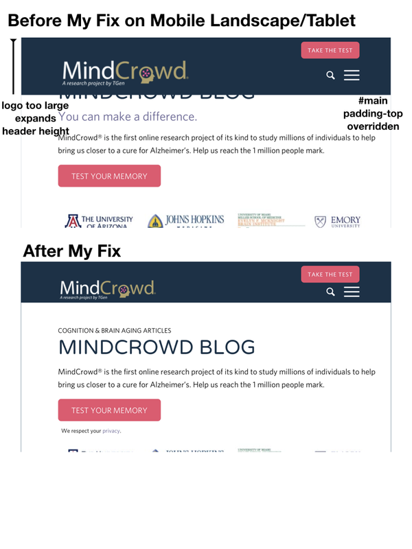
Adding a couple of images to show you the difference. My fix took care of it. I do not need to try any CSS. I just wanted you to review mine to make sure I am not affecting anything else.
Be aware this only happens when the Header as a fixed size set manually. I checked on sites whose header is either large or slim, and this does not happen.
This is the before and after my CSS fix on a Page as seen on a Mobile Landscape/Tablet.
This is the before and after my CSS fix on a blog post as seen on a Mobile Landscape/Tablet.
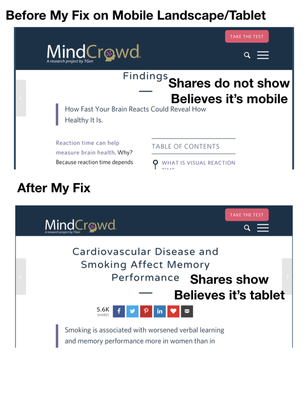
Fixing only the header, may not work. You might need to fix the padding-top on #main that gets overriden so I had to add a margin-top.
Hope it helps others.
Havi
November 19, 2021 at 2:35 am in reply to: Mobile Landscape not Responsive and WhiteSpace Hide on Desktop not Working #1329580After so many years always using Enfold, I guess I only reach out to you when there are complex issues. ;)
I think I fixed it – it’s not the Child theme. two things are behaving strangely:
1- the logo becomes way too big on Tablet.
2- the #main area needed more top padding as margin-top kept being overriden somehow./* fix menu height and logo size on tablet*/
@media only screen and (max-width: 989px) and (min-width: 768px) {
.responsive.html_mobile_menu_tablet #top #header_main > .container .main_menu .av-main-nav > li > a, .responsive.html_mobile_menu_tablet #top #wrap_all .av-logo-container {
height: 60px;
line-height: 70px;
}
.responsive #top #main {
margin-top: 70px !important;
}
}I hope this helps others who may see their tablet render a bit strangely.
And I am bring back a piece of code that I found on a 2 years old ticket that Yigit fixed and thank you Yigit!! This came in very handy too:
/*remove sidebar from tablet*/
@media only screen and (max-width: 990px) {
.content {
width: 100%!important;
border: none!important;
}
.sidebar {
display: none!important;
}}Rikard,
Can you check what I did and tell me if I need to tweak anything? It will be really appreciated!!!
Warmly,
Havi
November 18, 2021 at 5:26 pm in reply to: Mobile Landscape not Responsive and WhiteSpace Hide on Desktop not Working #1329543Hi Rikard,
Perfect. Let’s discard the obvious (and easiest) first. Maybe there is some Quick CSS that is affecting this behavior. So I went through it and pulled only those 4 CSS that affect the header. Is any of these causing the issue and should be modified? Maybe specify the screen size so they don’t affect tablets?
Don’t remember how they came to be as some maybe really old and need to be removed. This would be a good time. ;)
/*Header Container Stretch */
.html_header_top #top .av_header_stretch .container {
width: 83%;
max-width: 100%;
}/* top menu bar button*/ << this is so it displays the Call to Action Pink button on top. Very important.
span.avia-menu-fx { display: none; }
li#menu-item-40 a {
background: #ea526e;
color: white;
}
#top #header_meta a, #top #header_meta li, #top #header_meta .phone-info {
color: #ffffff;
border-color: #163248;
text-transform: uppercase;
font-weight: 700;
margin-top: 2%;
padding-top: 10px;
padding-bottom: 10px;
padding-left: 15px;
padding-right: 15px;
border-radius: 7px;
font-size: 13px;
}
#header_meta .container {
min-height: 40px; << this maybe needs screen size defined?
}
.av_secondary_right .sub_menu>ul>li:last-child, .av_secondary_right .sub_menu>div>ul>li:last-child {
border: none;
margin-right: -15px;
}/*avoid click on items on page when hamburger menu expands to full screen*/ << this one is fresh and good
#header {
position: relative;
z-index: 9999;
}/*Keep Header on Mobile Fixed*/
.responsive #header {
position: fixed !important;
top: 0;
}
.responsive #top #main {
padding-top:95px !important; << maybe this one needs screen definition to not affect tablet?
}Crossing my fingers that a few modifications to this code will fix the issue. The header on the Child Theme is identical to the one on the Parent Theme. I just replaced it but it shouldn’t cause any issues as they are one and the same. If it does, then there is a problem creating a Child theme. And I don’t think that’s the case.
What do you think? If this is not the issue I already have the screenshots, and I’ll start putting them together. Sometimes a picture is worth a thousand words (but for the sake of both our times, let’s hope it’s a CSS for mobile or desktop that is affecting behavior on tablet.
Thank you!
Havi
Thank you, Mike!! You da best!!
November 17, 2021 at 11:51 pm in reply to: Mobile Landscape not Responsive and WhiteSpace Hide on Desktop not Working #1329387Hi Rikard,
I am going to test the whitespace later. But the Mobile Landscape covering the section text can be partially fixed with these values:
@media only screen and (max-width: 989px) and (min-width: 768px), all
layout.css:2577.responsive.html_mobile_menu_tablet #top #header_main > .container .main_menu .av-main-nav > li > a, .responsive.html_mobile_menu_tablet #top #wrap_all .av-logo-container {
height: 55px;
line-height: 65px;
}There is still a portion of the section text that is covered by the header. Can you please help me craft the final CSS code?
This is a Fixed height header (60px) and that’s slimmer than Slim, sticky and logo and menu position adapt to browser window.
For some reason, this behavior doesn’t happen on other sites I checked whose Logo and menu do not adapt to browser window.
So I still have a few more pixels to shorten here, I would appreciate your help on it.
I will keep this ticket as Mobile Landscape not responsive and will open a new ticket for the whitespace (the whitespace was my workaround but I happened upon a different issue and will check a few more things before I submit the ticket, if needed)
Basically, for tablet or mobile landscape the header is taking over more space and the footer need a breakpoint after two widgets when there are 4 widgets in it. < I can open a new ticket for this one if you’d like.
Changing to the parent theme is affecting the footers, (hopefully nothing else) as I keep moving the content for the 4th footer widget from the first to the 4th. I’d appreciate it if you do not change it to the parent theme. :)
Hope this additional info helps. Best regards and thank you in advance!
Havi
Thank you, Ismael!!! It worked like a charm!!! Should I remove this part? (I would rather remove what we don’t need so we don’t have any other issues later) ;)
/*avoid play of youtube on mobile menu*/
#top.home .avia-video .av-click-to-play-overlay .avia_playpause_icon {
display: none;
}
#top #wrap_all .av-burger-overlay-scroll {
background-color: #163248;
opacity: 1;
}One down, a few more to go!! :)
Warmly,
Havi
Hi Mike,
It did not work. It clicks the embedded video below the menu item and starts playing the video. You remain on the full page display video.
Cleared browsers. Went incognito. Did not respond.
Help!
Thank you!
Havi
November 16, 2021 at 6:55 pm in reply to: Mobile Landscape not Responsive and WhiteSpace Hide on Desktop not Working #1329256Found more!! It works and only displays on mobile landscape if I add the separator inside of the 1st color section but it I add it inside or a Grid Row (like on the home page) it does not respond to the Advanced options to Hide on large and small screens.
Maybe the behavior has changed somehow with the last release? I hope this helps.
Thank you!!
Havi.
November 16, 2021 at 5:11 pm in reply to: Mobile Landscape not Responsive and WhiteSpace Hide on Desktop not Working #1329242Hi Rikard,
Yes, the problem is that the content is being hidden under the header on mobile landscape.(not on desktop or mobile portrait) so I wanted to add a separator for mobile landscape only) but when I tell it to hide it on large screens, it doesn’t. It adds those 50px to the top.
Please, compare your screenshots with the separator removed. I removed the whitespace separator. The space is gone. I did not change the padding of the first section. The separator is adding that padding. And those 50px belong to the separator that are not supposed to display on large screens. Feel free to add the separator again on that page. But it happens on every page I add it to.
The other problems are that on mobile landscape the rendering is off. The footer is crammed up (I think it needs a break point after two widgets. And some dark blue lines appear between the sections that are not there on desktop or mobile portrait.
Thank you so much!
Havi
November 16, 2021 at 7:03 am in reply to: Mobile Landscape not Responsive and WhiteSpace Hide on Desktop not Working #1329169Hi Rikard,
The header only has the GTM code so as it’s staging, I just replaced it with the one from the parent theme and it is still not working. :(
I added a Separator/Whitespace to the top of the page and checked hide on large screens and it doesn’t hide it.
Please, do not remove the look of Staging asa couple of pages have been sent for approval of the government before we can move them to the Live environment. I cannot afford to lose the work. But planning on copying the page as drafts to the Live environment tomorrow.
Do you think it’s something else? And if the parent child works, there aren’t many more files on the Child theme. And I don’t see anything off.
Is it possible that the latest updates did not go through as expected? Kinsta did recover the site off a backup to Staging. They say there are no corrupt files but I doubt it. Should I use Filezilla and manually upload the theme? Like, delete the Enfold folder and replace it with a freshly uploaded one?
Tell me what steps you want me to take and I’ll take care of them.
Thank you so much!
Havi
November 16, 2021 at 12:40 am in reply to: Mobile Landscape not Responsive and WhiteSpace Hide on Desktop not Working #1329143Hi Rikard!
How are you? Yes, I see the problem both on Staging and on the Live sites. Sending you the admin login. Let me know how to fix it so I can add the same fix to the Live site.
Thank you!!
Havi
Thank you, Mike! That’s really harcoded. And it would show up every time I have this button with this text, That would create a different issue and this is getting too complex.
I did remove the CSS I had added to the child theme’s stylesheet (hope that was ok)
/*padding left to text*/
p.padleft {
padding-left: 20% !important;
}I guess the theme has a bug right now regarding displaying or hiding whitespace. And rendering on mobile landscape. I will create a new ticket to address it.
Thanks.
Havi
Thank you, Mike. It’s close but I need to do away with the left padding. It’s not centered and it looks off.
Is there a way to add the text under the button on the same <div>? I do like it closer and centered with respect to the button. I wonder why it wouldn’t pick up the CSS when I added the actual <div> code with Code. Was I supposed to select some additional option?
This was the code I added to Code (it showed the button and the text perfectly but not the right colors):
<div class=”avia-button-wrap avia-button-left avia-builder-el-4 el_after_av_textblock el_before_av_textblock ” title=”Play the MindCrowd Memory Test”><span class=”avia_iconbox_title”>TEST YOUR MEMORY</span>
<p style=”font-size:13px;text-align:center;”>We respect your Privacy.</p></div>Can I remove the CSS I had added to the child theme’s stylesheet?
/*padding left to text*/
p.padleft {
padding-left: 20% !important;
}One more CSS question:
There’s a padding inside of the cell 75px top not rendering on landscape mode on mobile. It does show on Desktop, and on Portrait Mobile but not on Mobile Landscape. So, the text is under the menu.
I changed the break point for the top section hoping it would not be covered by the menu when I look at it on landscape mode on mobile, but it did not work. (It was Grid Row Mobile Breaking point > On Mobile Devices 767px or lower and now it is On Tablets > 989px or lower)
Thank you in advance!!!
Warmly,
Havi
If I add a white space 20px and select Hide on Desktop, It does not hide it on Desktop either and the screen also does not cover the full viewport on mobile landscape.Hi Mike!!
Thank you so much! The most important part is the top padding for the text (bottom padding for the button above) I have tried adding margin and padding-top=0px and bottom for the button and the same for anything that I could find but I could not get the text close to the button above as I need it to be (like when it’s inside of the same <div>)
I added the text to the page you have on Private data. And a class=”padleft” but it does not work. I gave it 20% (so I could notice it would be applied) but I also need it to be responsive so adding px would not translate well)
Is there a way to create a button with the text under it as a new element? I think the issue it the box itself that adds spacing in between. But look forward to your suggestions.
Thank you in advance!!
Warmly,
Havi
Hi Rikard,
I found the problem. You won’t believe what it was. My client’s sysadmin (they maintain a pretty large IT center) changed the DNS settings for this subdomain on Cloudflare to Proxied. That’s why the cache was not clearing up. When I asked for a screenshot of the DNS records, the Proxied status was there on the screenshot and he kept saying that nothing was being cached on his end.
Sometimes I don’t know how some people keep their jobs. He removed the Proxy caching at midnight (my time) last night and I just got up and wanted to let you know.
Feel free to close this ticket. Nothing was wrong on this end. Heads up to others, if it looks like something has been cached, and the same code works on an uncached environment, you cleared the server’s cache, the browser’s cache and even gone incognito, don’t let host support people tell you otherwise. It’s cached somewhere.
Thank you so much!
Havi
October 2, 2021 at 10:31 pm in reply to: TOC widget content disappers after update to 4.8.6.3 #1323303Guys,
Tested and it works like a charm!! Thank you!! You are geniuses!!
(Already fixed the footer – thank you for pinning it to the top)
Will check the rest to make sure all is well. :)
October 2, 2021 at 10:24 pm in reply to: TOC widget content disappers after update to 4.8.6.3 #1323302Guys, following this as I have the same problem. Here’s a link to my staging site, I even added a new Shortcode to the post to see if that did it with Blocks and nothing.
Please let us know if this works so we can implement this solution.
Thank you,
Havi
PS: Also let me know if there’s anything else you would like from me.
Hi Rikard,
Never mind. I just checked once more and now everything renders properly. Something must have been hyper cached somewhere out of my control.
Thank you!!!
One of your biggest Enfold fans.
Havi :)
Hi Rikard!
Weird, right?
Sending you the wordpress admin login and login URL in Private Content Section.
TIA!!
Havi
Hi Yigit!!!
All is well around here!!! And I just added this to staging’s functions.php child’s theme and it worked like a charm!
I am going to add it to the live site.
Thank you!!
Havi
-
This reply was modified 2 years, 11 months ago by
havi.
Hi Ismael,
This is what I see for some reason: https://ibb.co/F3Zhy2P
All I want is to stop the Block Editor from loading as I am only using the Classic Editor. This is the only site that I run that has this issue. All my clients have Enfold. Why is this happening here?
How do I stop it from loading?
Thanks,
Havi
PS: Those articles are appreciated but not the issue here. I reached out to Kinsta and the server was experiencing issues and hitting PHP limits (they probably restarted PHP) and I blocked a few IPs that were hitting hard and it immediately improved.
Hi Ismael,
I didn’t get an email about your reply.
The screenshot shows completely black. Nothing can be seen. Also, I just checked the website and the performance is so bad, I had to place a ticket with Kinsta.
What settings have you changed besides disabling the SSL default check?
This is a LIVE site. Performance went down the drain. How do I remove the Block Editor from Loading?
Thanks.
Havi
Hi Ismael,
Doing fine. Buried in work. but keep moving forward… :)
A- no cache plugins
B- I don’t see the block editor being loaded on any of my other client sites (some hosted on Kinsta and some on LiquidWeb)
I think you are right on the money when saying something is not quite working as it should.
Sending you the login details.
Thank you so much!
Havi
Hi Ismael!
How are you? Yes. Load Only Used Elements is always selected on both mentioned scenarios:
a- without file compression enabled (that’s how I can see the list of the elements loaded)
b- with compression enabled (that’s how you can see the Block Editor is being loaded and the merged avia file is way to big)
I have cleared the server’s cache from Kinsta before compressing, and after compressing. I set it up and maintain it, why is this happening and any ideas, suggestions? Why does this only happen on the mobile/responsive version and not on the desktop version?
Thank you!
Havi
Thank you Niko!! It worked!
Warm regards!
Havi
Hi Nikko!
The helper-main-menu.php worked like a charm!
Thank you!
This will be replaced on the next Enfold release, right? I don’t have to create a child version, correct?
Havi
November 30, 2020 at 5:45 pm in reply to: Schema Markup Errors when Turning Blog Post to ALB #1264037Hi Ismael,
Could you please submit this as a bug? I have been turning blog articles to pages by using ALB for years (as recommended a long time ago by Kriesi) and this error never happened. I first noticed it when Yoast changed their Schema and you guys added the SEO deferring to the SEO plugin.
Something has gone awry. I suggest looking into why there are two “blog” markups created, one is good and without errors and the other one has the errors. This never happened before.
I would not appreciate having to use another plugin for Schema to replace what the theme should provide by default. Switching to ALB is really wonderful for a blog boost as I can turn it to Evergreen while still remaining on the blog. It worked perfectly with no issues (as that information is still there, I can still see the date, author, and thumbnail) but now it fails. I am sure that you did not design allowing switching to ALB to create a markup issue.
Besides, Enfold has a pretty large CSS and JS file that impacts LCP (last contentful paint) and no matter how little code I use for the page, these are large files. Adding more plugins is not recommended.
Thank you.
Please keep me posted of the fix.
Havi
-
This reply was modified 3 years, 5 months ago by
November 26, 2020 at 12:31 am in reply to: Invisible 301s being created av-blog-meta-category-disabled #1263136Thank you, Ismael. I will test it this weekend on staging and let you know if it works. :)
November 23, 2020 at 9:51 pm in reply to: Invisible 301s being created av-blog-meta-category-disabled #1262482Ismael,
I never opened this ticket for the CSS. I have been extremely clear that there are redirects in the code that BOTS can crawl and identify as 301s given than I have custom category pages and I had to implement permanent redirects.
Enfold category pages are not customizable unfortunately.
Before I disabled Categories from being displayed on Blog Posts, I had 350 hyperlinks to categories that in my case, generated permanent redirects. Not that having that many links to category pages is good as it gives too much importance to the category pages.
I disabled them from displaying but still have 175 links (that generate the same number of permanent redirects) in the code.
Bots do not care if the CSS is hidden.
My question, once more, how do I remove this hyperlink from the code? Is there a way?
Thanks,
Havi
<main class=’content units av-content-small alpha av-blog-meta-comments-disabled av-blog-meta-category-disabled av-blog-meta-html-info-disabled av-blog-meta-tag-disabled’ role=”main” itemscope=”itemscope” itemtype=”https://schema.org/Blog” >
<div class=”av-heading-wrapper”><span class=”blog-categories minor-meta”>Lesiones Personales Abogados </span>
And here’s the report (partial):
Page URL with Redirect Link Initial Redirect URL Final Destination URL Status code Discovered
11 Cosas que tu Aseguradora no Quiere que Sepas | Reclamos Accidente
https://ligadejusticia.com/11-cosas-que-tu-aseguradora-no-quiere-que-sepas/ https://ligadejusticia.com/category/abogado-accidente-bicicleta/ https://ligadejusticia.com/abogado-accidente-bicicleta/ 301 22 Jun 2020 (01:15)11 Cosas que tu Aseguradora no Quiere que Sepas | Reclamos Accidente
https://ligadejusticia.com/11-cosas-que-tu-aseguradora-no-quiere-que-sepas/ https://ligadejusticia.com/category/accidentes-de-construccion/ https://ligadejusticia.com/accidentes-construccion/ 301 22 Jun 2020 (01:15)11 Cosas que tu Aseguradora no Quiere que Sepas | Reclamos Accidente
https://ligadejusticia.com/11-cosas-que-tu-aseguradora-no-quiere-que-sepas/ https://ligadejusticia.com/category/accidentes-de-auto/ https://ligadejusticia.com/accidentes-auto/ 301 22 Jun 2020 (01:15)11 Cosas que tu Aseguradora no Quiere que Sepas | Reclamos Accidente
https://ligadejusticia.com/11-cosas-que-tu-aseguradora-no-quiere-que-sepas/ https://ligadejusticia.com/category/lesiones-personales-abogados/ https://ligadejusticia.com/lesiones-personales-abogados/ 301 22 Jun 2020 (01:15)La 11a Feria del Libro Hispana/Latina en Nueva York | Queens 2017
https://ligadejusticia.com/11a-feria-del-libro-hispana-nueva-york-queens-2017/ https://ligadejusticia.com/category/comunidad/ https://ligadejusticia.com/comunidad/ 301 17 Aug 2020 (01:29)Novena de Navidad Centro Cívico Colombiano New York
https://ligadejusticia.com/20-novena-de-navidad-centro-civico/ https://ligadejusticia.com/category/comunidad/ https://ligadejusticia.com/comunidad/ 301 17 Aug 2020 (01:29)Abogado de Coronavirus COVID-19 • Demanda de Muerte por Negligencia
https://ligadejusticia.com/abogado-de-coronavirus-covid-19-demanda-de-muerte-por-negligencia/ https://ligadejusticia.com/category/lesiones-personales-abogados/ https://ligadejusticia.com/lesiones-personales-abogados/ 301 22 Jun 2020 (01:15)Abogados de Lesiones Por Quemaduras en New York | Accidentes NY
https://ligadejusticia.com/abogados-de-lesiones-por-quemaduras-en-new-york-compensacion-maxima/ https://ligadejusticia.com/category/lesiones-personales-abogados/ https://ligadejusticia.com/lesiones-personales-abogados/ 301 22 Jun 2020 (01:15)Accidente como Pasajero de Taxi en Port Jefferson, Suffolk: $77,000
https://ligadejusticia.com/accidente-como-pasajero…n-port-jefferson-77000-por-dolor-y-sufrimiento/ https://ligadejusticia.com/category/accidentes-de-auto/ https://ligadejusticia.com/accidentes-auto/ 301 22 Jun 2020 (01:15) -
This reply was modified 2 years, 11 months ago by
-
AuthorPosts