Forum Replies Created
-
AuthorPosts
-
Yes, thank you very much! The tip helped me a lot.
The script
#top #wrap_all .avia-slideshow-button, #top .avia-button {
background-color: rgba(0, 0, 0, .4) !important;
}
because I wanted the button at the top of the slider to be transparent black. I have now given the SLider a class and adapted the script:
.slider.avia-slideshow-button, .slider.avia-button {
background-color: rgba(0, 0, 0, .4) !important;
}Now everything is correct again! Perfect
Many thanks for your great support! Dianamany thanks for the script. now it works correctly!
many thanks for the script. now it works correctly!
Supplement:
Tablet portrait format: I was able to solve the splitting and switching of the cells for the iPad in portrait format myself, but there is still a problem with the display: see screenshot: https://osmosis.de/support/gm/person/grid-row3.PNG
How can I ensure that the content box (white speech bubble) fills the entire width of the screen and the text remains positioned in it?
The problem with the view in TABLET landscape format (see previous post) still exists. I would also need your help with this.
Best regards, Diana
Translated with DeepL.com (free version)
sorry Mike
I just tested it again: IT WORKS!!!
My problem has been solvedTHANK YOU for your SUPPORT!
Hello Mike,
first of all: shouldn’t it read like this in your script for the cell to be displayed (class: cell-dodisplay)?
@media only screen and (max-width: 1440px) {
.cell-dodisplay {
display: block!important; }
}So if I have understood it correctly: I give the first 3 cells with 1/5 3/5 1/5 all the class cell-nodisplay > so that they are all hidden on mobile devices including the ipad landscape format. I duplicated the cell with the text and put it in a 1/1 cell and named it with the class class-dodisplay. see scrennshot: https://osmosis.de/support/gm/backend.jpg
I now have the following script in the CSS:
@media only screen and (max-width: 1440px) {
.cell-nodisplay {
display:none !important; }
.cell-dodisplay {
display: block!important; }
}I cleared the cache on the ipad and still the same, wrong view appears as before: https://osmosis.de/support/gm/home/tablet-cell.jpeg
(in both views: tablet landscape and tablet portrait)Where is the error? Can you help me further?
Best regards, DianaWonderful! Now it works in the mobile version too! THANK YOU
Thank you for this hint and the screenshot. I have adjusted it according to your specifications, and it works PERFECTLY!!! Thank you :)
Hello Mike
First of all, many thanks for your support.
Yes, the ID in the cell element was temporarily removed because I had a problem with the page and had to load an earlier version.
But now I have defined the class “cell-nodisplay” in the two 1/5 cells according to your recommendation and inserted your script in the CSS.
Unfortunately it does not work on the I-pad in landscape format and also not in portrait format: see screenshot https://osmosis.de/support/gm/home/tablet-cell.jpegWhat else can I do?
Best regards, Dianathank you for the script, yes now it works and the columns are the same. Thank you very much!
Dear support team
I have now adjusted the padding in both cells exactly identically, but the result is still not correct:
see new screenshots:
Left cell: https://osmosis.de/support/gm/cell1.jpg
Right cell: https://osmosis.de/support/gm/cell2.jpgOn the left – I don’t know why – the timeline is centered – that’s how it seems to me.
What can I do?Best regards Diana
I have solved problem 1 – that it is also displayed in a single column on the ipad Hochfromat.
But problem 2 with the wide spacing still exists: Could you still help me with this?
Best regards, Diana
Thank you for your quick reply and the CSS update. Everything works perfectly now!!! THANK YOU
Hi Ismael
I apologize for the late reply.And unfortunately NO, on my cell phone it is still displayed as on the screenshot: https://emmerams-muehle.de/support/email.png
I use an Android phone (Google Pixel 7)
Do you have any ideas?Best regards Diana
January 25, 2024 at 2:16 pm in reply to: Overlapping numbers – animated countdown – mobile version #1432012Thank You. This problem is solved. Perfect
Thank you very much. The script works perfectly!
Thank you Mike, the script works perfectly!
Hello Nico,
PERFECT! Yes, now everything works as intended.
MANY THANKS!
Best regards, DianaMany thanks Mike. The inserted script is perfect.
I have another question regarding this website: I have a section “faq” with two diagonal margins: see https://gerlindemichel.osmosis.de/home-white/#faq
There is a background image in the section. The background image is not cut diagonally at the top: see screenshot: https://osmosis.de/support/gm/top.png
At the bottom margin, however, it works perfectly: https://osmosis.de/support/gm/bottom.png
What do I have to do so that the background image also appears in the diagonal section at the top margin?
Best regards DianaSuper support! My request has been solved perfectly
Thanks for the help. Everything fits perfectly now!
And thanks for the implementation and the alternative tips. Really great support!That works perfectly. Thank you very much für your support!
Hello Rikard,
I have temporarily removed the recommended script:
.html_header_top.html_header_sticky #top #wrap_all #main {
padding-top: 0px !important;
}
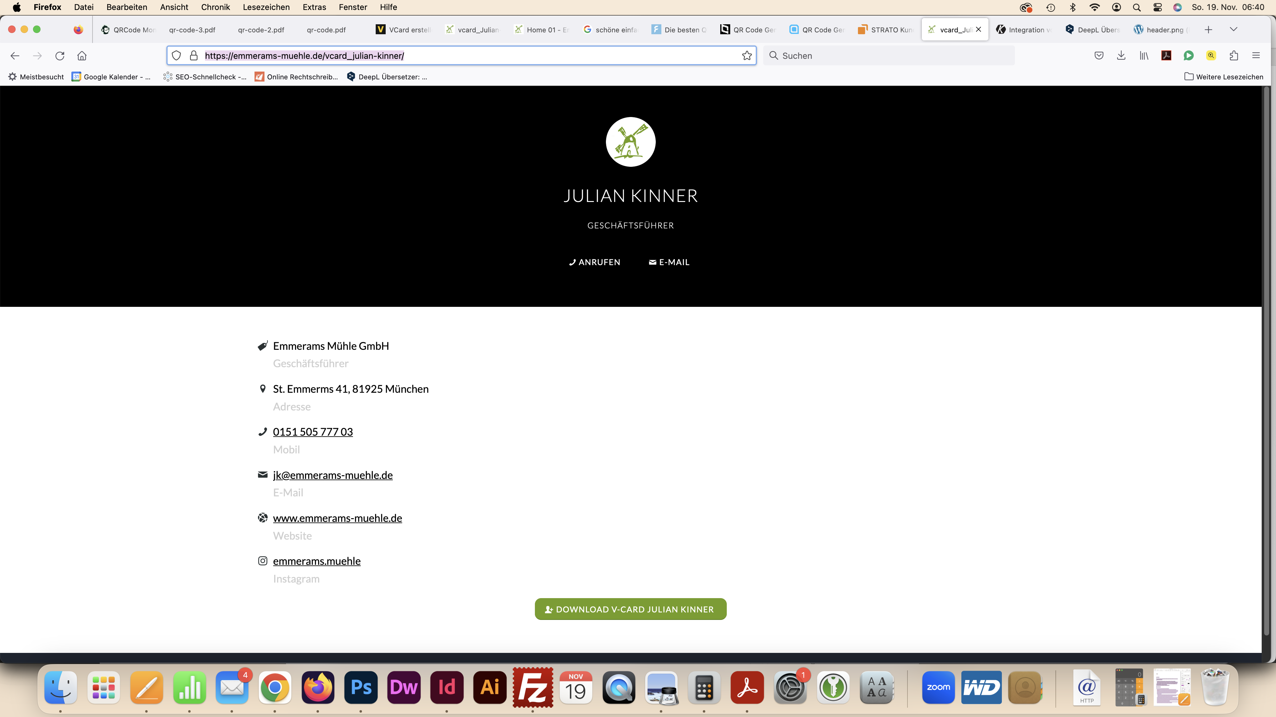
>> But then a white bar appears at the top where the header is: see view now: https://emmerams-muehle.de/vcard_julian-kinner/
in comparison to the view before with the script mentioned above: see screenshot: https://emmerams-muehle.de/support/header.pngHow can I remove this bar without using the aforementioned problematic script? The header should only not appear for this one page.
Best regards, Diana
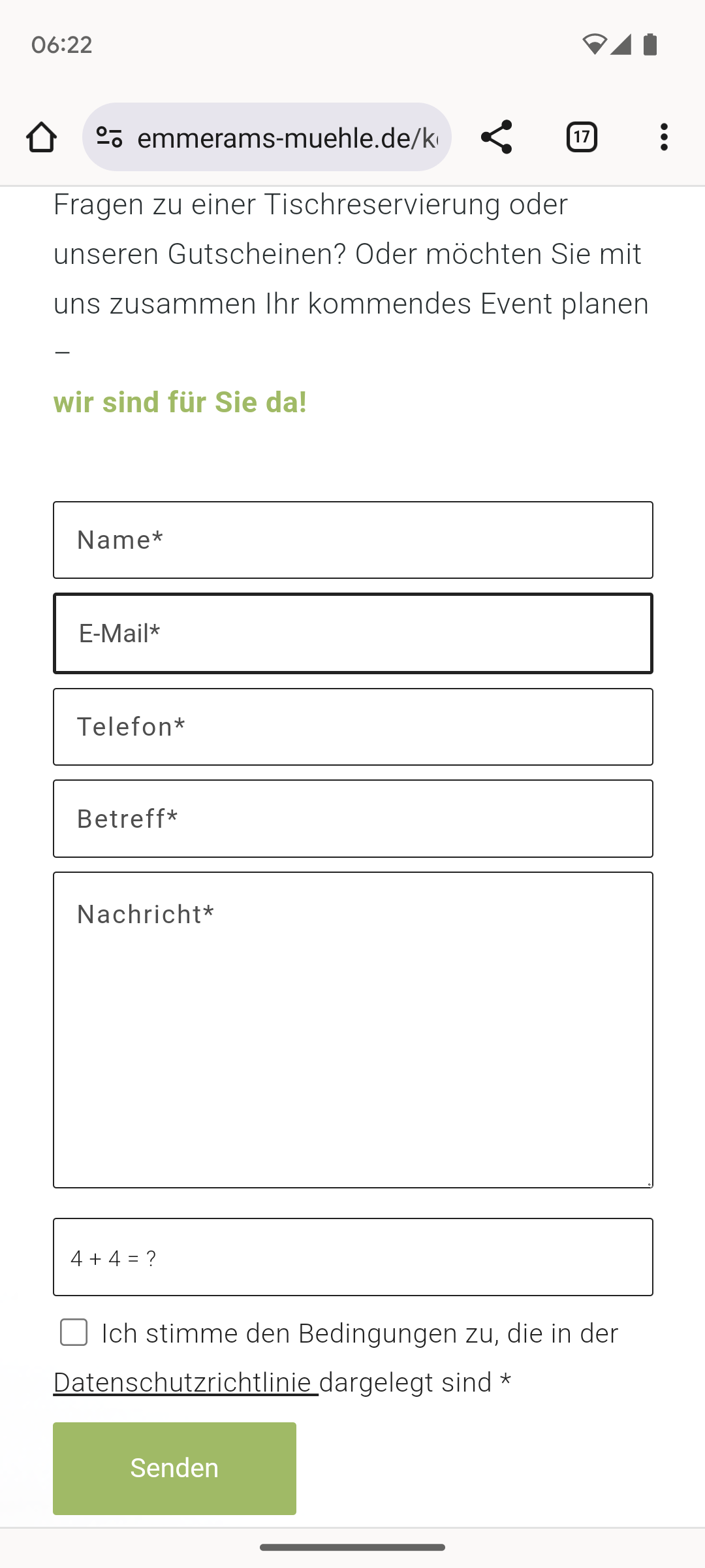
Dear Support Team
by chance I was able to solve the problem with the download of the VCF file myself: with the help of the plugin “Enable virtual card upload – vcf,vcard”But I now have another question regarding the page https://emmerams-muehle.de/vcard_julian-kinner/
On this page, I would like the header and logo to be completely hidden and no white field to be displayed. (On all other pages of the website, however, the header should be displayed, as at: https://emmerams-muehle.de/home-01/) I have now tried to solve this using the following CSS code:
.page-id-825 #header { display: none !important; }
.html_header_top.html_header_sticky #top #wrap_all #main {
padding-top: 0px !important;
}
I’m not sure about the second code (starting with “.html….”) because I didn’t manage to adapt the code so that it only fits the page with page-id-825. I am afraid that this code may also affect other pages and that the header will not be displayed correctly.What do you think? Does the code fit? Or do you have to rewrite it so that it only points to the page with page-id-825? I would be very grateful for any feedback.
Best regards, DianaHi Ismael,
Yes sure, I first tried to set this via the default settings Advanced > Responsive > Element Visibility. The only problem is that the settings for the tablet landscape format (between 768px and 989px – e.g. tablet landscape format) do not work for the iPad in landscape format and the desktop version is still displayed here.
That’s why I added the additional CSS.
As I said, it is now also displayed correctly on the i-pad in landscape format for the test page https://elianafe.de/home-support/: but in order for it to be displayed, I also have to deactivate the option “Hide on large screens (wider than 990px – e.g.: desktop)” for the second image slider with the ID #tabletquer-header in the standard settings Advanced > Responsive > Element visibility.And so it now works on the ipad-tablet landscape format, but not on the desktop PC: because here the image slider is now displayed 2x below each other, although I have defined in the CSS that the image slider with the ID #tabletquer-header should be hidden:
#top.page-id-9907 #tabletquer-header { display:none !important; }Could you please help me so that it works correctly again on the desktop PC?
Best regards, DianaPerfect. Thanks a lot.
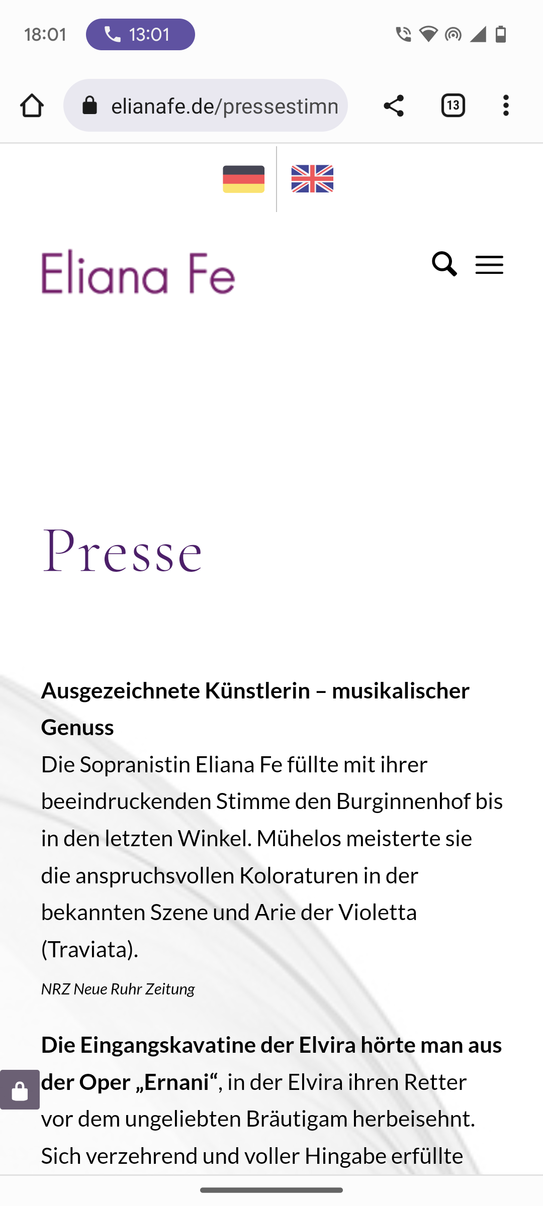
Best regards, DianaHere is a link to the screenshot of the mobile view of the Press subpage: https://elianafe.de/support/flags-press.png
Now I could solve the problem myself!
All is well. Don’t need an answer any more.
Many greetings, DianaThanks Mike, now I understood and could change it accordingly. Many greetings, Diana
Thanks Yigit. That works perfectly!
Best regards Diana -
AuthorPosts