Forum Replies Created
-
AuthorPosts
-
Hi.
No, it’s happening on chrome and safari. I guess it’s good you can’t see it in a way…
I’m pretty happy with the way this project shaping up at the moment – not quite finished, but getting there.
We carefully considered the typography, used subtle textures and some pretty good photography. With Enfold it was pretty quick to create a clean, elegant, easily navigated, sparsely coloured website. Adding some quick CSS made some of the not straight-out-the-box stuff a bit easier to achieve (not that there’s that much here that’s not easily achievable).
I’m really happy with the hero images that invite you to ‘dive’ down the page by blending into the colour sections below the headers.

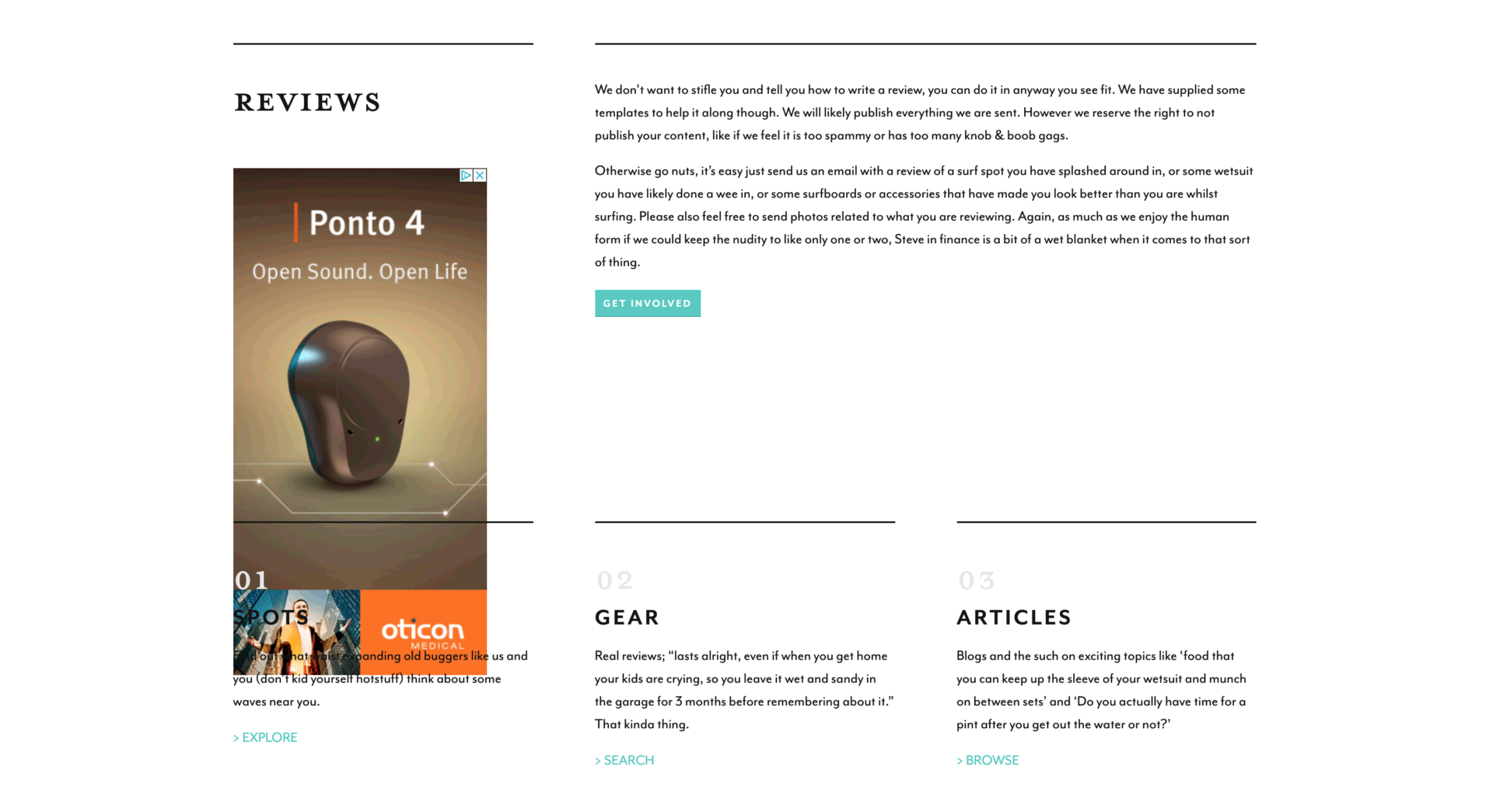
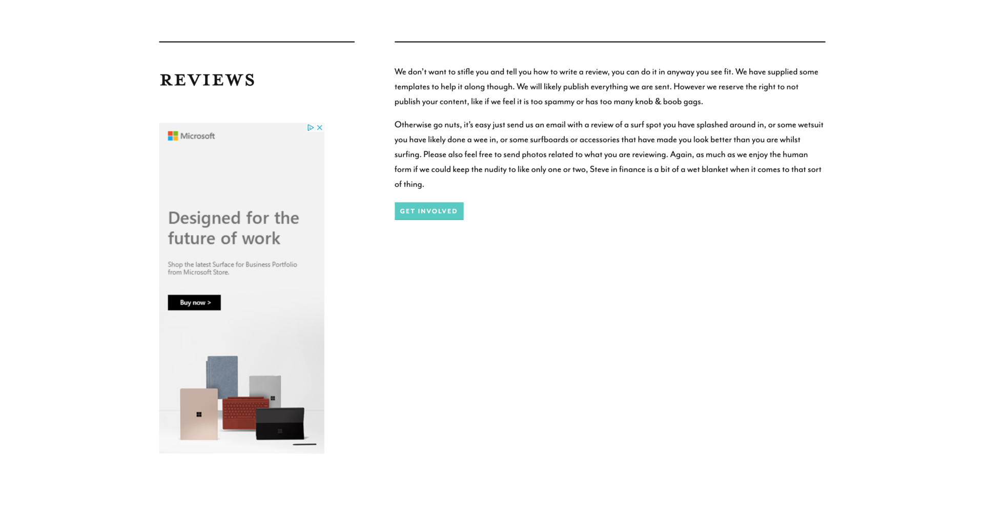
This shows the issue. More often than not, refreshing the page fixes the issue.

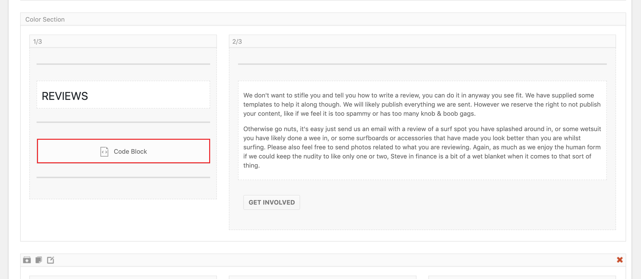
Thought it might help to show you what you’re looking for in the ALB.

Under the word ‘REVIEW’, roughly half way down the page. (There’s another one at the bottom, but that’s full width and doesn’t interfere with other content.)
Thanks for your patience so far.
I’ve put div tags around the code in the code blog and added some CSS, which appears to have sorted out the width issue. However it seems to ignore any height, meaning on the homepage the 1/3 width ad under the word ‘reviews’ often runs over content below.
…Any ideas?
Thanks Rikard,
You got an email and I can send you some temp log in details? -
AuthorPosts
