-
AuthorPosts
-
February 19, 2019 at 6:16 pm #1069053
Hello,
I would like to create different pages. Sure.
A “Home” a “product info” for example, and so on.
Therefore I have now created the individual pages, which I fill with the contents. If I now link from the “Home” to the “product info” the page will also open for me.
But what I want is that the page transition is an automatic scrolling to the “product info”. A kind of scrolling, as it currently is state of the art.
Do I have to put all new pages in the “Home” to reach scrolling and link to each site from here?
Cheers, JSFebruary 20, 2019 at 10:50 am #1069376Hey Tom,
Do you have an example on some website so that we can understand better what you what you’re trying to achieve?
Best regards,
VictoriaFebruary 21, 2019 at 6:44 pm #1070057Hi Victoria,
thank you for your post!
At the moment if you click at one of the two crosses at startscreen you jump to it´s linked pages. These pages I created in the page editor (don´t know the correct term).
But what I want is not jumping/opening to the linked pages – I want that it slides/scrolls/move to the linked pages.
At the moment I can´t find a example page….
Cheers, JSFebruary 22, 2019 at 5:57 pm #1070424Here just at the beginning you can recognize what I mean:
It´s the “Link A/B/C” thing and the move transition to them…
Cheers, JSFebruary 23, 2019 at 4:35 pm #1070673Hi gestaltraeume,
Here are some links for you to consider:
If you need further assistance please let us know.
Best regards,
VictoriaMarch 1, 2019 at 5:42 pm #1073294Can´t solve the scrolling in my OnePager from “Home” to another position (for example to the place below, pls scroll down from Home) by clicking onto one of my two crosses (at “Home”) for example.
I know that I have to set an ID of the specific section.
But I don´t know where to add which code?!
JSMarch 2, 2019 at 10:58 pm #1073768Hi gestaltraeume,
Here is a thread for you to consider
https://kriesi.at/support/topic/anchor-links-5/If you need further assistance please let us know.
Best regards,
VictoriaMarch 3, 2019 at 9:22 am #1073867March 3, 2019 at 9:25 am #1073871…and…I don´t want to link from a menu.
I want to link from a picture or a text or an other element…
Here is the concept I do need: https://kriesi.at/documentation/enfold/example-of-one-page-dots-menu/
But I can´t see which code I have to give the buttons to scroll to the defined ID sections…
JS-
This reply was modified 7 years, 1 month ago by
JS.
March 3, 2019 at 11:39 pm #1074076Hi,
Here is the instructions to the dot menu
Please click the css toggle to see the css usedBest regards,
MikeMarch 4, 2019 at 8:12 pm #1074498Sorry but I can´t fix the scrolling concept with this links and suggestions. They are too complex and confuses me. Or perhaps I am too stupid.
Once more a little bit more detailed to fix my problem:
On the “home” (pls see link below) you can see two crosses. From each of these 2 crosses I want to scroll with a mouseclick to the different 2 sections which you can see if you scroll down with the mouse wheel.
So I guess I have
1. To give the 2 sections different id´s in the Section ID.
2. To give the crosses in it´s Link-Settings a manual Link: And it´s nomenklatur is: http://….???……OR…href…???… OR …???…JS
-
This reply was modified 7 years, 1 month ago by
JS.
March 5, 2019 at 6:22 pm #1075008Thought it could go this way:
https://www.dropbox.com/s/krg8ptmyrex74fx/id.jpg?dl=0
But no…
JSMarch 6, 2019 at 7:01 am #1075318Hi,
No that is not going to work. The type of scrolling you want is in the script for the sub-menu, but I see now that you don’t want to use the sub-menu, you want to use two images linked to an anchor.
So I recommend using the plugin “Page scroll to id”
I think I can help you with this, please include admin login in the Private Content area so we can be of more assistance.Best regards,
MikeMarch 6, 2019 at 10:24 am #1075428This reply has been marked as private.March 7, 2019 at 5:53 am #1075758March 7, 2019 at 9:22 am #1075865This reply has been marked as private.March 8, 2019 at 4:25 am #1076209Hi,
Entschuldigung, der Login funktioniert nicht für mich, bitte überprüfen. Wir können auf Deutsch kommunizieren, aber ich werde Google Translate verwenden. Bitte entschuldigen Sie die Fehler.Sorry the login is not working for me, please check.
We can communicate in German, but I will be using Google Translate, so please pardon any errors.Best regards,
MikeMarch 8, 2019 at 8:13 am #1076250This reply has been marked as private.March 8, 2019 at 2:49 pm #1076395Hi,
Thank you for the login, I was able to get it working for you. For the example I made the left image goes to the section right below the image, and the right image goes to the last section.
Please remember that you can only have the ID once on the same page, placing the same ID in two sections will break the link.
So for the link write it like #hometomed

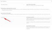
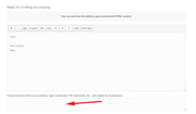
for the target, place the anchor in the “Für Entwickler: Section ID” with no hash tag, like this:

You will need to clear your browser cache, I had to a couple of times brfore it started working.
Please take a look and test the links I made, then try changing to where you want them to point, please let us know if you need more help.Best regards,
MikeMarch 8, 2019 at 4:02 pm #1076406This reply has been marked as private.March 9, 2019 at 2:06 am #1076522Hi,
Glad we could help, sorry that you were at a standstill, I think we misunderstood what the issue was, but now you are good to go :)
I took a look at “Manufaktur-Section” and it looks centered to me, Please see the screenshot in Private Content area.
Please try to write on the screenshot to show what is not centered.
Here is a free online tool to write on a screenshotsBest regards,
MikeMarch 10, 2019 at 12:23 pm #1076982This reply has been marked as private.March 10, 2019 at 4:49 pm #1077037Hi,
Thank you for the mockup, so you want the word “MANUFAKTUR” to be in the middle of the screen, with the images above and a blank space below?
I added this css to remove the top margin from “MANUFAKTUR” and to move the words below the images up a little to give more room for the blank space.#top .wort_manufaktur_hinterleger p { margin-top: 0px !important; } #top #hometomed .icon_title { margin-top: -50px !important; }is this closer to what you had in mind?
Best regards,
MikeMarch 11, 2019 at 11:03 pm #1077542This reply has been marked as private.March 12, 2019 at 1:36 pm #1077817Hi,
When I look now I see that your icons are centered and no “MANUFAKTUR” text, sorry I had thought that you wanted the “MANUFAKTUR” text centered and the icons above, because in your mockup the green centered line was in the middle of the text, but you would like the section center on the icons, and the text below.
Do I understand correctly now?Best regards,
MikeMarch 12, 2019 at 2:22 pm #1077832This reply has been marked as private.March 13, 2019 at 1:02 am #1078061March 14, 2019 at 6:15 am #1078534This reply has been marked as private.March 15, 2019 at 3:46 am #1078977Hi,
I removed your text block element for manufaktur and placed the word in a code block wrapped in a span with the class “manufaktur”
this allowed me to move it without affecting the icons, and kept everything center in your section.
I also gave the font-size a “visual width” instead of a “px” this way as the screen size changes the word will remain “full width”
The only problem is that the z-index is not working well, so I’m having trouble putting the word behind the icons, I used opacity as a work around.
Please clear your browser cache and check.
This is the css I added to the code block:span.manufaktur { display: flex; justify-content: center; font-size: 16vw; } span.manufaktur strong { color: #d3d3d3 !important; margin-top: -63vh; opacity: .30; }We will need to write some more css to adjust the position of the word for other screen sizes. What do you want to do when the icons brake into 2 columns, and then into 1 column? At some point do you want to just hide the word?
Best regards,
MikeMarch 15, 2019 at 7:17 am #1079019This reply has been marked as private. -
This reply was modified 7 years, 1 month ago by
-
AuthorPosts
- The topic ‘scrolling not jumping’ is closed to new replies.

