-
AuthorPosts
-
November 7, 2018 at 7:48 am #1030709
Kein rechter Spaltenabstand bei 2-spaltigem Design unter 768px Breite
Ich arbeite gerade eine einem 2-spaltigen Design, der Designvorlage „Knowledgebase Demo“. Leider musste ich jetzt feststellen, dass ab der Seitenbreite unter 768px der rechte Seitenabstand aller Container wohl auf “0” gesetzt ist, was dazu führt, dass das Layout absolut unprofessionell auf allen Geräten unter dieser Auflösung aussieht.Leider bin ich der Website schon fast fertig und habe erst jetzt den Fehler bemerkt. Ich bin mir sicher, dass man das mit einem CSS wieder korrigieren könnte. Ich bin mit dem Enfold CSS aber nicht so vertraut, dass ich mir diese Änderung selbst zutraue. Könnt ihr mir weiterhelfen?
Schaut euch mal eure Vorlage unter https://kriesi.at/themes/enfold-knowledgebase-demo/category/how-to-install/ mit einem Mobile an. Dann seht ihr, das der READ MORE Button bis an den rechten Rand geht.
ENGLISH:
I am currently working on a 2-column design, the design template “Knowledgebase Demo”. Unfortunately, I had to realize now that starting at the page width below 768px the right side distance of all containers is probably set to “0”, which means that the layout looks absolutely unprofessional on all devices under this resolution.Unfortunately, I’m almost done with the website and have just noticed the error. I’m sure that is possible, to correct that with an right CSS again. However, I’m not so familiar with Enfold CSS that I can make that change myself. Can you help me?
Take a look at your template at https://kriesi.at/themes/enfold-knowledgebase-demo/category/how-to-install/ with a mobile phone. Then you will see that the READ MORE button goes all the way to the right edge.
November 8, 2018 at 5:01 am #1031087Hey frasche,
Please try the following in Quick CSS under Enfold->General Styling:
@media only screen and (max-width: 767px) {
.read-more-link a {
  margin-right:10px;
}
}
Best regards,
RikardNovember 8, 2018 at 6:52 am #1031125Hi,
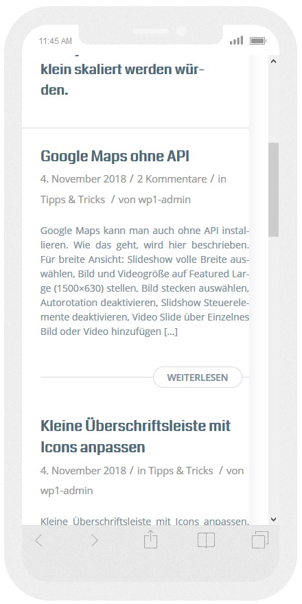
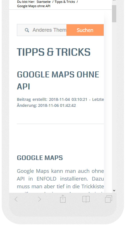
that work, but only the link and not all the text and colums. I send u now some pictures about the result, after i type in your code. I hope, that help you, to understand and fix the problem.

This is the site with the button

and this is the content side with this problem

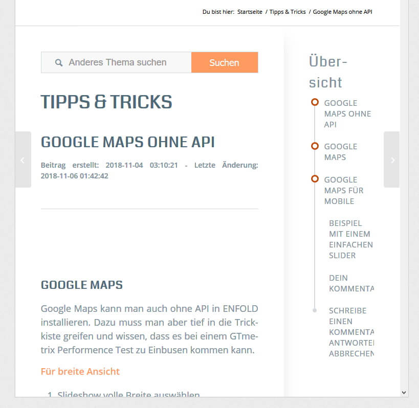
This pictures show the screen with 768px. That’s perfect.November 9, 2018 at 5:14 am #1031505Hi,
Thanks for the update, so you want to remove the shadow on mobile screens? If so then please try this CSS:
@media only screen and (max-width: 767px) {
.sidebar_shadow .sidebar_right .content.av-enable-shadow {
    box-shadow: none;
}
}
Best regards,
RikardNovember 9, 2018 at 9:33 am #1031589Hello,
YES! That’s it. Many Thanks. Now it looks good.
Maybe you can help me with another question. I would like to install a Google Chapcha in the Enfold contact form. I asked for it in this blog, but received an answer that does not help me. Maybe you have a simple solution for me?
I wish you a nice weekend.November 9, 2018 at 10:04 pm #1031852Hi frasche,
Glad Rikard could help :)
As for the other issue, please consider these threads
https://kriesi.at/support/topic/google-recaptcha-and-enfold-contact-form/If you need further assistance please let us know.
Best regards,
Victoria -
AuthorPosts
- You must be logged in to reply to this topic.
