Hey mjrielly,
Thank you for the inquiry.
1.) Did you create the post using the Advanced Layout Builder? If so, the featured image will not display automatically — you’ll have to add an Image element or slider to display the featured image.
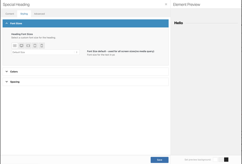
2.) Most of the font styling can be found in the Enfold > Advanced Styling panel. If you’re using the Special Heading element, you can also adjust this by editing the element and going to the Font Sizes panel.
Let us know if you have more questions.
Best regards,
Ismael
First: Do not upload the “Open_Sans.zip” file created by Google—this ZIP archive also contains the static font files in a separate folder.
Unzip the archive, remove all unnecessary files, and keep only these two files:
OpenSans-VariableFont_wdth,wght.ttf
and
OpenSans-Italic-VariableFont_wdth,wght.ttf
Then zip this folder and upload it.
Then it will work. But!
Secondly: It’s not recommended to offer the TTF. With WOFF2, you’ll cover 99% of all browsers—and the few users still running IE11 will just see the fallback font. The WOFF2 file is about half the size of the TTF.
Unfortunately, Google only offers the TTFs. There are tools—possibly even online tools—that can convert these TTFs to WOFF2. I’m not sure if they’ll preserve all the variable axes. I convert them via Terminal on my Mac.
Third: Do you really need an explicit italic font? With OpenSans, there are essentially just a few kerning differences, and the lowercase ‘a’ becomes a single-storey ‘a’ and the little e has its own glyph styling. Otherwise, you could easily get by setting the normal font to italic via CSS.
To cut a long story short:
Why not give this font a try? I’ve removed a few language variants that aren’t used very often. However, I’ve kept many diacritical marks in the font.
(–unicodes=”U+0020-00FF,U+0100-017F,U+2000-206F,U+20A0-20CF,U+2100-214F,U+2200-22FF” )
https://webers-testseite.de/OpenSans-VariableFont.zip
(woff2: 101 an 87kb – instead of ttf: 580kb and 530kb)
_______________
The range from U+0000 to U+00FF is identical to the ISO 8859-1 (Latin-1) character set. It forms the basis for the representation of text in many Latin-based languages within the Unicode standard.
Hey dnweil,
Thank you for the inquiry.
If you’re using the Advanced Layout Builder, each element, especially Text or Heading elements, has a Styling > Font Sizes option which can be adjusted for different screen sizes.
There is also an Element Visibility setting in the Advanced > Responsive panel which can be used to toggle the visibility of an element for different screen sizes. For cases where element options are not enough, you can always add css modifications.
Best regards,
Ismael
My website was running well.
I just updated my home page and some code on the quick css updated by itself (i do not change anything here).
It puts wrong value as you can see with { and this } :
time.slide-meta-time {
display: none!important;
}
.av-inner-tab-title {
font-size: 15px;
font-weight: bold;
}
#top .av_header_glassy.av_header_transparency #header_main {
background-color: rgba(255,255,255,0.8);
}
/* Sticky header on mobile */
@media only screen and (max-width: 767px) {
.responsive #top #main {
/* Margin top value should be equal to header height*/
margin-top: 0px;
}
.responsive #top #wrap_all #header {
position: fixed;
}
}
——————————————————
So i tried to clean up as below :
——————————————————-
time.slide-meta-time {
display: none!important;
}
.av-inner-tab-title {
font-size: 15px;
font-weight: bold;
}
#top .av_header_glassy.av_header_transparency #header_main {
background-color: rgba(255,255,255,0.8);
}
/* Sticky header on mobile */
@media only screen and (max-width: 767px) {
.responsive #top #main
}
/* Margin top value should be equal to header height*/
margin-top: 0px;
}
.responsive #top #wrap_all #header {
position: fixed;
}
1-Can you confirm the codes are correct?
2-but i still have issue because H2 are now in Bold and do not use the default type family
3-I tryed to erase all quick CSS but it doesn’t solv anything.
4-AND the homepage don’t display anymore on backend : https://thaigourmet.fr/enfold.png
-
This topic was modified 1 week, 4 days ago by
 jb84.
jb84.
Hi,
Thank you for the update.
Did you add this css code? This overrides the default style of the h2 heading.
#top h2 {
    font-size: 24px;
}
You can also adjust the style of the headings in the Enfold > Advanced Styling panel.
Best regards,
Ismael
Hey kuhnler,
Thank you for the inquiry.
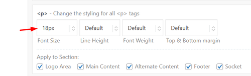
It is possible to set different font sizes on different screen sizes by adjusting Styling > Font Sizes > Heading Font Sizes. Click the screen breakpoint icons to specify different font size values for each screen size. The screenshot below should help.
View post on imgur.com
Best regards,
Ismael
Hello,
I am using the feeds plugin to pull in posts from Substack. I have modified the feed with this css. The first two increments format the text as you can see. By default the theme seems to make the thumbnails square so I added the third increment in the css to preserve the original aspect ratio of each of the thumbnails. You can see the result here: https://sethledermanmd.com/opinion-pieces/
But…I need the spacing above and below the individual poqststo be consistent, you can see that the sauce below the thumbnails is larger on the ones which have thumbnails which are horizontal because the grid seems to have the same overall depth for each post. Is there a way to have them pull in with a consistent amount of space below the thumbnails and also make he spacing above a little less in height?
Thanks so much.
/* Feedzy RSS post titles */
.feedzy-rss .rss_item .title a {
font-size: 20px !important; /* Adjust the size */
color: #3b68bb !important; /* Optional: title color */
}
/* Hover effect for titles */
.feedzy-rss .rss_item .title a:hover {
color: #0073aa !important; /* Optional hover color */
text-decoration: underline !important;
}
.post-entry img {
width: 100%;
height: auto !important;
display: block;
}
This reply has been marked as private.
Hi,
The top padding is set by your custom css:
.template-page.content.av-content-full.alpha.units {
    padding-top: 20px !important;
    padding-bottom: 20px !important;
}
Change 20px to zero if you want to remove it, but note this will affect all of your pages.
While you have set the text color to white, your text is bold (strong) which has a blue color, either remove the strong tag, or add the color to the span style, like your font size.
If you don’t know how to do that try this css:
.avia_textblock p span[style*="color: #ffffff"] strong span[style*="font-size: 14pt"] {
    color: #ffffff;
}
Best regards,
Mike
Hey bemodesign,
Thank you for the inquiry.
For the submenu text color and a few other improvements, try to add this to the Enfold > General Styling > Quick CSS field:
#av-burger-menu-ul .av-submenu-indicator{
    display: none;
}

#av-burger-menu-ul .sub-menu li a {
    color: #45a5dd !important;
}

#av-burger-menu-ul .av-width-submenu > a::after {
    content: "›";
    display: inline-block;
    margin-left: 20px;
    transform: rotate(90deg);
    font-size: 0.9em;
}
Please make sure to purge the cache before testing.
Let us know the result.
Best regards,
Ismael
Hello, Can you adjust or add new CSS to make the menus look good on desktop and mobile?
You are good at setting it to what looks best.
They are close, but couple things:
1. There are 2 “arrows” for the dropdowns. Just keep the one next to the wording, and remove the one on the right side.
2. Text color for “sub menu” should be #45a5dd
3. Anything you see that will make it look better
this is the last code i added:
@media only screen and (max-width: 767px) {
#top #wrap_all .av-burger-overlay .av-burger-overlay-scroll #av-burger-menu-ul li a {
font-size: 22px;
}
.html_av-overlay-full #top #wrap_all #av-burger-menu-ul li,.html_av-overlay-full #top #wrap_all #av-burger-menu-ul li li {
line-height: 1.5em;
}
.responsive #top #wrap_all #av-burger-menu-ul li {
font-size: 22px !important;
}
}
Hey jb84,
There is a 500 internal server error on the file in private while saving the theme options. Why that is I can’t say unfortunately, you would have to share server error logs with us, or reach out to your hosting provider.
The missing styling was likely due to a missing curly bracket at the end of your Quick CSS code:
time.slide-meta-time {
    display: none!important;
}
.av-inner-tab-title {
    font-size: 15px;
    font-weight: bold;
}
#top .av_header_glassy.av_header_transparency #header_main {
    background-color: rgba(255,255,255,0.8);
Best regards,
Rikard
Hey JannyPolak,
Thank you for the inquiry.
Looks like the Advanced Styling settings may be getting overridden by another css rule, or the styles may be cached. Before anything else, please try to disable the Enfold > Performance > File Compression settings, save, and purge your cache, then check again.
If the styling still doesn’t apply, you can force the font and text-transform for the main nav links with this custom css added on the Enfold > General Styling > Quick CSS field:
#top .av-main-nav > li > a > .avia-menu-text {
    font-family: 'Josefin Sans', sans-serif;
    font-size: 30px;
    font-weight: 400;
    text-transform: uppercase;
}
Make sure Josefin Sans is loaded on your site. If you’re using it via Enfold > Advanced Styling, it should already be enqueued. If not, you may need to select it under Enfold > General Styling > Fonts.
Please make sure to purge the cache before testing.
Let us know if the issue persists.
Best regards,
Ismael
HI
All of a sudden my menu is changed (on pc). The adjustment in Advanced Styling does not work. At least, I treid in ‘headmenu links’
See website https://www.rietreiger.nl
I tried now: Lettertype family Josefin Sans, Size 30px, transformation to capitals and weight 400
The wordt ‘Sauna’ in the menu is still not with capitals (supposed to be SAUNA, and also the font is not correct.
Can you help?
Hi, how can i change the fontsize for the mobile view here? i want the font much smaller – only in mobile view. thanks, alex
Hey Elena,
It looks like you want the font size to be 14px, but you have a Advanced Styling set to 18px which overrides it:
Since this size is for your whole site, try this css just for the testimonials:
#top .all_colors .avia-testimonial-content p em {
    font-size: 14px;
}
Best regards,
Mike
Hello,
I have a testimonials content element in the lower part of most of my website pages.
I would like to make the font size of the testimonials content smaller but when I reduce the font size in the style section of the element it seems to me that only the actual line height is reduced and not the font size itself. Lines get squeezed close to each other and are not easy to read.
Am I doing something wrong?
Credentials attached
Best regards,
Elena
Dear team,
on my page https://www.auto-wulf.de I use the extra info top bar.
in the backend it shows:
[av_font_icon icon='ue854' font='entypo-fontello' size='20px' color='#ffffff'] Geesthacht: 04152 / 87780 Dömitz: 038758 / 24077
on safari the phone symbol appear correctly, but on chrome just a white square box.
what is the reason / how to fix?
thx a lot & best regards Tilman
Hey bemodesign,
Try this css:
@media only screen and (max-width: 767px) {
    #top #wrap_all .av-burger-overlay .av-burger-overlay-scroll #av-burger-menu-ul li a {
        font-size: 22px;
    }
    .html_av-overlay-full #top #wrap_all #av-burger-menu-ul li,.html_av-overlay-full #top #wrap_all #av-burger-menu-ul li li {
    line-height: 1em;
		}
		.responsive #top #wrap_all #av-burger-menu-ul li {
    font-size: 22px !important;
		}
}
Adjust to suit.
As for your anchor link, the ID #book-call is in the second section column with the title “Free 15-Minute…” if you want the first section title “CONTACT BEMO DESIGN” to show, then move the ID to that section.
Best regards,
Mike
Hi,
Thank you for the screenshot.
We couldn’t reproduce the alignment issue on smaller screens on our end. For the table text size, you can try adding this to Enfold > General Styling > Quick CSS or your child theme’s style.css file:
.t3-widget-root .t3-table tbody tr td {
    font-size: 20px;
}
Please make sure to purge the cache before testing.
For any other styling issues specific to the booking module itself, we recommend keeping in touch with the Tomm Booking support team since we don’t provide support for third-party plugins. They’ll be in the best position to help you with additional configuration options.
Let us know if you have more questions.
Best regards,
Ismael
Hello, can you get me CSS to increase mobile font size, sub menu font size & line spacing? I just need to the mobile menu to look better. Please let me know what will look good. thanks!
I also have that very top of page link that says “Book a Free Strategy Call” That goes to an anchor link “https://bemodesign.com/contact-bemo-design/#book-call but it cuts off the top of headline when it does. how can I move this down when they click on this achor link?
THanks!!
Hey debbiepeverelli,
Thank you for the inquiry.
1. The overlapping image is likely due to the absolute positioning, which causes it to appear incorrectly scaled on smaller screens. The best approach is to either hide it on mobile or manually adjust its size using css media queries.
You may need to apply a custom css class name to the overlapping image element.
— https://kriesi.at/documentation/enfold/add-custom-css/#enable-custom-css-class-name-support
Once you have added a custom class, for example av-overlap-image, you can target it on smaller screens like this:
@media only screen and (max-width: 767px) {
    .av-overlap-image {
        display: none;
    }
}
Or if you prefer to keep it visible but resize it:
@media only screen and (max-width: 767px) {
    .av-overlap-image {
        width: 80px;
        height: auto;
        top: 20px;
        left: 10px;
    }
}
You can add these css rules to Enfold > General Styling > Quick CSS field and adjust the values as needed.
2. The light blue highlight on focused fields and the green success message are default styles applied to the contact form. You can override them by adding the following to Enfold > General Styling > Quick CSS field — adjust the color values to match your site:
#top .avia-form .avia-input:focus,
#top .avia-form .avia-textfield:focus {
    background-color: #yourcolor;
    border-color: #yourcolor;
}

#top .avia-form .avia-success {
    background-color: #yourcolor;
}

#top .avia-form .avia-success p {
    font-family: inherit;
    font-size: inherit;
    color: #yourcolor;
}
Replace #yourcolor with the hex values that match your site palette.
Let us know the result.
Best regards,
Ismael
Hi,
Try this css:
.avia-button.avia-size-large.av-1b88t-1848646851a5a8989084337c098e76b2 {
	font-size: 20px;
}
Best regards,
Mike
This will work!
How can I make the font size larger?
Hi,
For that page try adding this css:
.page-id-4370 .iconbox_left_content.avia-builder-el-9 .avia-icon-pos-left.av_font_icon{
  float: none;
  margin-right: 0;
  vertical-align: middle;
  display: inline-block;
  padding-left: 0.5em;
}
.page-id-4370 .iconbox_left_content.avia-builder-el-9 .iconbox_content_container strong {
  font-size: 15px;
}
Best regards,
Mike
Hi,
Odd. This is not the menu style I saw yesterday. Please try to use this css code instead:
#av-burger-menu-ul li.av-show-submenu > .sub-menu > li > a > .avia-menu-text {
    color: #ffffff;
    font-size: 0.8em;
}
To add a submenu indicator, try to add this css code:
.av-width-submenu > a::after {
    content: "›";
    display: inline-block;
    margin-left: 6px;
    transform: rotate(90deg);
    font-size: 0.9em;
}

.av-width-submenu.av-show-submenu > a::after {
    content: "";
}
Best regards,
Ismael
Hi,
Thank you for the inquiry.
Try this css code to adjust the color and font size of the submenu items.
.html_av-overlay-side #top #wrap_all .av-burger-overlay-scroll #av-burger-menu-ul li ul a {
    color: rgba(255,255,255) !important;
    font-size: 0.8rem;
}
The menu items with submenus should have angled brackets (>) by default.
Best regards,
Ismael
Hey dreyerjm,
Try is css:
.page-id-3710 .iconbox_left_content.avia-builder-el-4 .avia-icon-pos-left.av_font_icon{
  float: none;
  margin-right: 0;
  vertical-align: middle;
  display: inline-block;
  padding-left: 0.5em;
}
.page-id-3710 .iconbox_left_content.avia-builder-el-4 .iconbox_content_container strong {
  font-size: 15px;
}
Then clear your browser cache.
Best regards,
Mike
Hi, I have a plugin that is showing me the newest events but the colors, fonts, and sizes dont match. How would I get those to match the theme? I highlighted the text on the website so you can see it – it is black
when I upload, the server is putting the file I zipped titled “fontello-d16d12c1.zip” into the folder structure WordPress content > uploads > 2026 > 02 > fontello-d16d12c1.zip
When I ask google etc for what to do it says a folder named avia_fonts must be placed in the uploads fold and an uncompressed folder must be placed there.
What should the folder be named? the folder with the config.json file and css folder and font folder on the root? ipage.com is my service provider. the files created at https://fontello.com create the files. It appears the svg file is a blank file. that isn’t right. I can create a svg vector file in it but I wouldn’t know what size to make the vector file. This is a mild PITA.