
-
AuthorPosts
-
September 20, 2022 at 2:07 pm #1365703
Hi,
I’m refering to the closed topic “Word Wrap” Solution, which you can find here https://kriesi.at/support/topic/word-wrap-in-menu-or-have-the-menu-on-two-lines/
The provided CSS works almost perfect. However, I have the problem that the text shifts into one another when the header is shrinking. Can this be prevented?
Fire<span class="menu-break">Division</span>

span.menu-break {
display: block;
line-height: 0;
bottom: 35px;
position: relative;
}
September 20, 2022 at 3:18 pm #1365715i would do it like in the documentation of enfold: with flex box layout: Link
and add some additional css settings to better style the whole thing:.main_menu { max-width: 70%; /*** maybe use a calculation (100% minus logo width ) for it: calc(100% - 350px) ***/ } .av-main-nav-wrap { height: 100%; } ul.menu.av-main-nav { display: flex !important; flex-flow: row wrap; /**** try: row wrap-reverse to see influence ****/ justify-content: flex-end; /**** try: flex-start or center to see influence ****/ top: 50% !important; transform: translateY(-50%); } .av-main-nav > li > a { line-height: 35px !important; height: 35px !important; }BUT: if your shrinking header end height will be to low ( 44px – f.e. on choosing the small header height ) the items will be too near each other and overlap header area.
if you got shopping cart and social bookmarks besides your menu – there had to be more css to adjust the right setting.
September 20, 2022 at 4:19 pm #1365730Thanks for the quick response. I’ll give it a try.
September 21, 2022 at 7:05 am #1365790no – i know now that i misunderstood your question – you do not want a two line menu – you want to have the menu-items labels in two lines.
Just a moment: …
Ismaels Code will work – if you got no shrinking header – but there are solutions for shrinking header too.Just one moment – i think i got a more simple method now ! …
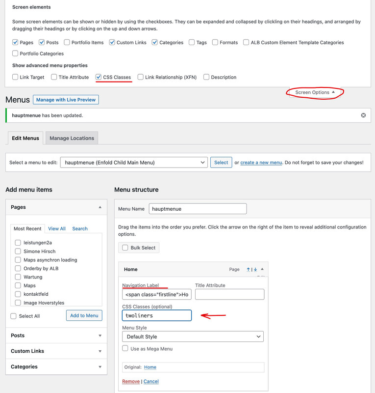
put in that Navigation Label of the menu-item:
( you only need those classes on the spans if you like to colorise them separatly or if they should have different font-styles )<span class="firstline">Leistungen</span><span class="secondline">Portfolio</span>give to the menu-item itself a class: twoliners
click to enlarge the image:
put this to your quick css
#avia-menu .twoliners.menu-item-top-level > a > .avia-menu-text {
  display: grid;
  height: 100%;
  grid-template-columns: 1fr;
  padding: 0px 10px !important;
}

#avia-menu .twoliners.menu-item-top-level > a > .avia-menu-text > span {
  justify-self: center;
  grid-column: 1 / 2;
  align-self: center;
}

#top #wrap_all #avia-menu .twoliners.menu-item-top-level.av-menu-button > a > .avia-menu-text  {
  gap: 3px 0;
}

#avia-menu .twoliners.menu-item-top-level > a > .avia-menu-text > span {
  line-height: 0px;
  text-align: center;
}

#avia-menu .twoliners.menu-item-top-level > a > .avia-menu-text > .secondline {
  color: #999;
  font-size: 1.1rem;
  font-style: italic;
}

#top #wrap_all #avia-menu .twoliners.menu-item-top-level.av-menu-button-colored > a > .avia-menu-text > .secondline {
  color: #ddd;
}
Maybe you have to adjust some padding or gap value for your header height.
See here the test page: https://consulting.webers-testseite.de/PS : you had to style the hamburger yourself f.e.
#av-burger-menu-ul * {
  border: none !important;
}

#av-burger-menu-ul > li {
  margin: 10px 0 !important;
}

#top #wrap_all #av-burger-menu-ul .twoliners.av-menu-button > a {
  padding-left: 10px ;
}

#av-burger-menu-ul .twoliners > a > .avia-menu-text {
  display:grid;
  height:100%;
  grid-template-columns:1fr;
  gap: 10px
}

#av-burger-menu-ul .twoliners > a > .avia-menu-text > span {
  justify-self:left;
  grid-column:1 / 2;
  align-self:center;
}

#av-burger-menu-ul .twoliners > a > .avia-menu-text > span.secondline{
  padding-left: 10px;
  color: #ddd;
  font-size: 1.1rem;
  font-style: italic;
}
/****  etc. ****/
September 21, 2022 at 12:54 pm #1365823 -
AuthorPosts
- You must be logged in to reply to this topic.