Tagged: woocommerce
-
AuthorPosts
-
January 13, 2022 at 3:04 pm #1335430
Hello,
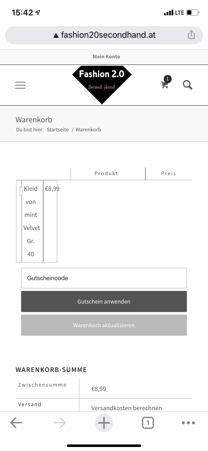
I have the situation, that product images in the cart are not shown if I have a device with less than 425px width. They are displayed perfectly in wider resolutions.
The shop uses WooCommerce 6.0.0 and Enfold 4.8.2 with a Child Theme.
I tried the solution from a past thread in 2017, but the solution from back then did not change anything.
Any ideas what I could try?
regards,
KarinJanuary 14, 2022 at 7:06 am #1335512Hey Karin,
Thank you for the inquiry.
The product image in the cart dropdown is displaying correctly on our end. Please check the screenshot below (see private field). Is it only happening when adding a certain product?
Best regards,
IsmaelJanuary 14, 2022 at 10:05 am #1335536Hello Ismael,
This is not the picture I meant. The pictures affected are the ones in the cart table below, you can see it on your screenshot. Next to the X with which you can remove a product from your cart, there should be a picture.
If I use a tablet or PC, it’s visible. If I use a mobile phone, it’s not visible.best regards,
KarinJanuary 14, 2022 at 1:18 pm #1335580Hi,
Thank you for the clarification.
Looks like the cart item or cart row requires a bit of style adjustment. Please add this css code in the Quick CSS field or in the style.css file.
@media screen and (max-width: 767px) {
    .woocommerce .shop_table .woocommerce-cart-form__cart-item td::before {
      display: none;
    }

    .woocommerce-cart-form__cart-item {
      display: flex;
    }

    .woocommerce-cart-form__cart-item .remove {
      left: 50%;
      top: 50%;
      transform: translate(50%, 50%);
      text-indent: 9999px;
    }

    .responsive table.shop_table.cart .product-name {
      padding: 3px 10px 3px 3px;
      border-right: 1px solid;
    }
  }
The cart item should look like this after adding the css.
Screenshot: https://1drv.ms/u/s!AjjTfXSRbKTvwAQaC1FRsHpgeidM
Did you install a plugin to extend the functionality of the cart? It might have affected the default layout of the cart page.
Best regards,
IsmaelJanuary 14, 2022 at 3:25 pm #1335604Hello Ismael,
That’s exactly how I want the cart page to look. Unfortunately, I am not able to reproduce your solution. The code you suggested does not work.
I have no plugin installed which alters any functionality in the cart process and I also do not have any other CSS added which uses the same classes.best regards,
KarinJanuary 14, 2022 at 4:52 pm #1335610Hi Karin,
Could you please try copying the code from here – https://pastebin.com/JkarSiAb and check if that helps?
Regards,
YigitJanuary 17, 2022 at 1:51 pm #1335871Hello,
no, the images are still not shown on mobile phones, nothing has changed.
regards,
KarinJanuary 18, 2022 at 7:42 am #1335981Hi,
Thank you for the update.
Did you enable the Enfold > Performance > File Compression settings? Please try to disable it temporarily, then purge the cache. Or post the login details in the private field so that we can test the modification.
Best regards,
IsmaelFebruary 3, 2022 at 4:53 pm #1338738Hi,
sorry for my late reply. I did deactivate the file compression settings, nothing did change. I also updated to the latest Theme version, hoping that it would change something. (It didn’t.)
From what I can see it has something to do with the width of the product table on the cart page:

I don’t feel comfortable to share login details from my customer. But I am able to reproduce the behavior in one of my demo sites. I have added the URL in the private content.
regards,
KarinFebruary 4, 2022 at 12:34 pm #1338879Hi,
Thank you for the info.
You can use the email address below for the new admin account, but please make sure to generate the username and password on your end because we don’t have access to that email address.
Did you add the code in the Quick CSS field? It is possible that there are invalid css code in that field which requires some adjustment.
Best regards,
IsmaelFebruary 7, 2022 at 2:47 pm #1339364This reply has been marked as private.February 8, 2022 at 11:58 am #1339575Hi,
Thank you for the access.
We adjusted the css code in the Quick CSS field and temporarily disable the file compression settings. The cart page should now look exactly the same as the screenshot above. Please make sure to purge the cache before checking the page on mobile view.
This is the updated code in the Quick CSS field.
/* Kreditkartenfeld responsive */
@media screen and (max-width: 767px) {
  .woocommerce table.shop_table thead {
    display: none;
  }

  .woocommerce table.shop_table td {
    display: block;
    text-align: right !important;
    border: 0px;
  }

  .woocommerce table.shop_table td::before {
    content: attr(data-title) ": ";
    font-weight: 700;
    float: left;
  }

  .woocommerce table.shop_table_responsive thead,
  .woocommerce-page table.shop_table_responsive thead {
    display: none;
  }

  .woocommerce table.shop_table_responsive tr td::before,
  .woocommerce-page table.shop_table_responsive tr td::before {
    content: attr(data-title) ": ";
    font-weight: 700;
    float: left;
  }

  .woocommerce table.shop_table_responsive tr td,
  .woocommerce-page table.shop_table_responsive tr td {
    display: block;
    text-align: right !important;
  }

  #top #payment div.form-row {
    padding-left: 0px !important;
  }

  /* Target the Credit Card */
  #stripe-card-element {
    width: 200px !important;
    margin-left: -20px;
  }

  /* Target the Expiry Date */
  .woocommerce-checkout-review-order #stripe-exp-element {
    background: #ffffff !important;
    margin: 5px 0px !important;
    padding: 10px 5px !important;
  }

  /* Target the CVC Code */
  .woocommerce-checkout-review-order #stripe-cvc-element {
    background: #ffffff !important;
    margin: 5px 0px !important;
    padding: 10px 5px !important;
    margin-left: -20px;
  }

  .responsive table.shop_table.cart .product-thumbnail {
    display: block !important;
  }

  .woocommerce .shop_table .woocommerce-cart-form__cart-item td::before {
    display: block;
  }

  .responsive #top table .product-name,
  .responsive #top table .product-price {
    border-color: #c4c4c4;
  }

  .woocommerce-cart-form__cart-item {
    border-bottom: 1px solid;
  }

  .woocommerce .shop_table .woocommerce-cart-form__cart-item .product-price::before,
  .woocommerce .shop_table .woocommerce-cart-form__cart-item .product-name::before {
    display: block;
  }

  .woocommerce .shop_table .woocommerce-cart-form__cart-item.actions::before {
    displaY: none;
  }
}
Best regards,
IsmaelFebruary 8, 2022 at 3:13 pm #1339626Hi Ismael,
thank you so much for your support – it works now!
regards,
KarinFebruary 9, 2022 at 7:28 am #1339706 -
AuthorPosts
- The topic ‘WooCommerce Thumbnails not shown on mobile devices in cart’ is closed to new replies.
