
-
AuthorPosts
-
November 5, 2019 at 10:38 am #1153926
Hi,
For the “woocommerce single project page layout”
I tried to refer below official solutionAfter that.
The product are too big.Screenshot :
https://nimb.ws/6D89SzI hope to display product image on the left, product description on the middle. sidebar widget on the right.
I found there are many users ask same questions.
I tried some of solution here before. It still not work well.Is it possible to have a template or a final solution with CSS here?
Thank you very much!
November 9, 2019 at 8:29 pm #1155239Hey HeeHA,
Sorry for the late reply, please try this solution:
Try adding this code to the end of your functions.php file in Appearance > Editor:add_action('init','ava534345953_init', 50); function ava534345953_init() { add_action( 'woocommerce_after_single_product_summary', 'avia_add_sidebar', 25); } function avia_close_image_div() { global $avia_config; echo "</div> "; } function avia_add_sidebar() { if(is_product()) { $avia_config['currently_viewing'] = "shop_single"; get_sidebar(); } }Then add this code in the General Styling > Quick CSS field or in the WordPress > Customize > Additional CSS field:
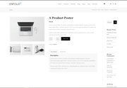
//add right sidebar to woo product page
.single-product-main-image {
    width: 25%;
}

.single-product-summary {
    overflow: hidden;
    width: 45%;
    float: left;
    margin-right: 5%;
}

.single-product .sidebar {
    width: 25%;
}
Before:
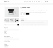
After:
Best regards,
MikeNovember 10, 2019 at 1:58 am #1155266HI Mike
Thank you very much for your reply.I tried it before.
It will have problem on mobile version.
Screenshot:
https://nimb.ws/eMWBLAI tried to adjust CSS. Seems no changes.
Could you help it?Thanks!
November 10, 2019 at 2:17 am #1155267Hi,
Thank you for the feedback, for mobile you will have to allow for full-width, I tried to check but couldn’t find the exact item as in your screenshot, but the ones I saw were correct, sidebar in desktop and full width in mobile.
Please see the screenshots in Private Content area.Best regards,
MikeNovember 10, 2019 at 2:27 am #1155268Hi Mike
Ha. I am trying to adjust it by myself.
Here is the CSS I tried :.single-product-summary { overflow: hidden; /* width: 45%; */ float: left; margin-right: 2%; }It still have problem. Please kindly see the Private Content.
By the way. The sidebar now seems woocommerce default widget.
It not shown the widget “Single Product Pages”.Hope your help. THANKS!
November 10, 2019 at 3:52 am #1155275Hi,
Thank you for the feedback, please include a link to this page so we can test with the same one, also which browser are you using?Best regards,
MikeNovember 10, 2019 at 5:44 am #1155298Hi Mike
Please see the Private Content.I am still trying the CSS.
I choose the sidebar for the product Sidebar Setting. It’s ok now.
Is it possible to be the global setting?
No need to choose the setting every time.Thanks!
November 10, 2019 at 6:55 am #1155299Hi Mike
I use chrome.
Here is the CSS I tried in our case:
On desktop, mobile version looks good.
But on ipad. The sidebar not look well.
Screenshot :
https://nimb.ws/3fOzYqHope you have the solution.
Thank you!//add right sidebar to woo product page .single-product-main-image { width: 25%; } .single-product-summary { overflow: hidden; /* width: 45%; */ float: left; margin-right: 1%; } .inner_sidebar { margin-left: 15px; } .single-product-main-image { width: 29%; float: left; margin-right: 20px; overflow: hidden; padding-bottom: 50px; }November 10, 2019 at 12:32 pm #1155316Hi,
Thanks for the link and screenshot, so currently the mobile brake point for the page is 767px, so we will change it to 1399px, at that point there is plenty of room for the 3 columns.
Please try this css:@media only screen and (min-width: 768px) and (max-width: 1399px){ #top .sidebar_right.template-shop .single-product-summary,#top .sidebar_right.template-shop .single-product-main-image.alpha { width: 60% !important; } #main > div.container_wrap.sidebar_right.template-shop > div { padding: 0 10px !important; } }After applying the css, Please clear your browser cache and check.
Best regards,
MikeNovember 10, 2019 at 3:37 pm #1155342Hi Mike
It’s great now!
Thank you very much!November 10, 2019 at 5:45 pm #1155355Hi,
Glad we were able to help, we will close this now. Thank you for using Enfold.For your information, you can take a look at Enfold documentation here
For any other questions or issues, feel free to start new threads in the Enfold forum and we will gladly try to help you :)Best regards,
Mike -
AuthorPosts
- The topic ‘woocommerce single project page layout official solution’ is closed to new replies.