Tagged: menu
-
AuthorPosts
-
January 11, 2019 at 2:40 pm #1052754
Hallo Zusammen,
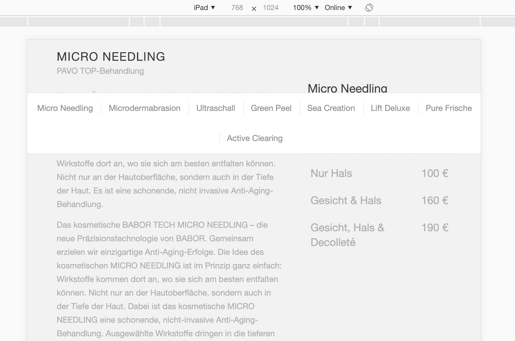
das volle Breite Untermenü verursacht ein Problem ab 768px breite. Es bleibt beim scrollen unter dem Hauptmenü/Logos stehen, weil es fixiert ist (Hauptmenü auch fixiert!), allerdings ist ab 768px breite das Hauptmenü ja verschwunden, das Untermenü bleibt allerdings auf der gleichen Stelle, sodass es nun mitten im Bild “schwebt”, dass sieht natürlich richtig doof aus. Leider wird die Fixierung direkt in den Style des Divs gepackt und nicht über eine Klasse, wie kann ich das lösen? Jemand eine Idee?
Oder habe ich irgendwo einen Denkfehler gemacht?
Danke im voraus und Gruß ✌️
Hello everybody,
the full width submenu causes a problem starting at 768px width. It remains while scrolling under the main menu / logos, because it is fixed (main menu also fixed!), However, from 768px width, the main menu is indeed gone, but the submenu remains in the same place, so it now “hovering” in the middle of the picture That looks really silly, of course. Unfortunately, the fixation is packed directly into the style of the div and not over a class, how can I solve it? Someone an idea?
Or did I make a mistake somewhere?
Thanks in advance and greeting ✌️
-
This topic was modified 7 years, 2 months ago by
Blatze.
January 11, 2019 at 2:43 pm #1052755
-
This reply was modified 7 years, 2 months ago by
Blatze.
January 12, 2019 at 7:47 am #1053007Hi,
Thanks for the screenshot, could you post a link to where we can see the actual element as well please?
Best regards,
RikardJanuary 14, 2019 at 7:27 pm #1053815http://dev.sarapavo.de/behandlungen/behandlungen-kosmetikstudio-oberhausen/
-
This reply was modified 7 years, 2 months ago by
Blatze.
January 14, 2019 at 8:20 pm #1053833Sorry needed to “fixed” it first again…
January 15, 2019 at 6:22 pm #1054236I made a Copy for Testing, please see here:
January 16, 2019 at 12:29 pm #1054533Nobody
January 16, 2019 at 9:02 pm #1054733Hi,
So on tablet, we need to switch the menu on Humberger so it can look correct, right?
Best regards,
BasilisJanuary 16, 2019 at 9:56 pm #1054759I don´t really understand what you mean, but I would think the solution is, that in this case(where the Mainmenü is not fixed at top anymore and is NOT the mobile Version of the Menü… ) the submenu position needed to be “top: 0px;” and the Problem is solved OR it needed (just like the Main menu) position: relative and not fixed at the top!
But I don´t know how to fix it with css without changing it in other cases..
-
This reply was modified 7 years, 2 months ago by
Blatze.
January 16, 2019 at 10:07 pm #1054770This is a submenu which I put in from the enfold Editor… NOT the Main menu! :)
January 21, 2019 at 4:02 pm #1056745ok, don´t know what happened, but today it works fine? 🤔
Thanks for all who tried to help me.
Have a nice day! 👋
Solved and ready to close! ✌️
January 21, 2019 at 4:18 pm #1056749maybe you updated the theme? See here – that was an old bug but it is fixed now since 4.5.1: https://kriesi.at/support/topic/transparent-header-with-sticky-submenu-between-768-and-990-px/
you can still see the point at: https://kriesi.at/themes/enfold-2017/elements/sub-menus/ because there is still Enfold 4.4
January 21, 2019 at 4:20 pm #1056752ah ok! Thats why!^^ 😄
THX for this info.
Have a nice day! bye 👋
January 22, 2019 at 12:43 am #1056938Hi,
Thank u!
Best regards,
Basilis -
This topic was modified 7 years, 2 months ago by
-
AuthorPosts
- The topic ‘Volle Breite Untermenü Problem mit postition fixed’ is closed to new replies.
