Tagged: video
-
AuthorPosts
-
March 15, 2021 at 2:10 pm #1288283
Hi guys,
i want to achieve a burned scroll with a hole in the middle of it. Behind should loop a youtube video.i have tried the color section, but it doesnt keep the border of my site its going fullscreen.
i have tried the fullwidth easy slide and i get it to work somehow, but the overlay image is tiling and also doesnt keep the border of my wordpress homepageis there a better solution how i can make this work.
Nicest would be if the video will be the parallax background of the whole page.March 16, 2021 at 1:16 pm #1288509no ideas ?
its pretty urgent for me ;-)March 16, 2021 at 10:25 pm #1288623is there something wrong asking this here ?
i thought this is the support forum and developers will tune in and tray to help ?
is there an e-mail-adress i can write to directly ?
confused right now ….March 19, 2021 at 6:05 am #1289096Hi,
Sorry for the late reply. I’m not sure I understand your intentions, could you try to explain them a bit further, or post a screenshot highlighting what you would like to achieve please? Please also note that what you are asking for is a customisation, and our support for matters like that is limited.
Best regards,
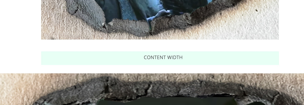
RikardMarch 19, 2021 at 10:12 am #1289122have a look : https://webers-testseite.de/video-behind-a-hole/
but a png will be very performance intensive on that.
this is a video alb in a color-section ( color-section with custom-class: hole-before ).hole-before .avia-iframe-wrap::after { content: ""; width: 100%; height: 100%; position: absolute; top: 0; left: 0; background-image: url(https://webers-testseite.de/wp-content/uploads/fire-hole-2908115.png); background-repeat: no-repeat; background-size: cover; pointer-events:none }March 19, 2021 at 10:45 am #1289130on the bottom – this is a color-section with custom-class: video-section :
give the color-section the video background -you like – but as you know – it will be muted on default !
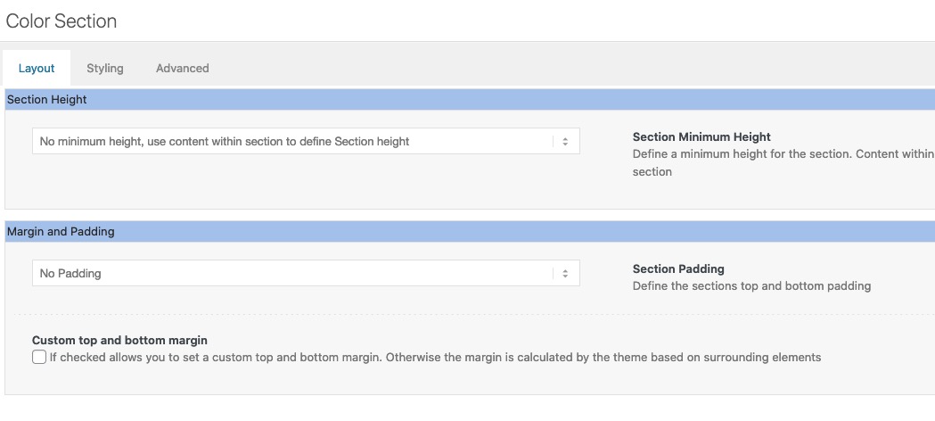
color-section with no padding and no minimum height !.video-section:after { content: ""; width: 100%; height: 100% !important; position: absolute; top: 0; left: 0; background-image: url(https://webers-testseite.de/wp-content/uploads/fire-hole-2908115.png); background-repeat: no-repeat; background-size: cover; pointer-events: none !important; z-index: 5; } .video-section { height: 56.25vw !important; /** depends on your video aspect ratio **/ }March 19, 2021 at 11:36 am #1289140but nevertheless – the mobile versions will not work as expected-
so maybe then you do all that code in a media query with min-widthMarch 19, 2021 at 2:24 pm #1289180Hi and thx very much for getting back to me.
this is what i want. Only i dont want the png.picture and the video to be stretched fullscreen. they should both fit to the rest of the pages frame. for me its 1920 pixels width.
is there another option to have a video as a parallax background. for the full width easy slider . this would be the perfect solution. but i need the video fixed to 1920 pixel width
kind regards
March 20, 2021 at 12:11 pm #1289325March 20, 2021 at 12:55 pm #1289330yes, it works fine. the png and the video are stretched fullscreen. i need both fixed to 1920 pixels width !
is there something i need to add to the code ?March 20, 2021 at 1:31 pm #1289334
-
This reply was modified 5 years, 1 month ago by
stucki1.
March 21, 2021 at 11:13 am #1289426is there a link to your page where you tested this?
Think of – i’m not mod – participant as you – i do not see your private content messages.March 21, 2021 at 11:54 am #1289429Hi Guenni007, thx very much for your help !!! though i am wondering about the official people here not answering …
here is the link:kind regards
ingoMarch 21, 2021 at 11:54 am #1289431the png overlay should not be scaled and not be tiled !
maybe you have to look at it with different resolutions on pc
kind regards-
This reply was modified 5 years, 1 month ago by
stucki1.
March 22, 2021 at 10:40 am #1289585first: if there is css code posted ? – on default the normal place to insert is quick css – you put it as ID ???

_______
A normal support of the team here should not really exceed the 10min. However, special requests are sometimes so complex that this time can not be kept here. – I do this on a whim, if I have time for it, and if it is an interesting question.
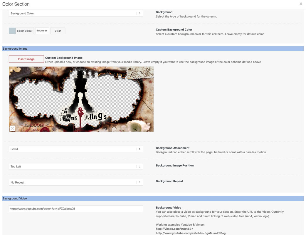
The approximation to your request should be sufficiently fulfilled with the following answer. I don’t feel like including the padding at the moment.So the second of my example color sections has your video and a background graphic (your png) – both to be set as usual via the color section ALB element.
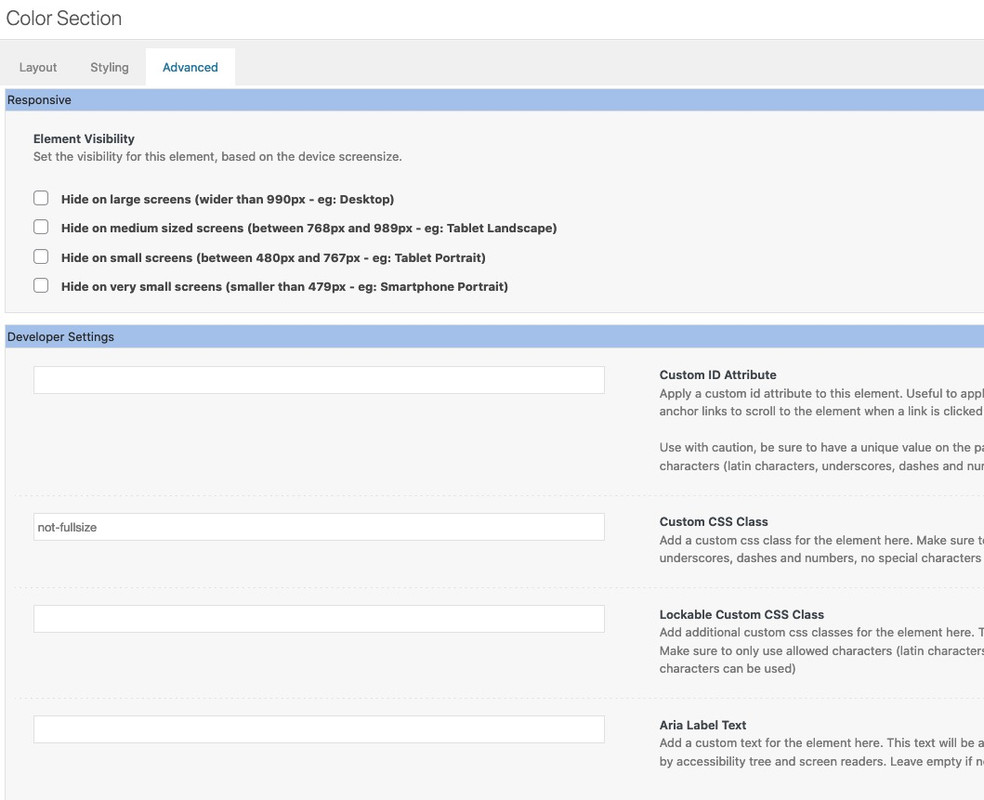
Please give the Color-Section the class: not-fullsize
and the following settings on alb elementThe construction of the “background” is to go over the pseudo-container :after – which inherits the background of the color-section –
the section height has to be in relation to the video aspect ratio..avia-section.not-fullsize { background-size: 0; height: 56.25vw } .not-fullsize .avia-slideshow { width: 100%; max-width: 1410px; margin: 0 auto !important; } .avia-section.not-fullsize::after { content: ""; position: absolute; top: 0; left: 0; width: 100%; height: 100%; background-image: inherit !important; background-repeat: no-repeat; z-index: 5 !important; will-change: transform; pointer-events: none; } @media only screen and (min-width: 1410px){ .avia-section.not-fullsize::after { background-size: 1410px 793px; background-position: center center; } .not-fullsize .avia-slideshow, .avia-section.not-fullsize { height: 793px !important } } @media only screen and (max-width: 1409px){ .avia-section.not-fullsize::after { background-size: 100vw 56.25vw; background-position: center center; } }see again: https://webers-testseite.de/video-behind-a-hole/
you had to adjust the value of 1410px to your needs
my test page got 1510px and a padding of 50px left right. so a normal container width of the 1/1 container would be 1410pxif the video got the 16:9 aspect-ratio
for screens >= 1410px a video-width of 1410px so the height is : 1410*9/16 = 793px
for screens <= 1409px the video-width is 100vw (100% videoscreen-width) the height is then = 56.25vwMarch 22, 2021 at 2:54 pm #1289637Hi Guenni,
thx again very much for your time and expertise.
i have ti working the way i want, mostly ;-)
on 4k its working very good. only if i zoom in very much, background image is cut off at top and bottom
on 1920 x1080 the site looks good with 90 % zoom and below.
if on 100 % and higher the background images is cut again.the problem occurs when the image width 1920 is getting higher than browser width… is there a way to fix this last problem ?
kind regars
ingoMarch 22, 2021 at 3:49 pm #1289654if your width is 1920px the height had to be : 1080px ( 1920 x 9 / 16 )
and mediaquerries switch point must be adjusted too.so it had to be instead:
.avia-section.not-fullsize {
  background-size: 0;
  height: 56.25vw
}

.not-fullsize .avia-slideshow {
    width: 100%;
    max-width: 1920px;
    margin: 0 auto !important;
}

.avia-section.not-fullsize::after {
    content: "";
    position: absolute;
    top: 0;
    left: 0;
    width: 100%;
    height: 100%;
    background-image: inherit !important;
    background-repeat: no-repeat;
    z-index: 5 !important;
    will-change: transform;
    pointer-events: none;
}

@media only screen and (min-width: 1920px){
    .avia-section.not-fullsize::after {
        background-size: 1920px 1080px;
        background-position: center center;
    }
    .not-fullsize .avia-slideshow,
    .avia-section.not-fullsize {
        height: 1080px !important;
    }
}

@media only screen and (max-width: 1919px){
  .avia-section.not-fullsize::after {
    background-size: 100vw 56.25vw;
    background-position: center center;
  }
}
March 22, 2021 at 6:58 pm #1289687and once again thx. !! But now the image background (scroll with hole) is not in front of the video, its always positioned at the left side of the video, 0 pixel distance from the left browser edge, filling the space from left browser edge to the video in the center of the browser. do you know what i mean ?
https://www.schach-welten.de/TEMP_ENFOLD_1.jpgkind regards
ingoMarch 23, 2021 at 6:12 pm #1289961dear Ingo, what please is so hard about copy&paste? https://kriesi.at/support/topic/video-behind-gif-png-picture/#post-1289654
If I copy my code from above and paste it into the developer tools as css it is as you want it. Why are things forgotten to take over?where is the background-size = 0 on the color-section ? (.avia-section.not-fullsize )
where is the :after rule on the color-section ? ( .avia-section.not-fullsize::after )March 23, 2021 at 6:43 pm #1289965sorry, i seem to be stupid ;-) Did all again, this time it works !! thx very much. I dont know why, but last time i must have forgotten something …
March 23, 2021 at 6:55 pm #1289968does not matter
March 27, 2021 at 8:49 pm #1290777Hi,
@stucki1 glad to hear that @Guenni007 was able to help you sort this out. Thank you for sharing your solution @Guenni007Best regards,
Mike -
This reply was modified 5 years, 1 month ago by
-
AuthorPosts
- The topic ‘video behind gif/png picture.’ is closed to new replies.


