-
AuthorPosts
-
May 31, 2018 at 2:19 pm #964785
Hi guys,
i use this code to display two columns of products at mobile view. Works well.
Only problem is, the yith wishlish button is to big now and covering some part of the price. Anyway to make it small on mobile?
@media only screen and (max-width: 736px) {
.avia_textblock pre, .responsive #top #main .products .product {
width: 45.6% !important;
margin: 0 4% 1% 0;
}}May 31, 2018 at 9:25 pm #964964Hey Max,
Can you add a screenshot or link us to a page where this is happening?
Best regards,
Jordan ShannonMay 31, 2018 at 9:46 pm #964979Here is the link:

It is the product archive of woocommerce.
-
This reply was modified 7 years, 10 months ago by
Max.
May 31, 2018 at 9:59 pm #964983Hi,
Yes, but I’m not seeing a pricing a overlap. Can you screenshot this occurrence?
Best regards,
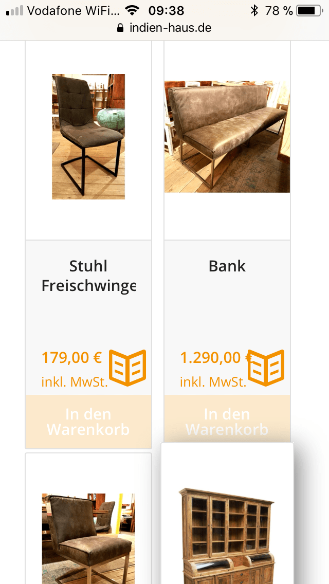
Jordan ShannonJune 1, 2018 at 9:41 am #965139Here we go:
When the Euro amount is larger than a 3 digit number, it starts to overlap. In this exampple the € sign.
 June 1, 2018 at 8:12 pm #965544
Hi,
Try knocking the font down slightly on mobile. Try this
@media only screen and (max-width: 767px)  {
.woocommerce-Price-amount.amount{
font-size:12px!important;
}}
Best regards,
Jordan ShannonJune 5, 2018 at 12:46 pm #967195Works great. Thanks
Same thing i would need for the text of the categories in the product archives.
June 5, 2018 at 5:07 pm #967316Hi,
Great! I’m glad to help. Please provide a link to the additional page where you need this code.
Best regards,
Jordan ShannonJune 5, 2018 at 5:23 pm #967325June 5, 2018 at 5:26 pm #967328Hi,
Please add the following to quick css:
@media only screen and (max-width: 767px)  {
.woocommerce-loop-product__title{
font-size:18px!important;
}}
Best regards,
Jordan ShannonJune 5, 2018 at 5:39 pm #967333It´s not the product title, it´s the category title.
June 5, 2018 at 5:47 pm #967334Hi,
Please screenshot, it will help me see the exact spot.
Best regards,
Jordan ShannonJune 5, 2018 at 5:52 pm #967339
In this screenshot you see several sub categories and some products.
I want to change the the text size of the (sub)categories on mobile view, as they are too big there.June 5, 2018 at 5:59 pm #967342Hi,
Apologies the only text I’m seeing being cut off on mobile is from the title (the text directly under the picture.)
Best regards,
Jordan ShannonJune 5, 2018 at 6:06 pm #967344
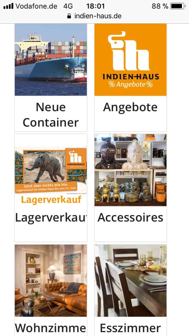
This screen appears under http://www.indien-haus.de/shop
It shows the main categories. F.e. Lagerverkauf the ‘f’ is cut off.
Wohnzimmer the ‘r’ is cut off.June 5, 2018 at 6:36 pm #967358Hi,
I see now. Try this:
@media only screen and (max-width: 767px)  {
h2.woocommerce-loop-category__title{
font-size:18px!important;
}}
Best regards,
Jordan ShannonJune 5, 2018 at 6:56 pm #967369Great. Thanks a lot. Amazing support here.
June 5, 2018 at 7:14 pm #967383Hi,
No problem at all my friend. I’m glad I was able to help. If you need anything further, please let us know here in the forums.
Best regards,
Jordan Shannon -
This reply was modified 7 years, 10 months ago by
-
AuthorPosts
- The topic ‘Two column product view’ is closed to new replies.
