
-
AuthorPosts
-
January 10, 2020 at 6:36 am #1172057
Hi Team,
A Few tweaks I need your assistance withDESKTOP VERSION
1. Menu switch point overlays onto the other menu. See screen shot
https://airlieprovidores.com.au/wp-content/uploads/2020/01/Screen-Shot-2020-01-10-at-2.25.47-pm.png
2. Less space between items in full-width sub menu
3. The dropdown arrows don’t seem to be working on the side widget feature. Works on mobile but not desktop, see screenshot
https://airlieprovidores.com.au/wp-content/uploads/2020/01/Screen-Shot-2020-01-10-at-2.26.02-pm.pngMOBILE VERSION
1. Need to make the full width sub header more prominent, more padding, bigger font and font in dark blue. See screen shot https://airlieprovidores.com.au/wp-content/uploads/2020/01/IMG_1709.png
2. On Desktop these icons display as 3 columns, is there any way to display them as 2 on a mobile, see screen shot https://airlieprovidores.com.au/wp-content/uploads/2020/01/IMG_1710.pngWhere have the social icons gone ):
January 12, 2020 at 4:30 pm #1172539Hey adGroupMarketing,
Sorry for the late reply, I see from your screenshot that your browser width seems to be about 1024px, I also see that your mobile menu is active until about 988px, would you like the mobile menu to stay active until 1100px where the main menu will be all on one line?
If so please try this code in the General Styling > Quick CSS field or in the WordPress > Customize > Additional CSS field:@media only screen and (max-width: 1100px) and (min-width: 768px) { .responsive #top .av_mobile_menu_tablet .av-main-nav .menu-item { display: none !important; } .responsive #top .av_mobile_menu_tablet .av-main-nav .menu-item-avia-special { display: block !important; } .responsive #top #wrap_all .av_mobile_menu_tablet .main_menu { top: 0; left: auto; right: 0; display: block !important; } .responsive #top .av_mobile_menu_tablet #header_main_alternate { display: none !important; } } @media only screen and (max-width: 1100px) and (min-width: 989px) { .responsive.html_mobile_menu_tablet.html_header_top #top #main { padding-top: 150px !important; margin: 0; } }To have less space between sub-menu items, please try this css:
#top #menu-supermarket-shop.av-subnav-menu > li > a {
    padding: 0px 5px 0px 5px !important;
}
To make your sidebar widget bullet points a down arrow, please try this css:
#top .widget_nav_menu ul ul li:before {
    content: "\2BC6" !important;
}
The missing social icons was due to a change the WordPress v5.2.3 core files, I have applied the patch to your site so they now show.
Please check these solutions and once you are satisfied we will look at your other issues, typically we ask that you create one thread for each issue because it makes it easier to address and for other users to find solutions, thank you for your understanding and patience.Best regards,
MikeJanuary 13, 2020 at 12:54 am #1172606Hi Mike,
The first code worked a charm! Thank you.
The other code regarding space was to do with the ‘full width menu’ element that I have added. Not the Main menu. So it didn’t work
Also, arrows was not the fix I am after. The subcategories should not be visible. Only the thing that should be visible in this menu is the items in capitals, with a dropdown menu to indicate more products.January 13, 2020 at 12:56 pm #1172740Hi,
Thanks for the feedback, the ” less space between sub-menu items” code is for your “full width menu” originally there was 10px of padding for each menu item, now there is only 5px, in this screenshot the green marks are the menu item padding.
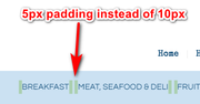
If I’m understanding the space issue correctly then try changing the “5px” in the code to “1px” for them to be even closer.I see what you mean about the sidebar menu needing a drop-down for parent items now. So to add the arrow to only parent menu items and create a drop-down for the children items please try this css:
#top .widget_nav_menu ul li.menu-item-has-children > a:before {
    content: "\2BC6" !important;
}
#top .widget_nav_menu ul ul.sub-menu {
    display: none !important;
}
#top .widget_nav_menu ul li.menu-item-has-children:hover ul.sub-menu {
    display: block !important;
}
Best regards,
MikeJanuary 14, 2020 at 6:03 am #1173077So nearly there! The arrows came up as squares. Can go without arrows.
Is it possible to have the dropdown options click to activate instead of hover? Seems quite erratic as hover.
Sorry I need help with the top and bottom padding not left and right. The second row of that menu just has quite a large gap as you can see and I am unsure of how to remove it.
One more thing, how do I get the full-width menu element to stick on mobile? And change the text from ‘menu’ to ‘supermarket shop’ in dark blue? It’s hard to read at the moment
Thanks Mike you’ve been a great help so far!January 14, 2020 at 2:04 pm #1173326Hi,
To create a on-click drop-down menu from the sidebar menu widget please remove the css above, then try adding this code to the end of your functions.php file in Appearance > Editor:function custom_widget_menu_dropdown(){ ?> <script> (function($){ $(document).ready(function(){ $('#menu-supermarket-shop-1 > li.menu-item-has-children').find('ul').hide(); $('#menu-supermarket-shop-1 > li.menu-item-has-children').click(function () { $('#menu-supermarket-shop-1 > li.menu-item-has-children').not(this).find('ul').hide(); $(this).find('ul').toggle(); }); }); })(jQuery); </script> <?php } add_action('wp_footer', 'custom_widget_menu_dropdown');Then clear your browser cache and check.
Best regards,
MikeJanuary 16, 2020 at 12:30 pm #1174905You are a genius Mike thank you! One final thing I can’t work out is how to only display the element ‘full-width submenu’ only on a mobile. It works great on mobile. Although changing this to read ‘supermarket shop’ from ‘menu’ would also be amazing. Thank you for your ongoing help, I really appreciate it!
January 16, 2020 at 2:09 pm #1174959Hi,
Thanks, to only show the sub-menu on mobile, Please try this code in the General Styling > Quick CSS field or in the WordPress > Customize > Additional CSS field:@media only screen and (min-width: 768px) { #sub_menu1 { display: none !important; } }To change the sub-menu text, Try adding this code to the end of your functions.php file in Appearance > Editor:
function supermarket_shop(){
  ?>
  <script>
(function($){
  $(document).ready(function(){
$( "#sub_menu1 .av-current-placeholder" )
  .text( "supermarket shop" );
 });
})(jQuery);
</script>
<?php
}
add_action('wp_footer', 'supermarket_shop');
Then clear your browser cache and check.
Best regards,
MikeJanuary 20, 2020 at 6:36 am #1176210Thankyou!!!! Everything worked and looks amazing! Fantastic support
January 20, 2020 at 12:45 pm #1176269Hi,
Glad we were able to help, we will close this now. Thank you for using Enfold.For your information, you can take a look at Enfold documentation here
For any other questions or issues, feel free to start new threads in the Enfold forum and we will gladly try to help you :)Best regards,
Mike -
AuthorPosts
- The topic ‘Tweaks’ is closed to new replies.