
-
AuthorPosts
-
February 21, 2017 at 2:46 pm #749992
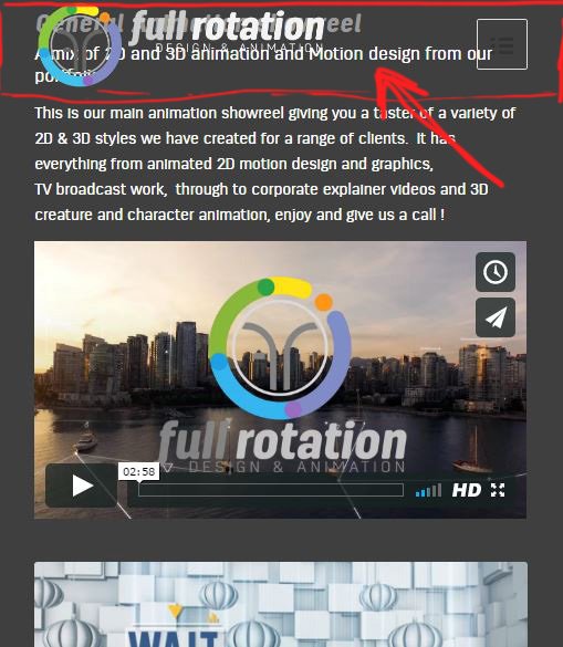
Hi, I just changed my mobile header to transparent, but after I did this any text I had in color sections below jumped up and moved under the header, so the logo and menu overlap and sit on top? Please see screenshot.
I tried code from other posts to add padding to the logo I also tried adding margin and padding to bottom of the mobile header like this
@media only screen and (max-width: 768px) {
#top #wrap_all .av_header_transparency, .av_header_transparency #advanced_menu_toggle {
  background: transparent!important;
  position: absolute!important;
padding-bottom:  50px important;
 margin-bottom:  50px important;
  }
 }
}
but nothing worked.
In the end I had to hack it by creating a custom class and adding massive padding-top to the special headings,
.mobileheaderfix .av-special-heading-tag{
padding-top: 75px !important;
}
but this is not ideal and more work as I have to add it to all headings on all pages.
Is there just one class or bit of code I can simply just add to the mobile header instead?
Many thanksFebruary 24, 2017 at 10:45 pm #751628Hey David,
Sorry for the late reply,
Can you please provide a link to the site so that we may take a closer look?
Best regards,
Jordan ShannonMarch 1, 2017 at 12:38 am #753354sorry yes the site is http://fullrotation.com
thank youMarch 1, 2017 at 7:53 pm #753921Hi,
Please try adding this code to the Quick CSS section under Enfold > General Styling or to your child themes style.css file:
@media only screen and (max-width:767px) {
	main {
		padding-top:70px!important;
	}
}
Best regards,
VinayMarch 4, 2017 at 2:08 am #755441Thanks that has sorted it, I just had to make the amount a lager number, cheers
March 4, 2017 at 8:21 am #755531Hi,
I am glad you were able to get this sorted. If you need any additional help please let us know.
Best regards,
Jordan Shannon -
AuthorPosts
- You must be logged in to reply to this topic.