-
AuthorPosts
-
March 18, 2022 at 11:46 am #1345044
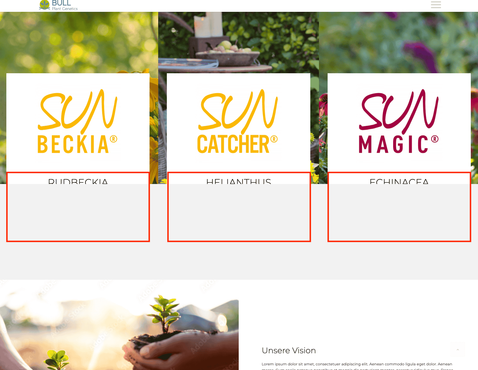
I have a text box in a raster element. This should be above the picture below (row-margin: -80%). If I don’t use any other elements underneath, the text is readable. But as soon as I add a blank space, for example, the text disappears in the background. What can I do to keep the text box in the foreground? So that it is also visible on all devices?
thanks for your help, DanielaMarch 18, 2022 at 1:31 pm #1345065Hey beyond-flora,
Thank you for the inquiry.
Looks like there is a -80px margin applied to the column in the first grid row cell. Did you adjust the margin settings of the column element?
.responsive #top #wrap_all .flex_column.av-l0w6l5fo-7029c4706ecbe4ec050ef84b345d1ca7 {
    margin-top: 0px;
    margin-bottom: -80px;
}
Best regards,
IsmaelApril 8, 2022 at 10:00 am #1347682Hi Ismael,
Yes that’s right with -80px. I would like the text overlay the image – similar to the screenshot (see link). But as soon as I deposit another element on the page, the text disappears in the background. Do you have any idea how I can bring it back to the foreground? Now, there is a color-section and the box is in the background.
Thank you for your help, DanielaApril 10, 2022 at 3:24 pm #1347853Hi,
Thank you for your patience and for the login, I couldn’t see your screenshot because it required a login, but I saw the first column and assumed that you wanted it centered over the background, so I removed the hr and changed the column’s negative top margin to a positive bottom margin and it seems centered now, please check.
If this is not what you wanted please upload your screenshot here or remove the login requirement from google drive.Best regards,
MikeApril 12, 2022 at 9:23 am #1348056Hi Mike,
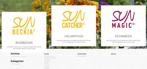
I would like the white block to go over the background image. See at the screenshot on the left site over the footer. But as soon as I add more elements to the page, the text is behind the elements disappears.
The Idea: The “SUNBECKIA” block is supposed to be above the grid element and above the secondary elements (like a color-section) … I hope you know what I mean?
Best regards, DanielaApril 13, 2022 at 5:17 am #1348174Hi,
The layout of the cells or columns are now similar aside from the 100px bottom margin applied to the column in the first cell. Is that intentional?#wrap_all .flex_column.av-l0w6l5fo-b220920a4a63c8fe0bc1fcf7779b0fb6 { margin-top: 0px; margin-bottom: 100px; }Would you mind providing a mockup of the section or a screenshot of how it is supposed to look?
UPDATE: I reviewed the thread above and found out that @mike actually added the bottom margin. A screenshot of the expected layout will help.
Best regards,
IsmaelApril 19, 2022 at 1:29 pm #1348792April 20, 2022 at 1:03 pm #1348931May 2, 2022 at 1:09 pm #1350179Hi Mika –
Sorry but no, I would like the block to keep a negative value. Everything should stay that way. The text block should just be in the foreground… How can I get the text to be visible without the block being moved?
Thank you for your new help ….Daniela
May 4, 2022 at 5:56 pm #1350511May 18, 2022 at 3:05 pm #1352192Hi Mike, perfect!
That’s how it should be!
Also, is there a way to solve this using a class?
Or does it have to be adjusted individually for each side?
I would also like to implement this on other pages, like here: … /sunbeckia/Do you have any idea?
Thanks for your help and best regards,
DanielaMay 18, 2022 at 8:09 pm #1352224Hi,
Glad to hear, if the layout was the same then you could use classes to achieve this, but your new page is not the same.
Are your additional pages going to use a grid element like the first page or a color section like this one?
On the first page the following element was a color section, on the new page it is two 1/2 columns, can you place these columns in a color section?Best regards,
MikeMay 25, 2022 at 11:38 am #1352906Hi Mike,
Yes, it makes sense that the structure is always the same. I have now created it in such a way that there are always two color areas one below the other. In the upper one then the 1/3 boxes that should go over the second color area. I created this on the start page and on the ../sunbeckia page. Is that how it works with a class?Thanks for your help!
Daniela
May 26, 2022 at 1:49 pm #1353050Hi,
Thank you for your patience, I found the solution a little more complicated because you are using the Sticky with curtain effect Footer Behavior, but by adding this custom class to the color section with the overlay columns: top-column-overlay-with-curtain-footer and this css:#top.av-curtain-footer.av-curtain-activated #main > *:not(.av-curtain-footer-container) { z-index: 2; } #top.av-curtain-footer.av-curtain-activated #main > .top-column-overlay-with-curtain-footer { z-index: 5; }Please note that the following color section should have it’s height set to at least 35% or 300px to allow for the column overlay.
I tested this on your homepage and /sunbeckia/
please clear your browser cache and check.Best regards,
MikeAugust 31, 2022 at 10:27 am #1363323Hi Mike,
sorry for the late response – it’s holiday time here.
It works great on the site now! Thanks!I now have the same problem on another page. Can you help again? The white container should also be in the foreground here. do you see what i mean?
Thank you in advance and sunny greetings
September 1, 2022 at 2:50 pm #1363487Hi,
Thank you for the link to your site, for your homepage aus Leidenschaft box I added this css:#top.home.av-curtain-footer.av-curtain-activated #wrap_all #main #av_section_2, #top.home.av-curtain-footer.av-curtain-activated #wrap_all #main #av_section_3 { z-index: 1; position: relative; }and it seems to be showing correctly now, please clear your browser cache and check.
Best regards,
MikeSeptember 12, 2022 at 11:06 am #1364696Hi Mike,
that’s great – thanks! I would like to do this on all subpages as well. Maybe with a class?
The structure is the same on all sides, so that there are always 2 color sections one below the other. Do you have a solution for me?Best regards and Thanks,
DanielaSeptember 12, 2022 at 11:55 am #1364726Hi,
If the pages have the same layout, then you should be able to add a custom ID to the second and third color sections:
second
third
and then use this css:#top.av-curtain-footer.av-curtain-activated #wrap_all #main #second, #top.av-curtain-footer.av-curtain-activated #wrap_all #main #third { z-index: 1; position: relative; }After applying the css, please clear your browser cache and check.
Best regards,
MikeSeptember 21, 2022 at 10:18 am #1365796Hi Mike,
Thank you for your help. Maybe I don’t fully understand this, but it doesn’t work for me. I cleared the cache and entered “second” and “third” in the color section for the ID.
Can you support me there again? I tested it on the “Sortiment” page.Thank you and best regards,
DanielaSeptember 22, 2022 at 1:20 pm #1365979Hi,
Please link to the “Sortiment” page, I didn’t find it in your pages or portfolio items.Best regards,
MikeSeptember 23, 2022 at 9:03 am #1366061Hi!
Sure, sorry! Here the links:
Best regards,
DanielaSeptember 23, 2022 at 12:05 pm #1366096Hi,
Thank you, I changed the color section ID’s to over & under and added this css:#top.av-curtain-footer.av-curtain-activated #wrap_all #main #over { z-index: 2; position: relative; } #top.av-curtain-footer.av-curtain-activated #wrap_all #main #under { z-index: 1; position: relative; }
the results:

You will need to adjust the placement of the box or make the height of the under section taller so the over box doesn’t cover the text.
Please adjust to suit, then clear your browser cache and check.Best regards,
MikeSeptember 26, 2022 at 4:05 pm #1366403Perfect and thank you! Now everything fits and we can hand over the website to the finale. THANKS
I am happy!Best regards, Daniela
September 26, 2022 at 7:03 pm #1366437Hi,
Glad we were able to help, if you have any further questions please create a new thread and we will gladly try to help you. Thank you for using Enfold.Best regards,
Mike -
AuthorPosts
- The topic ‘Text disappears in the background’ is closed to new replies.


