-
AuthorPosts
-
June 10, 2022 at 10:03 pm #1354885
Hi:
I was wondering if this was possible? So many Bios are so long, they look terrible in the Team Member Description Box, but opening in a lightbox would be pretty awesome. I searched the forum but couldn’t find anything.
Anyone done this before?
June 12, 2022 at 9:27 pm #1354989Hey Eleina,
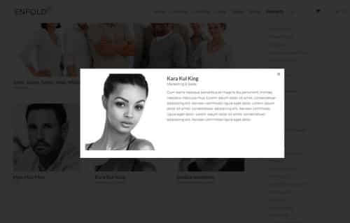
Thanks for your question, for this example I created long team member descriptions and used css to make them hidden (the borders are only for reference):

this is the css for the lightbox popup and to hide the team member descriptions:.white-popup { position: relative; background: #FFF; padding: 20px; width: auto; max-width: 500px; margin: 20px auto; } .white-popup .team-social { border: 7px solid rgba(0, 0, 0, 0.1); position: absolute; font-size: 19px; background: #fff; background: rgba(255, 255, 255, 0.7); opacity: 0; visibility: hidden; top: 0; left: 0; right: 0; bottom: 0; text-align: center; border-radius: 3px; } .avia-team-member .team-member-description { visibility:hidden; }Then I added this code to the end of my child theme functions.php file in Appearance ▸ Editor:
function clone_team_member_to_lightbox_popup() { ?>
  <script>
window.addEventListener('DOMContentLoaded', function() {
(function($){
   $('.avia-team-member').each(function () {
        var copyTeam = $(this).clone().html();
$(this).magnificPopup({
    items: {
        src: $('<div class="white-popup">'+copyTeam+'</div>'),
    },
    type: 'inline'
});
});
})(jQuery);
});
  </script>
  <?php
}
add_action('wp_footer', 'clone_team_member_to_lightbox_popup');
Then on click the team member element opens in a lightbox with the team member description showing.

*recommended css thanks to Guenni007 to have the team member image to the left and content to the right instead of below.mfp-content { display: inline-flex !important; } .white-popup { position: relative; background: #FFF; padding: 20px; width: auto; max-width: 800px; margin: 20px auto; } .white-popup .team-img-container { max-width: 300px; float: left; margin: 0 20px 10px 0 } .white-popup .team-member-name, .white-popup .team-member-job-title, .white-popup .team-member-description { width: 100%; }Best regards,
Mike-
This reply was modified 3 years, 8 months ago by
Mike.
June 15, 2022 at 3:08 pm #1355348This is totally awesome!!!! Thank you Mike, you are the best!
Except, I wonder if you could help me figure out one thing. Since I have multiple rows of team members (right now I have 3 rows), it’s placing white space under each row (as if the team member descriptions were actually there.
Here’s my page: https://3f6c0ed8c6.nxcli.net/about-us/musicians/
June 15, 2022 at 7:41 pm #1355383Hi,
Glad to hear this helps, try changing the css:.avia-team-member .team-member-description { visibility:hidden; }to:
.avia-team-member .team-member-description {
	display: none;
}
Then clear your browser cache and check.
Best regards,
MikeJune 15, 2022 at 8:57 pm #1355396That worked great. I so appreciate you! Excited about the ability to do this!!
June 16, 2022 at 12:32 pm #1355482Hi,
Glad we were able to help, if you have any further questions please create a new thread and we will gladly try to help you. Thank you for using Enfold.Best regards,
Mike -
This reply was modified 3 years, 8 months ago by
-
AuthorPosts
- The topic ‘Team Member Element – Open Team Member Description in Lightbox’ is closed to new replies.

