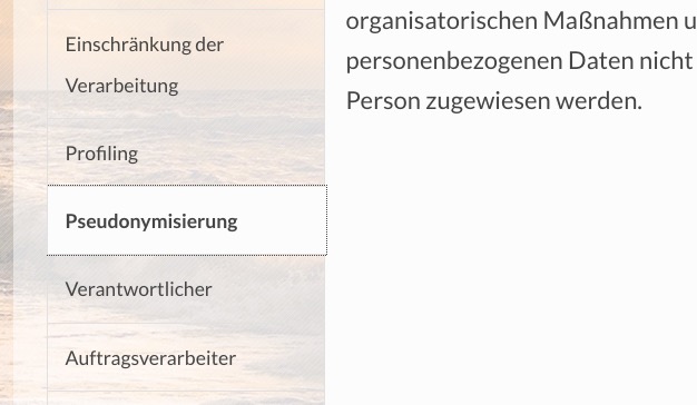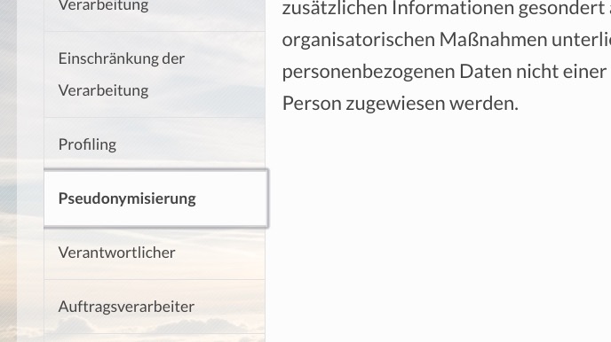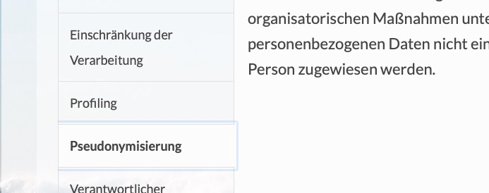
there was a new thing on Enfold 4.5 – and i can’t get rid of it.:
when clicking on a tab-title it will look like this on f.e. firefox

and chrome

on safari:

this was not so before 4.5 – when i click elsewhere on the page these dotted borders are gone – but it looks realy ugly – especially on semitransparent backgrounds
Link to page see private area
ok – i just added this to quick css :
.tab.active_tab {
    outline: none !important;
}
but why didn’t the problem appear until the new version was installed? Did you implement this in the previous version?
the navigation trough tab key is independent of that – and visible allthough
