Hello,
I’m working on a 2/3+1/3 (70% + 30%) page layout and encountered two nasty problems:
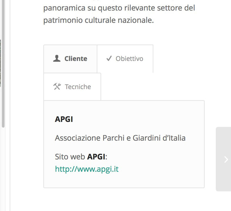
a) While using a Tab element (with 3 tabs + icons) on the 1/3 wide block, resizing the page or viewing it on a tablet causes the title tabs to shift on a second row, with an effect that is estethically horrible. Please see this partial screenshot:

How can I avoid such a problem? I have already tried to get rid of the icons, but this is not enough.
b) On some other pages, I placed a 360° HTML5 panoramic movie inside the 2/3 wide section, using the PanoPress plugin and configured the iframe movie to be 100% wide and 422px tall. In this case there are two different problems:
Is there any way to make those panoramic movies work 100% inside Enfolio?
Thanks for your help!
Note: moderators can see a direct link to a page under construction containing the panoramic movie.
Hey nightjar!
Would you like to try having the tabs switch to their mobile version on larger screens as well? Right now if your viewing on a screen smaller than 767px then they should be displaying the mobile version. You can change that on line 1049 in the /enfold/css/shortcodes.css file.
@media only screen and (max-width: 767px) {
Best regards,
Elliott
