Tagged: Masonry Gallery, tab section
-
AuthorPosts
-
March 15, 2019 at 4:00 pm #1079168
Hi
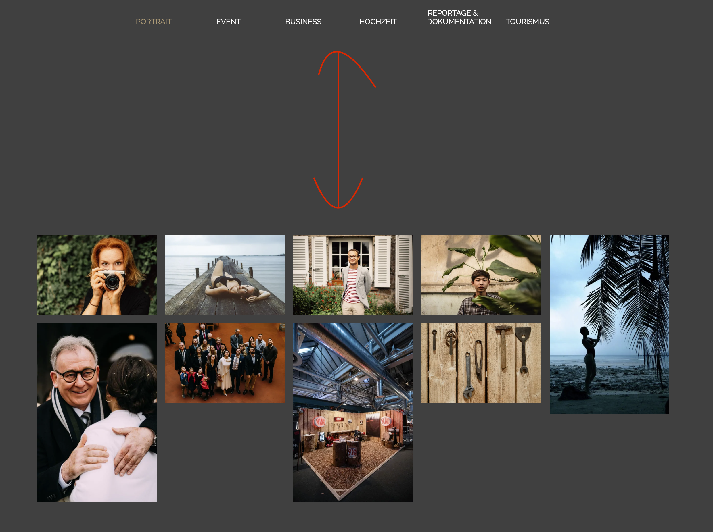
I am trying to achieve something similar to this

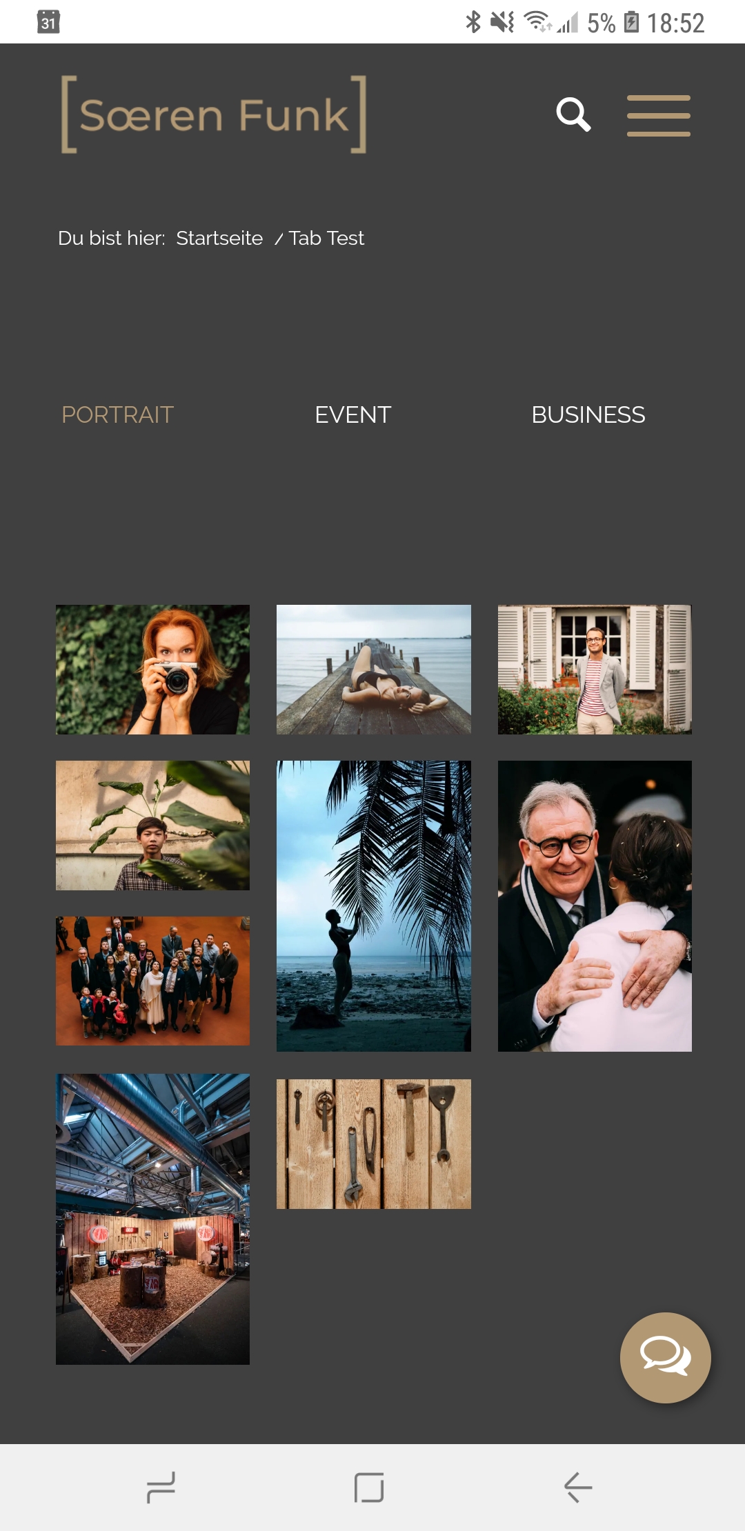
but I can only get this with a Tab Section and Masonry Gallery

How can I do that please? It’s working with a color section but not with the Tab Section.
5-10 pictures should be centered and not left aligned in a Masonry Gallery. Also I want the pics to be within the max. container width and not across the screen.
Thank you!
March 17, 2019 at 7:07 am #1079538Hey Funkys,
Could you post a link to the page in question so that we can take a closer look please?
Best regards,
RikardMarch 30, 2019 at 11:46 am #1084842Hi Rikard
Sorry for the late reply, we had a baby in the meantime. =)
Here is the example page where I also took the screenshots: https://www.soerenfunk.com/tab-test/
As described, it should look like in the 500px screenshot.
Thanks, Sören
April 1, 2019 at 8:11 am #1085318Hi Sören,
No worries, can you try adding this css code in Quick CSS, located in Enfold > General Styling:
#top.av-framed-box .av-layout-tab-inner .container {
    margin-left: auto;
    margin-right: auto;
}
Best regards,
NikkoApril 1, 2019 at 6:36 pm #1085646Hi
Thats almost perfect. But there is a big gap between the pictures and the selection. How can I close the gap?

Thank you,
Sören
April 1, 2019 at 6:47 pm #1085655Never mind, I found the solution to vertical alignment.
Thank you!
April 1, 2019 at 6:57 pm #1085663I do have one more question.
On the mobile version I see 3 of 6 options. Then I can click through to see the other options. How can I display all 6 options at the same time? – just like with the portfolio grids?

Thank you!
Sören
April 2, 2019 at 1:15 am #1085767Hi Sören,
Try adding this css code in Quick CSS (located in Enfold > General Styling):
@media only screen and (max-width:767px) {
  .js_active .av-tab-section-tab-title-container {
    min-width: 100% !important;
    max-width: 100% !important;
  }

  .js_active .av-tab-section-tab-title-container span.av-outer-tab-title {
    padding: 0;
  }

  .js_active .av-tab-section-tab-title-container span.av-inner-tab-title {
    margin: 0;
  }
}
Best regards,
NikkoApril 2, 2019 at 11:50 am #1086031Hi
Looks good – all options are visible.
But the entire thing still moves to the left on mobile so that the options on the left side get pushed out of the frame. Is there a solution for that?
Thank you very much,
Sören
April 2, 2019 at 12:25 pm #1086044Hi Funkys,
Please replace this code that I gave:
.js_active .av-tab-section-tab-title-container {
  min-width: 100% !important;
  max-width: 100% !important;
}
with:
.js_active .av-tab-section-tab-title-container {
  min-width: 100% !important;
  max-width: 100% !important;
  left: 0 !important;
}
Best regards,
NikkoApril 8, 2019 at 3:23 pm #1088321Perfect, thank you!
April 9, 2019 at 7:50 am #1088565Hi,
Great, I’m glad you got it working. Please let us know if you should need any further help on the topic or if we can close it.
Best regards,
RikardJune 25, 2019 at 4:55 pm #1113292Hi
I have another question on this topic.
Ho can I make the Gallery inside the Tab Section full width on the page? I tried some solutions I found on the forum but none of them worked for me.
Thanks
June 26, 2019 at 7:03 am #1113487Hi Sören,
Please try this CSS as well:
.av-framed-box .av-layout-tab-inner .container {
    width: 100%;
    max-width: 100%;
}
Best regards,
RikardJune 27, 2019 at 1:04 pm #1113933Perfect, thank you! That is a great feature!
June 27, 2019 at 3:46 pm #1113992Hi Funkys,
We’re glad that we could help :)
Thanks for using Enfold and have a great day!Best regards,
Nikko -
AuthorPosts
- The topic ‘Tab Section with Masonry Gallery’ is closed to new replies.
