
-
AuthorPosts
-
February 5, 2025 at 7:42 pm #1476438
Dear Support Team,
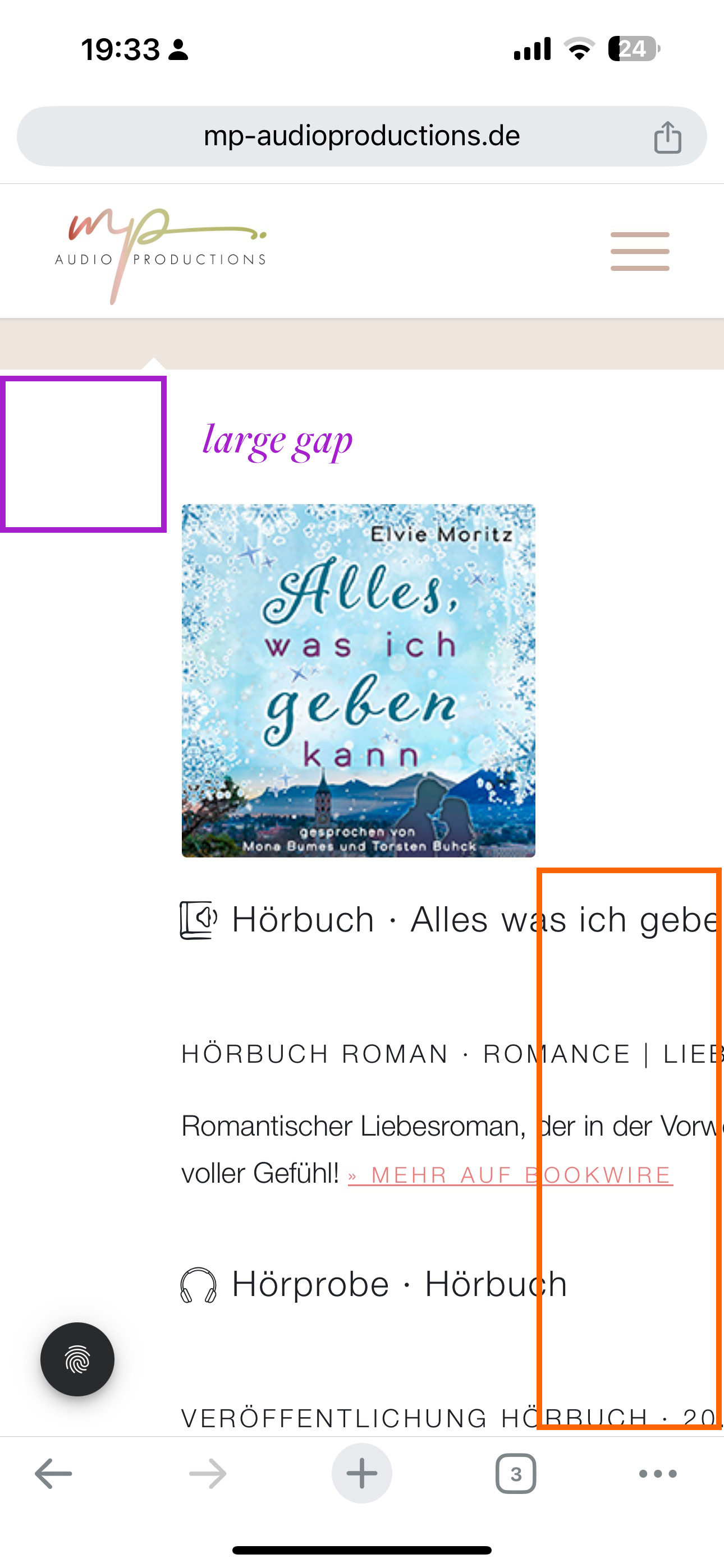
on the following website we have a tab section with content that is always truncated on mobile devices: https://mp-audioproductions.de/mona-bumes/#tab-hoerbuecher
The screenshot of the mobile version is here: https://mp-audioproductions.de/support/mobile.jpeg– The text is cut off.
– Is it possible to reduce the large space at the top nd left for mobile?Many thanks and best regards, Diana
February 7, 2025 at 5:32 am #1476579Hey Diana,
Thank you for the inquiry.
The issue occurs because of this css rule:
.js_active .av-layout-tab {
    display: table-cell;
    border: none;
}
Please remove the css, then temporarily disable the Enfold > Performance > File Compression settings. If the issue persists or if you can’t find the css rule, try to override it with this code in the Quick CSS field.
.js_active .av-layout-tab {
    display: block !important;
}
Let us know how it goes.
Best regards,
IsmaelFebruary 8, 2025 at 4:37 pm #1476695Dear Ismael,
Thank you very much for your reply.
Regarding the first part of your recommendation: delete the code:
>> I did not find this code in my css, so I could not delete it>> So I executed the second part and integrated the given code into the css:
.js_active .av-layout-tab {
display: block !important;
}>> The content no longer appears truncated and is displayed correctly, but the tab function no longer works. In the mobile version, all content (from the first and second tab) is listed one below the other in the first tab. The second tab is empty in the mobile version.
What can I do to make the two books from the second tab appear there again?Best regards, Diana
Translated with DeepL.com (free version)
February 8, 2025 at 6:25 pm #1476709Hi Ismael,
I had to remove the script from the css again. It had the effect that the text was no longer truncated in the mobile version, but at the same time I just noticed that the tab no longer works in the desktop version either > so I removed it again.Now the view is just as wrong as it was at the beginning.
Is there another solution? Why is the tab element causing such problems in the mobile version?
Best regards, DianaFebruary 10, 2025 at 6:33 am #1476800Hi,
Thank you for the update.
We edited the css a bit. You should also edit the Color Section above the Tab Section and modify the ID (hoerbuecher) since it’s the same ID used for the first item in the Tab Section. This causes the page to scroll up whenever the first tab item is clicked.
Best regards,
IsmaelFebruary 11, 2025 at 5:16 pm #1476900Dear Ismael,
Thank you for your reply.
Unfortunately I had a CSS error in the site and had to import a CSS backup. And since it was from Saturday 8.11.2025 I probably overwrote your changes in the CSS! Oh dear, I’m so sorry, I hadn’t seen the mail yet and when I was about to check it, I noticed the misery. Sorry about that. So I don’t know if your changes are gone now??? >> Unfortunately it still doesn’t work correctly on the cell phone > could you please take another look?I have changed the ID “hoerbuecher” to “hoerbuecher-mona”, the tab section has the ID “tab-hoerbuecher”.
Best reagrds, Diana
February 12, 2025 at 6:00 am #1476922Hi,
We added the css again. Please make sure to purge the cache before checking.
.responsive.js_active #top .av-layout-tab {
   display: block;
   float: left;
}
Best regards,
IsmaelFebruary 19, 2025 at 10:31 pm #1477420Hi Ismael,
this code works perfect! Thanks a lot!
Best regards DianaFebruary 19, 2025 at 11:00 pm #1477421Hi,
Glad Ismael could help, if you have any further questions please create a new thread and we will gladly try to help you. Thank you for using Enfold.Best regards,
Mike -
AuthorPosts
- The topic ‘Tab section mobile view’ is closed to new replies.