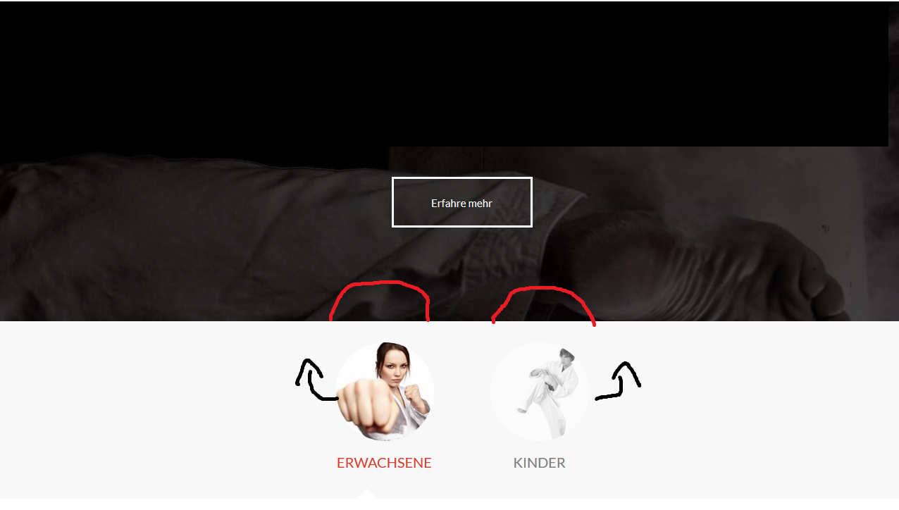
Tagged: tab section
-
AuthorPosts
-
September 5, 2019 at 1:55 pm #1134409
Hello Team Kriesi,
I would like to overlap the two (it will soon be 3) tab section images slightly above the overlying container.Can you help me? I think it’s a mistake of mine.
All relevant data can be found in the private area.
Best regards

-
This topic was modified 6 years, 6 months ago by
Aviatist.
September 6, 2019 at 7:10 pm #1135086Hey Aviatist,
Best regards,
VictoriaSeptember 9, 2019 at 2:49 pm #1136039Hey Victoria,
Thanks for your feedback!So there is no way? -margin & z-index was also my first thought, unfortunately without success. : /
Best Regards
September 11, 2019 at 2:54 pm #1137063Hi,
Thank you for the update.
You can try this css but it might affect the tab section behavior because we’re letting the child elements overflow outside the container.
.av-tab-section-outer-container {
    overflow: visible;
}

#top .av-section-tab-title {
    color: #7d7d7d;
    margin-top: -100px;
}

#bildover {
    z-index: 100;
    position: relative;
    overflow: visible;
}
Best regards,
IsmaelSeptember 12, 2019 at 10:30 am #1137453hey Ismael,
Thank you for your help! That looks very good!I noticed something in the mobile view. (See image)
Interestingly, this funny formatting happens only after the repeated loading of the mobile view.
On my private huawei p20pro it looks good even after reloading. Strange! do you have a solution?
Best regards,
Florian-
This reply was modified 6 years, 6 months ago by
Aviatist.
September 16, 2019 at 1:03 am #1138600Hi,
Sorry for the late reply, it looks like the section is now hidden on mobile viewpoint, do you no longer need assistance with this?Best regards,
MikeSeptember 17, 2019 at 12:38 pm #1139081Hey Mike,
Thanks for your feedback. No problem! The new Enfold update is probably doing a lot of work.Right, there were some mobile display issues. Everything looked right on my private p20Pro. For another phone (Honor), it was unfortunately as it is to see on the screenshot.
We have chosen a different solution for the current project. But it would be interesting to know how to fix this problem in the next project. But I would have to reconstruct the problem, right?
We really love Enfold and we believe that it is the right tool for our agency. Our customers are also impressed by the great overview and make friends quickly, for their own work.
Thank you for your great work!
best regards
September 18, 2019 at 5:49 pm #1139605Hi,
Thank you, from looking at your image I believe you are referring to how the tab section is dropping one tab down when there is not enough screen width for the tabs? Typically the tabs are meant to run off the screen advancing forward as the tabs are click, but this also has a limit. Please see our demo here.
Did I understand this correctly?Best regards,
Mike -
This topic was modified 6 years, 6 months ago by
-
AuthorPosts
- You must be logged in to reply to this topic.
