-
AuthorPosts
-
July 8, 2018 at 3:47 am #982624
Hi,
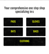
On my site http://77.104.128.85/~triden11/ – I have a section called “Your comprehensive one stop shop specializing in:” with 5 columns of contents. it looks great on desktop but on mobile, I would like for them to stack 2/2/1 instead of 1/1/1/1/1
Basically have “PADS” ad “GLOVES” show up on one column then “BATS” and “BAGS” on another column and finally “CLOTHING” only on mobile.
July 8, 2018 at 6:57 pm #982768Hey navindesigns,
Here is the code you can put in Enfold > General Styling > Quick Css, if it does not work, put into themes/enfold/css/custom.css
@media only screen and (min-width: 480px) and (max-width: 990px) {
    #top.page-id-206 .flex_column.av_one_fifth.avia-builder-el-4,
    #top.page-id-206 .flex_column.av_one_fifth.avia-builder-el-6,
    #top.page-id-206 .flex_column.av_one_fifth.avia-builder-el-8,
    #top.page-id-206 .flex_column.av_one_fifth.avia-builder-el-10  {
        width: 50%;
        margin-left: 0;
        margin-bottom: 10px;

    }
    #top.page-id-206 .flex_column.av_one_fifth.avia-builder-el-12 {
        width: 100%;
          margin-left: 0;
    }
}
If you need further assistance please let us know.
Best regards,
VictoriaJuly 8, 2018 at 7:13 pm #982774I added the code but I am not seeing any changes on my end :(
July 8, 2018 at 8:25 pm #982815July 9, 2018 at 3:48 am #982912Yes but it is not showing up on my phone like that. They are still stacked ontop of each other
July 9, 2018 at 11:42 pm #983437Hi,
What is the actual model of your phone? Try to adjust the css media query.
@media only screen and (min-width: 480px) and (max-width: 990px) {Adjust the min-value to 360px. You may also need to turn on the custom css class field so that you can replace the generic css selectors.
Best regards,
IsmaelJuly 10, 2018 at 3:05 pm #983708I am still not seeing any of the changes on the front end. Maybe I am having some caching issues?
July 11, 2018 at 12:57 pm #984204Hi navindesigns,
Here is the correct code:
@media only screen and (min-width: 360px) and (max-width: 990px) {
    .responsive #top.page-id-206  #wrap_all .flex_column.av_one_fifth.avia-builder-el-4,
    .responsive #top.page-id-206  #wrap_all .flex_column.av_one_fifth.avia-builder-el-6,
   .responsive #top.page-id-206  #wrap_all .flex_column.av_one_fifth.avia-builder-el-8,
   .responsive #top.page-id-206  #wrap_all .flex_column.av_one_fifth.avia-builder-el-10  {
        width: 50%;
        margin-left: 0;
        margin-bottom: 10px;

    }
    .responsive #top.page-id-206  #wrap_all .flex_column.av_one_fifth.avia-builder-el-12 {
        width: 100%;
          margin-left: 0;
    }
}
Please remove the one I gave you before and use this one.
Best regards,
VictoriaJuly 12, 2018 at 4:30 am #984455Thank You. This works!
One last thing, can I have some space between each horizontal one, maybe 20px or so right now they are touching each other
July 12, 2018 at 9:35 am #984570Hi navindesigns,
Here is the complete code:
@media only screen and (min-width: 360px) and (max-width: 990px) {
    .responsive #top.page-id-206  #wrap_all .flex_column.av_one_fifth.avia-builder-el-4,
    .responsive #top.page-id-206  #wrap_all .flex_column.av_one_fifth.avia-builder-el-6,
   .responsive #top.page-id-206  #wrap_all .flex_column.av_one_fifth.avia-builder-el-8,
   .responsive #top.page-id-206  #wrap_all .flex_column.av_one_fifth.avia-builder-el-10  {
        width: 50%;
        margin-left: 0;
        margin-bottom: 10px;

    }
    .responsive #top.page-id-206  #wrap_all .flex_column.av_one_fifth.avia-builder-el-12 {
        width: 100%;
          margin-left: 0;
    }
    .responsive #top.page-id-206 #wrap_all .flex_column.av_one_fifth.avia-builder-el-6,
    .responsive #top.page-id-206 #wrap_all .flex_column.av_one_fifth.avia-builder-el-10 {
        margin-left: 4%;
    }
}
If you need further assistance please let us know.
Best regards,
VictoriaJuly 13, 2018 at 3:23 am #984936That did not work – here is my screenshot – https://imgur.com/a/1gH2AfX
Please see login below, you can use it to test
July 15, 2018 at 4:11 am #985560Hi,
I changed the code a little, to this:@media only screen and (max-width: 990px) { .cta-btn-l { width: 46% !important; margin-right: 10px !important; margin-bottom: 10px !important; float: left !important; } .cta-btn-r { width: 46% !important; margin-left: 10px !important; margin-bottom: 10px !important; float: right !important; } .cta-btn-c { width: 100% !important; margin-left: 0 !important; } }Please clear your browser cache and check.

Best regards,
Mike -
AuthorPosts
- You must be logged in to reply to this topic.

